Society of Visual Storytelling

    SVSLearn Forums

    • Register
    • Login
    • Search
    • Recent
    • Tags
    • Popular
    • Users
    • Groups
    • Search

    Circus WIP

    Illustration
    14
    35
    12957
    Loading More Posts
    • Oldest to Newest
    • Newest to Oldest
    • Most Votes
    Reply
    • Reply as topic
    Log in to reply
    This topic has been deleted. Only users with topic management privileges can see it.
    • Maile McCarthy
      Maile McCarthy last edited by

      I'm getting ready for my first SCBWI event in a few weeks. Yipes and yay! Here's a piece I'm hoping to put into my portfolio. I would appreciated any feedback before I start coloring.

      Thank you!

      upload-629fde29-d424-4bdd-b5b4-924d08921c6b

      Twitter @MaileMcCarthy
      www.mailemccarthyillustration.com

      1 Reply Last reply Reply Quote 0
      • Steve Young
        Steve Young last edited by

        lol funny, thought i would a a few more interesting character to create interest.

        Never give up, always push yourself two steps further than you believe you can go.

        Maile McCarthy 1 Reply Last reply Reply Quote 0
        • Maile McCarthy
          Maile McCarthy @Steve Young last edited by

          @Steve-Young said:

          lol funny, thought i would a a few more interesting character to create interest.

          Thanks Steve. Do you mean adding more people/animals to the image, or pushing the ones I have to make them more interesting (or maybe both!)?

          Twitter @MaileMcCarthy
          www.mailemccarthyillustration.com

          1 Reply Last reply Reply Quote 0
          • Steve Young
            Steve Young last edited by

            I guess a little of both wont hurt 🙂

            Never give up, always push yourself two steps further than you believe you can go.

            1 Reply Last reply Reply Quote 0
            • Rob Smith
              Rob Smith last edited by

              This image made me laugh! Nice job. I like the limit palette. Suggestion: maybe you could scale the audience a little smaller which would increase the sense of height and danger.

              Maile McCarthy 1 Reply Last reply Reply Quote 0
              • Samuel Nunez
                Samuel Nunez last edited by

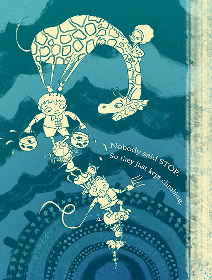
                I thought this was the finished piece but then I saw your comment that you haven't painted it yet. I really like the monochrome color palette. Reminds me of 60-70's illustration.

                One thing you could try doing is having some fun with the type. Your composition uses a nice repetitive circular motif and it would be interesting if you had the type follow lines of the tent and stands.
                stop_type.png

                www.instagram.com/samuelnunezart

                www.samuelnunez.com

                Maile McCarthy 1 Reply Last reply Reply Quote 0
                • Maile McCarthy
                  Maile McCarthy @Samuel Nunez last edited by

                  @Samuel-Nunez I love that idea with the type. Thank you. I'll definitely go with that.

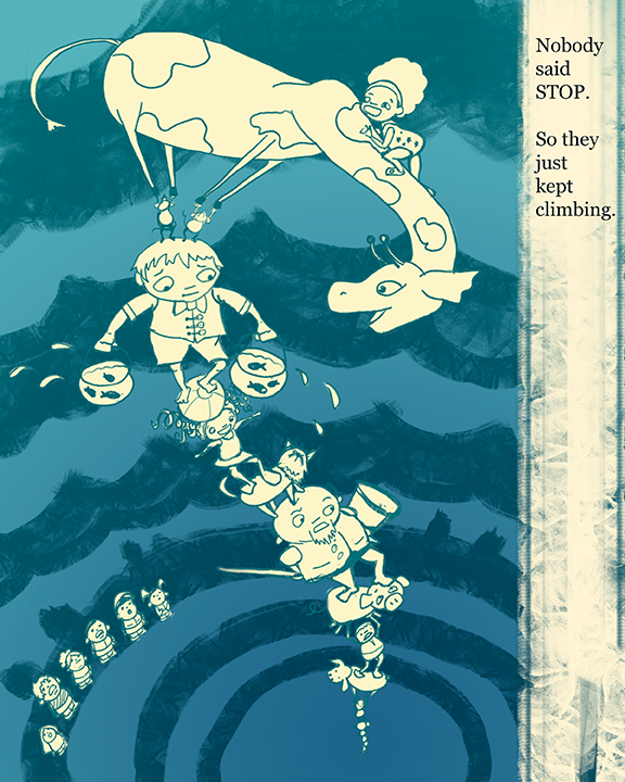
                  I'm so glad I put this up before I colored it since I'm getting so much feedback that people like it as is. I think I'll do a colored version and them put them up for side-by-side comparison. I'm very curious to find out the result.

                  Twitter @MaileMcCarthy
                  www.mailemccarthyillustration.com

                  1 Reply Last reply Reply Quote 0
                  • Maile McCarthy
                    Maile McCarthy @Rob Smith last edited by

                    @Rob-Smith Thanks for the suggestion. I agree-- I think I'll scale them back and have more of them and see how that looks.

                    Twitter @MaileMcCarthy
                    www.mailemccarthyillustration.com

                    1 Reply Last reply Reply Quote 0
                    • Leontine
                      Leontine last edited by

                      love the composition and the fun characters! cant wait to see you coloring!

                      Leontine
                      "A picture is worth a thousand words."

                      https://leontineillustrator.com
                      https://www.instagram.com/leontine.illustrator/
                      http://www.facebook.com/leontineillustration

                      1 Reply Last reply Reply Quote 0
                      • Spencer Hale
                        Spencer Hale last edited by

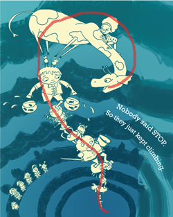
                        awesome concept! I would suggest, arching the giraffe's back and neck more so i flows with the curve of the the tower, really emphasize the curve of everything. i did a draw over of the gesture line that might help.
                        curve.jpg
                        Those mice holding up the giraffe rock!

                        spencerhalefire.tumblr.com | instagram.com/spencerhalefire | twitter.com/spencerhale

                        Maile McCarthy 1 Reply Last reply Reply Quote 0
                        • Naroth Kean
                          Naroth Kean last edited by

                          I totally love this idea, it is so much fun to look at. Your characters are very quirky and that makes them so cool.

                          http://narothkean.com
                          https://twitter.com/narothkean
                          https://www.instagram.com/narothkean

                          1 Reply Last reply Reply Quote 0
                          • Lynn Larson
                            Lynn Larson SVS OG last edited by

                            This is one of those pieces that makes me grin every time i look at it! I would suggest putting a bench under the people for the audience? Or maybe a short wall in front of them? I thought they were waiting in line to climb up! That would be cool too, showing a line of people and critters waiting hehe.

                            https://instagram.com/lynnlarsonart/
                            https://twitter.com/lynnlarsonart

                            1 Reply Last reply Reply Quote 0
                            • Vicky Vicky
                              Vicky Vicky last edited by

                              That is great! Only thing I would say is the giraffe is maybe a bit too rounded in body and the neck would be more tapered, and I am not sure what the shape coming off the cheek is. Love the image! Fun!

                              1 Reply Last reply Reply Quote 0
                              • Maile McCarthy
                                Maile McCarthy @Spencer Hale last edited by

                                Hi everyone. Thanks for all the feedback. I played around with color, and it only seemed to make it worse. So I guess this will be the finished style after all.

                                upload-43b8a2bb-3403-4def-801d-2a8422a68fb0

                                @Lynn-Larson and others. How does this read to you now, especially the audience? I spent a couple of hours yesterday drawing in all the detail of the audience as well as more circus people in the ring, and it was just too much.

                                @Spencer-Hale Your gesture line really helped. I think it flows much better now.

                                @Vicky-Vicky Thank you! I reworked the giraffe a bunch, though I didn't change the face. I think the confusing shape you're talking about is the ear. Is it any clearer now, with the neck changed and spots added?

                                Twitter @MaileMcCarthy
                                www.mailemccarthyillustration.com

                                Rich Green 1 Reply Last reply Reply Quote 1
                                • Lynn Larson
                                  Lynn Larson SVS OG last edited by

                                  Oooh! Flows so much better now! the audience definitely reads spectators now, and that change in the curve of the giraffe's neck really eases the eye along! I think the color is great, and the mice still make me laugh! Excellent job!

                                  https://instagram.com/lynnlarsonart/
                                  https://twitter.com/lynnlarsonart

                                  1 Reply Last reply Reply Quote 0
                                  • Rich Green
                                    Rich Green SVS OG @Maile McCarthy last edited by

                                    @Maile-McCarthy this update is absolutely fantastic. I love the minimal markings for the audience. It reads perfectly without distracting the eye from the towering attraction. And it also really adds to the just how far up they are towering too. Love it!!!

                                    www.richgreenart.com instagram.com/richgreenart/

                                    1 Reply Last reply Reply Quote 0
                                    • Vicky Vicky
                                      Vicky Vicky last edited by

                                      Hi Maile,

                                      Great revision. The giraffe looks a lot better and that curve really makes for a nice composition for the whole piece. To me, the ear still doesn't really have the shape of a giraffe's ear, those curvy lines wouldn't be there. I would just make it simpler and maybe make the little "antennae" thicker to be more giraffe-like. Not a big issue.

                                      Maile McCarthy 1 Reply Last reply Reply Quote 0
                                      • Naroth Kean
                                        Naroth Kean last edited by

                                        Good luck! it has turned out very lovely. So much fun, I love those characters and their swag haha.

                                        http://narothkean.com
                                        https://twitter.com/narothkean
                                        https://www.instagram.com/narothkean

                                        Maile McCarthy 1 Reply Last reply Reply Quote 0
                                        • J
                                          Jeszika Lee last edited by

                                          just peeked in on this thread - and the improvements you made are fantastic! You really refined this and brought it all together so well! And I am glad you stuck with this color scheme - it has a great design quality to it!

                                          1 Reply Last reply Reply Quote 0
                                          • Maile McCarthy
                                            Maile McCarthy @Vicky Vicky last edited by

                                            @Vicky-Vicky said:

                                            Hi Maile,

                                            Great revision. The giraffe looks a lot better and that curve really makes for a nice composition for the whole piece. To me, the ear still doesn't really have the shape of a giraffe's ear, those curvy lines wouldn't be there. I would just make it simpler and maybe make the little "antennae" thicker to be more giraffe-like. Not a big issue.

                                            Thanks Vicky. This kind of feedback is really helpful to me. It's a good reminder of how important it is to understand the anatomically correct way of drawing something before making an abstract departure. I didn't do that here, and I guess it shows!

                                            Twitter @MaileMcCarthy
                                            www.mailemccarthyillustration.com

                                            1 Reply Last reply Reply Quote 0
                                            • First post
                                              Last post