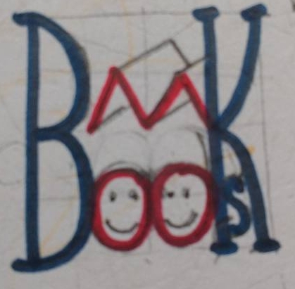
What do you think of this for a logo?
-
Marsha Ottum Owen Books is my business name. What do you think of this for a logo?
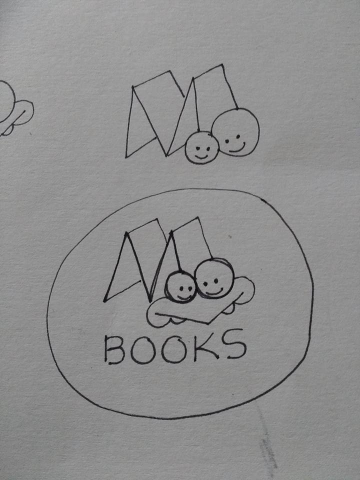
-
it's clever! I like it. Maybe give the letter M some thickness to it, or draw it like the edge of a book?
-
I like the M of two books-idea - that would work very well as a logo! But I would not put the two faces over the book. A good logo has to meet some specific requirements
- it should be simple and readable at both small and large formats
- it should work in both colour and black and white
- it should be vector-based graphic and type
In light of this, I would rather go for the faces in the O's - perhaps one large and one small O? Close together, and it would still look cute, I think. That would leave your supercool M-books uninterrupted, and the logo would read better imo.
Just my suggestions

-
Thanks, Camomilla. So put the two o's next to the M and each other but not overlapping? I'll play around some more. Thanks!
-
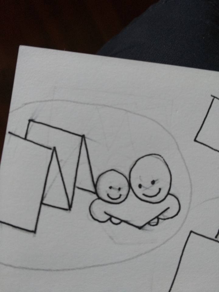
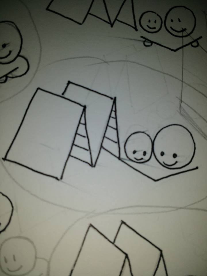
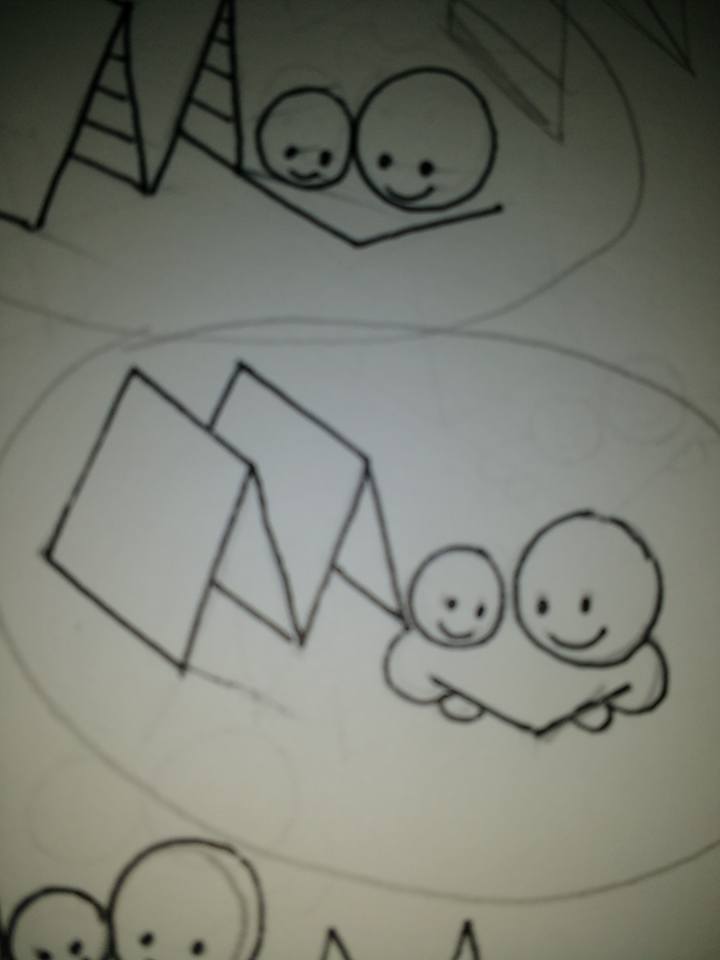
@Camomilla Here are a few more tries. Is this better? Still not sure if it feels right......
-
Maybe I could write BOOKS under the M in the space .....maybe not.
-
I was thinking that the to faces could be the O's in the word "books" - sorry if I was vague describing what I meant. The point of this is to minimize the amounts of elements in the logo - simplicity is a good thing when logos are concerned

-
Oh, I see. The M books stay as they are and then, I use the two O's in the word Books. Good idea! Thanks, Camomilla!
-
-
Still needs work of course. Maybe not so square so I can fit the s in better, etc. I'll try again later. Kind of burnt out on drawing for awhile

