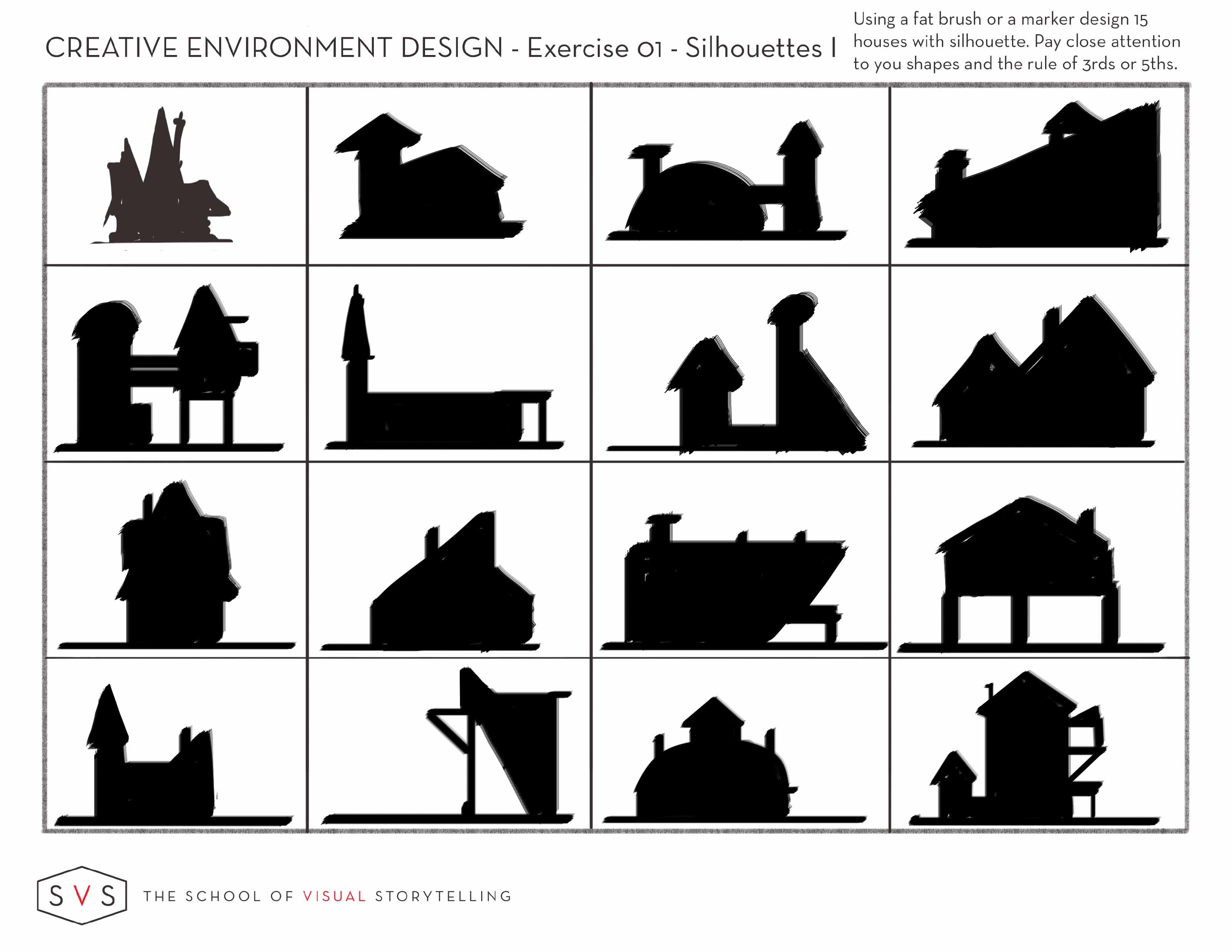
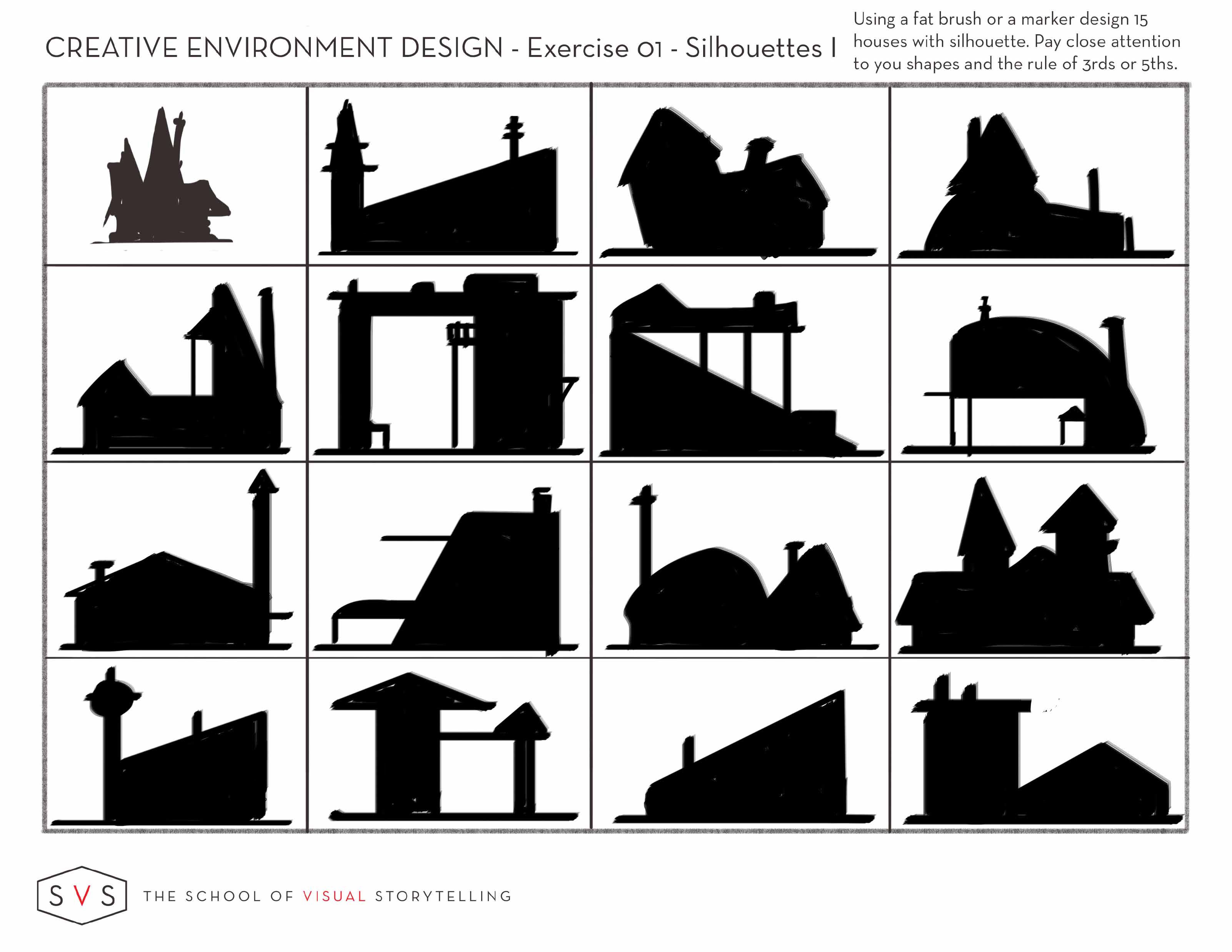
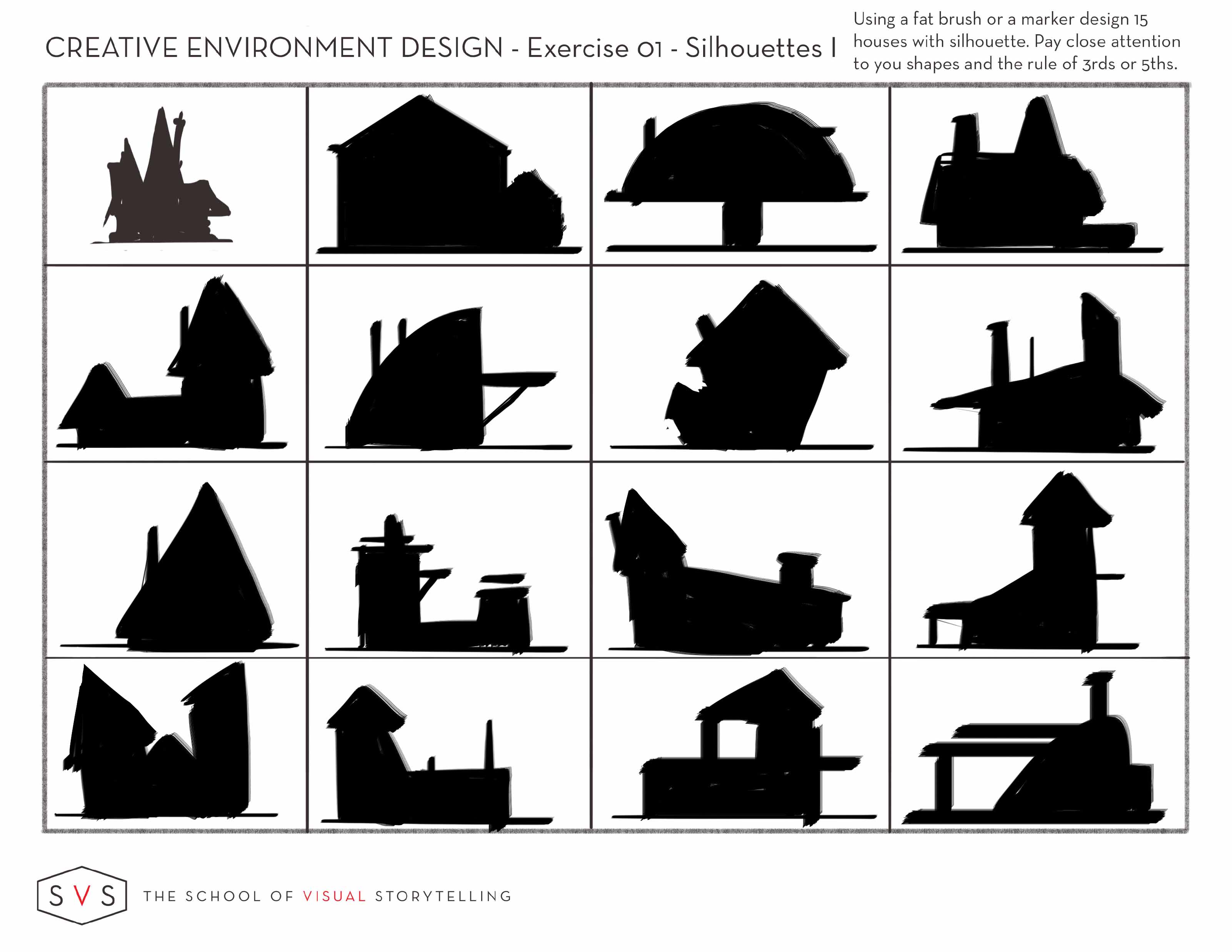
Creative growth and silhouettes
-
This month I entered the 3rd Thursday competition and was able to watch the live critique session for the first time. It was a great experience and I was fortunate enough to have gotten a critique from @Jake-Parker. I totally agree with what was said and will definitely use silhouettes going forward when designing pieces especially spot illustrations because they completely rely on quick readability. For those that didn't watch the critique I basically had a design whose silhouette could've been a squirrel or a guys face with big hair. That lack of readability is not good, the irony is that after I submitted my piece I was watching Jakes lesson on what.....SILHOUETTE lol. The fact that my critique was focused on that was a huge sign to incorporate silhouette design into my work flow. So here are some silhouette house designs from Jakes workbook for the Creative Environment Design course.


-
Nice shapes! what a lovely variety! I really like the half moon one with the deck in the last panel
-
@Lynn-Larson Thank you, the next part of the lesson is to do the same with trees. I'll be posting those too. The lesson then calls for selecting one of the trees and one of the houses to actually draw in the detail of how they would look. That should be fun.