Illustration Critique Help: color use, lighting, over all feel
-
Edit: updated work below in the comments.
I've been working on these pieces for a few weeks and feel that I've gotten too close to make a decent judgement call on what they need (if anything) to be polished off and finished.
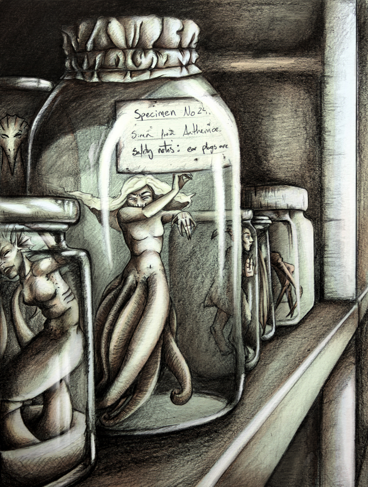
I started with the Collector (woman with crystal ball) piece. I drew it traditionally, scanned it in, and, after doing some thumbnail color studies, digitally painted it. I kept working on it and eventually over-saturated it and overworked it. I moved on to the Specimen Jar piece and after a few hours got to a stopping point and put it down. When I came back the next day I loved where it was at. I liked the muted tones and more limited color palate so I added a bit of details (defined facial features, hands, etc) and highlights and called it done. I then went back and toned down the Collector piece. I'm not sure if they quite go together yet (they definitely do when just in graphite) or if I still have some tweaking to do.
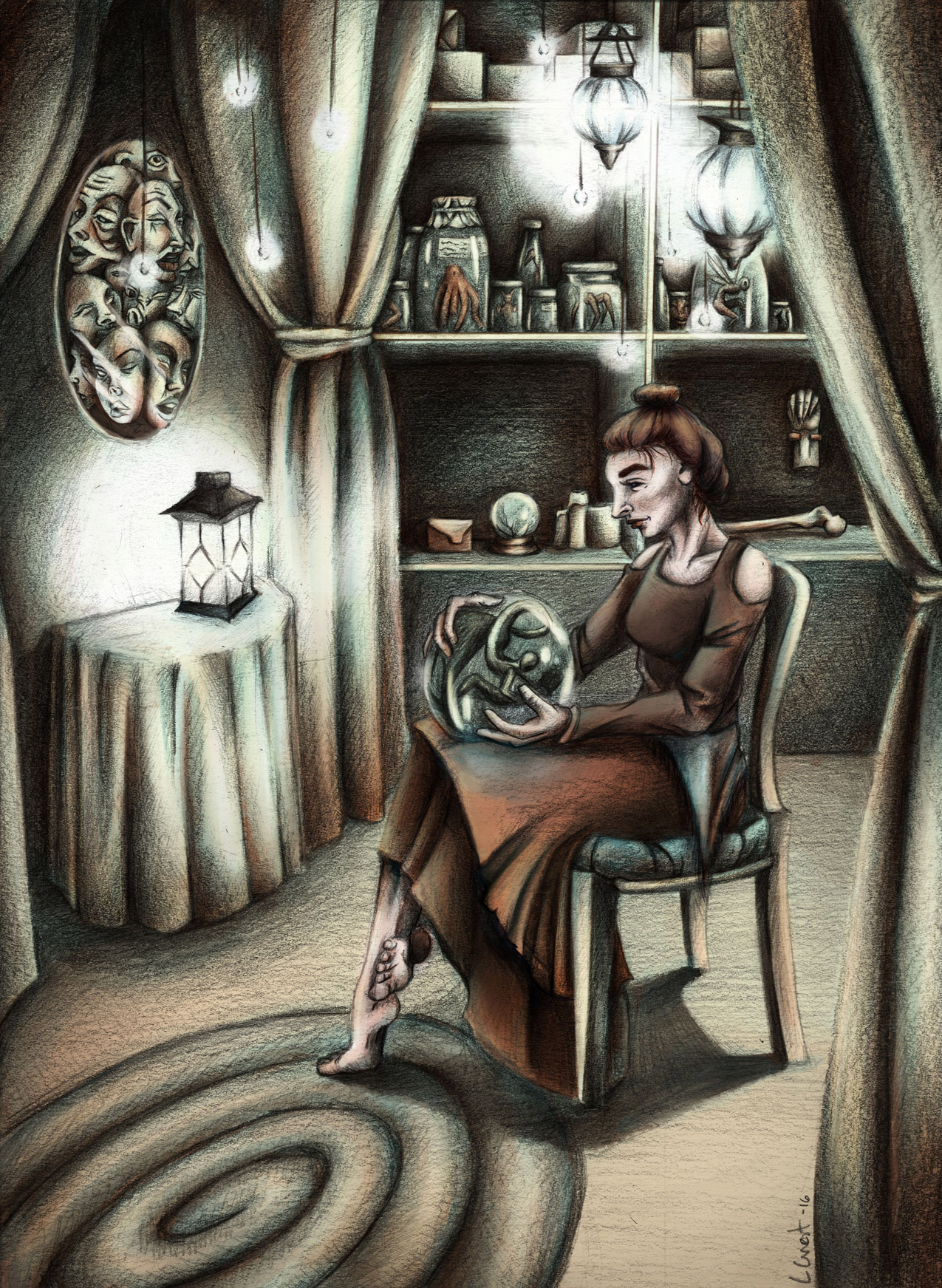
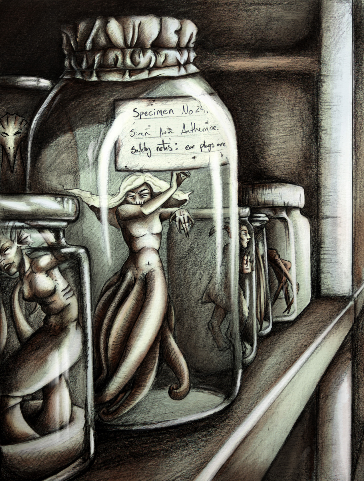
I'd love to hear your thoughts on these. Feedback is greatly appreciated.

-
Here are the base sketches without digital work applied to them:
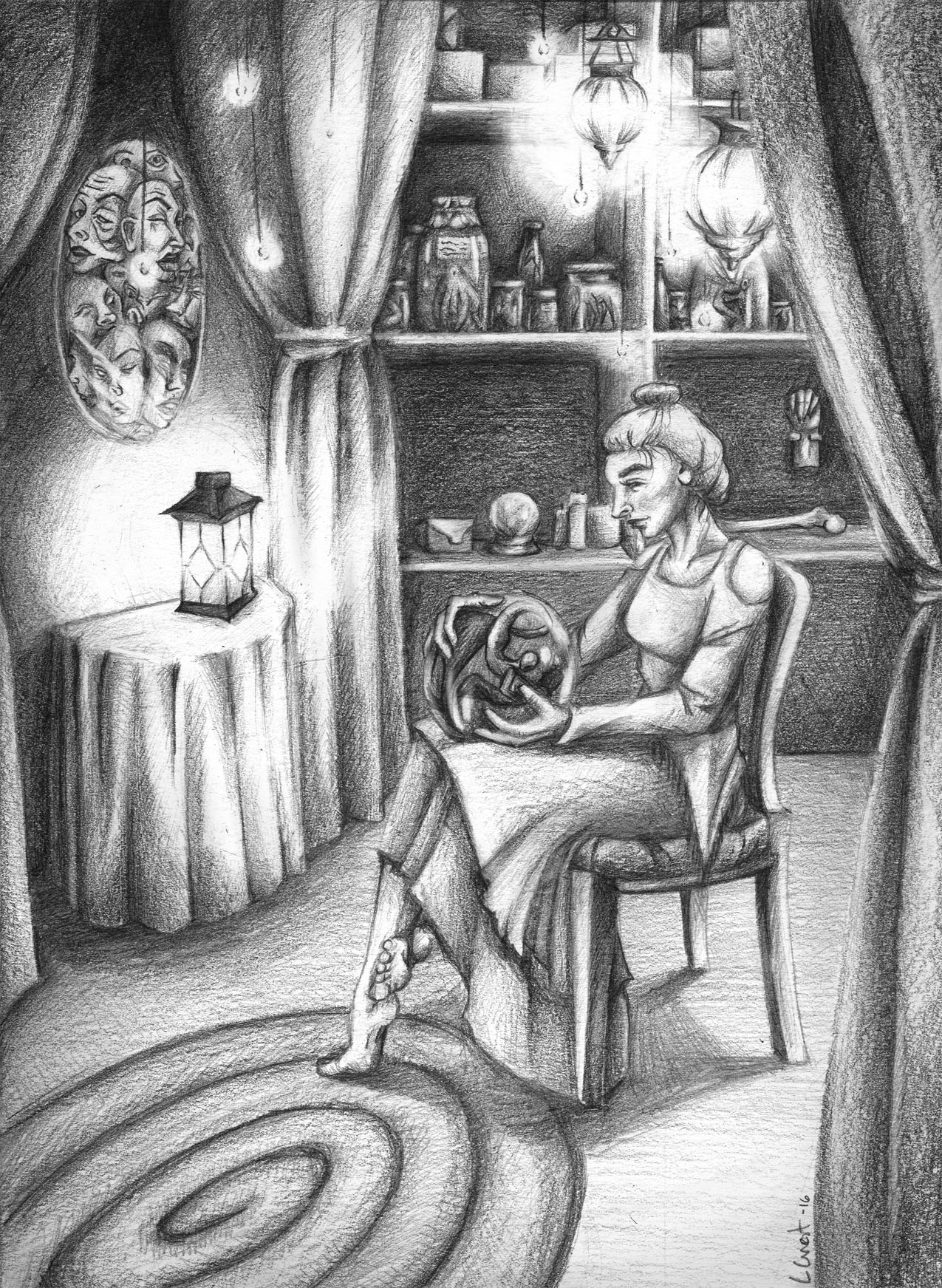
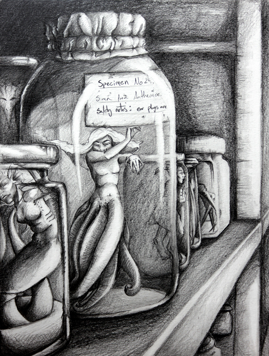
-
Update: I'm not sure any of these are improvements but I figured I'd test out some ideas.
In this piece I added more contrast to the figure in the middle. I thought that may help to define her a bit more. The line art that I added around her clothes and around specific parts of her skin really helped define and crisp up the image, I feel.
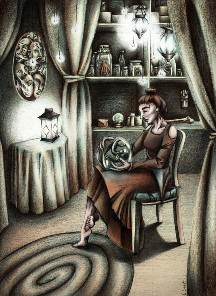
I then noticed that she doesn't stand out well from the background so I experimented with lightening the entire background in this piece.
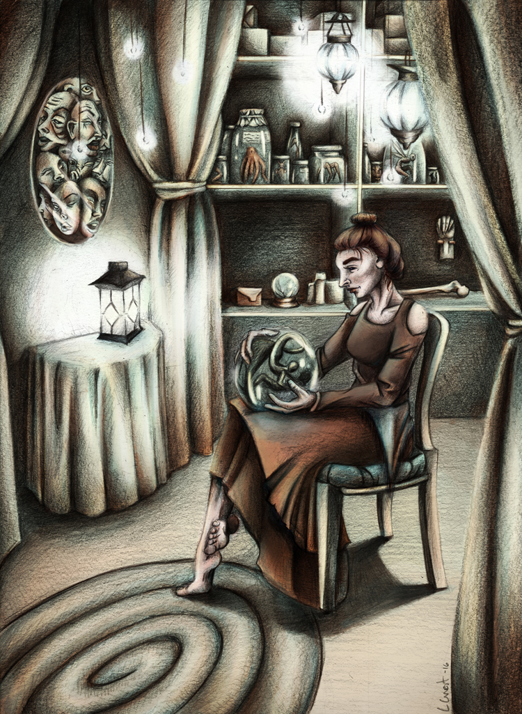
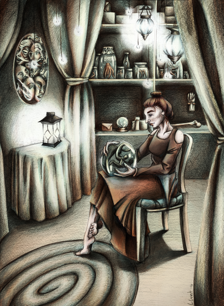
I then lightened her hair and skin a bit to give her more contrast herself. I don't think this last experiment helped much and seems to have washed out the image.
-
LOVE the black and white versions really nice. One tip I learned about coloring black and white images in Photoshop is to always have your colors B- setting (Brightness) at 100% when you are working on a multiply layer above the sketch...you can adjust your saturation as you please but leave the brightness all the way up....the reason being at 100% there is only pure color being applied with no black added...so Photoshop takes the values already in your image and uses those. So if you use a color that already has some black in it, it will add that black to the values already in your image and it will make it darker....and mess up your values if you already have them the way you want. Another tip is that if you want to adjust your values use the blending mode of Luminosity then only paint with gray (no color at all) and it will adjust your values if you pick a gray with a brighter value and paint it on a black area it will lighten....it's an easier way to adjust your values and it's on a whole new layer so if you mess up you can just start over.
-
@evilrobot I've never heard someone talk about B-settings that way but it makes sense. I've always worked to color lightly drawn sketches in Photoshop and add the shading and details there so I've never run into this problem before. This explains why my values are getting muddled. I've always picked my colors to be 50% or over with the B-setting but I'll have to try them at 100% now. Thank you!
Also, thanks for the luminosity suggestion. I'll be testing that out as well!
-
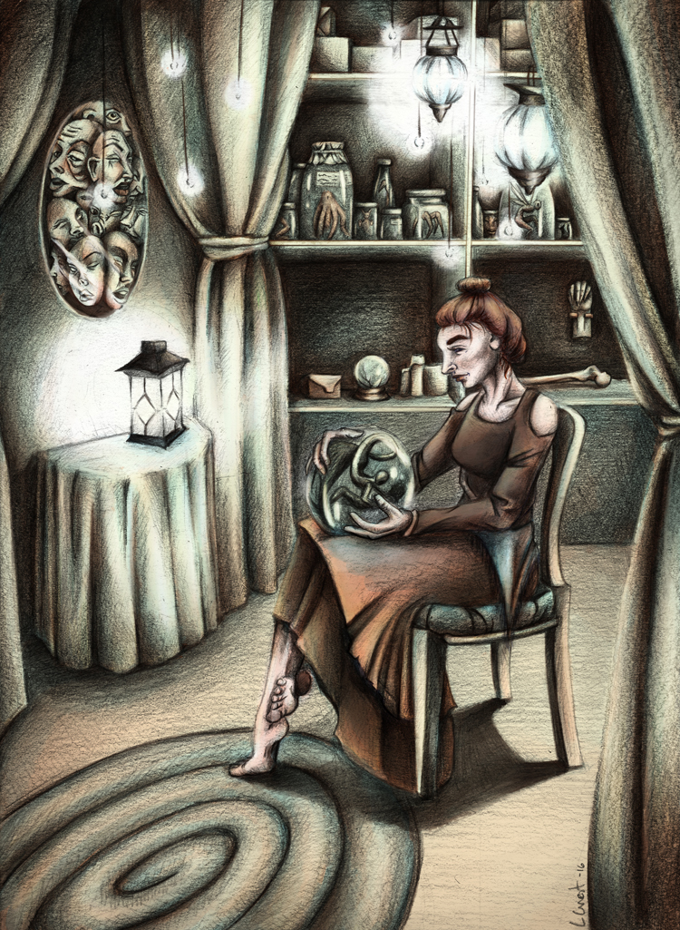
Update: I like these a lot more. @Evilrobot your suggestions on coloring helped a lot to color the piece in muted tones but without losing the values. Thank you!
-
These look pretty good on my screen. Nice work. I dig the style. Love to see what you'd come up with for a Third Thursday challenge.
-
@evilrobot Thank you!
 I really like how they turned out in the end.
I am looking forward to Third Thursday challenges in the future for sure. I'm going to be missing this month while finishing up other projects but I'm super excited for next month's prompt!
-
Very interesting piece! I just love the specimen jars and the story of collecting that I find in here... I looked at the shelves in the background of the first one for quite a while... very creepy and your style sets the mood for it nicely.
I think that you have an anatomy issue on the feet though. I did a quick paintover to address the issue. It looks like the big toe is on the wrong side of both feet. It's a tough and twisted pose that you have picked for sure.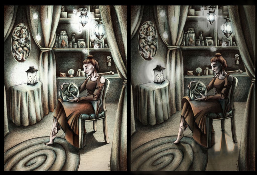
I did some sidebyside work here and I hope it is ok that I did so. I think you have chosen a VERY challenging lighting scheme for this work. You have a lantern on one side of the room and some hangy-down lights in the rear of the room. This would make the front of her face lit while the side of her face and body (her left side) hidden in shadow. Since the lights are further away from the collector, I thought the room would be darker overall and that the direction of the shadow under her chair would change... similarly, I think there is a tricky, secondary shadow that would be here and I don't think I could do it justice right away... multiple light sources are a bear sometimes.
Bringing in more shadow and darkening the whole piece selectively really makes the room look more mysterious and dark while maintaining some of the disturbing beauty of the woman in the middle.I am still very intrigued by this piece. So nice.
-
@Bob-Crum Thank you for your suggestions and paint over! It looks like I did indeed get the feet wrong. facepalm I guess that is the whole point of finding references for EVERY detail of the piece not just the majority of them. I'll definitely go back and change that. Thank you for pointing that out!
This is my first illustration with a detailed background that I pieced together from multiple sources so your paint over was super helpful. I'll have to play around and try to improve the feel of the image through the lighting as your piece really did convey the atmosphere a bit more with what I was attempting to accomplish. I felt that something was missing/off but I couldn't quite figure out what it was.
Thank you for your help! I'm excited to go back and rework aspects of this piece with this new guidance.

-
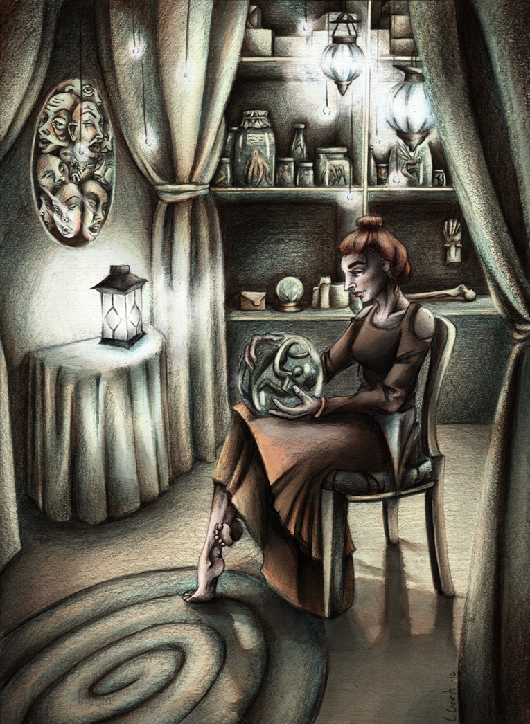
@Bob-Crum your suggestions on changing the lighting has completely transformed this piece! Thank you so much. Here is an update:
-
Excellent! I am feeling that a lot more now!