New to the children's book industry.
-
Hey ! (We are a couple) We're still new to this platform and also to children's illustration. We've already faced some rejections when applying to agencies. The feedback we received was mainly: "We already have a style similar to yours," or "Your style doesn't quite fit our needs yet." Currently, we're still searching and have even taken courses on Itsme.biz to improve and see if there's a possibility of being represented by one of their partner agencies.
We'd love to get your feedback on our portfolio, please. Is there anything missing? Or any areas that need improvement?
Your experiences and insights are also very welcome, as we really need them. Thank you so much!
Portfolio : https://www.owlfens.com/
-
@Owlfens Overall, you have a very appealing style that should work well in kids publishing.
For me, your strongest piece is the family bagging grain. The story is clear, there is good contrast between the characters and background, and there is not so much texture that it overwhelms the image. Your character pages are good too.
Others need to tell a clearer story. For example, what is the reason the goose is chasing the boy? And it is odd that no one notices the screaming kid and goose.
I don't understand the one with the letters.
Not a huge issue, but I might make the bear's food truck a hot chocolate truck to simplify the story.
For the classroom, I would move the blackboard to where the window is to make "Art Day" more obvious.
Now it goes without saying that most of these would work as they are in the context of a book with the text, but I think the point of a portfolio is to show not just you artistic ability, but your storytelling abilities as well.
All the best!
-
@tombarrettillo Thank you very much for your feedback. It allows us to delve deeper into our research and pay close attention to the details. It's very encouraging feedback! We are taking note of all the areas for improvement.
-
I really love your style, and I think it would look amazing in children's books! I like the variety of illustrations in your portfolio too. The market scene is one of my favourites—so many details! And the grandpa-granddaughter duo has such a fun, dynamic pose and expression.
One small thing: in the piece where the kid is making music with utensils, maybe the pose could feel a bit more energetic and dynamic, like he's really into it. Right now his pose looks a little static. But overall, your portfolio is awesome, and I’m sure you’ll find an agent soon! All the best!

-
Your style is great! now you just need your own project to complete and launch. Y'all are a powerful duo and you don't need to wait for permission to make something amazing and impactful. If that seems daunting to you, remember that Beatrix potter, one of (if not the) best-selling author-illustrators of all time originally wrote her stories as letters to little children friends when they were sick. Think about someone specific, and make a project with them specifically in mind, and it will be amazing how universally engaging it will be.
Give yourselves permission, and go bonkers!
-
Hi Guys

I already think that your portfolio is good and you're on a really good way (and so fun that you're doing your illustrations together? I love it!) but there are a few things that I noticed. Take it with a grain of salt though because I work in the german market and it's a bit different from the american/british one!
So first thing that I noticed and it's the main one I think: You could work on the readability of your images. And what I mean with that: Values!
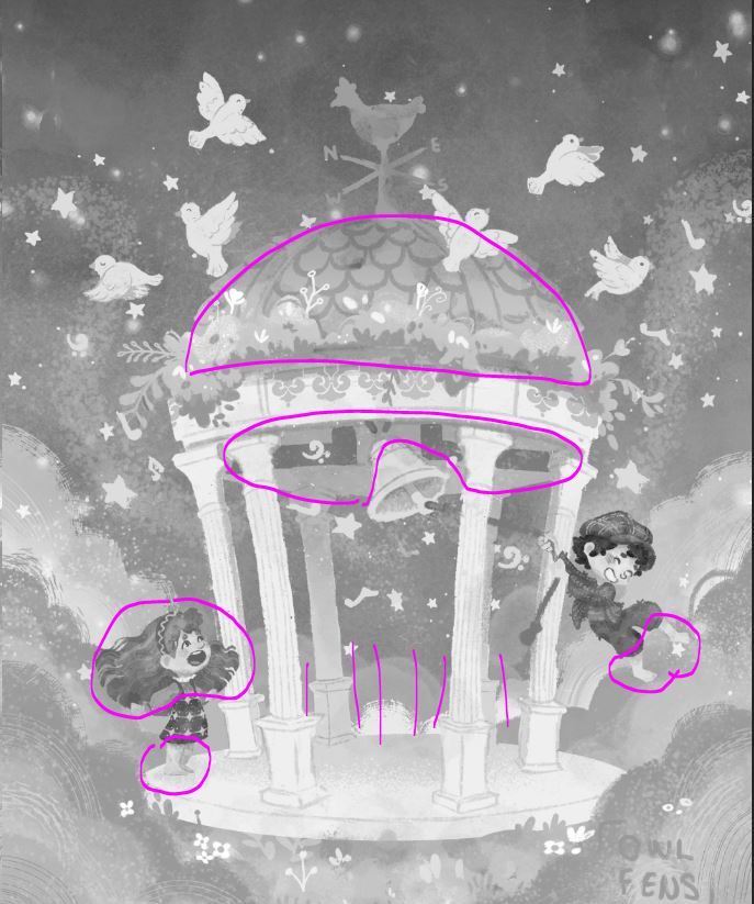
Take this picture for example:

There are a few value problems in this one. One of the most important things that editors will look for in a picture is if the characters are readable - and I think especially with the girl there is a problem there. Because her hair isn't super dark and also her eyes have a medium value she doesn't stand out very much. The darkest part of the image is the hair of the boy and that gives the image kind of an unbalanced feel. A big problem ist that their feet almost disappear into the background. Maybe you could fix that with a a little bit of an outline? I think the girl would be an easy fix - just make her hairband really dark and also the eyes. (Eyes are always the most important thing for a character I feel) You could also use different values for the clothes of the boy, I think they are more or less the same value.
To give the image more depth I would also darken the roof of the pavillon - the outside and also the ceiling. This way the clock would stand out more and would make it super easy to see what the image is about at first glance.
Just for the sake of it you could also darken the upper part of the sky. (Always try and use the full range of values, that makes composition much more easy)An easy hack for handling values (maybe you also know this one?) is using ctrl + y in photoshop. To make it go to black and white (sorry I have the german version so the english words might actually be different) you have to go to View -> Proof Set Up -> and then choose Dot Gain 20%. Then you can toggle between b&w and the colored image super easily


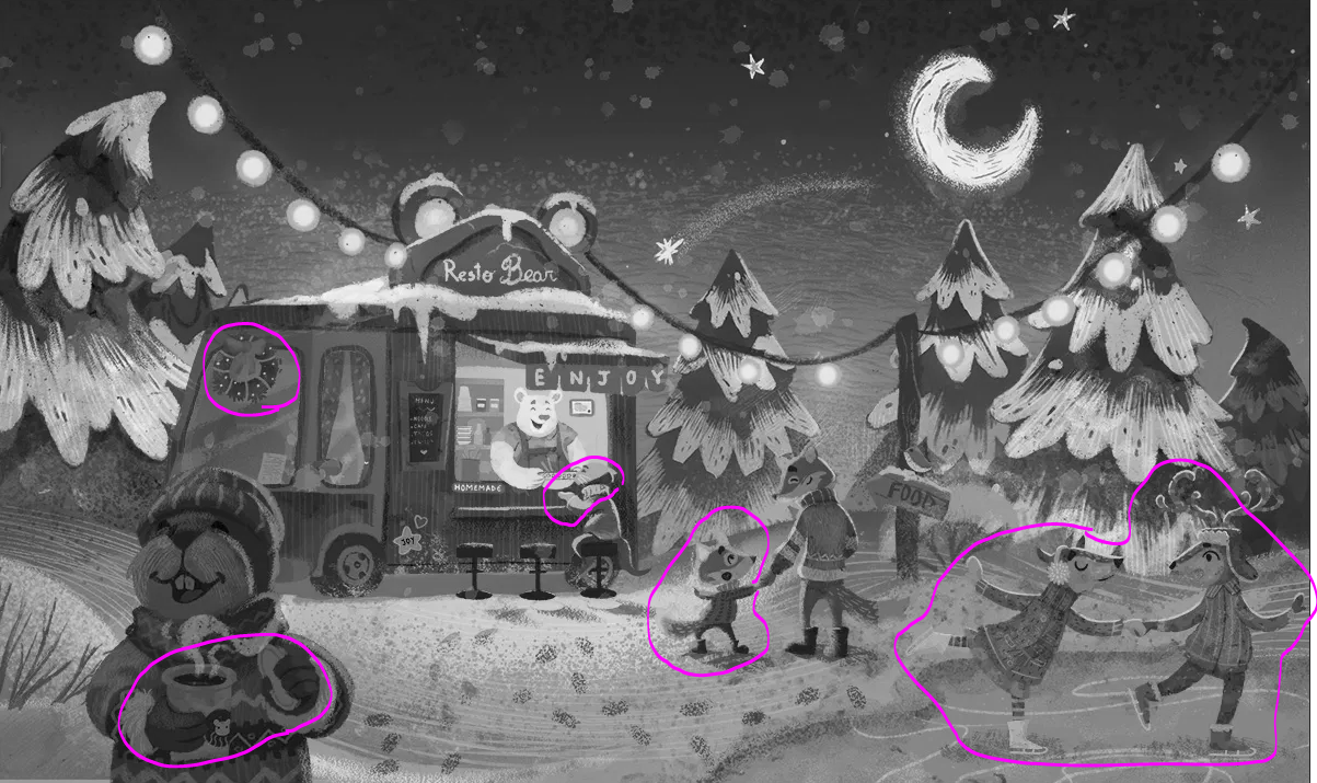
In this one you have a similar issue. I don't want to make this post even longer but a few things that stood out to me: the snow on the pinetrees is very light and distracts from the character in the image because there is so much contrast. The characters on the other hand aren't really standing out and lack contrast. Maybe you could make the characters darker overall and then brighten their rim light? (so that the rim light is almost white would be the best I think) (And make the snow on the pinetrees darker) There are a few other areas that I marked that have little problems.
But i LOVE the colors in this one
There are also similar issues in the other images but I think that's enough value talk!Another thing that stood out to me aside from the values was that a few of your character designs look a little bit two-dimensional in my eyes (but again - german market, so it might be different for you!)
Though I love the pigy chef and find him very adoring the big pigy-chef on the left lacks three-dimensional qualities. Funny enough the smaller ones are way more three-dimensional - so maybe you could leave out the big one? Ore draw the big one from a 3/4 view.
Willy Wonka also feels a little bit stiff to me.
But on the opposite I think that the grandpa and his granddaughter aren't lacking three-dimensionality at all. Maybe you could update the other ones?Mini mini thing: In the german market your eyes would be too cartoonlike for the editors. I like them but maybe make sure there are similar eyes in the market that you want to enter! Eyes are really the most important thing in a character design and they matter a lot.
Last mini thing: For me your black&white images have a different feel to the other pieces in your portfolio. My portfolio started to have success in the industry when all my images had the same quality and feel - maybe you could get rid of the outlines in this one? (Or add outlines to all the other ones but that's probably way more work) But I love your outline style and you shouldn't put it aside forever!! Just put it in the drawer for now and wait until you're in the industry. When you had a few book deals then consistency won't matter as much
 I think for editors (and agents) it's easier to understand you (and your personal brand) if you have one consistent style at the beginning.
I'm sorry that this was so long but I hope I can help you this way! Getting into the industry can be super frustrating and sometimes there are just a few tweaks you have to make. Your portfolio is wonderful and especially your colors and characters have such a warm feel to them. I think if you tweak a few of your images and step up the game just a little bit you will have no problems getting an agent! I wish you two all the best and hope you have the success that you deserve
