traditional --> digital disconnect. I need help with cohesive art style and direction...
-
Hi guys,
I have no idea what category this was supposed to go in, so apologies if I don't have right one.The short version of this question/request is... why does my traditional work look so different than my digital work, and how do I take my traditional work and make it look great in digital? How do I make my work feel more cohesive?
Okay now the longer version for some context...
One of my goals last and this year was to have a solid portfolio.I have always gravitated towards traditional work- I love impressionism, seeing brushstrokes, paint splatters, scratchy pencil marks. I mostly love graphite, watercolor and adding in mixed media.
To accomplish this goal I decided to choose a few of my own picture books or illustrated projects I am working on, and some pieces or themes that I like and want to work with.
... but as I went through several months of sketches/ideas, I felt frustrated. Some of the pieces that I have done and experimented as far back as 2018 are more pleasing than some I have done recently... I have played around with digital (procreate) and some of the pieces just look so bad...and I wish I had a more clear formula rather than just messing around and trying things...
I do suspect one of my issues is color- when I do traditional, everything comes out really blah and flat. And when I try digital, it looks pretty messy..or really stiff!
I have a collection of favorite artists and illustrators, and what I like about each of their work, and have tried to emulate them. I have So much of it feels like experimenting and I want to have a cohesive art style that is a little more predicable. I am taking the Art style course (and I have watched so many YT vids on the topic).
Anyways, I have seen a lot of work here on the forum that is amazing, and I really do believe that I will get better and even great one day if I am doing the right stuff...I just don't know exactly what I am missing. Here are some pieces of work I have done for some more context. (some of it is not narrative, but just so you can get the basic idea)
Some earlier work:
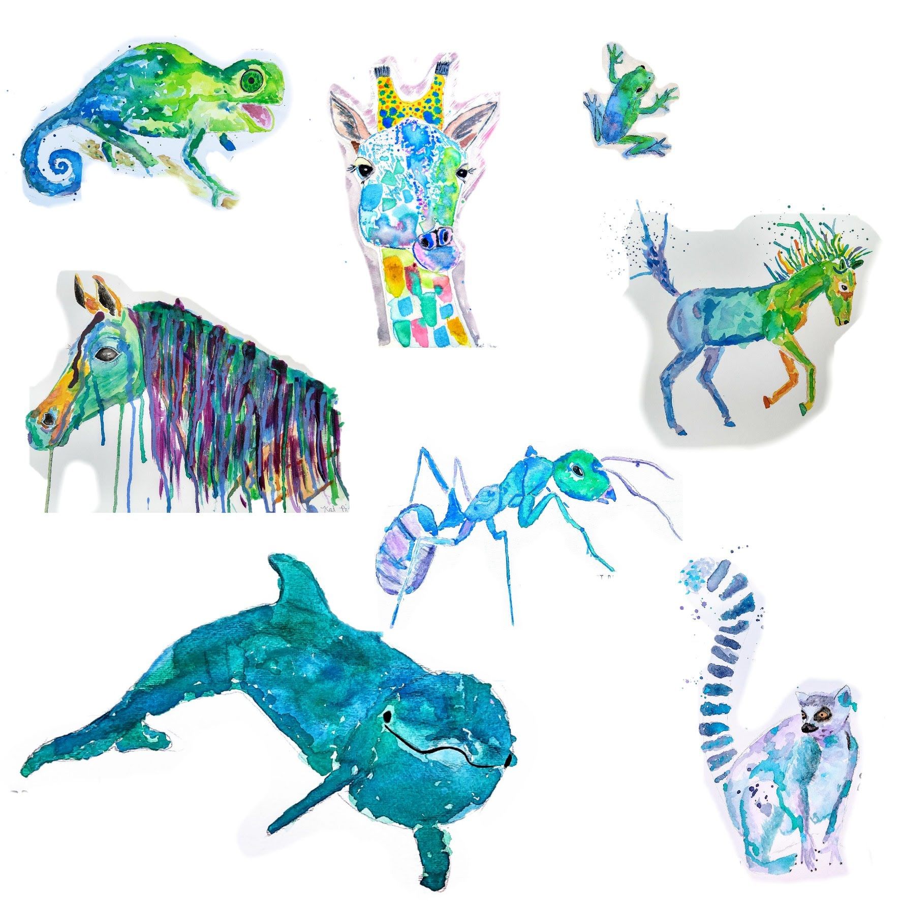
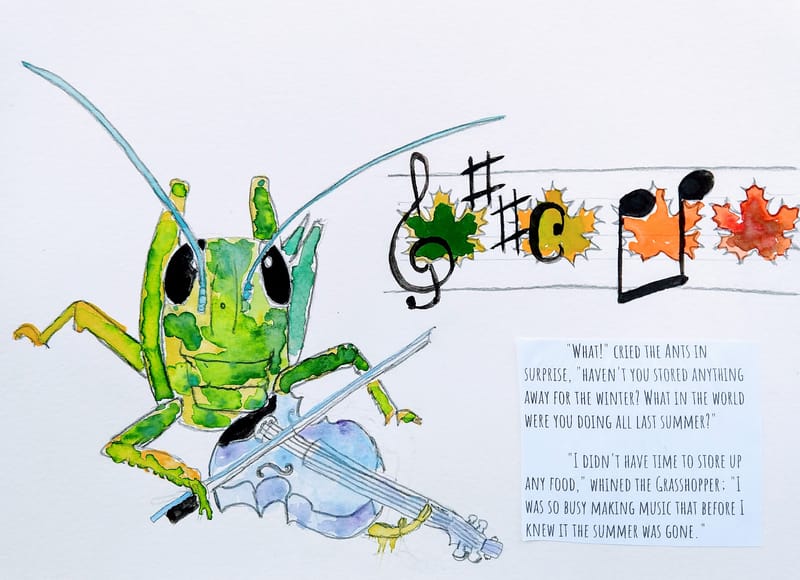
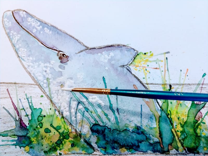
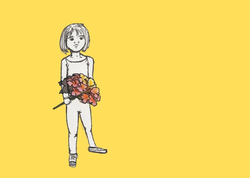
Some more recent work, inspired by my personal interests, and a little more character and story driven, but it just feels like when I go to put color, it kind of falls apart, or at least I don't feel like I know what I am doing:
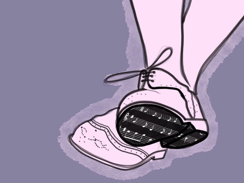
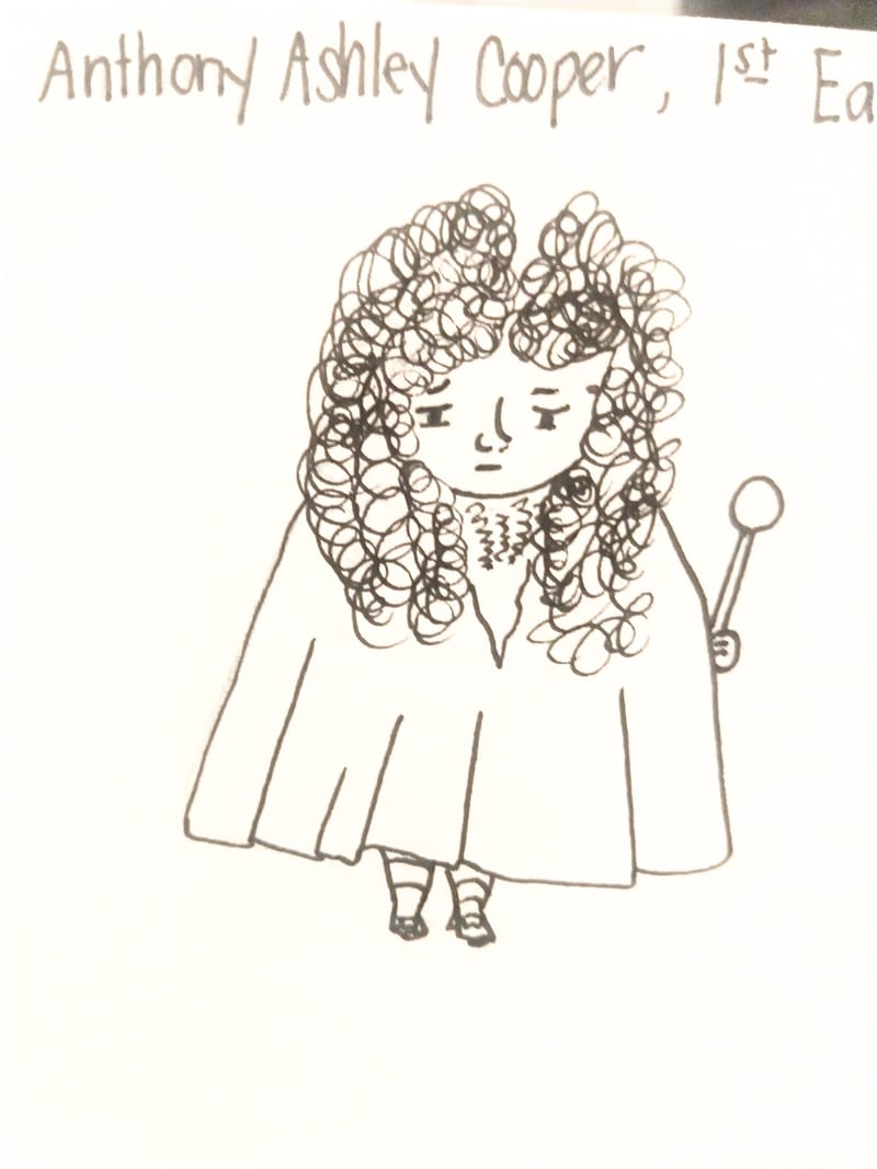
And here I brought Lord Ashley Cooper to Procreate and attempted to color him:
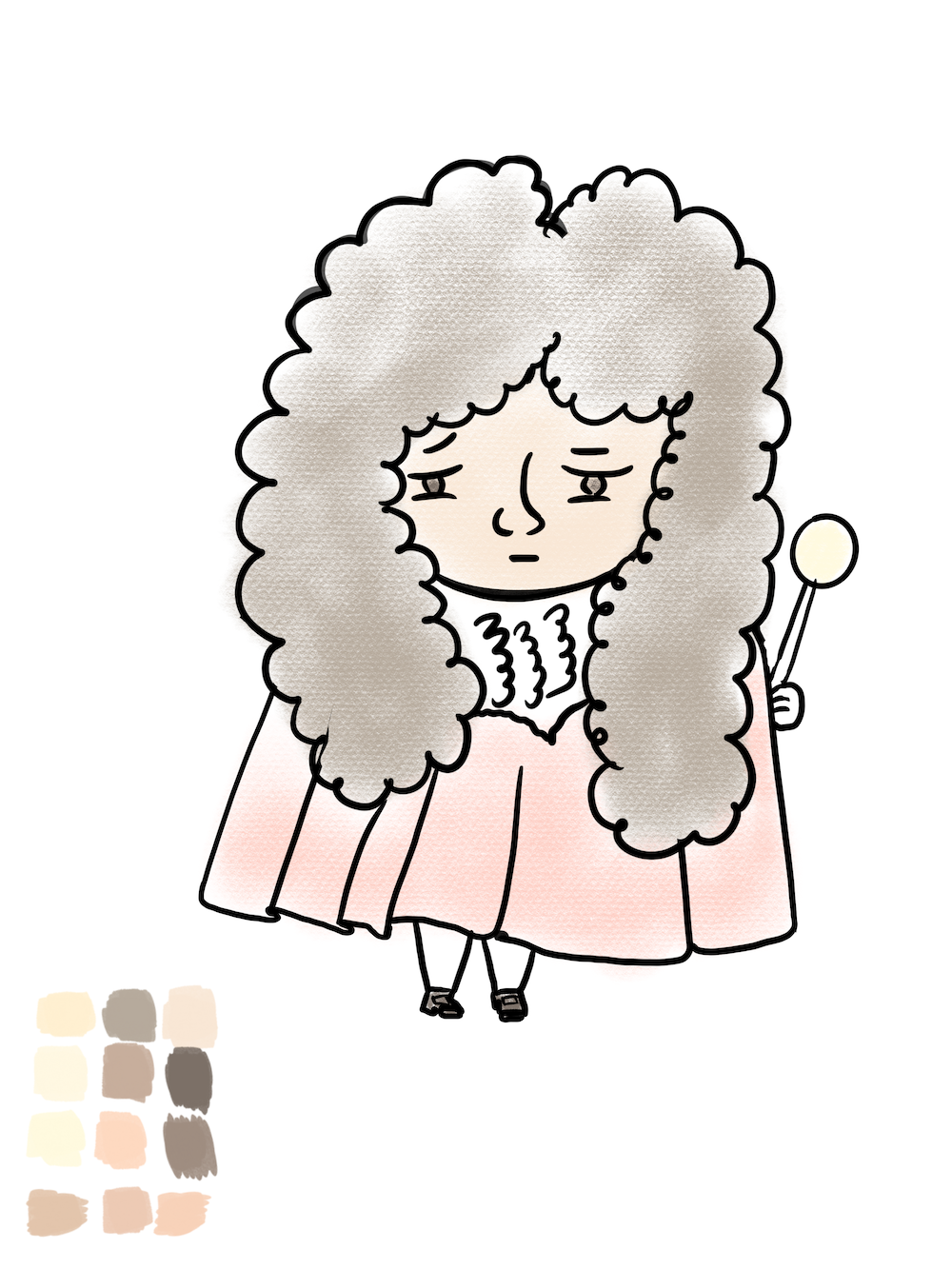
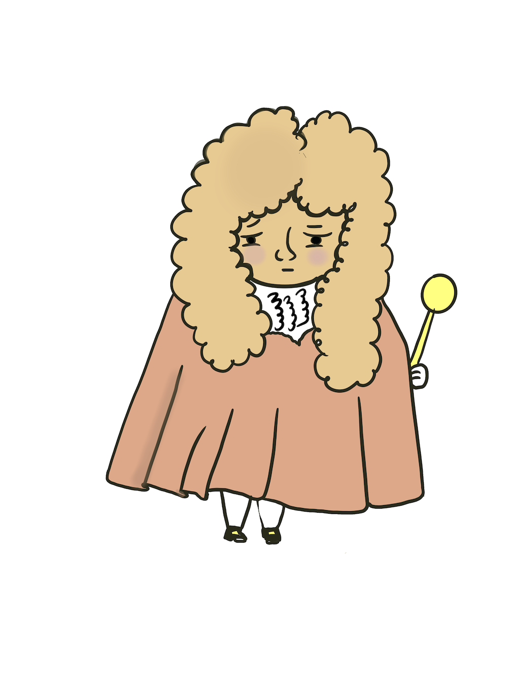
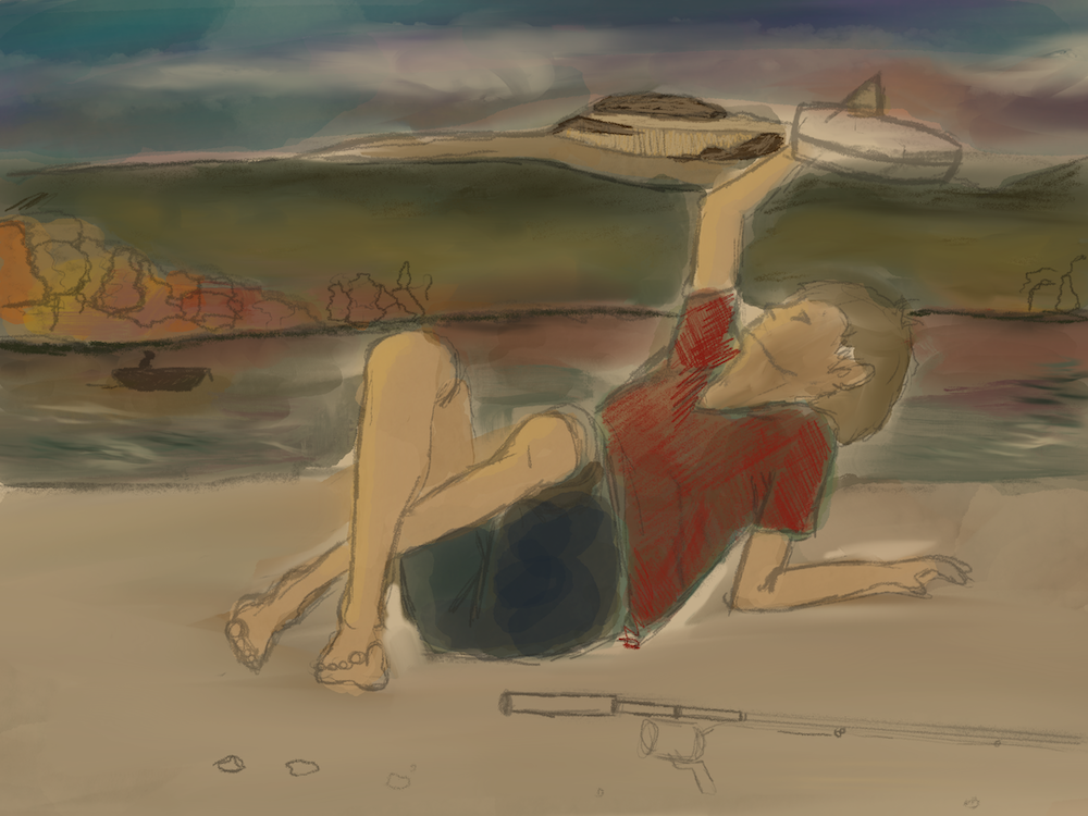
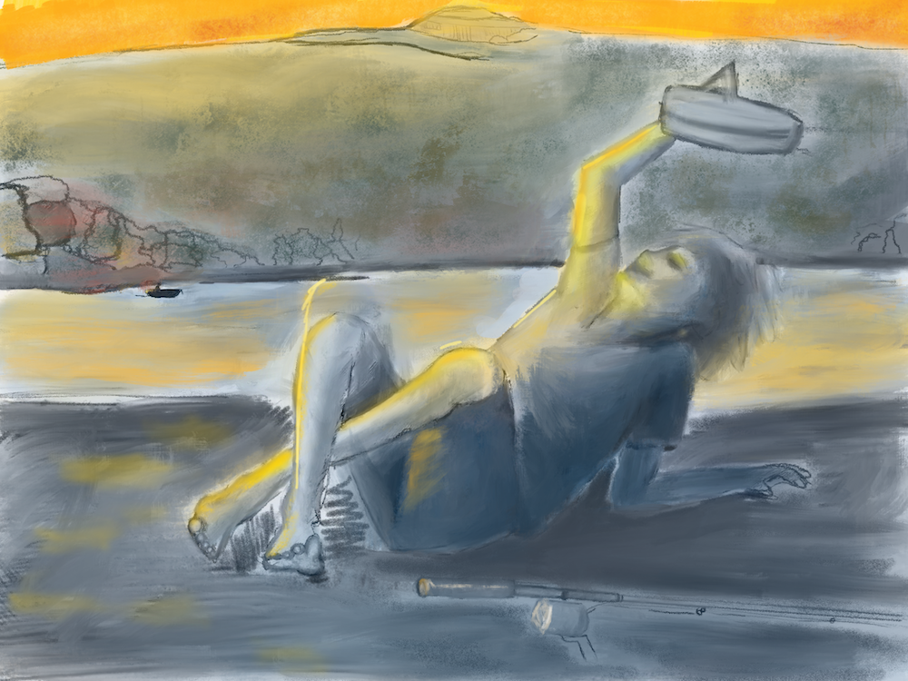
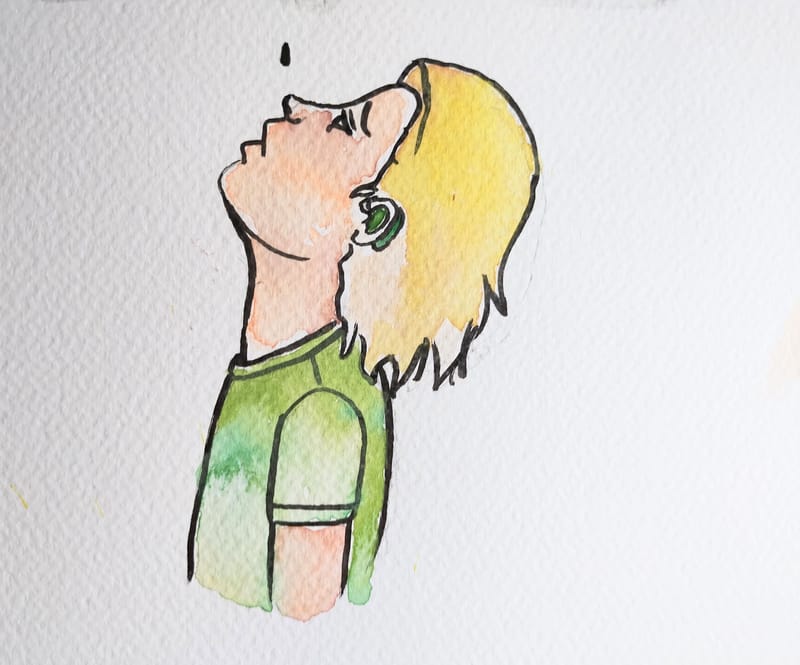
Ink --> colored in Procreate
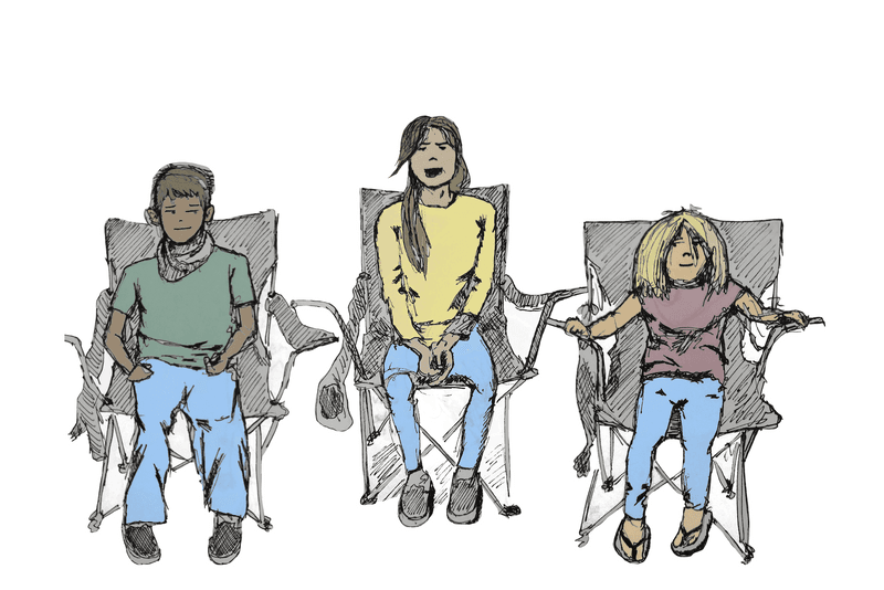
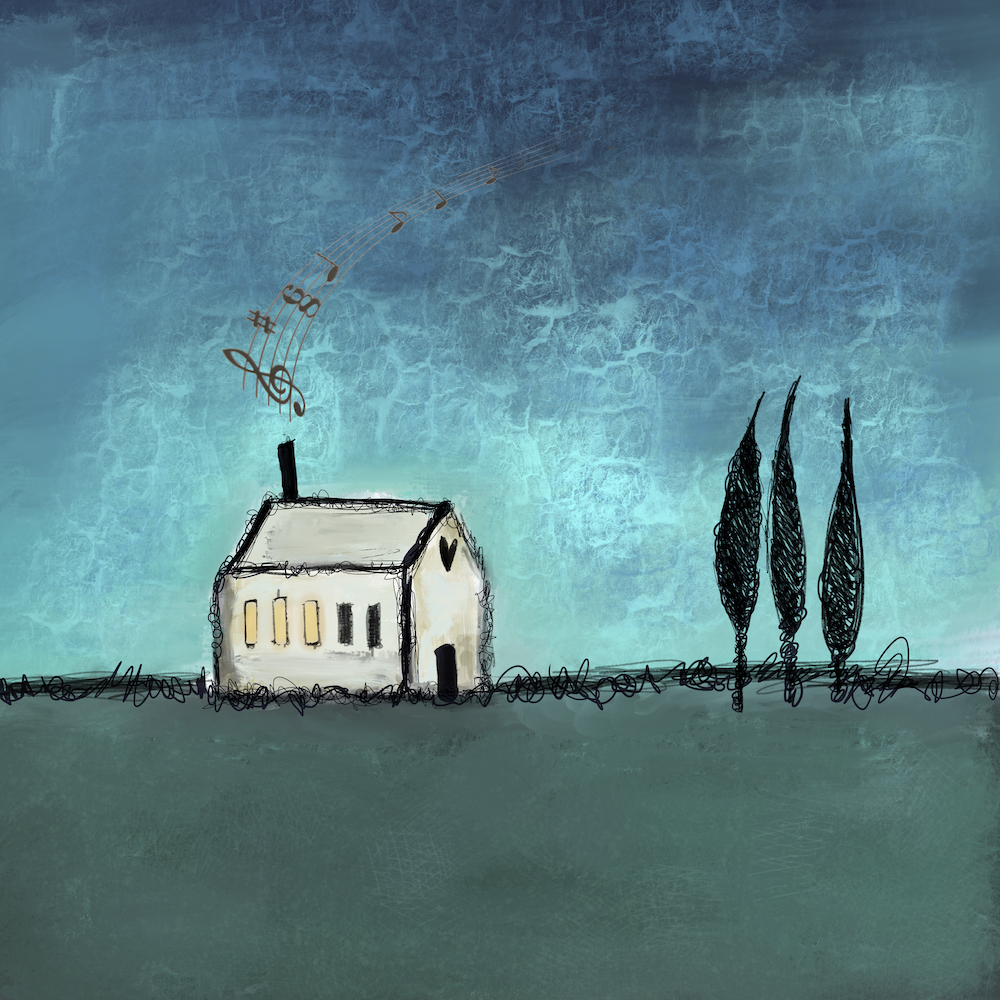
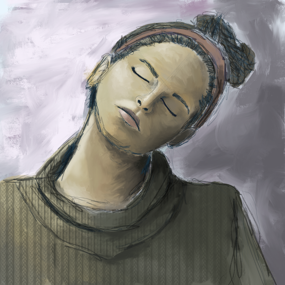
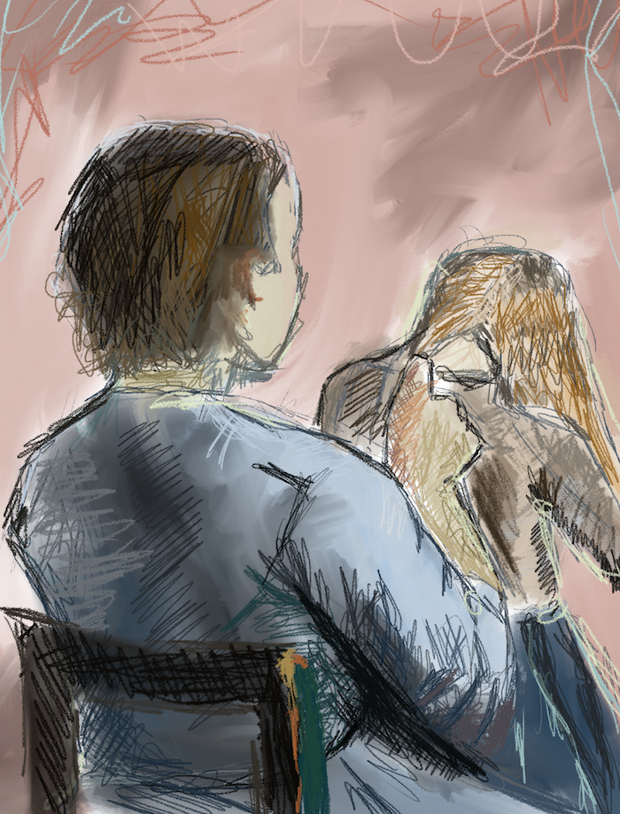
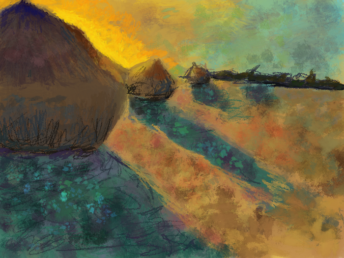
And again, a sketch for a pic book I'm writing...and then an attempt to color in procreate...
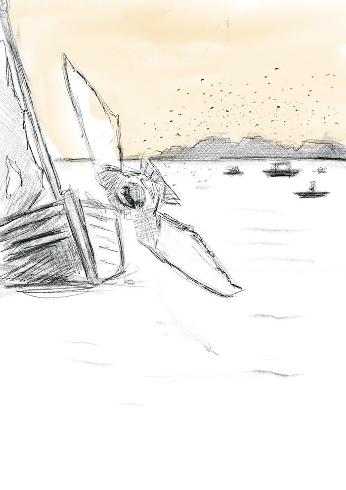
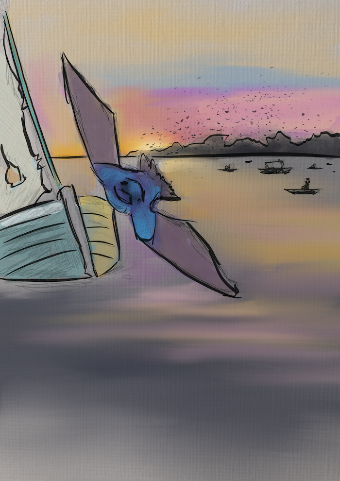
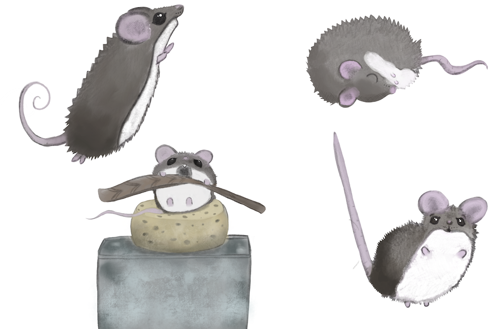
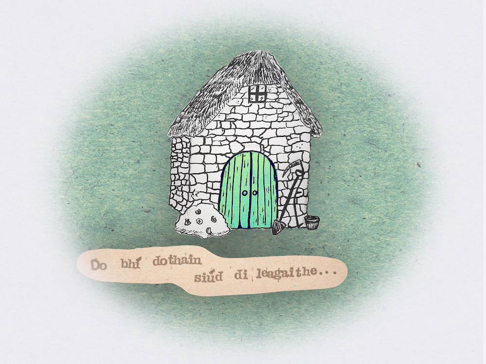
Anyways, I know that is a lot of pics, but I wanted to show the range of my work, and how I kind of just don't know which way/style to go when working on a piece, and I do a lot of guessing and playing around.
How do I proceed from here? What would you say I should focus on? ( I am already participating in the HTFYA challenges, so that will push me, but I'm not even happy with my work on those!)
I hope this all made sense. -
Hi @Katt , your work is very lovely! I actually prefer your traditional work over the digital.
Here’s a great post from Anoosha about her traditional process.
https://anooshasyed.substack.com/p/my-collage-process
Keep experimenting with techniques and you’ll find a rhythm.
Also, do lots of master copies from artists you love! Check out my below post on this.
https://forum.svslearn.com/topic/8403/copy-covers-for-practice/42?lang=en-GB
Keep asking questions!
-
@Katt I love your watercolors, the mix of bright colors together is very beautiful and fun. They're much more interesting than your digital works, which look very generic. If you gravitate towards traditional... then just do that? There's no need to force yourself to do digital. You don't need digital to be a picture book illustrator. Just learn to scan and clean your paintings properly and you're good to go.
-
@NessIllustration thank you
 I think that I started doing digital because it gave me the freedom to change sizes and move things easily, and of course just drop color on... I suppose I also started doing it because it was so "clean"- i found getting out all my colors and laying everything out on my art table a little stressful, and I saw people who make digital art that looks almost indistinguishable from traditional... so i thought...why not? I think I just don't know how to go about color with my traditional- one of the reasons I started doing the crazy watercolors was because it felt free and I didn't have to make decisions- which doesn't really work if I am trying to do consistent characters.
But I agree, I like my earlier work too, that is why I was so frustrated...like how did i get worse? LOL. -
@Jeremy-Ross Thank you
 I posted down below that I partly turned to digital because of the ease of moving things around etc. and I see so many artists do digital art that looks exactly the same as traditional.
I will check that link out...and your post. Thanks so much. -
@Katt No matter the reason you chose those crazy colors, I think they're really pretty and would look stunning in a picture book! As long as you keep the same color palette, even if you mix them differently each time, I think it would still look consistent. It's a style that stands out! That is SO difficult to do, to find a look that's pretty and marketable, but unique too. You have something special here, don't abandon it by trying to make all clean digital art like everyone else

I would encourage you to experiment more with that style again, and figure out process and method that you feel comfortable and happy with. It's also easier to keep working to stabilize a style you've used in the past, than start from scratch trying to find something else brand new.
I think this may be partly your problem here. You have things that you liked and gravitated towards in the past, for many reasons (feeling free, working around difficulties with colors, enjoying watercolors) but instead of leaning into those things that spoke to you, you're going away from them and starting from scratch. It's like you're re-learning all over again, which may be why you feel like some of your newer work is actually worse.
Experimenting is an important part of the creative process, but it's meant to help make decisions and lean into something, eliminate others. You try something new and then decide: Did I like this? Do I want to do more of this, or is this a hell no? It's a process of elimination. You shouldn't start from scratch every time. You should look back at what's worked for you in the past, what you enjoyed most, what displayed your strengths the best and hid your weaknesses the most. And then you lean into THAT. That's your style

-
@NessIllustration Thank you :))
-
@Katt You haven’t carried over techniques used in the past (block shapes on the giraffe, lemur’s tail, strands of horsehair, grasshopper textures, whale’s skin texture). I assume you do want to continue using these techniques but haven’t been able to replicate it.
I can see you’re applying layers of semi-opaque brush strokes, hoping colors will mix but end up looking like muddy oil paintings. I’ve been there. Traditional technique won’t work on digital apps. You’ll need to feather no more than 2 colors to recreate the mixing of the watercolors. The following video tutorial covers this:
Calvin at DrifterStudio: Watercolor Tutorial for Procreate \ Watermelon SliceOr use a clipping mask, as demonstrated in the video below.
Every Tuesday: Paint Messy Watercolor Lettering in ProcreateI know you stated you’ve already watched many tutorials, but here are some additional videos that may be of help:
- Squidpeg: Procreate Watercolor Tutorial Using ONLY Standard Brushes * Biggest takeaway: don’t use the Procreate watercolor brush.
- Max Ulichney: PROCREATE WATERCOLOR TUTORIAL - Painting With MaxPacks Brushes
You seem to have lost favor for vivid colors and have adopted more earthtones. It's such a stark difference that I have a hard time seeing the two periods of your life as 1 portfolio. I would recommend either removing the old work or continue to make more bright color pieces.
Two last bits of recommendations:
-
Consider purchasing custom Procreate brushes designed to simulate traditional media.
-
If you want to try an app that simulates watercolor paint, you may want to look into Rebelle or Corel Painter. Both app companies have a bundle sale once a year on https://www.humblebundle.com/software. It’s usually $25 for a bundle (painting app, other creative apps, paper, brushes) and you can set most of the money to go to the sponsored charity. You’ll have to double-check if the bundle includes a mobile/tablet version of their apps.
-
@willicreate thank you for your detailed reply.
In terms of what I want to replicate, I know that I want to replicate work that has 'evidence' of the tools used, I like seeing pencil marks, and splatters... i mentioned in a reply above that one of the reasons I used the watercolors I did is because I didn't actually have to think about it, but let the paint do their thing. I actually made those pieces when I was just starting to do more art, and not necessarily for children's book illustration. (Oh and these aren't up on my portfolio).
You will notice that many of those pieces are characters/animals by themselves, floating in space so to speak. When I started focusing on children's illustration, I kind of felt like I had to do backgrounds, and I simply did not know how to do that with watercolor. Or at least to make objects decipherable, and I kind of went in and out of using hard line work to make them distinguishable. I also struggle with perspective, and digital allowed me to cut and paste/resize a lot, something that would frustrate me with traditional.
I definitley like earth tones in general and gravitate towards those, but also the wild colors... not sure what to make of that. I know I like doing pencil, and then adding color (like the whale), but I feel discouraged in the sense that it feels like I 'must' have an exciting background for children's, even though in my experience as an avid children's book reader/consumer, I don't always see this in professional illustrators. I do honestly sometimes wish I didn't have to use color at all, I love grayscale.
I will check out those tutorials, and I might have some more questions.
thanks! -
@Katt Thank you for clarifying certain points.
I used the watercolors I did is because I didn't actually have to think about it, but let the paint do their thing
Both Rebelle (desktop only) and Corel (tablet version is available) offer free trials. Find out if their app's paint physics simulation meets your needs.
I kind of felt like I had to do backgrounds, and I simply did not know how to do that with watercolor.
As you already noted, there are many published books with illustrations without backgrounds. So, feel free to create a portfolio that reflects the kind of work you'd want to be hired for.
Should you want to pursue complex backgrounds, perhaps you can do one of the following:
- Design the background on Procreate, then copy the final layout onto watercolor paper and complete it with paints.
- If you want everything on one sheet of paper, apply frisket or rubber cement on the areas where the characters and objects of interest will be. Then you can paint the background first, then afterwards remove the protective film and paint the rest.
- Have you considered creating collages (characters and objects of interest done in watercolors, laid on top of a digitally painted background)?
Or at least to make objects decipherable
To separate the elements in or from the background, you can either
- Different level of values per plane
- Have a cool color palette for one plane or set of objects, warm for the other.
- Restrict the colors to a palette of complementary colors
I do honestly sometimes wish I didn't have to use color at all, I love grayscale.
Editorial and pulp artists often did black + white + 1 color illustrations. It's very close to grayscale. Depending on the execution, I think this method can work for contemporay teen books.
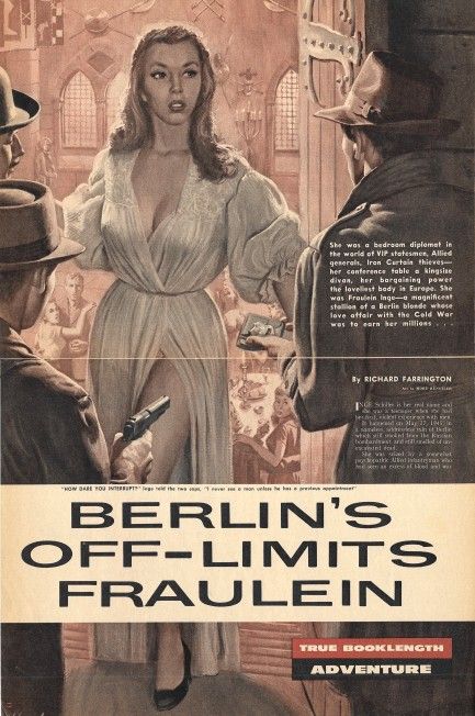
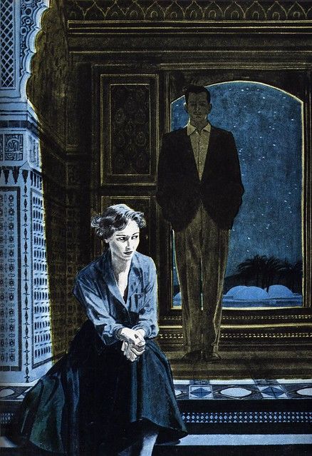
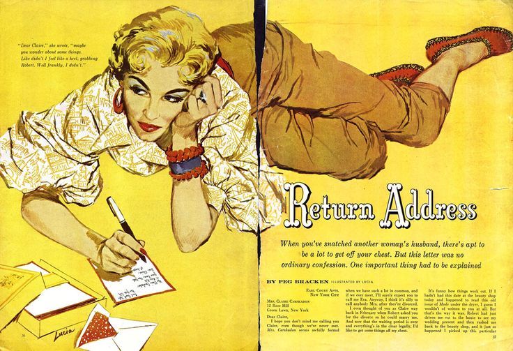
Hope you found this info useful.
-
@willicreate thanks so much

-
On the procreate app, I like to use brushes like pencil, dry brush, chalk where it has a more traditional feel, but it also helps to use the same brush for everything in an art piece, like for both line work and coloring
-
Referenced by
 Katt
Katt