Did I fix my art?
-
I took part in the January critique arena. The prompt was "she walked into the dark, she knew she wasn't alone".
Here's my original piece:
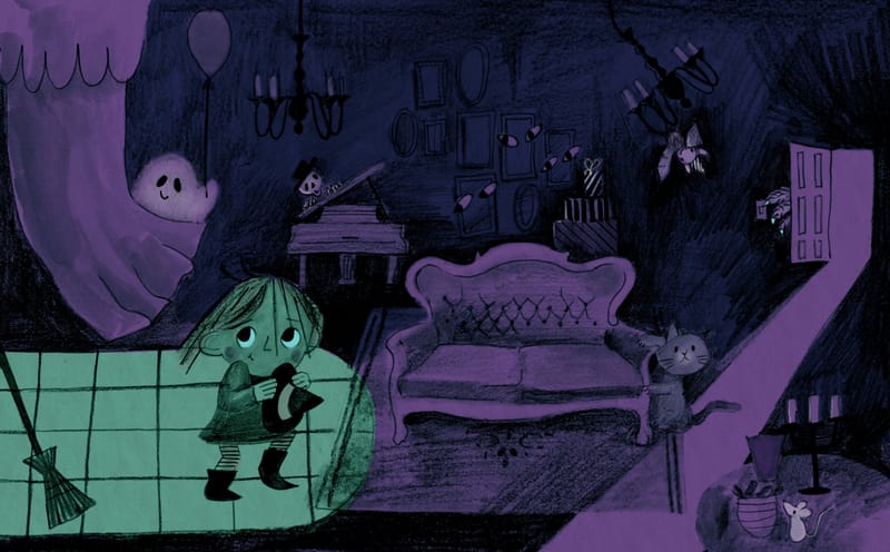
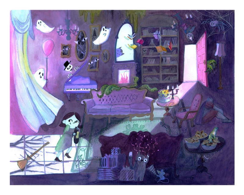
I had such fun making it that I wanted to have another go, taking on board the feedback from Jake and Anthony. And in the spirit of thinking of where this would live in the world, I thought it could be a jigsaw puzzle. So I added some more details to version 2.The first image was made in about 3 hours (I'd done the sketching over a week, but the actual finished piece of work came together very quickly - mostly out of necessity as I ran out of time before the deadline)
This latest piece of work has taken HOURS. And I have definitely been on John Hendrix's project arc with this one and spent a long time in the pit of despair (definitely google that poster if you don't know what I'm talking about

I used watercolour, gouache and pencil crayon and then played around with levels and curves in photoshop to make it pop.
My plan this year was to put myself out there and make finished products that I would submit to agents throughout the year. I would love to get feedback on what you think about this final image. Really appreciate this forum, podcast, monthly competition and all your opinions! Thank you so much
Here it is:
-
@Holly-Fox I missed the January HTFYA so I don't know what the feedback was. But I like how you broadened your palette and incorporated additional light sources. The characters are cute and appealing.The mini-stories that are happening in the image make it fascinating to explore. One thing I am wondering is whether the fireplace should also through some shadows. And the mirror(?) above it seems like a window with the light that is coming from it. I think it should reflect more of the darkness in the room.
studiojcd.com
she/her/hers
Insta/Twitter: @chengdesautels -
Nice job @Holly-Fox ! The room feels much more alive now! So many things to look at. Well done!
-
@jenn thank you so much! After I posted this I started to see that the fire looked off. I'll have a go at working in some more shadows and add some more depth to the mirror so it reads better. Great suggestions!
-
I did not know the John Hendrix's project arc! But gosh, it describes my current situation accurately. lol. Have been on my own author-illustrator project for 4 months know and I have been in the pit for at least 2.5m of that.
That said, I actually prefer your style in the original pencil drawing with the limited palette, and the girl much better than in your new one (maybe too smooth?) but the composition and lightning of the second one if that makes sense. The first one reminded me a bit of the pencil drawings of Valentina Toro (Colombian illustrator) who I quite like. That might just be my personal preference as I do find limited palettes more interesting and also rougher lines. Or because I have been stuck in the pit of despair for too long which only consists of black and yellow ink... -
@Holly-Fox
Gosh, so many things to look at. I will say that it took me about four times around the canvas to realize what is happening. It’s a surprise party right and the creatures haven’t “ surprised” her yet?
I guess based on what our “teachers” say, we should “ get” what’s happening almost right away. With all the pure white in so many scattered places it’s hard to know where you want us to look. Also the clump in the bottom center which really tells the story, would have some cast light from the window and that would help to see the presents etc hiding. Is she walking into the room from a door on the left or the one in the top right? I think if everyone was hiding and just a little piece of them showing as did with the octopus, owl etc the attention would get back to her. The bright white full view of the ghosts, mirror etc keep drawing me away from her. Perhaps some warm color on her would make her pop. Take with a grain of salt of course, great story and elements, focus just needs to be roped in. -
Personally I thing the main character design looked better in the original. It kinda lost its charm in the redraw. The first one looks very intentional with the way she's drawn, like you spent time deciding on her hair and nose and making her expression clear. The new one feels less interesting and loses the focus compared to other stuff going on. She should be the first thing we look at and the highest contrast of lighting should be on her. You did that in the original by making the light on her green. Maybe try something in between the two? Like make the details more visible but not competing with her as the focal point. Will Terry's "Draw 50 Things" class might be worth checking out if you haven't already. Hope it helps.
-
@Holly-Fox I agree with @kayleenartlover. Your character is much better in the original. A lot of her personality and apprehension is lost in the new version.
Also, you have added so much more detail and color to the new illustration that it overwhelms the eyes. There is no flow or focal point any longer. The bright pink on the left and on the door draw your eye in those directions. In your original, you start with the girl, and her eyes lead you to the next area (the ghost), and give you a path around the room.
Hope you don't mind, but I did a quick draw over of what I think might work better in your original.
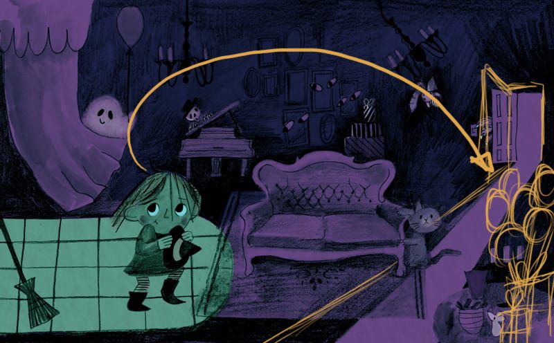
I would move the balloon (and add more) and the presents to the table where the mouse is as your "destination" for the readers' eyes as they move around the room. You need to have the cat looking in the direction of the girl, and maybe hidden a bit more. Lastly, you need to add a bit of the crayon-like texture to the curtain so it looks more a part of the whole composition.
I don't remember what the guys said about your art, so my comments/suggestions are only based on what I see here. Hope it helps!