Dimension Kid development
-
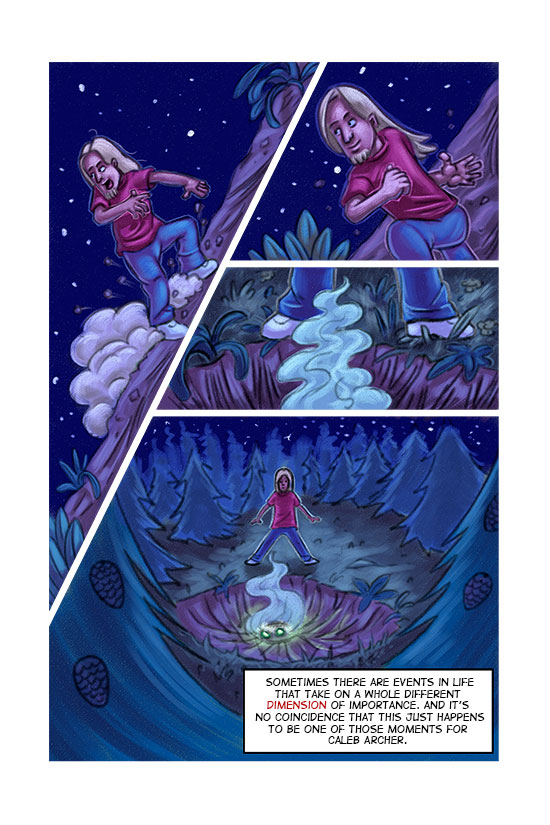
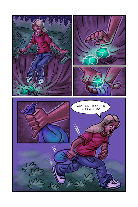
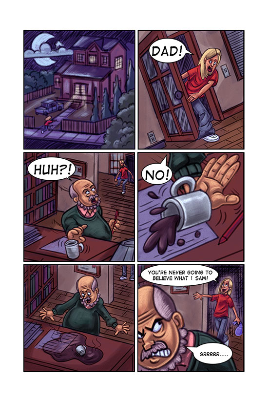
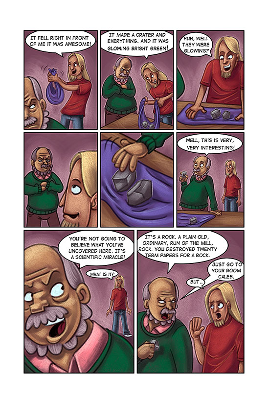
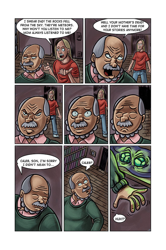
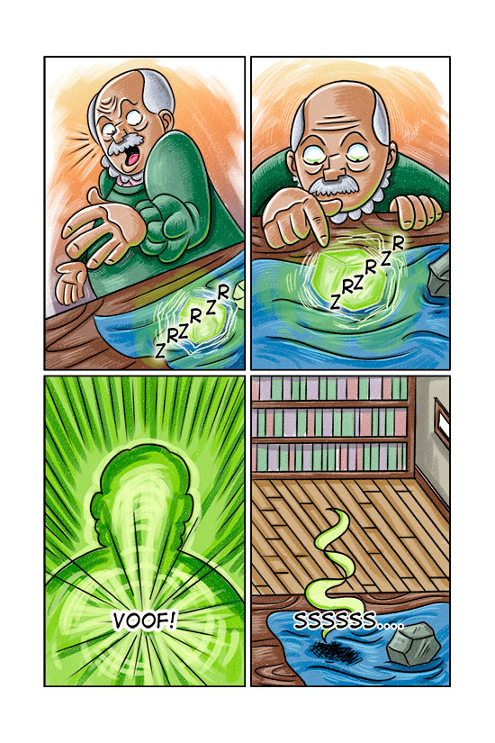
This is a graphic novel I wrote. I finished the first seven pages and then decided the style and character designs weren't working. So here are the original pages. I'm redesigning the characters and the style so that's what I'll be posting here. Any and All feedback is appreciated
-
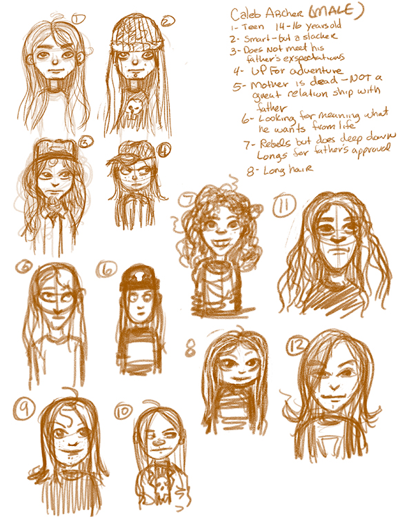
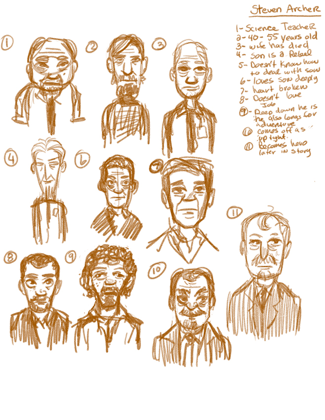
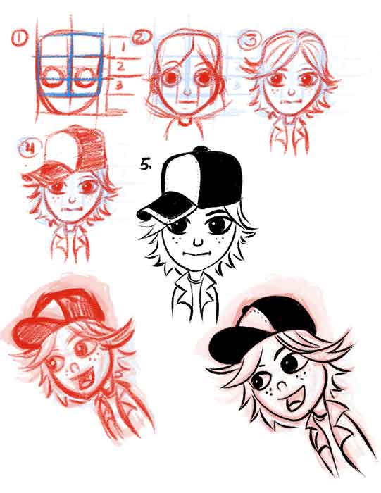
These are some sketches I'm working on to get pointed in the right direction on character designs. If you have the time if you could give me some feedback and let me know maybe what the top three you like are....or what ones you think are heading in the right direction. If you have anything you want my feedback on let me know. I'll reciprocate the favor thanks.
-
Great idea!
For Caleb Archer, I like #4 best, personally…in the sense that he definitely looks like a teen who is a bit fed up..he is convincing in the 14-17 age bracket and looks like he’s got a bit of teen fire inside. The hat is a nice touch that will help make him look individual e.g. from behind & from different angles with the colours etc. I like #1 too, though a little mild, and hair overlong for my taste, I prefer the shoulder-length ones. Not keen on goatee in #3. #12 is kinda similar to #4, but I think #4 is better. I like #11 too actually…he looks quite soulful. Yeah, I think he is my second favourite, thinking about it more.For his dad, I like #7, #10, and #11 best. #7 looks like he is jaded but could be a hero later; #10 I think looks a bit evil (if you want to go for someone who feels REALLY distant from Caleb which would then heighten the twist later), #11 definitely looks uptight but also sort of science teacher, conventional, father type figure who spends a lot of time with books and not with his son.
Hope that helps, good luck with it! Keep us updated
")
-
I like #4, too because he looks on the younger side. I also prefer the shoulder length hair. I like the baseball cap over the other hat styles and I like his freckles in #4. I don't feel nearly as much sympathy for the characters that look older for Caleb. I like #7 or #8 for dad. I think you've got some good story ideas so far.
-
Worked some more on character sketches today.
-
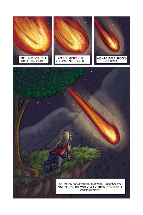
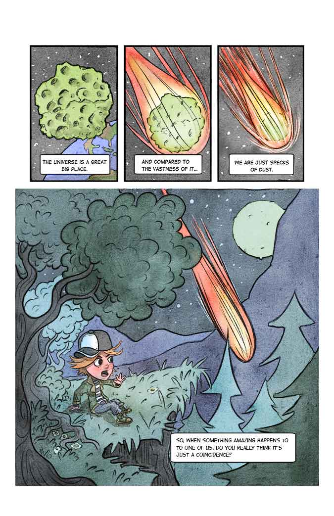
Completed page #1. Reworked the panels a bit and used my new style and character.
-
Focusing on making Caleb look younger would be a large priority for me. I like 11 best but feel that design #4 would also work well. Facial hair really ages the character so I'd avoid it for the teen.
I feel that 7, 10, and 11 are my favorite for Stephen's dad with 7 and 11 being the favorite (10 looks a bit sneaky/twisted). All three of those give off a more scholarly vibe due, in part, to the line angles used as well as the grooming and dress for the character.
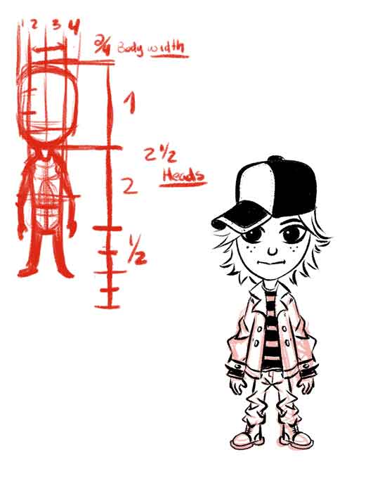
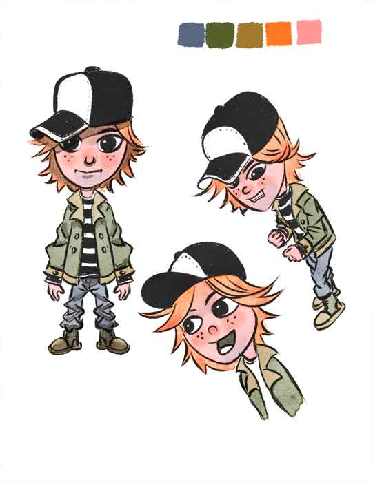
The reworked character for Caleb speaks much better to his age and is more crisply rendered. The redone page uses the text boxes better (a bit more rounded and organic). The colors, values, and line art of the redone page make it much easier to follow the action in the page and tell the story more effectively. Great job so far.