Feedback on Composition, John Space v. Caterpillar
-
Hello!
I am doing a piece where John Space encounters a giant caterpillar, but I am still hesitating on the composition. So I am coming here for help! Which version do you think is working best, and why?
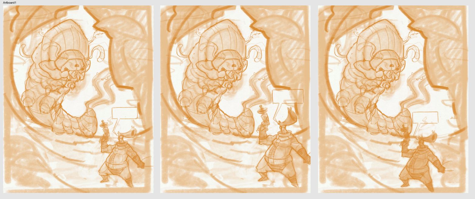
Image 1: John Space is small.
Image 2: John Space is bigger.
Image 3: John Space is small and overlap with the caterpillar.I am not sure of what's my name anymore at this point to be honest
 !!
!!EDIT: is there a way to scale the image so that there are displayed smaller?
EDIT2: change images to be next to each otherFind me on Instagram: https://www.instagram.com/nodragem/
Portfolio: https://www.nodragemillustration.com -
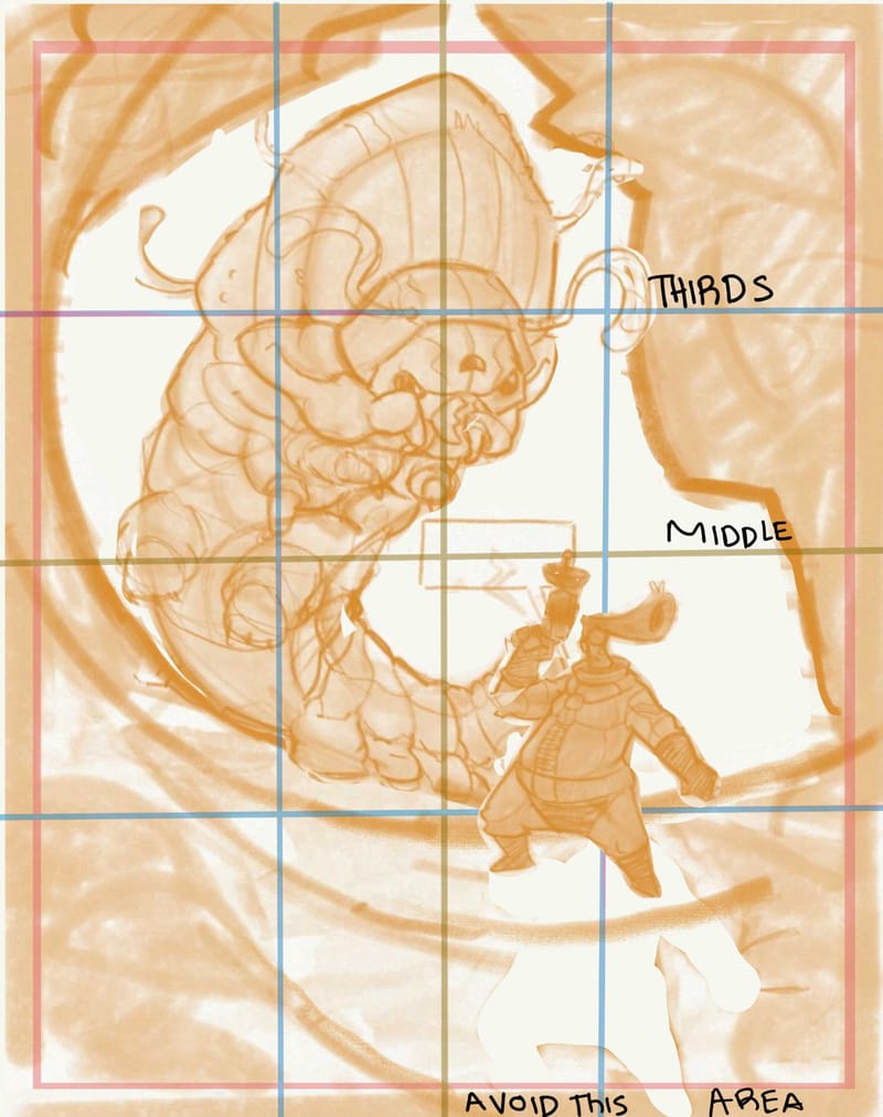
@Geoffrey-Mégardon hey there! I love your character designs! Im so glad you posted on the forum, its a pleasure to see people’s early stages and help by being another set of eyes.
I put dome grid lines over each of the sketches you shared and it shows something interesting

(The only way ive found to scale images is by screenshotting images together, i guess the width controls the size)
Its rough when you have been looking at an image for a long time, you make what seems like a huge change, but really all the variations are ….basically the same…


The middle and thirds grids are really helpful to boil down a composition and give you something firm to guide you ( grids aren’t subjective!)
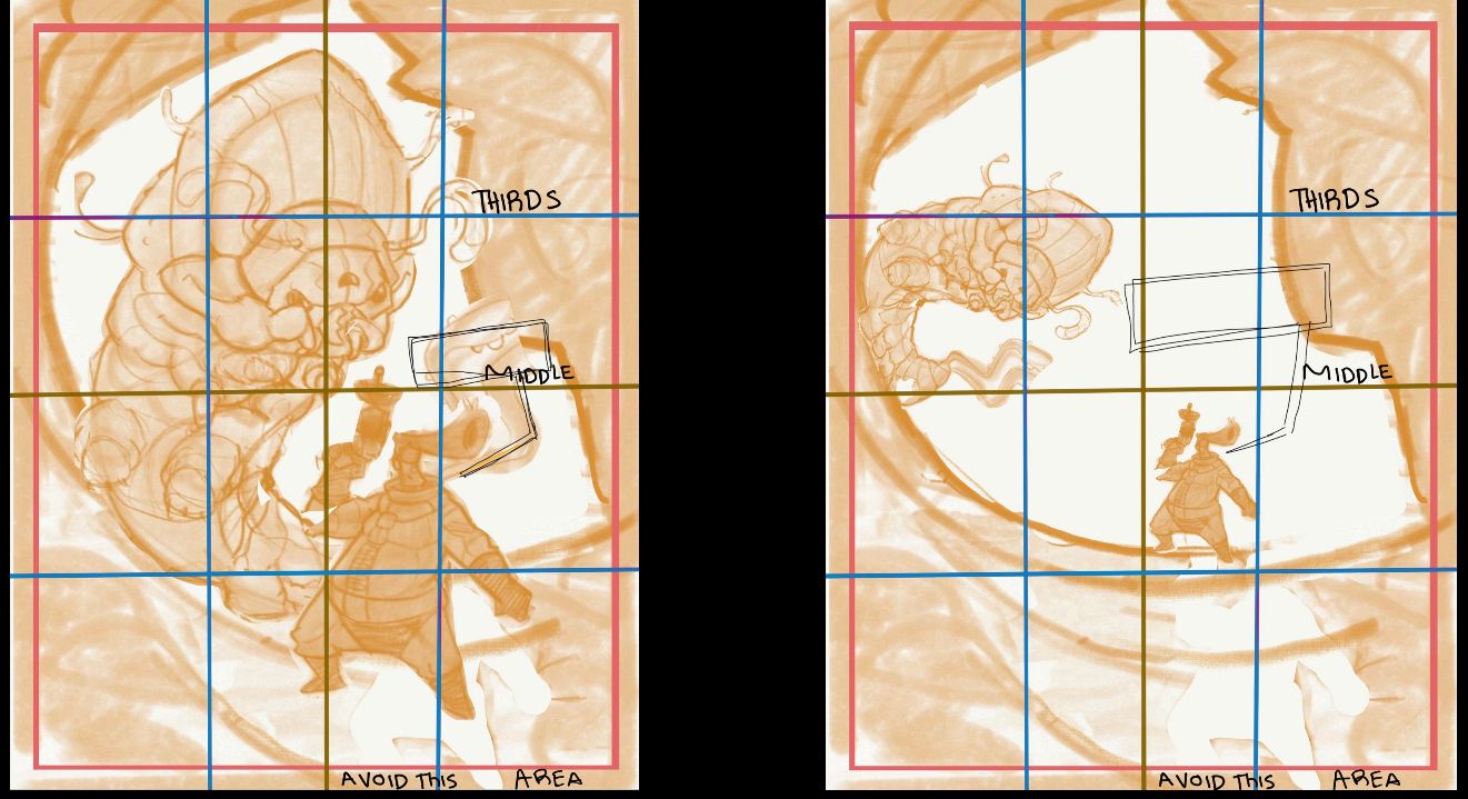
Something else that can really help to play around with a comp is to separate copies of your characters from the background and from each other, and start putting them in wildly different places and wildly changing the sizes.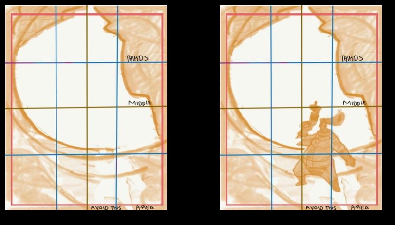
I really like how your background sets up the viewing space, here are a few re arrangements i made in playing, they might not work with what youre trying to do, but fun
Im excited to see what it turns into! Ive never heard of johnny space, but im excited to find out more about him!
Blog: mamatheartist.blogspot.com
Coloring page newsletter: https://bit.ly/Color-in -
@R-Fey-Realme Thank you very much for your feedback
") It was really helpful to come back to the fundamentals and see where my elements sit on the 3x3 grid!
It was really helpful to come back to the fundamentals and see where my elements sit on the 3x3 grid!So, my main point is that John Space is in great danger and he is unaware of it. I want the Caterpillar to look very big and dominating the picture arching over John, and John Space to feel small, vulnerable. Maybe I should have shown the previous step where I played with placements, sizes, and environment. But as I have already sorted the big lines of the composition, the difference between the 3 compositions I suggested are indeed very small.
Basically, my questions are: I have the general composition sorted but ...
- should I make John Space a little big bigger so we can see more details of him or is it too detrimental to the big vs small contrast?
- should I move John Space so that there is an overlap? would it help with giving depth? or should I avoid overlap and have too clear silouhettes?
In terms of the 2 compositions you are suggesting, I think that they are interesting in terms of placement and the flow they create, however they break the big vs small contrast I want to convey... Sorry I did not make this idea clear in my post.
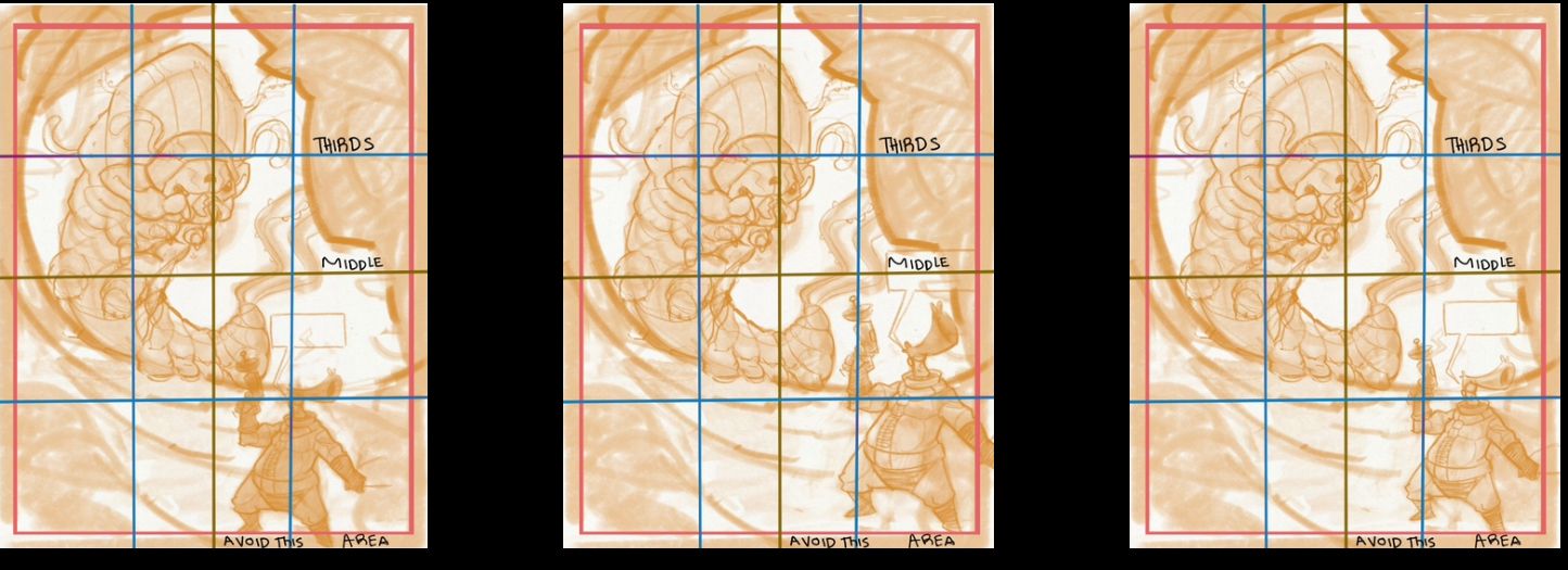
Now with the grid you have added to my 3 compositions, I think I can see things that help my decision. For instance (using the order you've used when posting the 3 images), in Image 1, John Space's head in on the third lines intersection, giving it focus. While in Image 2 and 3, it is the gun that is given focused.
Seeing the images as you have presented them, I start to think that image 3 is working better than the others. To have John Space's head under the horizon line and under the third line strenghen his vulnerability and the fact that he is moving out the panel (into the cave). In Image 2, he looks more confident and heroic (which might be a good thing too). In Image 1, John Space is very much aligned with the vertical third line, which does not help conveying the idea that he is moving out of the frame.
I might be overthinking it
 too many possibilities.
In any case, thank you very much for your help and making me think!PS: You can see more of John Space here by the way: https://www.nodragemillustration.com/webcomics
(Although there is an issue with the level of contrast/colors at the moment I need to fix). -
@Geoffrey-Mégardon I like the one where he overlaps. It makes my eye draw back to the monster behind him and go back and forth between them. The others make me feel like looking off the page more.
-
@Geoffrey-Mégardon Oh okay, how about this then?
I should have been more clear too. Im worried your spaceman is too close to the edge in all of them, and while i like the overlap one the best, you lose the silhouette of your cool gun. Im sure there is a way to solve the composition with the spaceman more centralized while preserving the small big contrast and the negative space around important bits (gun, hair, face, focus). A big reason i think john space should be more centralized is because i assume the story is about john space, the space man, being in danger, and not the caterpillar named john space finding lunch… i hope that makes sense…
edit oh you’re saying he is supposed to be moving off the panel? Its not a poster? Its a comic panel? Well the gesture he is in feels like he is just standing, if he is supposed to be moving, you might want to change the gesture….
-
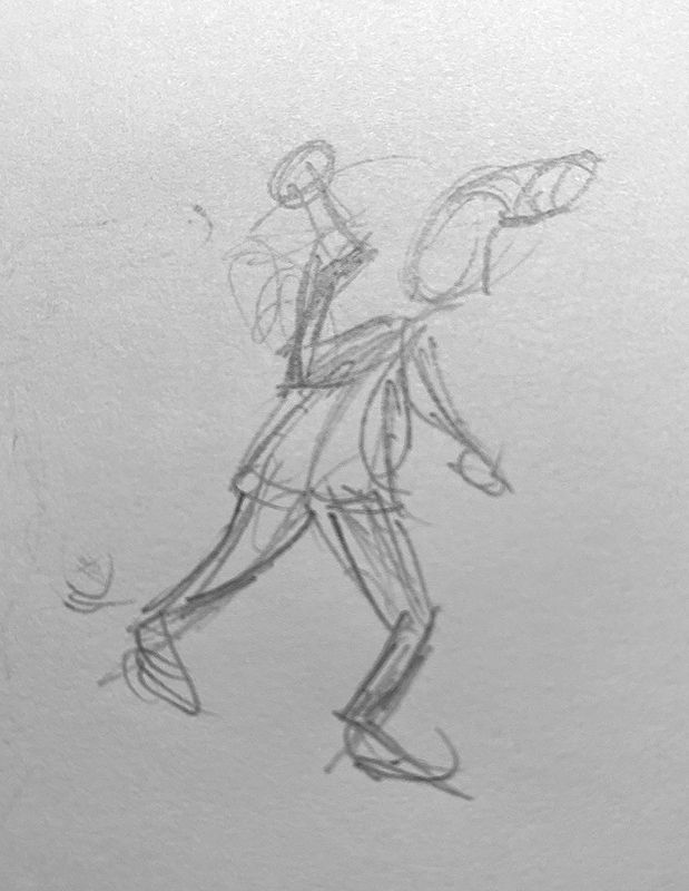
@Geoffrey-Mégardon like @R-Fey-Realme suggested, John's pose needs to change to have it be more obvious he is moving to the right. As he is now, he looks as if he is hiding behind a wall, preparing for a surprise attack. Perhaps shifting his weight to his front leg like in this very rough sketch.
-
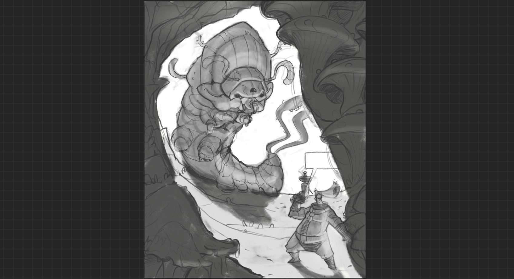
@Geoffrey-Mégardon after reading the following posts I can agree that 3 looks best. You can still make him a tad smaller, bringin their feet in but keeping his head in place
-
Thank you all for your feedback!
that is very useful to see so many different ways of experiencing the composition. Such a puzzle!@R-Fey-Realme yes that's to be seen as a comic page. Although John Space is the hero, on this page, the "danger" appearing behind him is the main subject. That's why I am willing to put John Space on the periphery. I like how you've changed the forearm/gun angle btw
it improves the flow, I will try to integrate that change. I also think that you are right about the silouette of the gun. I don't want the reader to miss the information that his gun is ready.@tom-barrett If I had to describe John Space's action with words, it would be: walking cautiously downhill inside a cave, his left hand reaching for some support, or moving some grass out of the way. I have some sort of an Indiana Jones pose in mind (replace the gun with a torch). I will try to improve that aspect.
@MerryMary I like that this composition is making your eyes go back and forth between the two! however, as @R-Fey-Realme mentioned, it might be important to keep the silouhette of the gun readable.
@makekong thanks supporting Image 3
 I needed it!
So I think I am going to render image 3 with John on a separate layer group for now. Like that I can progress and I will still be able to move and scale John Space around at the end!
Thank you so much for your help and ideas
I think it helps a lot to speak about the whys for me to gain confidence.Find me on Instagram: https://www.instagram.com/nodragem/
Portfolio: https://www.nodragemillustration.com -
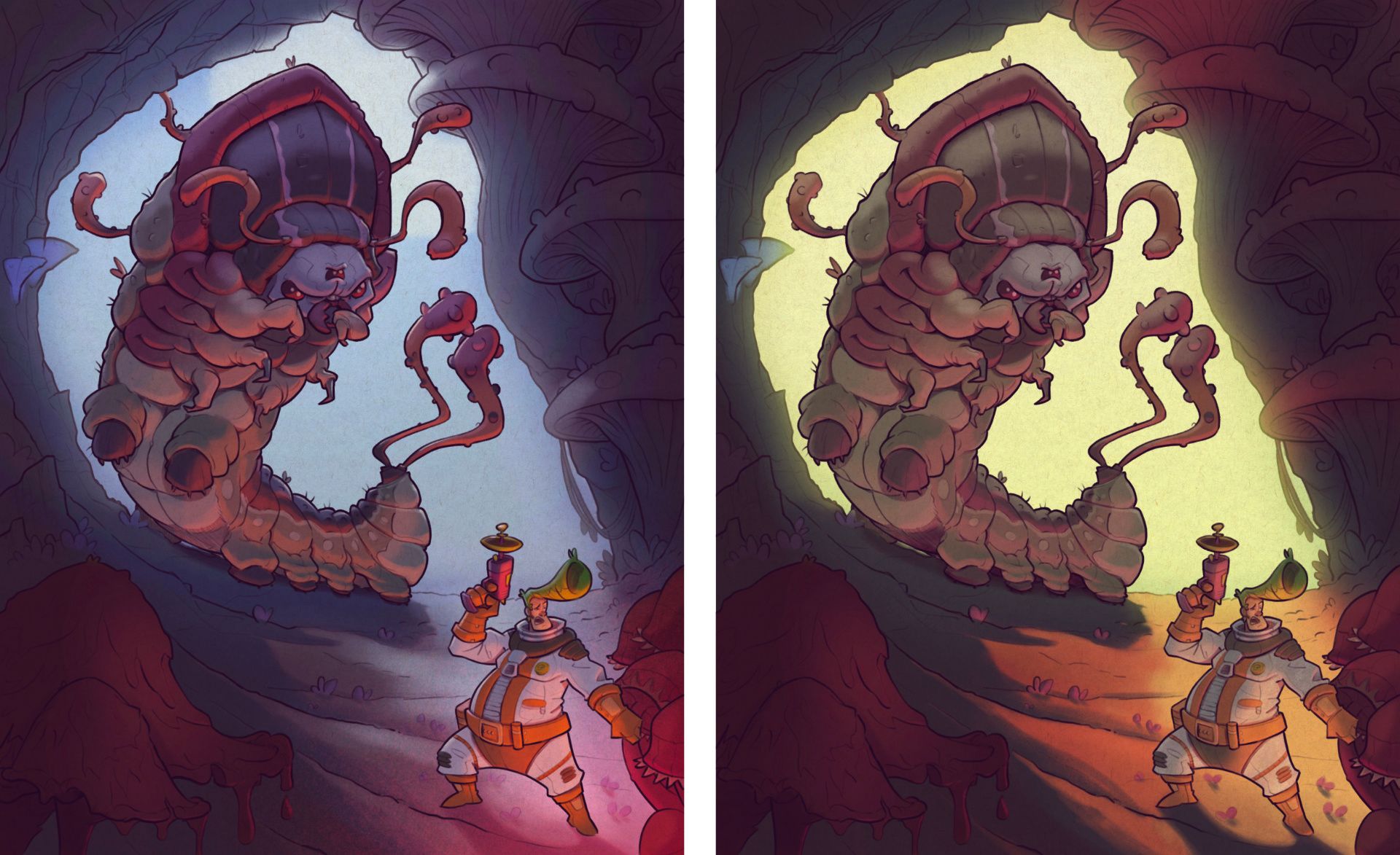
Trying out some lighting options, which I believe can totally change the composition.
But I have no idea what to do in terms of colors!Otherwise, I have done the inking for John and the Caterpillar, now I have to do what is the hardest part for me: the environment!! Drawing rock and mushrooms is not that easy
I hope to be done by the end of the weekend!
-
I posted my struggle with composition a few weeks ago; now I am posting the "possibily" final image after struggling with colors and lights!
I really wanted the green and orange image to work, but I struggled so much with choosing the colors and intensity of lights, I am not even sure it works still. So then I made the blue/night version.
Which one do you prefer? is there anything that seems to not work? what could be improved in terms of color and light? Any feedback welcome!
Find me on Instagram: https://www.instagram.com/nodragem/
Portfolio: https://www.nodragemillustration.com -
This post is deleted! -
@Geoffrey-Mégardon The red in the first composition makes it look a lot more ominous and dangerous. I like that one the best.
-
@ChloeGreenbergArt So I did a little "survey" on instagram, and it seems that most people prefer the night scene
So I will be using it!
Thank you for your feedback! I should be publishing the final page today.