Feedback on a children's book illustration
-
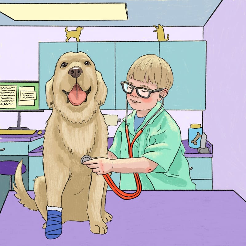
Hi guys. I've been terribly inactive over the last couple of years since my art has largely taken me in a bunch of different directions such as murals and illustrating coloring books. However, I was recently approached by a publisher about a possible children's book gig and they asked me to do a sample. I was hoping I could get some feedback on it because honestly children's illustration is not really something I'm very confident about yet.
What do you all think of this piece for young children? Should the shapes be simplified and more rounded/cartoony? Should the colors be more saturated? I don't have kids, or even kids in my life, so I don't know what they like. I've looked to other illustrators and I think this style I have here can certainly appeal to kids, but I don't know if it's popular right now or if this seems old fashioned? Any advice is appreciated!
-
@juliekitzes I checked out your portfolio. And FYI, your sense of color and composition is really great!
I think what you have here for a sample is really strong!
I honestly think my brain goes to the tables and walls, if you're able to put elements/objects to enforce this scene, that it could be a really great and good enough sample.
PREFACE, not an expert and haven't taken the whole SVS Learn Courses yet, but: If I were to show this to my kid it's very readable, I can easily point to each of the subjects and have a conversation with him about the "doggies owie" and what the doctor boy is doing. I do this a lot when I read to him, we read the text and then start talking about the different stuff on the page, and this accomplishes that.
You could probably keep going with adding and rendering. Simplifying would make it more abstract, which you could attempt, but that might be a paradigm shift in your style. ( potentially )
Those are my primary thoughts. It's really good and its in the vein of your style and in the vein of a simple children's book illustration. I don't really have any insightful thoughts or heavy critique for this.
-
@alexw Thanks so much for checking out my portfolio. Going to visit your instagram too. And thanks so much for the feedback. My husband (not an artist) said the same thing about the table/wall. I'll definitely add something there.
-
@juliekitzes I find it very helpful to show my artwork to friends and family that aren't in the artist field. If we ask for feedback, sometimes they'll point out things that are sort of outside of the aesthetics and more about the subject or emotions behind it (like the wall stuff or the doggie).

-
I agree with everything @alexw said.

And I don't think you need to change your style too much in order to fit in with what you think children's illustration is. You'll want to make your sample be art that you're happy and enthusiastic about illustrating an entire book in.
I think your loveliest art is on the top row of your website - all those textures and flowing forms! They would not be unwelcome in a children's book, though I'm sure it takes a whole heap more time! But maybe you could incorporate a bit of that in this piece, if you'd like to.
Here's one suggestion: at the moment the dog is looking straight at the viewer and doesn't seem to know the boy is there. Maybe you could turn his head to face the boy, or he could be looking at his sore foot, or at the stethoscope? Creates a bit more interaction.
Aha! I think I've finally realised what it is about those flat shapes that doesn't quite sit right with me: I think they contrast too much with the more realistic shapes of the boy and the dog. I know it's hard to make veterinary cabinets and tables interesting... Maybe you could make the dog and boy more flat colour if that's something you like?
In fact the dog almost looks like a photo, even more realistic than the boy. So maybe you could make the boy and background more realistic to match the dog, or vice versa?
(I like how you've got the boy and dog's heads framed by the cabinet behind them.)I've gone down a bit of a rabbit hole, looking at other children's vet books. I'm not sure these are going to be any help, but I had fun "researching!"
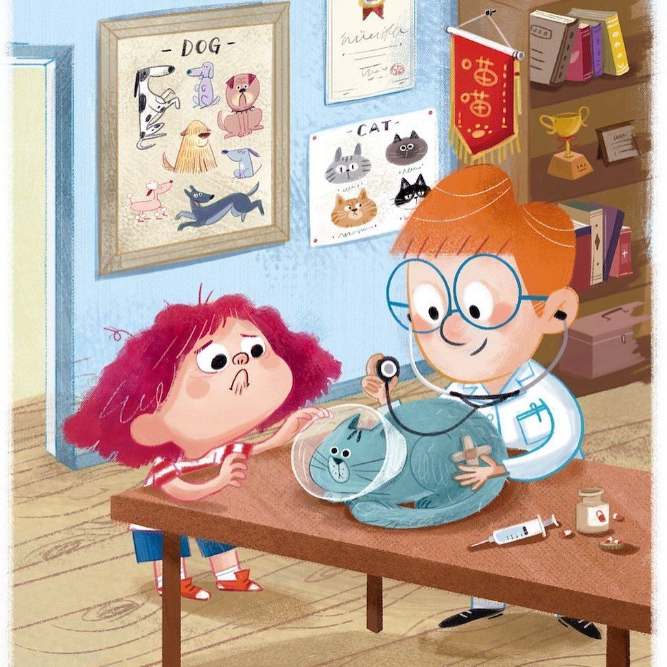
I can't find the name of this illustrator ( ) but I think it's great how they've got texture in even the flat things, fun details everywhere (those posters!
  ), and a dynamic perspective.
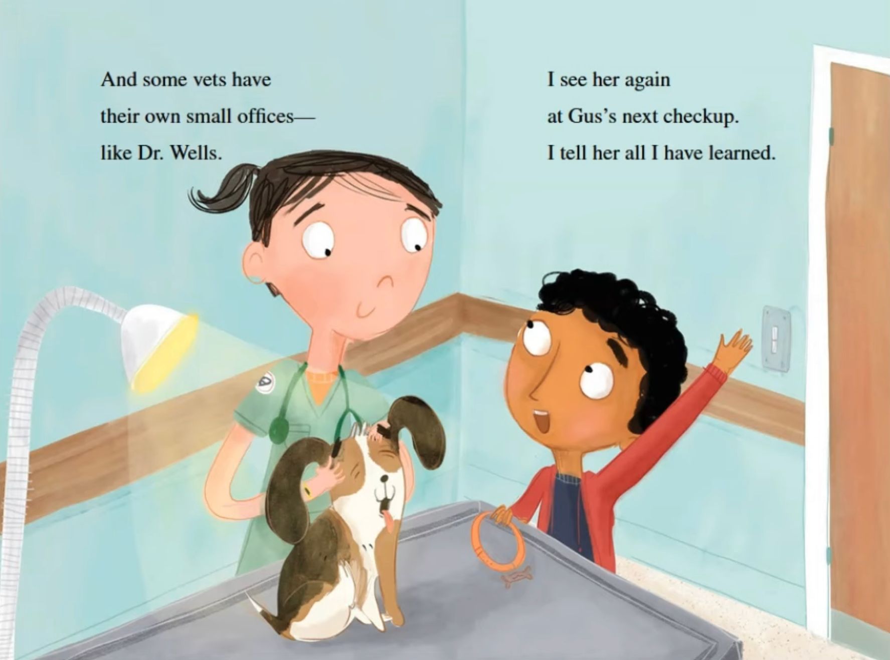
On the other hand, Catalina Echeverri has kept this one very simple, with enough texture and contrast to show what's important.And this one's my favourite, with a similar colour scheme and perspective to yours!
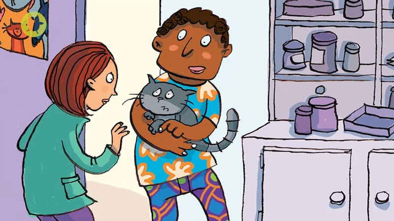
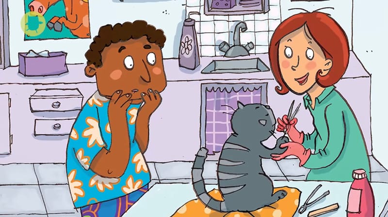
Everything in the background is desaturated purples and grey, with more saturated colours in the characters and a few props.
This is Paula the Vet by Julia Donaldson and Joelle Dreid and I recommend the read! I love how the vet gets more frazzled as the day goes by, and the silly surprise at the end.Sorry that I've rambled on and on! I hope something here is helpful.
Have a fantastic weekend!