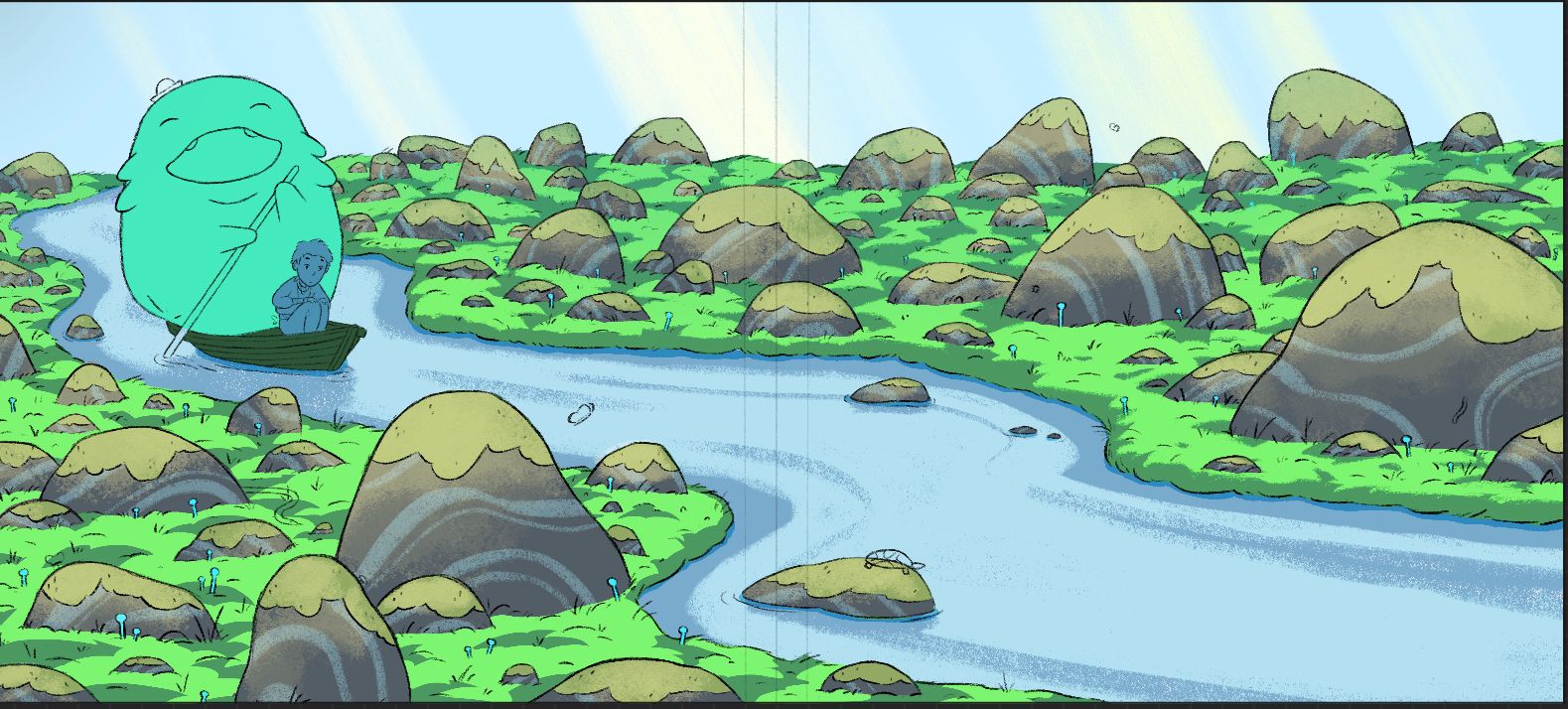
Stumped on lighting
-
I’d like this to be lit like a bright sunny day with pretty general mid-day lighting because everything in my portfolio is more intense lighting.
How do I make it feel like a bright sunny day/ how exactly should I light the rocks and grass? I think I’m going in the right direction with the grass but the rocks still don’t feel right and I’ve tried so many different approaches.
I also can’t get the colors right. It’s way too green and I don’t even like this shade of green, it’s just where I’ve needed up with trying to make it feel bright.
I know having more of the piece finished up can help the colors and lighting feel more balanced but it doesn’t feel like that’s the problem right now.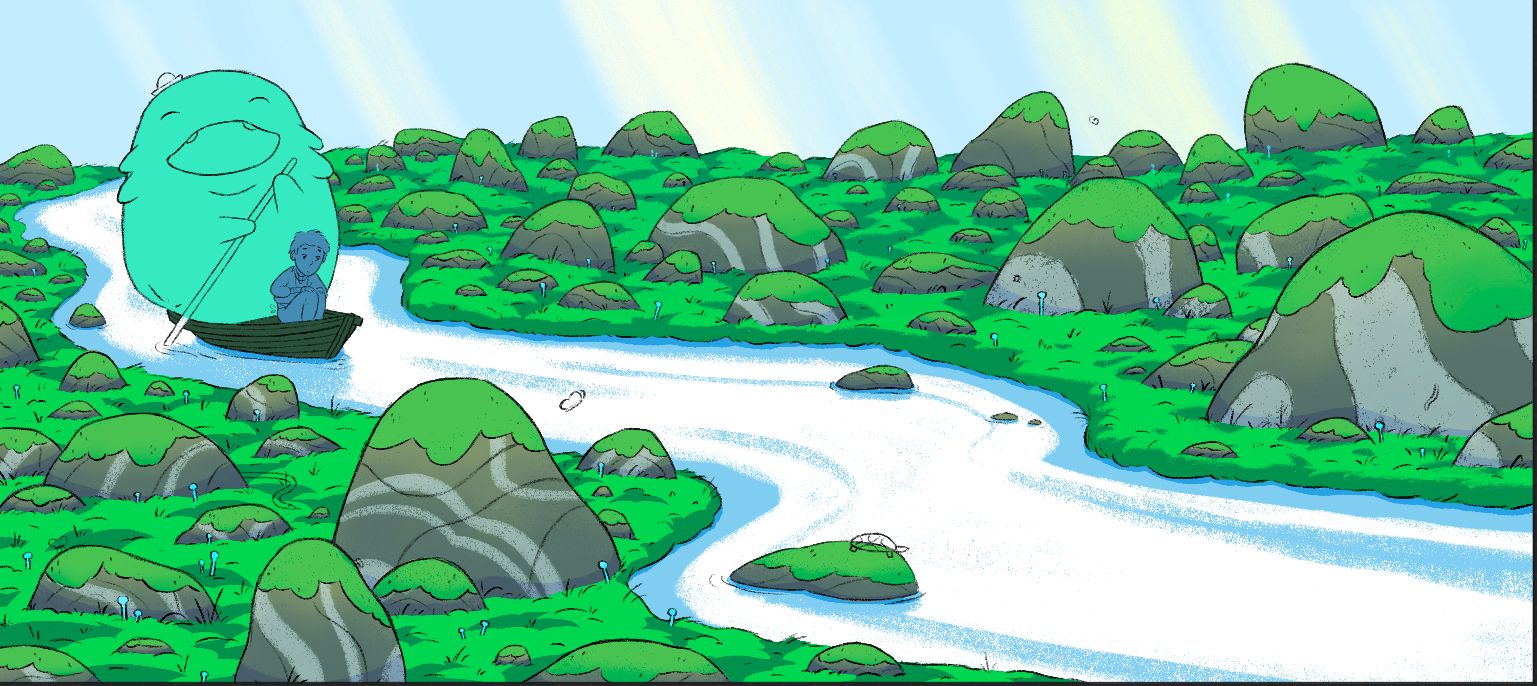
-
@Griffin-McPherson it is a bit green but I think it’s a good base green. I had to play with this one myself and what I did was an overlay layer with a watercolor brush and painted over with a deep yellow and subtle orange. Also I think if you give some of your closer and larger mossy rocks a bit of a shadow like the grass it would look good too. Hope my vision helps you in some way.
-
@Asyas_illos thank you!
-
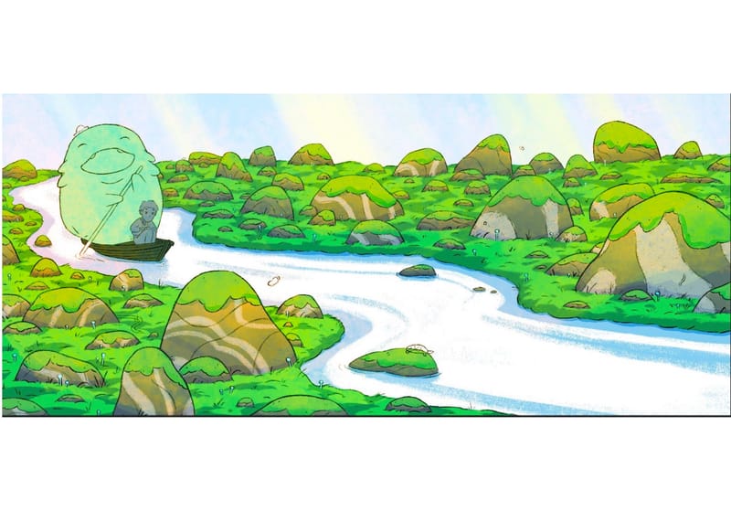
hi. if you have a mid-day lighting - you have a strong sunlight in your scene and this light should overexpose your bright green making it less saturated. I've replaced stones on the 2nd picture to show the possible green color better. -
@Griffin-McPherson bright daylight is cool where sunrise or sunset light is warm glow. So you could cool off your areas of light to read more bright afternoon. Especially with water, you'll have that blue bouncing adding a bit.
-
@AngelinaKizz that’s a great observation, I hadn’t thought about that! Thanks!
-
Maybe use a little bit more yellow green? you could break the green into slight gradients of greens? You can also use different greens for different plants (e.g. the moss on the rocks might be more yellow than the green of the grasss).
Also the light can create even more diversity in the green by bringing some yellow; while the shadow can bring more blues in the green. In fact, even with a white light I think a piece of grass will become more yellow and saturated when hit by light because of subsurface scatering.
You can also try to add atmospheric perspective and see if it helps.
Hope that helps!
-
@Anton-Bandarenka
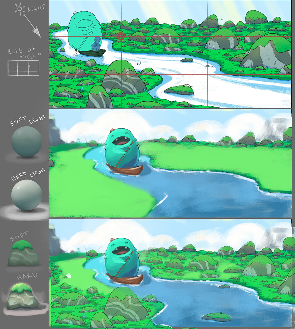
Thanks, this is really helpful! I’ve implemented those color changes to the grass but it still doesn’t feel right to me for some reason. Maybe it’s the way if styled it? The lower left area isn’t done but the upper right area is generally how I want it to look with the textured edges between the light and dark patches of grass. What do you think?I see you nudged things over to better fit the rule of thirds which I do actually like better I think. However, this piece is meant to be a spread so I’m afraid the characters would be too close to the gutter if I were to move them.
-
@Geoffrey-Mégardon I actually started off with some atmospheric perspective but ended up getting rid of it because it looked odd since it’s over a rather short distance. I’d still like to experiment with that though.
I’ve struggled so much with balancing different colors between the moss and the grass. I feel that moss should be lighter than the grass but when I do that it looks way too bright once I do the light overlay. If I make it darker it looks like the light isn’t hitting it at all so it just keeps ending up being the same green as the grass.
-
Hi Griffin!
Some ideas that might help to get this strong light feeling:
-local color: the local color (and reflectivness) of objects will strongly influence the final color (value, hue) after interacting with the light source. The more reflective, the brighter final value.
(So it is quite hard to say which green is the right one. It depends, what the local color of the grass is and with which light source it interacts.)
-planes. Think, which planes are being hit by direct light. These will get much brighter (or at least change hue in dark matt objects)
-hard (cast) shadows. Think where direct light doesnt reach and creates hard cast shadows.
-in the mid day scenario: mostly top planes are being hit by direct light. There will be short cast shadows(or even no cast shadow, if light coming straight down). The direct light source (sun) is very strong, it will separate the values of lit and unlit planes. The sky itself is not the light source and will (unlike in overcast, cloudy sky) not be the brightest on the picture. The color of the sun light is almost white/light yellow. The planes in shadow, facing up will get fill light from the sky. There will be some bounce light of the direct light on corresponding planes. The far distance object will loose contrast (planes in shadow will be lighter and more blue).
-exposure: you should keep in mind, what you want to show. The areas in light or areas in shadow? 1. Areas in light: lit object have more details, more color. Shadow objects loose detail and fall in one dark value. 2. Areas in shadows: Shadow object have more details, color, get generally brighter. Objects in light loose color and get close to white.Hope you can find some of it helpful.
I also did fast scribble over your picture to show some ideas. Hope you dont mind.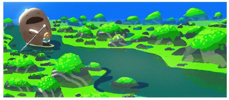
-
@Griffin-McPherson
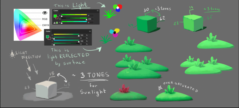
well, I think I should explain a few moments before giving any advice. First of all a bit of theory. In digital painting we're working with LIGHT (rgb scheme). That means, that green color in photoshop is not color of object. It's a light which lighten up an object (grass in this case) and you can see the light reflected by grass. Surface of the grass absorbs some part of light and as a result you can see a color of grass. Not pure light. And that's why I think you should consider using less saturated and bright color for the grass at the background.
The next issue is values of green. If we're talking about sunlight we should use 2-4 tones between light and shadow. In our case local (true) color of grass is on the front side of the cube. The sun makes the top surface a bit brighter (local + 1-2 tones) and the right surface becomes darker without sunlight (local - 1-2 tones). You follow the ratio - there are exactly 3 tones between light and dark parts of the grass in your picture. But looking at the shape of hummocks we almost can't see a shadow on it. And color blends between them should be more subtle.
So, in my opinion you should consider reducing contrast of the grass color and flattening a landscape. -
@Griffin-McPherson
@marek-halko touched on this a bit but I too think there are actually too many shadows on the ground the contrast going on there makes it it feel a bit busy. -
@Asyas_illos oh, that isn’t what I understand from what Marek said. I can see how having less variation would look better but I’ve been battling since I started coloring this with how to light the grass and have yet to find a comfortable solution.
-
@Griffin-McPherson I just meant what he touched on about midday light have very little to no cast shadows. But in my opinion the contrast with all the shadows on the ground is a bit distracting.
-
Oh, i was just throwing some ideas how to tackle a bright mid day light (not trying to make a better picture necessarelly). Of course, it is creating a lot of small hight contrast spots and making it a bit distracting. But that can be for sure solved with redirecting the light a little and reorganising of the rock elements...
-
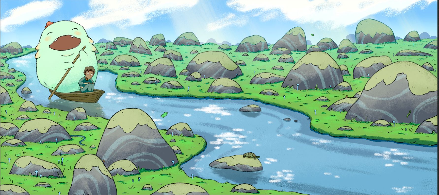
I’m pretty comfortable calling this done but I’d like any last suggests you all might have. The main things I’m still thinking about changing up is the clouds and the highlights on the water. Does this lower right area on the water leave a comfortable room for text? Let me know your thoughts!
-
@Griffin-McPherson Very nice improvement! and nice atmospheric perspective! Maybe the brigther green in the grass is slightly too satured to my taste
")
For the water, you could try to have the reflection of the grass and sky in there. Might be fun to try. But it looks fine already.
For the text, it really depends on the text and the font size you are using.
Find me on Instagram: https://www.instagram.com/nodragem/
Portfolio: https://www.nodragemillustration.com -
@Geoffrey-Mégardon yeah I actually did have clouds reflected in the water at one point! It could definitely work but I feel that the highlights on the water convey a bright, sunny day more than the cloud reflections.