How's this style
-
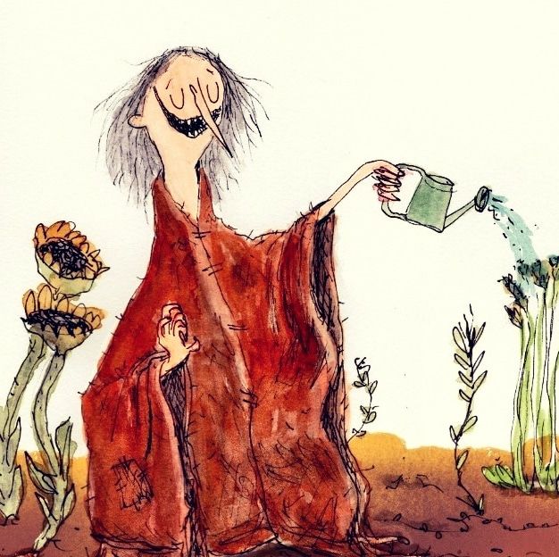
This is the style I've settled on for my children's book. It's watercolour and ink, scanned(which saturated the colours), and then touched up in Procreate.
Too saturated? At first I wanted to fix that, but then it grew on me.
Thoughts?
-
Kyle, I love it! I don't think it's too saturated. The colours and textures work perfectly. Reminds me a bit of Quentin Blake. Timeless.
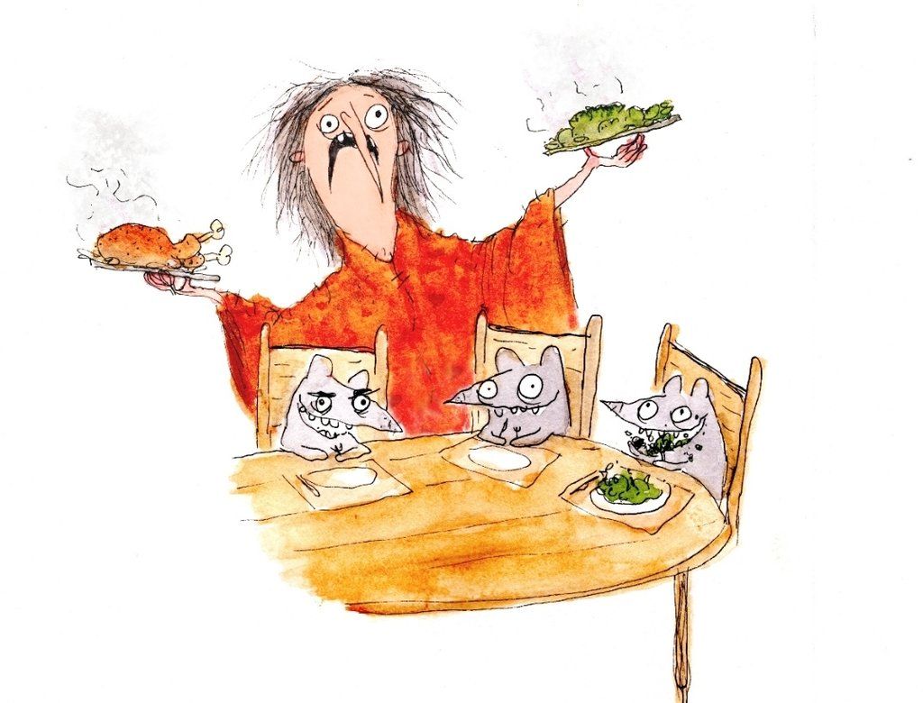
You've got wonderful larger-than-life characterisation which I feel is complimented by the saturation. If you had more greys in those colours I think it would take away from the strength of your illustrations. All of the characters are really marvelous - especially the mice. Love them!
Really good. Let me know when you are a rich and famous illustrator. It's bound to happen!
-
@Adam-Thornton-0 thank you!!
I'm glad you like the saturation, I'm worried how it will be received.I don't know if there's even a route to being rich and famous through illustration anymore, but I'd be happy with a few books on the shelf for sure.
-
I love it
-
I love your style Kyle!
I think the foundation of your loose watercolor and ink work is something you just can't go wrong with.
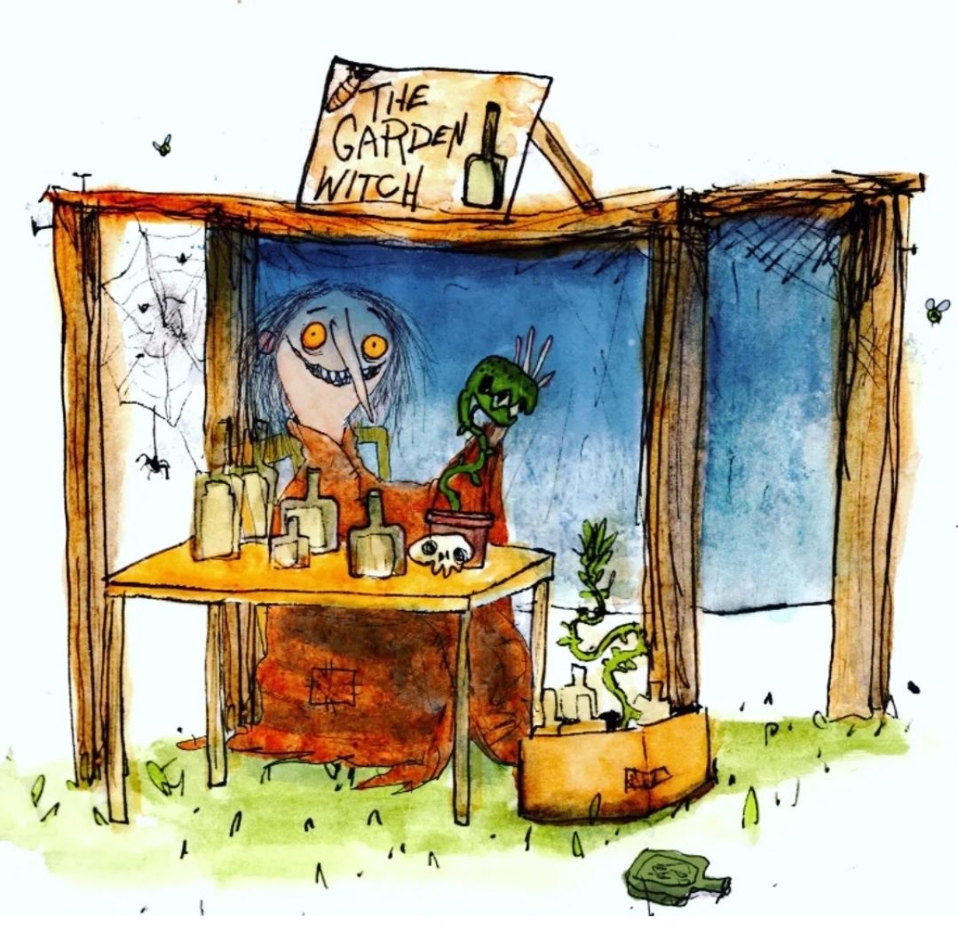
The one thing I'd say though is to be mindful of how you want your white space to appear in these pieces and once you decide that to keep it consistent. When you scan these traditional pieces in are you bringing them into photoshop and selecting the white and cutting it out to leave a more pure white in the background?
Or are you hoping to leave the color of the paper in there? These two options make for a really different final image. And I think you can see that difference in the first and second illustrations you've included here.
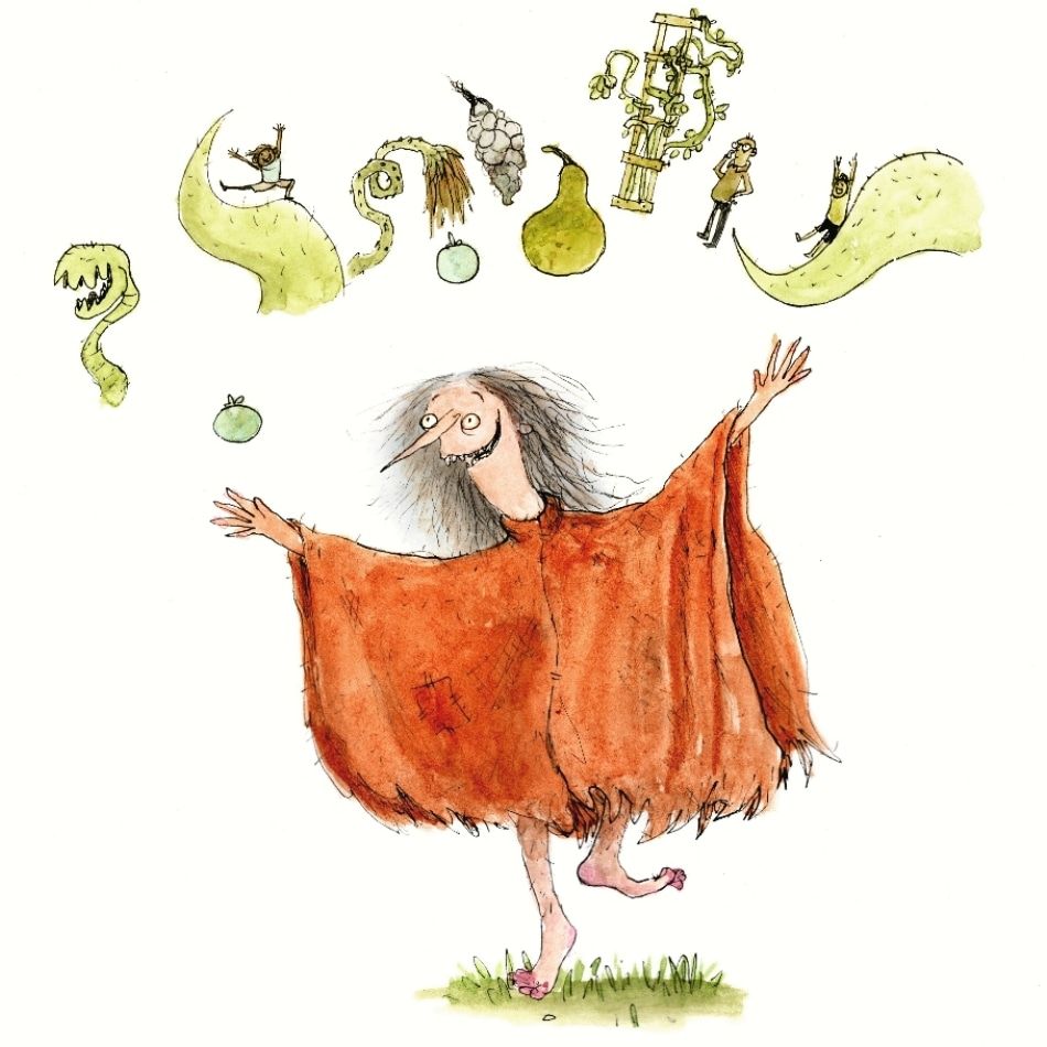
Other than that, I say keep going with this Garden Witch, I adore her! -
Looks great! I wouldn’t change a thing
-
She is so fabulous, and not too saturated! I adore her!
The only thing I’d look out for is when your tones get too even, like on her face in the second image. It’s no big deal, but it breaks her chaotic feel a bit when the painting is too perfect. I’d add a splotch of some red or something to one cheek to break up the evenness, but this is really just nitpicking.
I can’t wait for your book to come out. If anyone is destined for fame, I think it’s you.
-
@Kristen-Lango I see it, and I think that may be from me sharing this image on instagram and applying a filter to it. They're all bright white in my final images folder

-
@Mia-Clarke good point!! I'll go back in on that one, thanks!
Ha, fame would probably drive me insane -
I love your style! The characters all have so much personality! It reminds me too of Quentin Blake's work.
And it doesn't look too saturated to me, especially in the first image (but that's the one with the Instagram filter?). I struggle with the saturation on my scanned watercolor pieces too. Do you keep the original paintings next to your computer when you do color corrections? That helps me a lot.
Sometimes I take photos of them instead, but that's another learning curve! I'm still figuring out how to get the lighting right. But it's an idea, in case you're handy with a camera.
Your linework is fantastic and I love how expressive you made your characters. I bet kids'll love them! Looking forward to seeing your work on the shelves!
-
Oh yeah, for sure what you are doing is working. Keep going. The saturation is perfect, your Quentin Blake style is phenomenal and influenced much of my love for line art and funky characters, which is unique in the market. I am one of your biggest fans!!! So yes, don't change a thing.
")
Erin Richardson
instagram.com/erinrichardsondesigns21
www.erinrichardsondesigns.com -
-
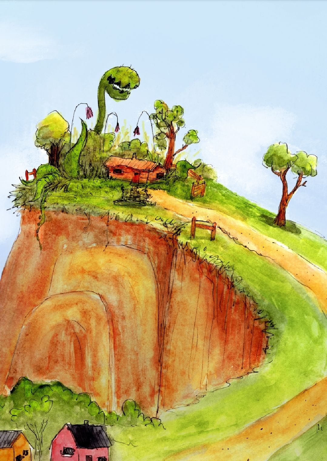
A few more and an adjusted one. Got rid of that Piranha plant, fussed with other elements.
-
@kylebeaudette Your work makes me laugh out loud, especially these last two. The characters are so good. Not too saturated from my point of view, except maybe the one of her sitting under a canopy at the table.
-
Perfect @kylebeaudette!
-
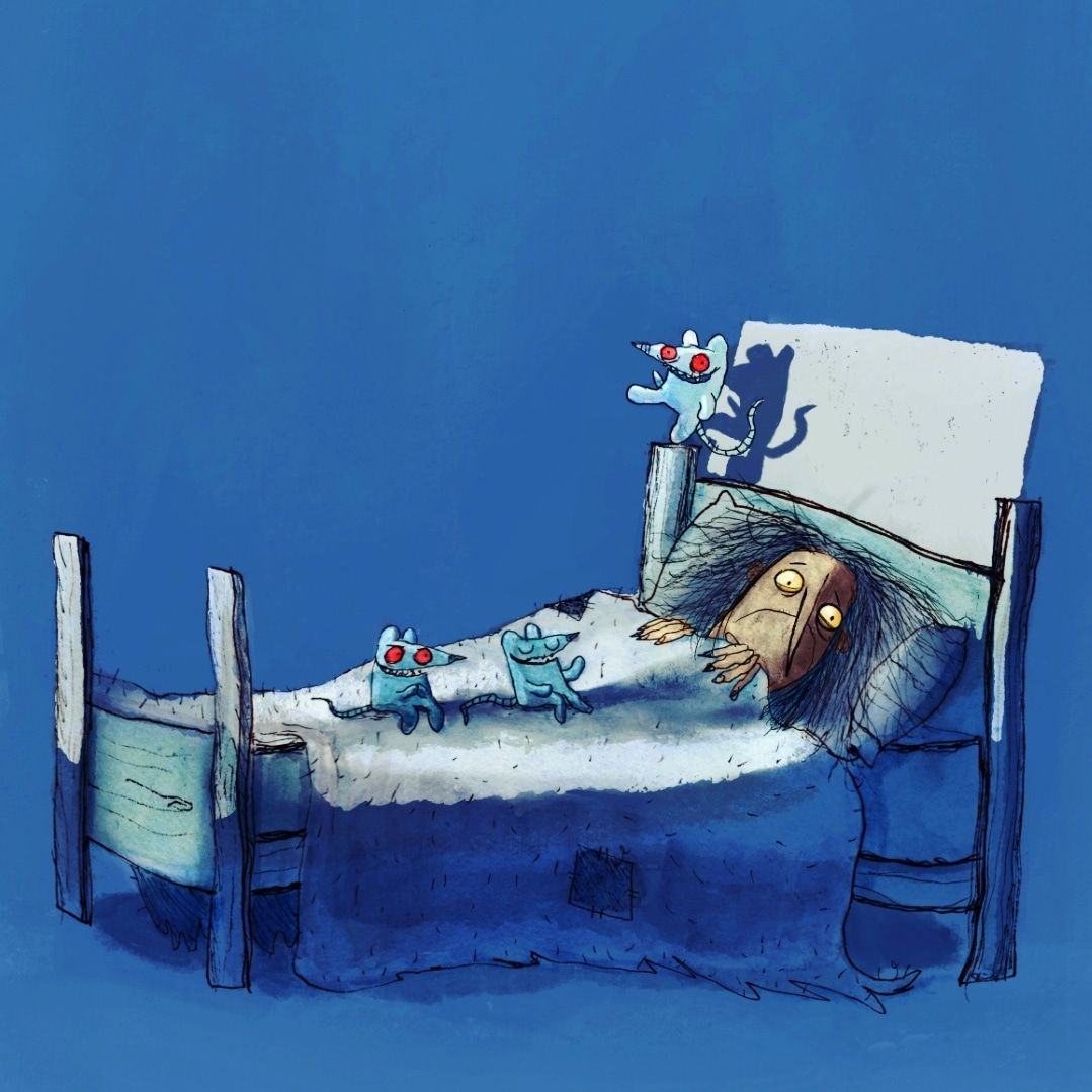
@kylebeaudette Oh I really love that blue one, you nailed the shadows on this!
-
More! This is from the first page of the book. -
@kylebeaudette Lovin' the expression of her in the bed!
-
These look really nice. Your style reminds me of the illustrator who illustrated Roald Dahls books, Quentin Blake. Nice work mate.