Seeking any feedback from the SVS Members
-
Hi Everyone,
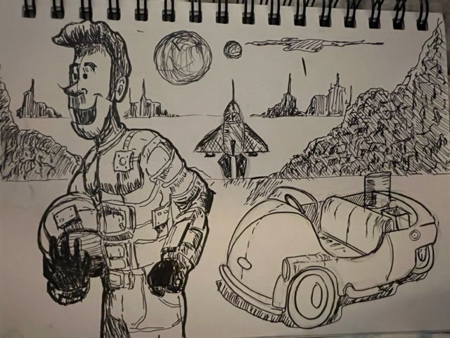
I tried to do a sketch with background. I'd love to hear any ideas you might have to make it better? I was thinking thet maybe the roket ship should be moved bact a little further and then indented wheel tracks going from the bugg to rocket ship.Any ideas/critiques are welcome.
Thanks team.
Mike
-
@Mike-Babich Interesting! To clarify the story, is it an astronaut who's just landed? Is the environment meant to be earth (just came back from a mission) or another planet?
My first thought is the rocket ship definitely needs to move away from the center of the page because it is the gutter (if yours is a spread) but even if not, the fact that something is right smack in the middle is quite distracting. Your instinct is right, maybe move it back a little and try to group it with the other elements so the focus remains on the astronaut.
-
@ArtMelC Thnak you so much for your input. Yes the infomation you gleaned from the image is pretty much what I was thinking. I was thinking an astronaught has landed on an alien planet, landed his rocket and has started to explore in his moon buggy car.
You brin up a great point about the rocket being dead center. This was purely just an image but as you say it could be a full spread.Thank you for yout time I appreciate it.
Mike
-
@Mike-Babich the astronaut looks great and so happy with what he found. That makes me curious to what he's seeing. The buildings in the background are slightly simulation shape, with one point antenna each. Could you give them more variation in size/shape and maybe some closer and some really on the horizon line?
The planets in the sky give a clear message of this being an other planet. The car confused me a little, first I thought it was a beagle or something like it and it made me think of earth. I like the coulissen idea of the foreground, middle ground, back ground. It gives depth. -
@Chantal-Goetheer Hi Chantal, Thank you so much for your feedback.I have had a few people coment on the car not fitting in. I liked the design I think It does throw the viewer by it looking so beetleish. My son said to me why did you use a VW beetle? Ill think more about the vehicle and do some other changes. Thank you!