Seeking critique from other SVS members!
-
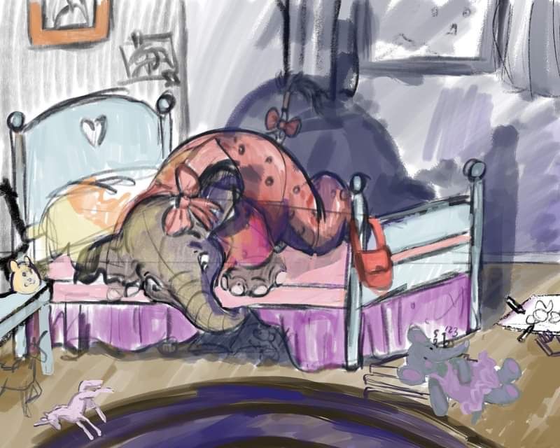
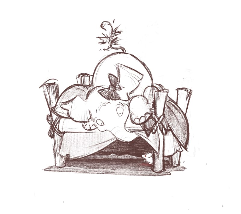
Hi I was wondering if anyone can give me critique on this sketch before I make it into a watercolor piece? Anything I should change? Also I’m not sure I love the color scheme but I’m drawing a blank as to what would be better here. Thank you so much!
-
@Heather-Foxwood Hi Heather! Just curious—What’s the story here? Is this a monster under the bed scene?
-
I'd love to give critique, but same feelings here: Please first of all tell us which story you want to tell with the illustration, else we can't help with the visual storytelling, only with the looks.

-
@Sarah-VanDam yes! But to try to think outside the box I asked myself what "monster" would an elephant stereotypically be afraid of and so it's a little house mouse who resides under her bed. The idea is they eventually become friends but for now, she's using her trunk to lift the bed skirt so she can peek without being at ground level of the potential monster.
-
@Heather-Foxwood Overall, this is a cute scene! For some reason the elephant is reading more curious than scared to me right now. It might be the angle, because it's hard to tell how wide her eyes would be from here, but you could play with them a little more anyway and see if giving them more white area might help her seem more afraid. Is it possible to show her mouth being open a little? That might help too. You could also try bunching her pose up a little more, with her hind legs under her belly. We tend to try to get as small as possible when we're afraid. I'm also not wild about the brown on the floor and in the picture frame. There's a lot of pink, purple, and blue in the rest of the image, which is a lovely analogous color scheme. You could try making the floor one of those colors instead and see how you like it.
-
I would recommend to test out how this scenery would work from another angle.
F.e. if you put the "camera" to worm's perspektive, it would give you the opportunity to show also the mouth of the elephant.To make the look more anxious I would recommend to not only lift the eyebrows but curve them like a u, instead on an n. To show her discomfort.
Also it helps to make very tiny pupils, only dots, and don't let them touch the outside of the eye (the surrounding lineart) to make someone look like he/she is panicing. Your elephant girl's pupils look somehow relaxed.I would definitely re-work the perspective of the bed and room and window. In a lot of svs-lessons they recommend to "never use parallels to the edge of the paper".
Your illustration will look much more advanced if you work with perspective and vanishing lines/points.
So I recommend to put the camera to steps to the right and one step forward, so the person "shooting the picture" would have to turm the camera counter-clock wise.If it's of help I can scribble what I mean for you?
-
@kirsten-mcg Wow this is incredibly helpful--thank you so much! I love the idea of working her pose and bunching her up more. I never would have thought of that!
As for the colors I agree the floor doesn't work but I wasn't sure if it was just a bad color scheme to begin with. Does it work as analogous or should it be something else and if so any ideas which direction it should go? I'm not sure why but I'm really struggling with this one.
-
@MimiHecher thank you so much! I'm seriously not great at backgrounds which is why I'm so excited SVS has classes on those. Could you please do that scribble to explain what you mean? I'm having a hard time visualizing it but it sounds like a great idea! Honestly, I'm doing this piece specifically to have something to add to my portfolio with a background beyond grass and trees so I am really grateful for your input.
-
@Heather-Foxwood No problem! A fresh pair of eyes always helps.
 I've struggled with color a lot, especially with interior illustrations. Someone once gave me the advice that colors don't have to be realistic. So for example, walls and floors can be any color of the rainbow, not just brown or white. I think that's what helped me the most. So yes, I think your piece would work well as an analogous color piece. I might be biased though, because purple-blue analogous colors schemes happen to be one of my favorites lol!
 -
@Heather-Foxwood First of all, I love the drawing! It's so cute!
I've struggled with color a lot AND this is my first forum post (hooray!), meaning take my advice with as much salt as you need.

My first thought when I saw this (after noticing and loving the drawing) was that there might be too many colors going on. I'm in love with analagous color schemes! And I agree that the floor doesn't have to be a realistic color, especially in the dark.
Something I noticed as I looked at it again is that the most vivid/saturated color seems to be in the bed skirt. It seems like a lot of the advice on composition is about focusing the viewer's attention by using the most eye-catching colors, lighting, and contrast in the spot in the composition where you want the viewer's eye to go. So, maybe desaturate/gray out the bed skirt and make the jammies on the elephant a little more vivid.
-
@MimiHecher I was wondering if this perspective works or if it still breaks the parallel perspective rule? (
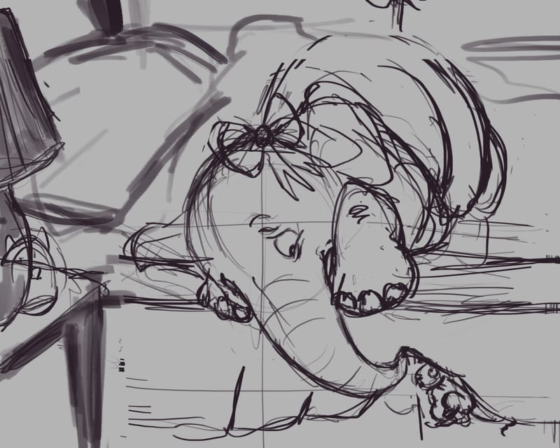 image url)
 -
@Heather-Foxwood I'm sorry for letting you wait for so long! I've been quite busy the last day!
The new version of you elephant girl looks really fantastic and emotional and it reads SO well now, that she is afraid! I totally love it!
I'm not sure which style you prefer, but to me to this scenery a 3 point perspective would fit. I just randomly did the vanishing lines, they are far from correct, and also I might have chosen the wrong size of the furniture, but I would rotate the bed this way:
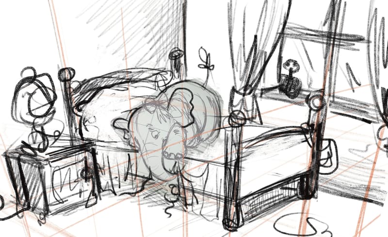
I would NOT recommend to show so much of the room, as it tales away focus of the elephant!
 I just needed to draw "outside the box" to get everything look right.
 -
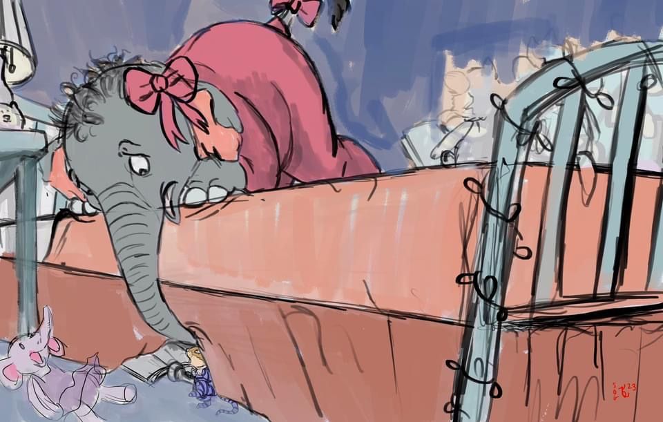 Another stab at it. Thoughts?
 -
@Heather-Foxwood Hi Heather! Here’s me trying something: My first thought was that I couldn’t see the mouse in the first draft until you mentioned it. Maybe you could silhouette the mouse as a light shape against dark? Also, do you need the whole background? Maybe you could even do a spot illustration. Also, how could you design the props and the background to be more specialized to an elephant character? A tough question to answer, but it can make the illustration more interesting.
-
@Heather-Foxwood Oh, this pov is pretty cool!
 Very good!
It seems like this illustration's purpose should rather be to show how cool you can visually tell emotions, and not how much interior you draw. Too much of the room just takes the focus away, I would even crop away a lot of the right side of the illu. No need to see the end of the bed. But it would be nice to see most of the bedside table.
-
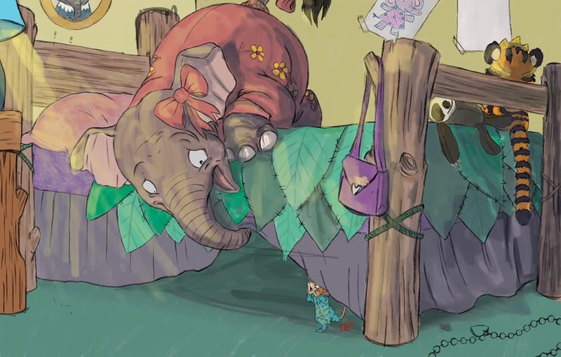
@MimiHecher thank you. I agree the bed was too much there. Messed with it again, practicing as a full page spread so nothing important is in the middle of the page. Are the colors going in the right direction? Shading and lighting is just a test so far. I’m struggling with a color scheme. The reason I am trying to add a background is my portfolio is lacking in those so Inam working to learn to draw interesting settings. My favorite thing to do is characters but I am sure if I want to get out there some sembelence of a setting is important.
-
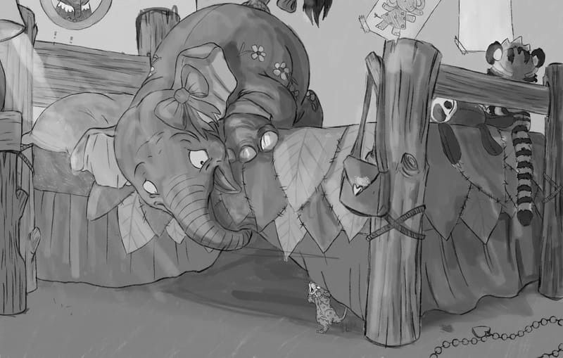
@Heather-Foxwood the composition looks really good. The colours are tricky because when you turn the image to gray scale (see below) some parts of the bed are the same colour as the elephant so the elephant blends a bit into the bed. Also the mouse might be more emphasised in terms of contrast. Im no good with colours myself so can't really give more helpful thoughts. It was talked about in the magic of colour lessons. I get the idea but find the execution very hard. The small mouse and big elephant work really well with the angle and emotion.
-
@Chantal-Goetheer oh my goodness thank you that helps a ton. I just joined SVS in January so I haven't gotten to take that course yet! But I never thought of running it through as a black and white to show contrast. I'll play with that more--again, thank you so much it helps a ton!
-
@Heather-Foxwood Wow, this new composition is GREAT!

I love how you managed to put in a lot of children's stuff although you don't show much of the room!I would put th mouse more to the left and deeper unter the bed, because it wouldn't be bad to show her in full, instead of cropping a part of the head.
Also it might be interesting, as the mouse is wearing a pyjama, to give an visual hint that she has her bed under the elephant's bed, instead of putting nothing under the bed.
It would be something in the shadows, so you would have to work with silhouettes that read well.
Or the mouse has her own lamp with dimm light, behind her. XDAbout the colors: Are you only testing the hues which you want to work with, or are you going to color it in watercolor 1:1 this way?
Regarding the hues: In my opinion they work together much better than in your first attempt. The only thing I would change is the color of the mattress, as purple stands out and so something very unimportant becomes a focal point. Why not making it yellowish grey or greyish green? Some color that is already in a lot of places of the illustration, but greyed out so it's less important?
Also I think it would better fit the cushion to have a green tone, making it go together with the very cool leaf-blanket.So the overall colors of the room would somehow resemble "jungle" - browns and greens - which I think is a very cool hint that (some) elephants live there.
-
Very interesting work!
I think there is no strong "no parallel lines to paper's edge" rule; it is just something to be aware of. The concept of Sarah Vandam is strong and had an horizontal line.
In terms of your current composition, I would say:
- maybe try not to cut-off the mouse or its head (the cover is covering it now), so it has a readable silhouette
- maybe use stronger lights and shadows (e.g. a night lighting with warm yellow vs blue) to make the scene a bit more dramatic and guiding the eyes to the mouse and elephant facial expression.
- maybe use more lines to guide the eyes to the mouse
- maybe make it a one page spread to strenghen the verticallity of the composition (mouse is under the elephant).
 can't wait to see where you will be taking this illustration !