Society of Visual Storytelling

    SVSLearn Forums

    • Register
    • Login
    • Search
    • Recent
    • Tags
    • Popular
    • Users
    • Groups
    • Search

    First illo of 2023

    Artwork
    8
    14
    531
    Loading More Posts
    • Oldest to Newest
    • Newest to Oldest
    • Most Votes
    Reply
    • Reply as topic
    Log in to reply
    This topic has been deleted. Only users with topic management privileges can see it.
    • AngelinaKizz
      AngelinaKizz last edited by

      My first illo of 2023. Still aiming for loose, and losing some edges…
      I’d love to hear thoughts and critiques.
      Hope you’re all having a great start to 2023.

      217D5B31-BF2E-4BB9-97FA-EBC5C9FE558F.jpeg

      www.evarartistry.com
      www.Instagram.com/evarartistry/

      Griffin McPherson Chantal Goetheer 2 Replies Last reply Reply Quote 5
      • Asyas_illos
        Asyas_illos last edited by Asyas_illos

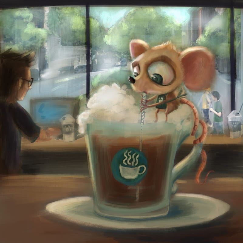
        This is really great Angelina! I love the painterly feel to it! I see tons of improvement! My only critique is I think the mouse could use a tiny bit less looseness. I think he should feel a little crisper, imo. Sorry mouse and cup I mean as they are the focal point.

        Asyasewardillos@gmail.com
        www.Instagram.com/asyas_illos/
        https://asyasewardillos.wixsite.com/mysite

        AngelinaKizz 1 Reply Last reply Reply Quote 2
        • AngelinaKizz
          AngelinaKizz @Asyas_illos last edited by

          @Asyas_illos thanks Asya! I'll try a layer over top to tighten up and see how it feels

          www.evarartistry.com
          www.Instagram.com/evarartistry/

          1 Reply Last reply Reply Quote 0
          • Griffin McPherson
            Griffin McPherson @AngelinaKizz last edited by

            @AngelinaKizz the background looks good but maybe a little TOO good. I think it brings a bit too much attention away from the focal point. Maybe just removing some details or glomming more shapes and values together could help. I think cleaner foreground edges could help a lot as well. Over all this is a great looking piece and your improvement is really showing! Starting off 2023 right

            AngelinaKizz 1 Reply Last reply Reply Quote 1
            • Chantal Goetheer
              Chantal Goetheer @AngelinaKizz last edited by

              @AngelinaKizz beautiful!! Agree with what @Asyas_illos and @Griffin-McPherson already said to make the mouse more the focal point. But wow! I was wondering if you could get rid of the logo on the cup? Somehow I get a strong Starbucks feel and pulls my eye there. Hope one day I can pull off something as beautiful as this!

              1 Reply Last reply Reply Quote 1
              • AngelinaKizz
                AngelinaKizz @Griffin McPherson last edited by

                @Griffin-McPherson and @Chantal-Goetheer thanks! I'll work on it some more and post the finished piece soon!

                www.evarartistry.com
                www.Instagram.com/evarartistry/

                1 Reply Last reply Reply Quote 0
                • AngelinaKizz
                  AngelinaKizz last edited by

                  329DC788-74FB-460D-9296-8FE32A0FC32B.jpeg
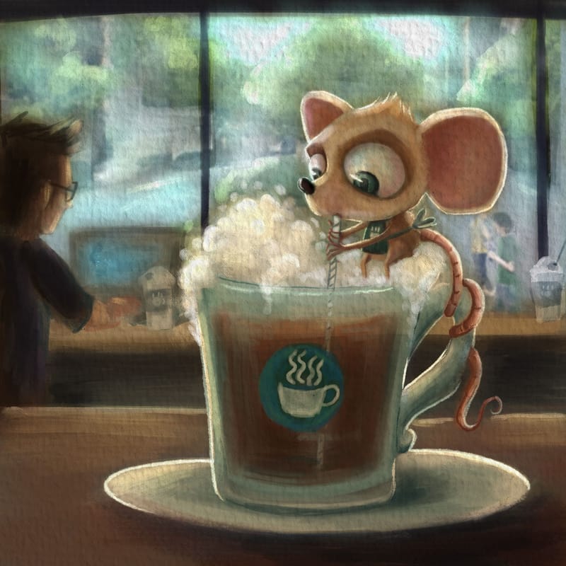
                  I’ve been off to a slow start this year.
                  I finally got to tightening up the mouse.
                  I also loosened the background.

                  How does he feel now?

                  www.evarartistry.com
                  www.Instagram.com/evarartistry/

                  Mia Clarke 1 Reply Last reply Reply Quote 2
                  • Mia Clarke
                    Mia Clarke @AngelinaKizz last edited by

                    @AngelinaKizz This is a lot better, I think, your focal point is really clear and I immediately understand what is happening in the image.

                    I must say though that I’m not wild about the multiplier overlay of paper texture, I feel like it looks like something I have to look through, rather than something that’s inherently part of the image. Like wobbly, grayish cling-film on top, if you see what I mean. I think your image would be better served by more strategically applied, subtle texture, rather than one sheet over everything…

                    Other than that, this feels like a portfolio piece in the making. Great work.

                    www.miaclarkeart.com
                    https://www.instagram.com/miaclarkeart/

                    AngelinaKizz 1 Reply Last reply Reply Quote 0
                    • AngelinaKizz
                      AngelinaKizz @Mia Clarke last edited by

                      @Mia-Clarke yeah, you’re totally right. I like the paper texture more often than not…but you’re right, this time it’s not fitting.

                      www.evarartistry.com
                      www.Instagram.com/evarartistry/

                      Mia Clarke 1 Reply Last reply Reply Quote 0
                      • AngelinaKizz
                        AngelinaKizz last edited by

                        DB5A692C-5835-4685-9A17-101BD0EB82F6.jpeg

                        www.evarartistry.com
                        www.Instagram.com/evarartistry/

                        Tom Harshberger 1 Reply Last reply Reply Quote 5
                        • Mia Clarke
                          Mia Clarke @AngelinaKizz last edited by

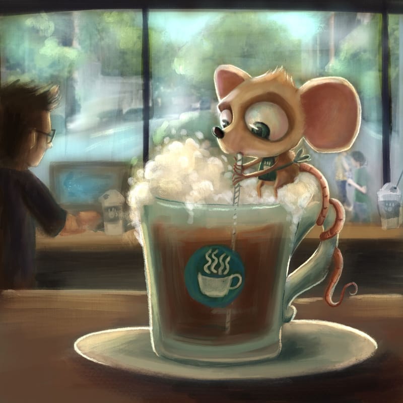
                          @AngelinaKizz I think this is a great piece. Ultimately, you need to follow your artistic mind, and I think the paper structure might just be a matter of taste (and I’m just one person, and I might be wrong…)… Maybe you can still use it on this piece, but make it more transparent?

                          www.miaclarkeart.com
                          https://www.instagram.com/miaclarkeart/

                          ajillustrates 1 Reply Last reply Reply Quote 2
                          • ajillustrates
                            ajillustrates @Mia Clarke last edited by

                            @Mia-Clarke @AngelinaKizz Agreed - try the paper texture between 25% and 50% opacity of what it was before, and I think you'll find the sweet spot for this piece!

                            https://ajillustrates.com
                            https://www.instagram.com/aj.illustrates/

                            1 Reply Last reply Reply Quote 1
                            • Tom Harshberger
                              Tom Harshberger @AngelinaKizz last edited by

                              @AngelinaKizz @AngelinaKizz Cool to see the progress. Really like the lighting on the mouse's ears and neck! I too struggle with canvas textures being too much. It's hard to gauge when you're looking at it for hours!

                              instagram.com/tomharshberger.art

                              1 Reply Last reply Reply Quote 1
                              • geekinm
                                geekinm last edited by

                                I really like this piece. Well done it looks great to me x

                                1 Reply Last reply Reply Quote 1
                                • First post
                                  Last post