Please help me make part of my illustration stand out more!
-
Hi Folks,
So I have this illustration I have been working on and I need to draw more attention to the potion bottles tipping over on the bedside cabinet. (see left of image).
My brain is saying - " use higher contrast in areas to draw focus" but when I have tried to darken the cabinet to make the potion stand out I feel like it hinders the illustration as a whole...
Any ideas / suggestions would be super helpful as I'm hitting that brick wall with it!
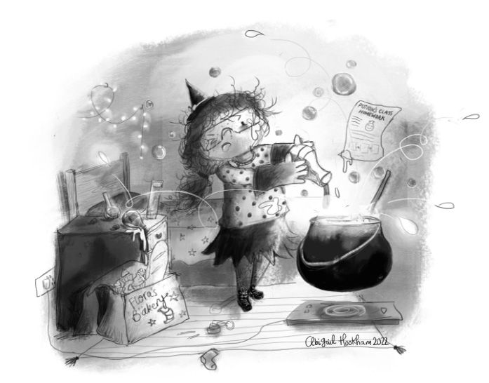
I have attached both light and dark cabinet options so you can see what I mean.
How can I make those potion bottles tipping over more of a noticeable thing?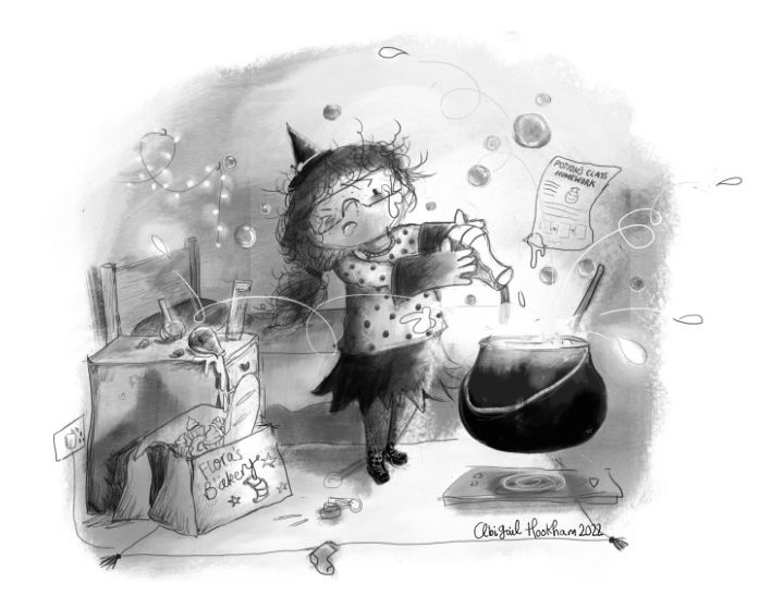
-
@Abigail-Hookham love the concept and the action you've got going. Just an idea, but maybe make the bottles larger (similar to the one in her hand) and simplify the values/texture in that area. There is a lot going on in that part of the image and the little bottles get kind of lost. The shading and drawing style on the cabinet is quite textured and busy, so simplifying might help.
-
@Abigail-Hookham What a cute illustration! This is exactly what my eldest looks like whenever she’s cooking.
 ️ Is it for a book?
To your question. Contrast is one thing, but your potion bottles don’t really have much of a silhouette, even in the darker image, and so in order to see them (even after I had read that they were in the left corner), I had to zoom in. If I were to draw attention to the bottles I’d do a couple of things:
- Lighten the value of the bottles significantly, and light them better. Maybe I’d even add an in-image light source to directly shine on them. I don’t know what’s in the bottles, but of it’s potion I would think that could be florescent, maybe? That way the potion could be the light source. In any case, I’d fiddle with the value enough so that you could zoom way out and still see them. I don’t think darkening the dresser is wrong, in fact I think that looks better, but that might just be me.
- Make the bottles bigger, either by increasing their actual size, or by moving them closer to the camera.
- Declutter the rest of the image. Right now, there are a lot of things calling for my attention in the image, and I think this makes it harder to notice the bottles. There are elements there that I don’t think are needed to tell the story, such as the bed, the cord for the heater, the sock or the fairy lights, and elements that might be needed but are a bit too prominent (such as the bubbles and the splashes). I’d consider removing or simplifying the crap out of the unnecessary elements, and lowering the contrast on the elements that do support the story but that are mostly decorative (such as the bubbles).
- There is a splash that tips the bottle over. I’d strengthen the trajectory line for that one, and brighten it up, to help guide the viewer’s eye to the bottle. I’d also not have the stray splash have a looptiloop line, but keep it to a simple arch, to make the guiding of the eye more straightforward.
That’s all I can think of atm. Good luck!
-
@Mia-Clarke Ah thank you so much for such a detailed reply.
Yes it is for a book
")
These are all super helpful suggestions and I will give them all a try now! I think I was getting to that point where you have been too close to the drawing for too long and I literally was seeing none of it! De-cluttering is such a good shout too - I am terrible at over-doing the unnecessary so thank you for that point especially!
-
Hi!
I don’t think playing with the contrast around the bottles will be enough.
What if you removed whatever is next to her feet and put the bottles there instead? If the girl is the focal point, it will be easier to notice the bottles if they are close by.
And I agree that they should be bigger.
Great job on this so far!!
-
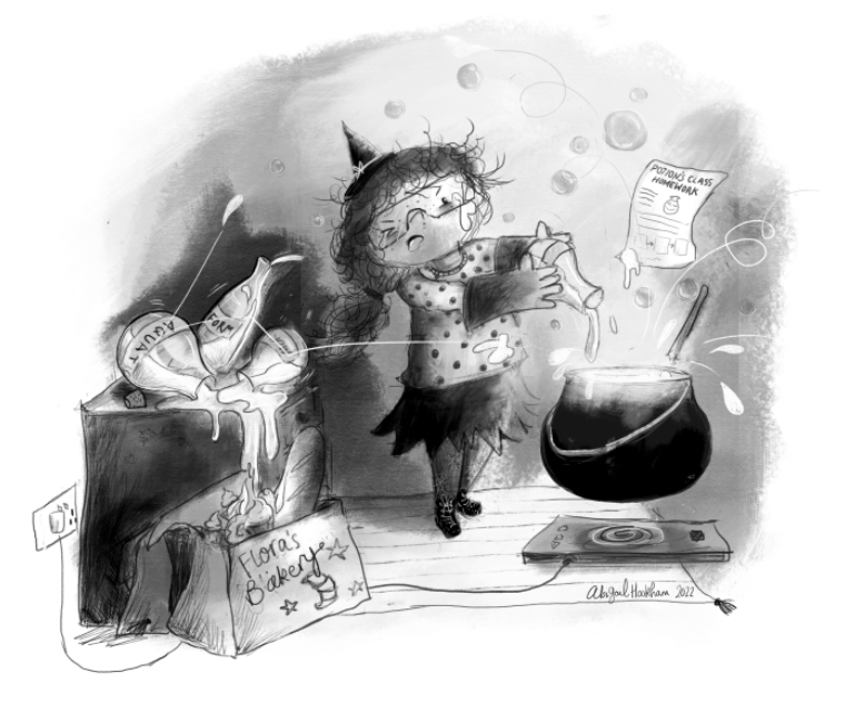
I've taken into account all the great advice and this is where I am at now!
Let me know what you think - I am still quite attached to the original version - however, it wasn't obvious enough that the potion bottles had tipped over so it didn't do the job it was meant to! Hopefully this re-done one achieves that more?I might have to put the bed back in though - I feel like it's missing it!
-
@Abigail-Hookham Yes, this is clearer. I think putting the bed back will help to tie the piece together. If you are concerned about it being a distraction, you could experiment with lower contrast so the bed recedes to the background more. Good work
-
@Abigail-Hookham Wowww! This is so much clearer, amazing work! I think you could put the bed back, as long as you keep the contrast of it lower than what’s in your middle ground.
-
@Abigail-Hookham This is so cute, and the bottles definitely stand out more now.