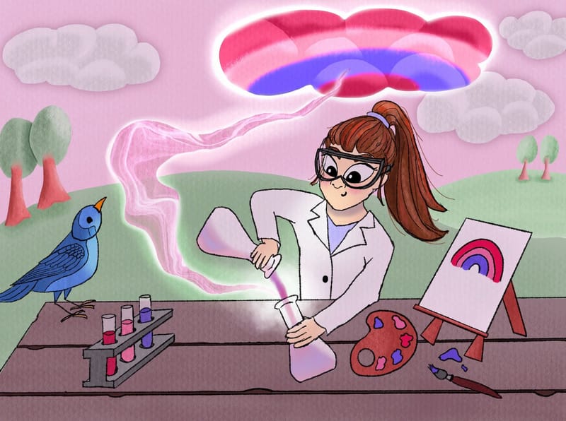
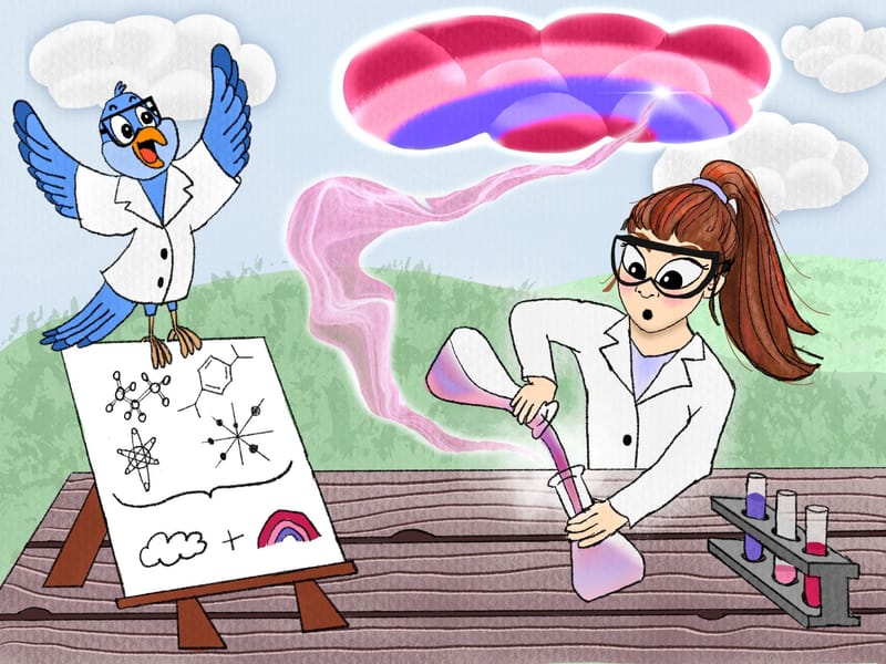
First illustration
-
Hi! I am just starting out, learning the basics of how to draw. Even though I’m not entering Critique Arena, I thought it would be fun to put something together for the ‘cloud’ prompt.
As this is my first illustration attempt, I don’t really know what kind of feedback to ask for.
Any general suggestions would be appreciated!

-
Hi Susan,
Good first effort, but there are a some things I see that could be improved.The most important is that there is no clear story in your illustration. While it is obvious she is trying to create a rainbow of sorts, there is no clear motivation for the action.
My suggestions are:
-
instead of a rainbow painting, make that some kind of "scientific" document with a rainbow cloud formula she developed and other scribbles/drawings as she worked to figure the formula out. If you go this route, remove the palette and brush
-
maybe she could be holding the flasks up near eye level to observe closer the reaction of the mixing chemicals
-
get the bird involved in the story. Give it more character by anthropomorphising it as a friend/assistant
-
your lines need a bit more texture to avoid the coloring book look, unless that is what you are after. Make some lines thicker than others
-
the cloud needs more clarity as to what it actually is supposed to be
-
Make the sky blue, or a sunset gradient so it is not competing with your mist coming from the flask.
-
the illustration could benefit from some kind of lighting, esp since she is outside. Perhaps some subtle shading to indicate the sun
-
make the levels in the test tubes uneven for more interest. She has obviously used some, so make it look that way
I know this is a lot, and I am not trying to overwhelm you or be overly critical. I think you have a nice base for a great illustration. Hope this helps!
-
-
@tom-barrett I really appreciate you taking the time to write this - thank you!!
 I know I have a lot to learn, and this is extremely helpful.
I was trying to go for the story of someone who loves both art and science, and found a way to combine the two (i.e., painting the clouds). I wonder if her wearing an artist’s smock instead of a lab coat would have helped?
-
yes, a smock might help as there is a disconnect between her and the art part of the story.
If she is "painting the clouds", I would make them look more painterly (less confined to the cloud shape).
And looking at the art again, I think you have too much going on. You have the before (mixing) and after (painted cloud) happening at the same time. There is no anticipation (will it work?) or climax (it did work!).
Think of your story as a whole book and where this illustration would fit in. That might help you break it down more.
Look forward to seeing what you do with it.

-
@susanhowarth-art Hey, great job at posting your first illustration here. Firstly I love the colour combo, I think it is beautiful.
Regarding the story, "a person who loves both art and science" is a really difficult thing to convey through a single illustration without confusing the readers, especially with no text involve. It may be something you tell over a whole picture book... so my suggestion is to narrow down the focus for this particular illustration. You might focus on the science side while dropping tiny hints of some art materials scattered in the background that are not the focus.
I agree with most of the points Tom has mentioned above, you will do well to think about them.
Minor addition: for grouping of people and things (e.g. trees) try to avoid the "Noah's ark syndrom" of putting things in pairs of similar sizes - they look very unnatural, especially having 2 trees on left and the same 2 trees on the right. Try to vary the size, shape and distance. And try making them odd numbers.
-
@ArtMelC These are great tips and suggestions - thank you so much!
-
This post is deleted! -
@Stephanie-H Thank you!

-
@Stephanie-H @ArtMelC @tom-barrett
UPDATE
Thank you so much for your feedback! I’ve made some changes based on your suggestions.
I agree the lineart and lighting need a lot of work, but I’m going to leave them for now as I haven’t quite figured out those techniques yet.

-
This post is deleted! -
@susanhowarth-art You really used the suggestions given by others to improve the piece! Amazing!