BCBF Illustrator’s Exhibition - Critique/Opinions wanted!
-
Hi all!
I learnt about the Bologna Children's Book Fair Illustrator's Exhibition not too long ago, and am pretty excited about giving it a shot. Around the same time, I learnt about the Silent Book Contest and thought that I should maybe try killing two birds with one stone by working on a silent picture book dummy for the contest, and selecting five spreads from the dummy to finish first to submit to the BCBF exhibition. The deadline is Mid-October, which is a bit tight but doable I think (it will be my first time submitting to both)
I've pretty much finished my book dummy and would love to get some opinions on which grouping of five spreads below I should pick (the spreads read left to right, top to bottom).
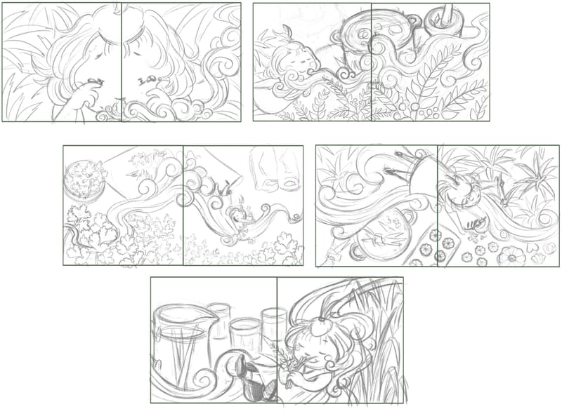
Grouping 1 - The Story Gist
Lines:
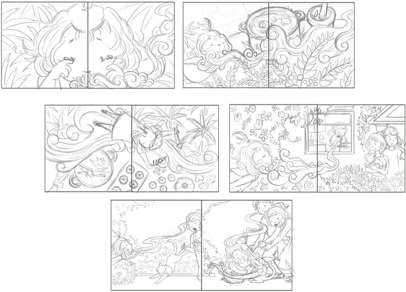
With rough values blocked in for extra context
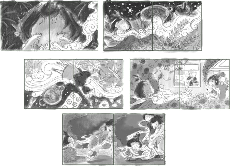
The rationale for picking these 5 spreads is that they tell the gist of the entire story, featuring two spreads from the story's "climax" (no. 2 and 3) but I'd like to know if it actually reads legibly to others?
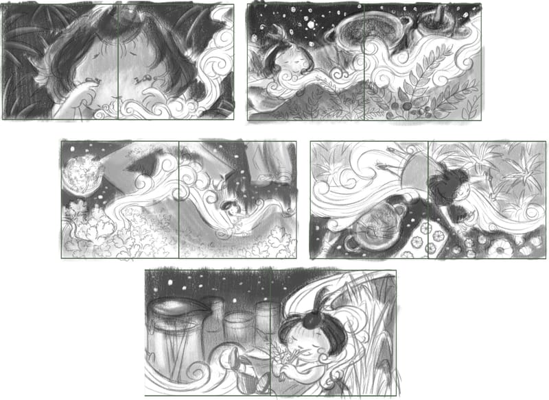
Grouping 2 - The Story Gist with more Rounded Ending
Lines:
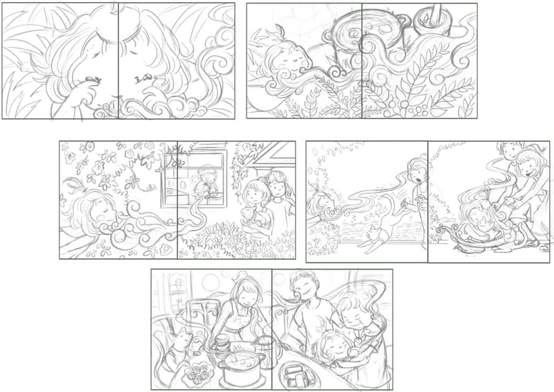
With rough values blocked in for extra context:
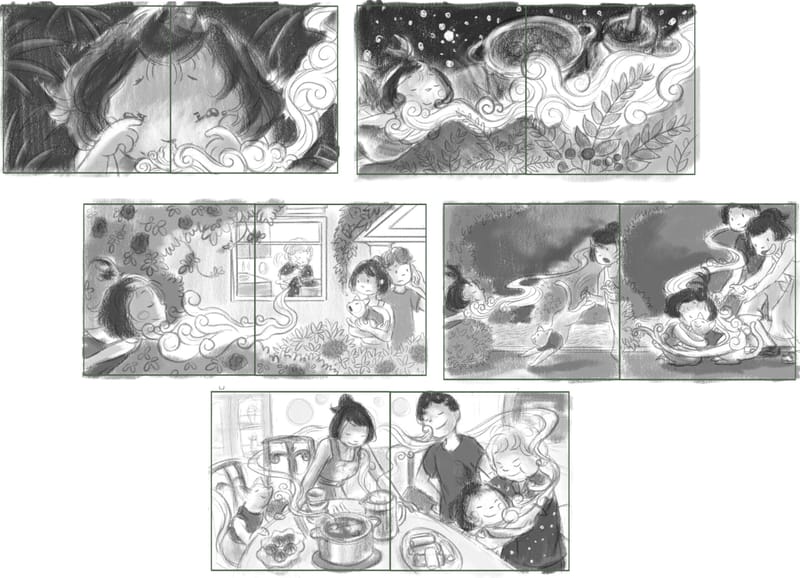
This is a variation on Grouping 1, just removing one of the spreads from the "climax" to round out the ending a little bit more, and perhaps make the story clearer?
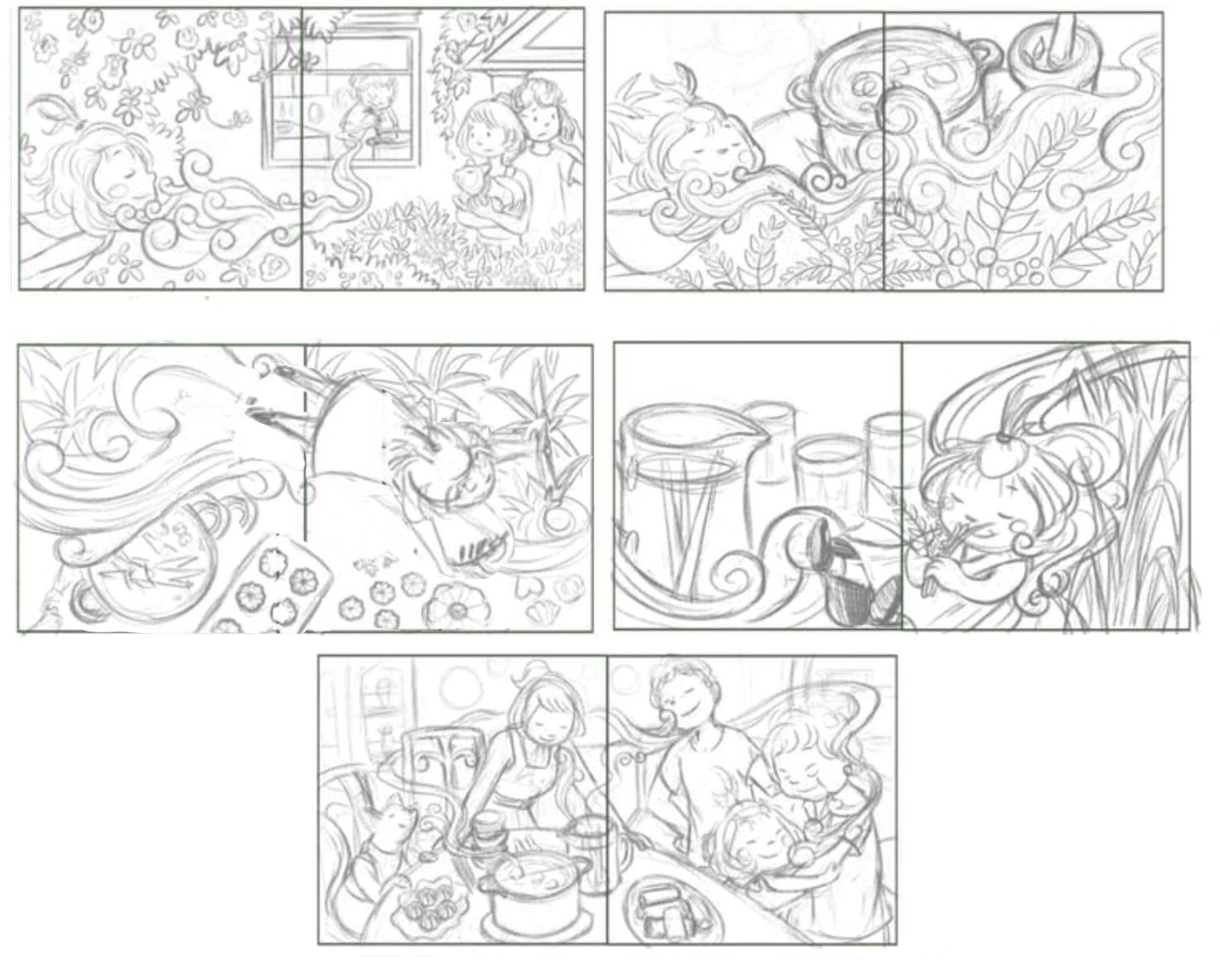
Grouping 3 - The Climax
Lines:
With rough values blocked in for extra context:
This grouping is meant to feature all the spreads from the story's "climax". I realize that this will mean you can't quite get the story of the book from the 5 illustrations, but presenting a unified story is not a must for the exhibition, as long as the set of illustrations follow the same theme. So I'm wondering whether choosing these spreads will give me more room to impress the judges aesthetically instead of giving space to more "functional" storytelling spreads like in the previous two groupings.
I hope some folks here can let me know which they prefer, and whether the overall story is even legible through these illustrations alone. Any other feedback is also welcome! Also tips from anyone who has participated in the BCBF exhibition or Silent Book Contest before would be great!
-
@JQ Oh these are beautiful! Love your sweet characters!
To answer your question: the climax grouping is much stronger storytelling.
In the story gist grouping, there is a spread of two full page illustrations that is hard to read -- the same values (I'm assuming they'll be in the same color palette?) and one of the character's body is cut off in the gutter. It's an abrupt transition to the next page.
Here's another composition you may want to adjust, as you already have a character's head spanning a spread. It's ok to have a character crossing the gutter again, but maybe not cut off directly in the middle. It reads best if characters aren't grouped in the middle and cut off by the gutter.
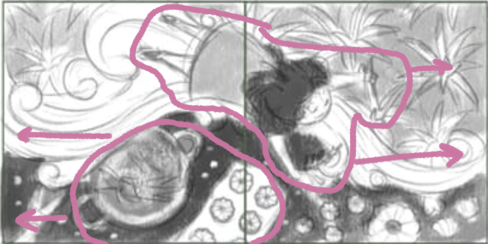
The same is happening in the last spread -- perhaps you could move the character more to the right?
Remember, you'll be showing these pieces to industry professionals who are trained to look at layout and composition. Having so many characters and elements in the gutter will be something they notice right away.
Other than that, love the movement in these pieces! They're so whimsical and beautiful! Please keep sharing your progress and let us know how it goes.
-
@Melissa_Bailey Thank you as always for your super valuable feedback! I'm really going "Grrr" at the gutter right now haha, I keep making that mistake even while being aware of the problem. But I totally agree, I will play around with shifting the characters further away in those spreads.
And I get what you are saying with the spread where a character is cut off by the gutter being jarring. I think when I visualized that sequence in my mind it was almost like a comic sequence with several panels showing the family reuniting with the girl one by one , and it might have worked as a crop in a comic panel but I realize it doesn't do so well with a full-page illustration. But I have an idea now of how to fix it (will probably remove the woman who is cut by the gutter in the left spread and modify the right a little). Thanks so much for pointing this out!
On your preference for the climax grouping - that's interesting that you think it has the strongest storytelling; I thought storyteling-wise it was actually the weakest, since not much else is going on except her floating on the scent cloud and smelling the herbs used in food she's imagining. I was actually inclining towards Grouping 1 which gives the story gist and still manages to showcase 2 climax spreads (I've also got other opinions on the ID forum that Grouping 1 & 2 have better story). I'd love to hear your elaboration for why Grouping 3 does it for you if you're able to share!
-
I think the 3rd grouping is most compelling however some changes should be made to the last two spreads because the girl is placed right in the gutter. The images are definitely unified through theme, but I don’t pick up on much of a story. You mentioned a story isn’t essential to the contest so maybe that aspect isn’t worth worrying about.
-
@JQ Group 2 has a concrete story I think. I read the story as:
The little girl is sleeping and wakes to the smell of her grandma's cooking. She follows the smell to he grandma's house. Her and her family enjoy a meal together.On a second read through I see that maybe she was missing for awhile. Possibly took a nap outside and that's what her parents look concerned and her cat is happy to see her.
Group 3 I am assuming is the dream sequence. I like the quietness of it.
Overall, I think I prefer Group 2 because of the story and the interaction of characters. That said the quiet dream sequence is quiet nice as well.
Good luck in the contest!
-
@JQ -- you're welcome! Happy to help.
The 4th spread in the 2nd grouping also feels out of place because it's the only one that's 2 full page illustrations. Plus, the two pages look like they'll be very similar in value and subject matter, which is visually confusing. It just doesn't feel like it fits and it really throws off the flow for me. That was the main reason why I prefer grouping 3 over grouping 2, as both seem to have similar storytelling.
The rest of the spreads have great flow! It feels like the girl is going on a sensory journey of discovery. Love it. (Other than the gutter issues, of course.
 )
)What if you took the best from grouping 2 and 3? Here are the spreads that I feel are the strongest and have the best storytelling:
I adjusted the one spread where the girl is cut off in the middle of the gutter, but addressing your other gutter issues would be a good idea. In the spread where she's smelling the lemongrass(?), take her completely out of the gutter. There's a way to do it while still maintaining the flow. The family feast spread is almost perfect; maybe just move the mom a smidge to the left so her arm isn't in the gutter.
Another option is to start with the 2nd spread in this grouping (the girl leaning into the illustration and smelling the aromas), removing the first with the girl leaning in and smelling the aroma coming out of the window. Then add an illustration between her floating on the aroma trail and the family feast -- maybe an illustration of what she does with the things she's collected on her aroma adventure -- does she help her mom or grandma cook the meal? That would be a great visual connection between her fantastical journey and the family sitting down to eat.
In my opinion, that would be the strongest visual storytelling. I do agree that the 3rd grouping you have might start to feel repetitive because she's doing a lot of floating. That's a good indication that your climax might be too long and might need some adjusting.
Hope this was helpful! You're getting a lot of different opinions -- we're all interested to see where you go from here. Please keep us updated!
-
Thanks @Griffin-McPherson and @Stephanie-H for sharing your feedback!
Yay, I'm glad you got the story Stephanie, the gist of it is about right.
Thanks @Melissa_Bailey for your detailed critique and suggestions again! Yeah I do agree that the final dinner table spread is a strong spread (it is also meant to be the last spread of the book), which Is why I am inclined towards Grouping 2 at this point, even though I feel like I might want to showcase more than one spread of the climax...but I can't get rid of the the spread where she reunites with the cat and family to keep the story coherent, so maybe I will have to sacrifice one climax spread after all.
But yeah, that reuniting spread is unforunately the weakest of them all, I will definitely be reworking it, possibly still keep it as a 2-page spread with a unified background but have multiple drawings of the same characters to indicate a sequence of actions over time.
-
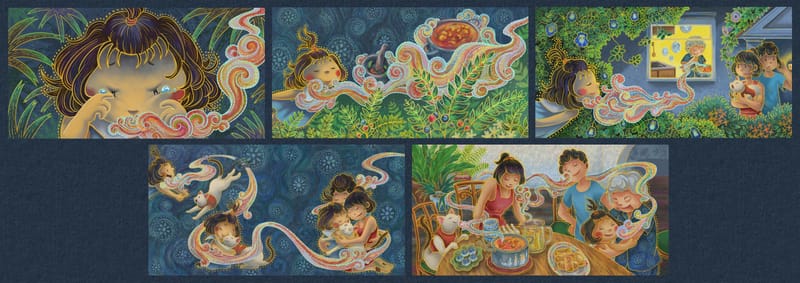
These are the final 5 illustrations I submitted for the BCBF Illustrator’s Exhibition. Thanks very much to everyone who shared their feedback!
-
@JQ Love the colors and rendering! Turned out well!
-
@Stephanie-H Thank you! Glad you like it
") The rendering style is experimental, and inspired by batik motifs.
The rendering style is experimental, and inspired by batik motifs.Looking at the pieces now I feel like there are still some things I would tweak, especially the contrast in the last one, but the deadline's over, at least for BCBF.