Color, rending, background feedback - for July Contest
-
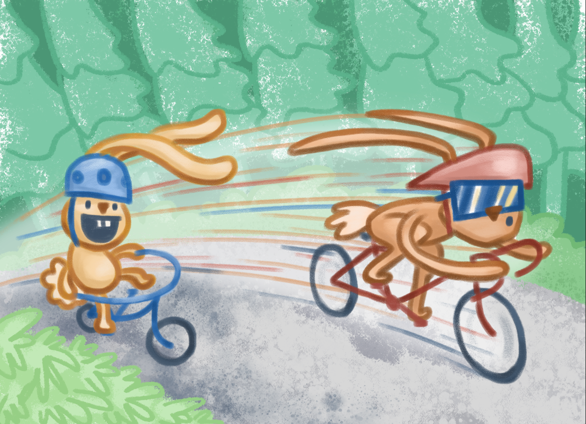
I've been struggling with rendering the background for my submission to the July Critique Arena. I want the style of the background to feel cohesive with the character style, but also fade back and not be too busy. I want it to feel gestural and simple, but not come off lazy or sloppy.
Any ideas on how I can improve the environment/background? Thanks!

-
@Rebecca-Jensen The background is looking great! As for the colours --- I recently borrowed a few library books where the illustrators used VERY limited colour palettes in unexpected ways. For example, red, blue and orange for a woodland story about bunnies. Another one was predominately blue and orange for a schoolyard setting.
To make this illustration pop, I'm thinking why not go in a different direction? Do the trees need to be green? Try purple, red or orange. Do the bunnies need to be brown? Try using a complementary colour to the trees - something totally opposite on the colour wheel. Make it fun and magical, it might elevate your whole story! ^_^
-
@Rebecca-Jensen I think you successfully made the background recede using less contrast and cooler colors. I like the movement in the leaves caused by the fast bunny. One thing that is perhaps drawing attention to the background is the texture. The bunnies have less texture, so it does distract a little. The expressions on the bunnies is clear, and there's a nice sense of movement.
-
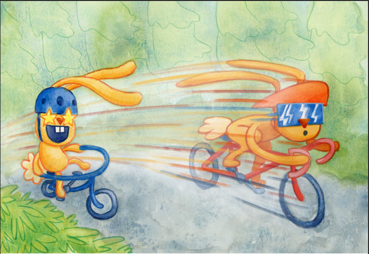
Thanks for the feedback! I did fiddle with the Photoshop version some more, but also made an analog version (watercolor, gouache, colored pencil + Photoshop finished). I found it easier to find that 'fade back' transparent yet textured look with real watercolor. Plus it's fun.


