My road race wips ^_^
-
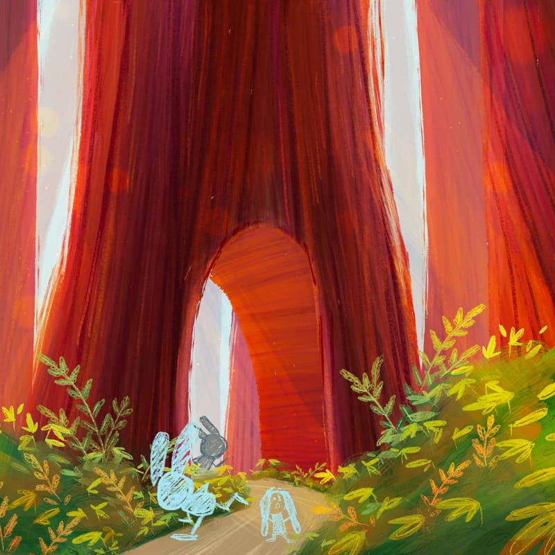
Update fitting characters into comp!
-
@Asyas_illos absolutely gorgeous background design
-
@AngelinaKizz thank you I was a little worried it was a bit too saturated.
-
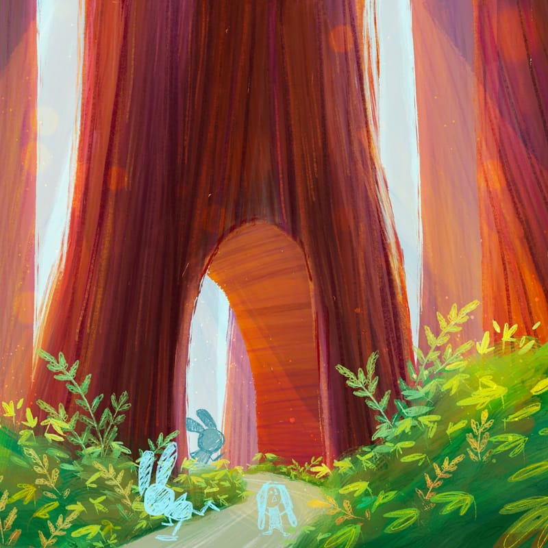
I did a light blue overlay layer over the whole thing just to see if it would cool it off a bit.
-
@Asyas_illos The ghost bunnies are a great addition! I like that a lot and great job with your color palette too!
-
@Asyas_illos I love this whimsical piece! I can totally feel that this is her dream and I think you've done a really nice job of making her color that pinkish coral - it really draws your eye there.
I'm thinking, one thing that might make it even stronger would be to make the fish a less warm color - the yellow is nice and lovely but its so bright I just wonder if they were perhaps a sea-foam green or a light purple if the story would be even clearer?
I'm only bringing this up because the fish are so beautifully done and I feel my eye wanting to look at them more than the main character.
But absolutely great work on this one!!
-
@Kristen-Lango thank you for the feedback! I’ve already submitted but maybe I’ll play around with those colors and see what happens. Thanks!
-
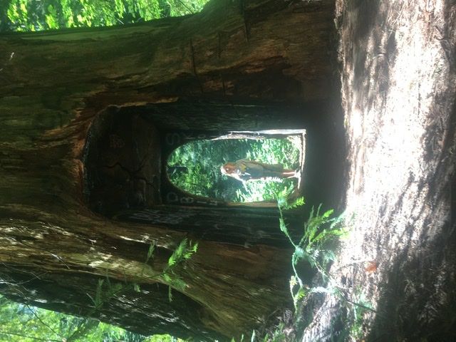
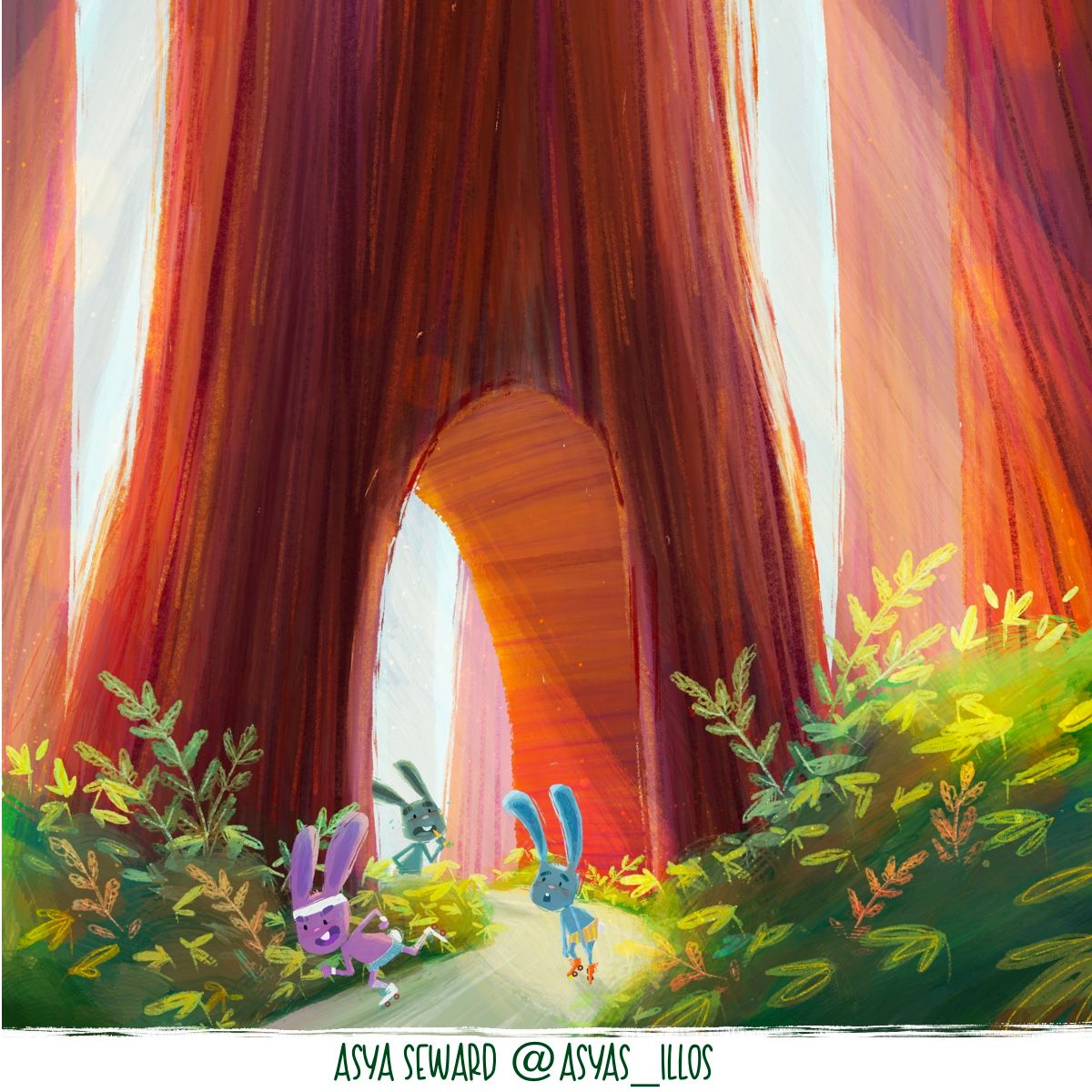
Whoops sideways… this one is obviously not a drive through but a walkthrough it’s been cut into an old stump, so it’s not a living tree anymore.
-
Coming in late but loving them all. The bright colors, textures and imagination are all great! Seems like you are overflowing with ideas, lucky you!
-
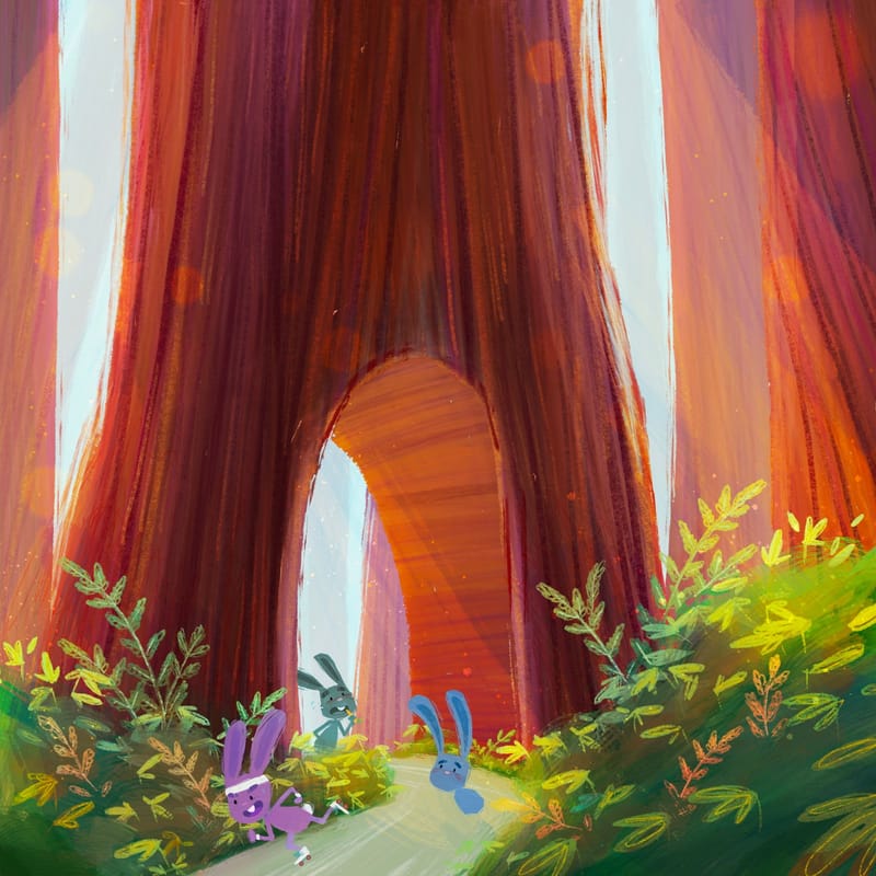
Still working on characters lol
-
Not sure what else I can do here needs something else though I think…
-
@Asyas_illos This is great, I love the colors! The only issue I feel there might be is that my eye is drawn to the awesome lighting around the tree and less on the characters.
-
@Asyas_illos This piece has a really beautiful atmosphere! In fact I think it's my favourite of the three
 The lighting really conveys a sense of grandeur and awe.
I agree with @Frogpunzel though, that the story around the characters is a little lost. I know your initial concept was to have one of the rabbits be so in all awe of the large tree that it forgot about the race, but it doesn't come through very strongly at this point. The expression on the blue rabbit looks a little more "dumbfounded" and "tired" (because of the slouch) than "awestruck" to me (maybe change his mouth to a smile and add "shiny eyes"?), and my eye is actually more naturally drawn to the grey-green rabbit as he is brilliantly contrasted against the white light behind to tree.
Perhaps you could try changing the awestruck character to the grey-green rabbit, like he's just coming in under the tree and is looking up into the arch? He could be so awestruck that he's forgotten about the carrot he's holding and he's holding it kinda limply in one hand.
-
@JQ thanks for the feedback I’ll see what I can do! I know it didn’t go quite as planned lol!
-
This post is deleted! -
This post is deleted! -
Yes, it's not a "rabbit road race" idea, but I think your daughter just gave you gold for a portfolio piece.
I love the idea of "carrot-sel" with carrots replacing the horses. It would be even funnier if a young rabbit couldn't resist taking a bite out of one of the carrots.
-
@Asyas_illos You’ve got the medium and huge components of the composition, but I think you could use more small objects; particularly on the cloud the frog is sitting on. Maybe little flags sticking up or something?
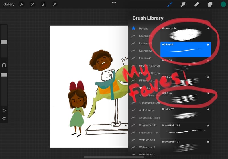
Really loving this piece, the colors are gorgeous and I love the brushwork style especially on the edges. What brush/ brushes do you use?
-
@Griffin thanks griffin I generally use only three brushes in procreate one a gouache brush two a rake, and three 6b pencil for details. Plus a couple watercolor things for sparkles and finishing touches.
-
@Griffin i think those are in procreate though I’ve downloaded a few brush packs that they might have apart of… I can’t recall.