Feedback request :)
-
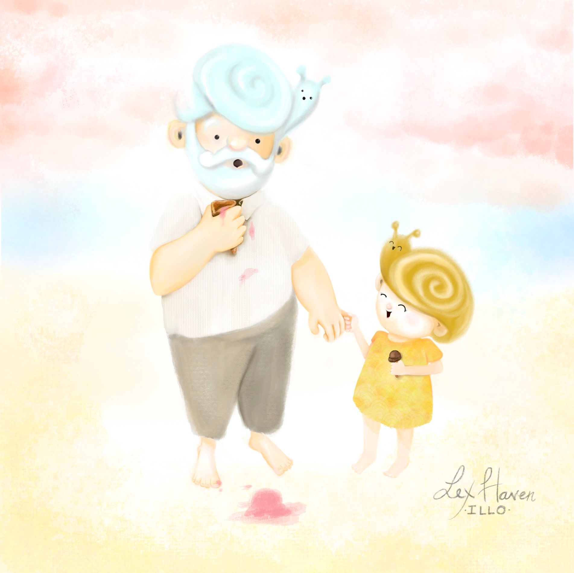
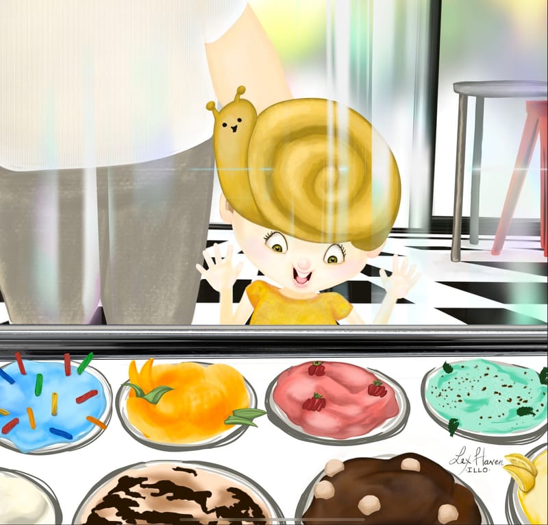
Hi, I’m developing a portfolio I can take to scbwi in Aug for children’s book illustration. My regular job is oil painting portraits. So I struggle a lot with what to leave out of illustrations because I’m used to painting every detail as realistically as possible. These two images are part of a mini project I’m doing with kids that have animals for hair.
The top image, I think maybe is too soft, I lost too many edges?
The bottom image, with the ice cream shop, went too far the other way and is way too detailed and saturated. Help!Thanks in advance for the feedback!


-
@Lex-Haven I think the colors are really lovely, the style is good but the silhouette is kind of missing. Also, I think you may work a the composition a bit more and get some contrast from the background.
-
@Lex-Haven Your style is nice and soft but I think as you yourself have mentioned the softness is a bit overboard. I think you should still be able to keep the soft/gentle look and feel of the image while refining the edges more and ensuring that there's sufficient value and/or colour contrast between the characters and the background - right now in both images it's too fuzzy.
The white in the first image is a little overbearing and I can't figure out where they are supposed to be - is it the beach? Or are they floating amongst the clouds? Or are they in heaven? (Sorry, that's the connotation that the diffused white light around the figures gives me)
I think your second image is actually stronger because the ice cream is well-rendered with good edges. The character and the background (the floor of the ice cream shop) is actually what I feel detracts from the image - there isn't good contrast between the character's face and the background and the checkerboard pattern itself is too distracting and draws the eyes away from the character and the ice cream, which should be the focal point. The way the reflections on the glass are rendered again feel too "airbrushy".
My suggestions would be to harden the edges and darken/tone the characters more (eg. really shade with darker reds/beiges on the face and arms) OR darken the backgrounds/choose different hues so that there's better contrast between character and background.
Hope this helps!
-
@Lex-Haven lovely, sweet characters. I've never seen animals for hair, so points for originality!
Yes, the first illustration is very soft, to the point where it is hard to read. Otherwise, you have chosen a great palette and have nice expression. Adding a smidge more value and a few edges will probably fix a lot of your issues with the piece. (Don't forget shadows too -- the lack of shadows, even light ones, makes the characters look like they're floating. Unless they are?)
The second illustration has more defined edges, but the edges are actually making the illustration harder to read and detracting from your character, who is supposed to be the focal point. The floor and ice cream are so saturated, with stronger values than any used in the main character.
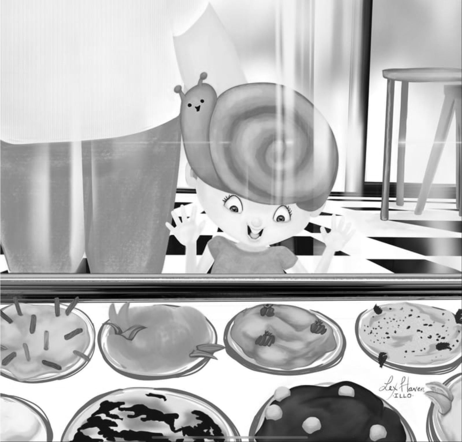
Hope you don't mind -- I took a screenshot to show some examples of what I'm talking about, because sometimes a picture is just easier!
This is the 2nd illustration in black and white so it's easier to see the values. If the intention is to have the ice cream as the focal point, then the illustration is fine as is. But if the intention is for the girl to be the focal point, you can see that with all her lighter values, she gets lost. Because there is so much contrast in the ice cream and background, those elements compete for attention and overpower the girl.

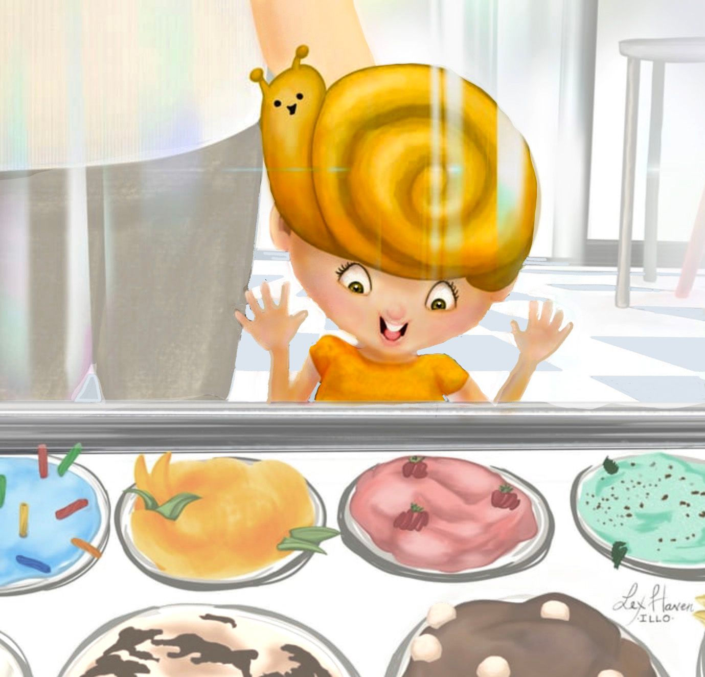
Here is a visual suggestion of just one way to adjust those values:

In this example, I lightened the ice cream and the entire background. I also changed the tile color from black to a light gray blue. The girl is darkened considerably and she was given the most saturated colors to help her stand out. The illustration is also cropped to draw more attention to the girl and place her a little off center, which adds interest.
There are lots of ways you can go with this illustration. This is just one example. And it's just a suggestion -- this is your art and you can do whatever you want with it!
Wow, you've given yourself quite the challenge: finding a new style in just a few months! It's great that you're diving into SCBWI and are serious about getting your portfolio ready for the summer conference. As you're doing so, here are a few things to think about:
-
Make sure your style is consistent. There are a few inconsistencies between these two illustrations, aside from the rendering. In one illustration, the characters have dots for eyes; in the other, the girl has more detailed eyes. Since this is a new style for you, I suggest picking one and sticking to it. For this particular style, I think that the dots for eyes works much better and is much cuter. It also looks like you used different brushes -- not meaning that you have to use only the same few brushes, but you might want to consider it. Again, since this is a new style that you're figuring out, finding some consistency will go a long way to making it look more polished.
-
Why are you changing your style? Is it for a change? Because you want to? Or you want to work faster? Or is it because you're afraid you won't get work with your more detailed style? If it's the latter, know that is not necessarily the case. There are a ton of children's book illustrators with a more realistic, detailed style--rendering with oils, acrylics, watercolor, digital, and more--and they're consistently getting work. There isn't one "children's book style". You can even work in more than one style. For example, you may want to check out these illustrators: Kadir Nelson, Hannah Harrison, Brian Lies, Matt Myers, Aaron Becker (he has more than one style), Eric Rohmann, Adam Rex (also works in more than one style), Daniel Kirk, David Wiesner, Jerry Pinkney, Erin E. Stead, Jonathan Voss, Christopher Denise, the Fan Brothers, Jason Chin, Floyd Cooper ... there's more but this will get you started.

-
Check out illustrators whose style is similar to your new style. Not to copy them, but to get some inspiration and to see what's already out there. What are they doing that works? What makes their art appealing? How can you incorporate that into your style? Here are some illustrators with a cute, simple style that you may want to check out: David Walker, Renata Liwska, Emily Winfield Martin, Helen Oxenbury, Charles Santoso, Shahrzad Maydani, Molly Idle, Patrice Barton, Sophie Blackall, Sydney Hanson, Vashti Harrison. And of course, there's more, but this will get you started.

WOW, this turned out to be a long reply! Hope it's helpful. Looking forward to seeing more of your work and where you go with it!
-