Critique on Storm Entry Request
-
Hello svs-ers,
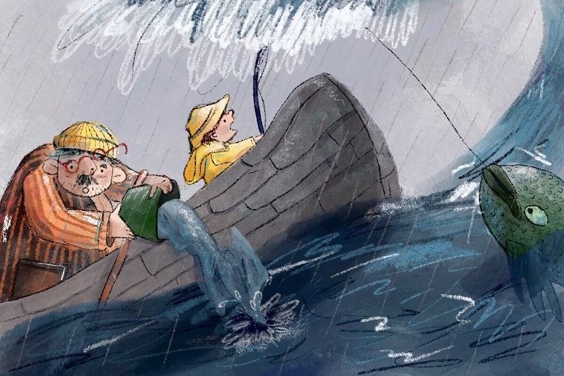
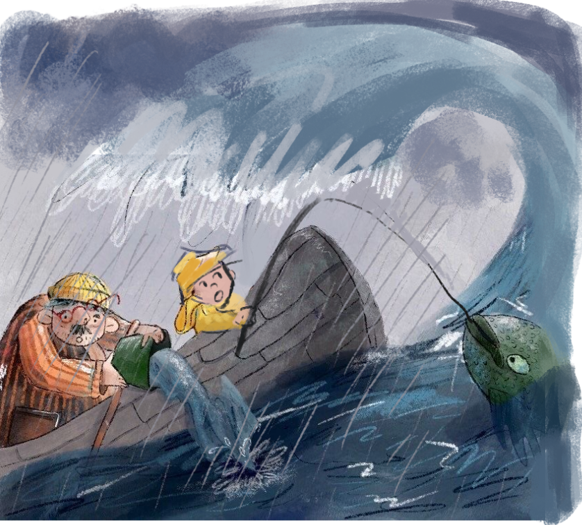
Would anyone be able to critique my Storm prompt? I’m keen to use this in my portfolio but unsure how to improve it (it obviously wasn’t selected for the top 16 for a reason) .
Thanks!
Chloe
-
@chloekrog Wow, this is really cool! I don't think there's any issue with your style, character design, colours, etc - this is all gorgeous to look at! I think the problem may have been two things:
- The image was cropped too tightly
I feel like I'm missing part of the story because it's zoomed in so closely. Maybe you could have panned out to the storm going on the background so we could see how far out they are at sea (maybe show a distant shoreline or fishing village, this could have heightened the atmosphere and drama). You could have showed a bit more of the wave, or highlighted the frailty of the little boat by showing how small it is surrounded by water and so on. Some lightning or a stormy, red sky would definitely add some danger.
- Confusing story-telling element
This ties in to the first point -- because it's cropped so tightly, I'm not sure where I'm supposed to be looking and how it all ties together. For example, the girl is distressed by the wave, but I'm directed to look at the fish she's just caught. The father is dumping out water, so clearly they're in some trouble, but the girl is still trying to fish, and even the father is looking at it, so is the fish important somehow?
These questions don't need answers, this is just what I'm thinking as I scan through the image ^.^ And overall it's a really good piece! I think tightening up your concept, pulling out wide a bit, picking a focal point and somehow making the whole scene more striking and memorable (whether it's with lighting or stronger story-telling), I think it would have been a really fantastic entry.
-
@chloekrog I agree about the cropping, I thought it was a storm cloud but now I see it’s probably the crest of that wave. That’s your biggest tension and it’s almost all cut out.
There may be some opportunity when zoomed out to repeat the wave curve in some way with the fish? If the fish seemed to almost be lost that would be a third tension point.
I really like this and your style is a lovely one, I’m always envious of this kind of style! -
@chloekrog Your style quite reminds me of Quentin Blake! It's really nice and textured.
I think one thing I would have liked to see more is making the element of a "storm" stronger. The way the rain is rendered now it looks a bit more like a light drizzle than a perilous storm at sea. I was slightly confused by the water on top at first as well, because of the cropping. At first glance I thought it was water spouting out from on top of the boy's head, but only after a third look realized it was actually the ocean waves curling over. So I think that part needs to be made more evident.
Now that I realize it's a wave, I'm also slightly confused by the depth and positioning of the wave vs the boy's fishing rod and the boat vs the fish caught on the line. From the size the fish looks like it's in the foreground, followed by boat + boy, followed by wave, but the wave is somehow covering the fishing rod...I think the depth/perspective relationship could be improved here. Also, is the boy looking at the fish tugging at the line or more concerned by the wave? Maybe a better way to convey the boy's shock would be for him to be facing the fish on the line, but peering at the incoming wave out of the corner of his eye, as if he's suddenly caught by surprise?
Great work and hope this helps!
-
@JQ
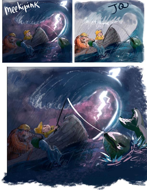
Roughed out quick amendments I made based on the above critique


-
@JQ Oooh, I love it! Including the whole wave really makes a huge difference.
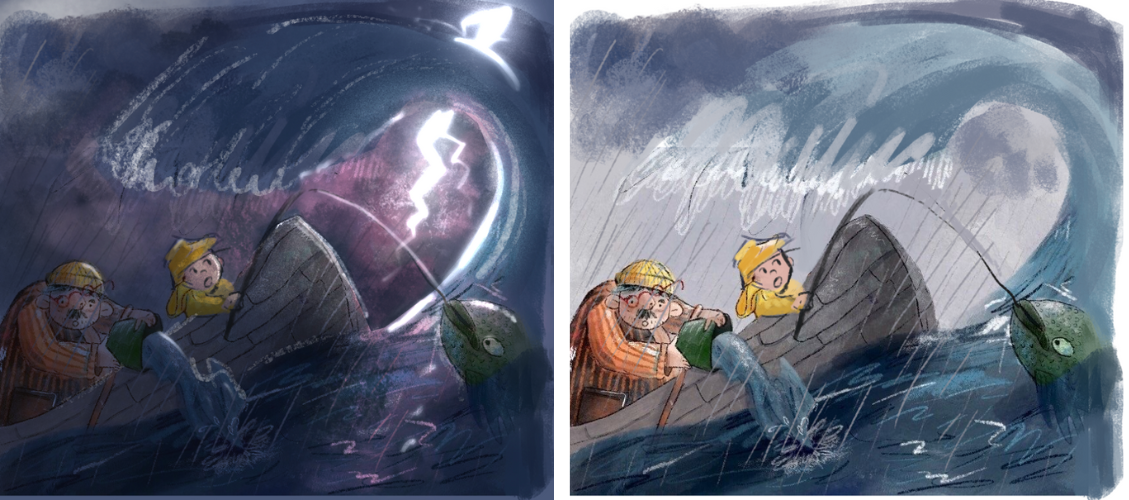
I went ahead and had a little play around with the lighting. Probably went too dark (it looks like a night scene now), but you can see what I was getting at. The lighting really affects the mood and adds to the drama, and I think having that bright flash of lightning in the sky pulls your focus to the STORM instead of the fish.

-
Yeah that's heaps better with the bigger wave. I'd go even bigger with the wave though. When designing think in thirds and fifths — so at the very least the boat should be taking up the bottom 1/3. With the draw-overs it's more like half. I would play with 1/5 for maximum drama.
I'm not sure we need the fish. It's very distracting. If you want to keep it is there something you can do to make it less distracting or a more integral part of the story?
-
Oh wow I'm loving to see these draw overs that @JQ and @Meekipink did - right away those two changes make the piece a lot stronger and more clear.
They've inspired me to add my two cents:

I think you should really push the pose of that boy and have a lot more tension of the fishing line.
Also I thought that making the fish larger would enhance this feeling of proportion and make you feel like "wow this boy and fisherman are really small compared to the storm of the sea and it's creatures"
Also personifying the fish more because why not?
 this is a kid's book illustration afterall and I think the fish would be a little angry about being hooked
Hope this helps! I absolutely love this kind of collaborative drawover stuff!
-
Wow, thank you for all this helpful and constructive feedback. I can see now how this piece would be more powerful with all your suggestions. I’ll try rework it and see where I go.