Sketch for Portfolio
-
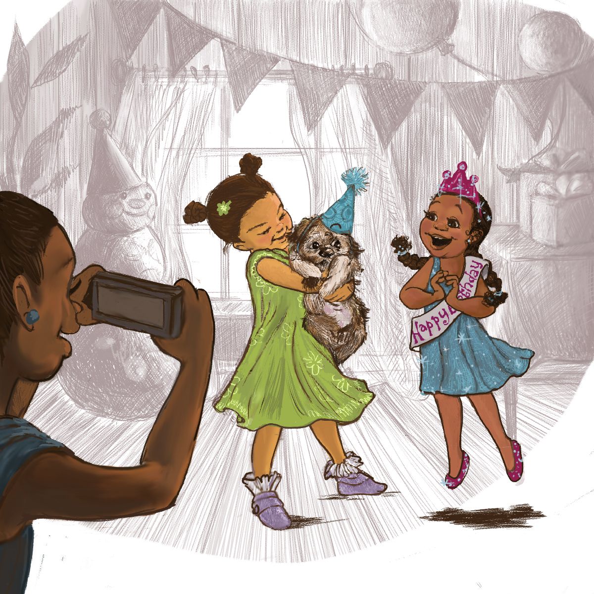
@ArtistErin This illustration is very cute. The characters look good and I like the colors. I also love the background being subtle. Very nice!. I like the new expressions of the birthday girl, but I am wondering why is she not looking at the puppy if that is what she is excited about? It looks like she is looking upward to something, but I am not sure what. Personally, I feel like the boys eyes are drawing a lot of attention, and would tone them down a bit or make them not as big. There is just more contrast with the boy's eyes than the middle character who I think is supposed to be more of the focus. Great job.
-
@Kim-Rosenlof Thank you Kim!!! I will make some changes! I loved your submission to the "Storm" challenge, BTW!!! I'm watching your posts and you definitely inspire me so just wanted to thank you for being in this forum:)
-
I love your handling of the characters and background in this! The background has a lot of detail, but doesn't overwhelm the characters because of it's lack of color. The kids are cute and stylized. Not weird.
 Awesome job with that! I agree with Kim about the Birthday Girl's eyes looking at the puppy. Also, you mentioned her feet. Little girls tend to bounce on their tip toes when they're excited...at least mine do! Changing her feet to look almost like she's dancing might make her pose a little more interesting.
 -
@Kim-Rosenlof I wanted to congratulate you , for many successes this year. Excellent work, and thanks as you encourage me to go more in a direction that is closer to my heart.
-
I love the images of the kids. The backgournd could either be more blurry or have some color. It is well drawn but it seems to argue with the style of the kids. the style of the kids is very nice, I might try to do the same with the background.
-
@PenAndrew Thank you very much!
-
@ArtistErin Thank you! That is kind of you.
-
@Russ-Van-Dine I'm loving how this is coming along!!! Thank you guys for your insights....


-
@ArtistErin Really cute! But I liked your previous version more than this last one, I think the eyes on the dog made it lose it cutenest, also, the girl looks like shes floating in the air. If you wanted her to appear jumping around, maybe you could capture the time when shes "falling down", when the clothes go slightly up because of the force.
Also, the mouth of the one taking the picture is too big, the way you drew it goes way over the eyebrow line.
-
@Eliana-Bastidas yeah I see that looking at them side by side. I should sketch out some gestures and see how those look. I am trying to show a relationship between the skeptical new puppy looking pensively at the exuberant girl. I’m still trying to find a consistent drawing style that makes sense, might go to watercolor/ colored pencil and see what comes of that… anyway thank you for your feedback, it’s helpful!
-
@ArtistErin If you are trying to get a "style" I would recommend to not force yourself to figure out on your own. A lot of people had done the work for you already, so instead of trying to draw things that may or may not work which I think will take years to do, you should take a moment to look at artwork that you really like. Then you can ask yourself, what it is that really make me like this? It's the way the gesture it's drawn, the storytelling, their choice of colors or their lineart? Maybe what you find appealing is the way they drew the "eyes", so try to imite them while you ask yourself what it is that make you like it. I think the way you question yourself it is the most important thing on this because it will help you reproduce that more efficiently.
Then you repeat the process, with several artist and you will get a completly new style because you wont be reproducing a specific artist, but multiple artist with "different" categories in mind.
If it would be me, I would go to the https://characterdesignreferences.com/visual-library, I would check for drawings about dogs that have eyes, get some references that I think may work, ask myself why I think it worked, then try to reproduce it.
Hope this help!
-
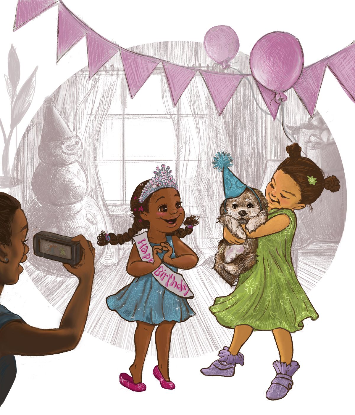
@Eliana-Bastidas Thank you!!! I've practiced this approach to some degree, I just sometimes get stuck on old paradigms and processes and so have to get back to basics and then I feel more confident. My mom found some old illustrations I did for her years ago and although I have made significant progress, I do see a relatively similar "look" that remains consistent which is so assuring. I see that same thread in others' approach/progress. Anyway, my piece, adjusted as I kept looking and tweaking until I feel it's finished state...
Onward and UPward...

-
@ArtistErin looks fantastic! Great job.
-
@Eliana-Bastidas Thank you!!!
-
@Meekipink Thank you!! Still working on proportion, this seems to be one of my biggest challenges…