Feedback please!
-
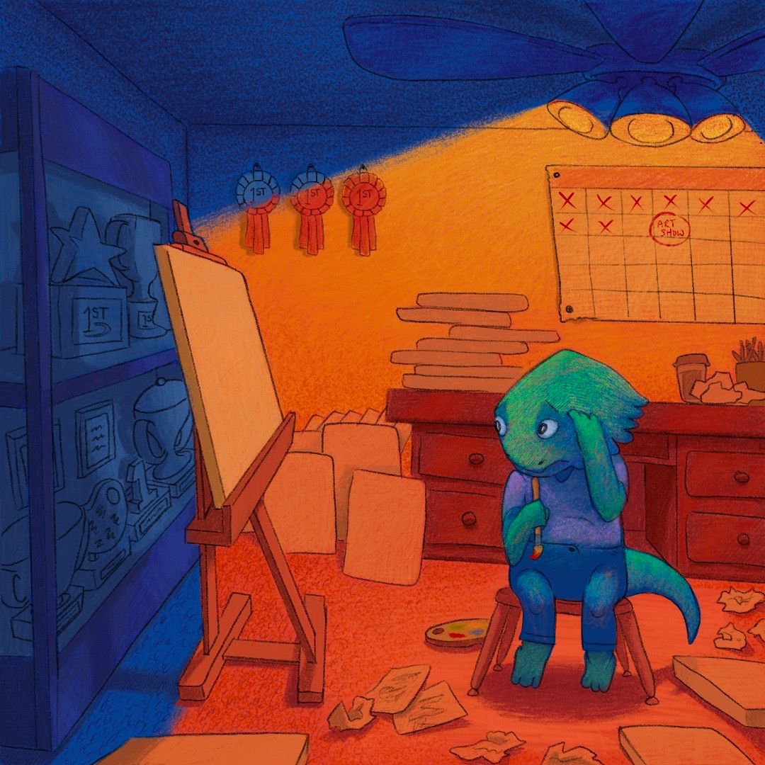
Im working on the word generator assignment. Mine was lizard-painting-show. I did a successful bearded dragon child painter who's under alot of pressure for the art show but has a creative block. Any feedback will help. Just wanting fresh eyes incase im missing anything.
-
Hi, great illustration. The only thing I see a bit out of place would be how the light from the ceiling fan light hits the left side of the environment. If the light is coming out at the angle indicated up top, sloping down along the back wall….then I’d say that’s inconsistent with how and where the floor divides between lit up and in shadow. I’d imaging the canvas and stand casting a harsh shadow against partially brightly lit shelving behind it.
But, I also get how this could be intentional to frame a feeling in the illustration. -
Is there anything, in particular, you're trying to improve on?
Some general feedback, I really like the colors. I think it was smart for you to block the orange and blue so clearly since it helps the dragon stand out. I think your composition is solid, too!One thing to improve is pushing certain elements to heighten the discomfort of the child or how intimidating the canvas is. With the angle you've chosen to draw we are on the outside looking in, which doesn't have to be a bad thing. It depends on your intention. Right now, my focus is on the child and I'm not sure if his anxiety would come across if you hadn't explained it. You can try improving this by exaggerating his pose and facial expression.
Oh, you can also add half-finished paintings to the canvases on the floor.
That's all the general stuff! I also love the texture, by the way.
-
@Patricia-Dishmon
Awesome thank you! I started strong with this one then fizzled out toward the end. Thank you for your feedback. I will definitely try to put more emphasis on his emotions and I think half done canvas is a good idea. I’ve noticed a lot of my work has the “outside looking in” feel. It’s something I want to improve in for sure. -
What a cute illustration and I love your style of rendering. Something that I feel detracts from the quality and readability is the brightness/ saturation of your colors. I find that I'm looking at the wrong spot due (the angle created between the orange and the blue at the top of the easel) to the harsh contrast and heavy directional line. A light on the room shouldn't cast such a spot light, so I would consider softening the blue and the orange so that the focus is on your main character. He's so great, and he's expressing such readable emotions, it's a shame to lose him in the background being so bright.
-
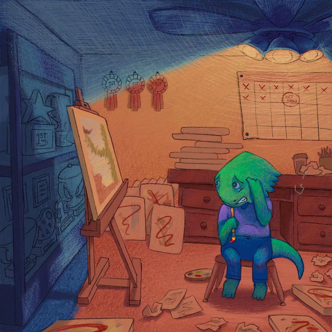
@tonydupreart Thank you for your feed back. Yes the lighting was bothering me too. I thought the blue/orange was really nice in the beginning but as the illustration came to an end It became more confusing then anything. Ive made some changes though to kinda clear things up. Thanks again!
-
@AngelinaKizz Thank you for your feedback. I agree and after reading your comment I took the eye dropper tool and tested saturation percentages from Will Terrys work and found that mine was about twenty percent more saturated everywhere. Ive made some changes and will post the new image to the thread. Thanks again for your feedback!
-
Here is an updated version if anyone is interested.
-
@Solomon-Designs wow I really like your style! It looks very organic and I like how you have so much detail in the background but it blends in really nicely and doesn't compete with the focal points. They are so many little nuggets that add to the story. And I like the new coloring as well. I think perhaps the lizard looks very blue yet, like the light that is hitting him isn't coloring him the same way that it's coloring the room, so if you warm up the greens a bit where the light is directly hitting him (maybe to match the green in his painting and on his color palette) he might look more integrated into his environment. But as it is now, he pops out more and you might prefer that. Love it!