Storm Colour Study — Serious Critiques Welcome!
-
Hi folks,
My entry for the Storm Critique Arena will be focusing on after the storm. We had a storm tear through where I live last winter, felling an astonishing number of trees in the forest. There was a lot of destruction but afterwards a lot of new life springing up in the aftermath as well. So it's illustrating both an ending and a beginning.
This spread is part of a larger story so there are some themes which aren't directly related to Storm :
-
hope
-
peace and resolution
-
the righting of a wrong
-
Being one's own jailer
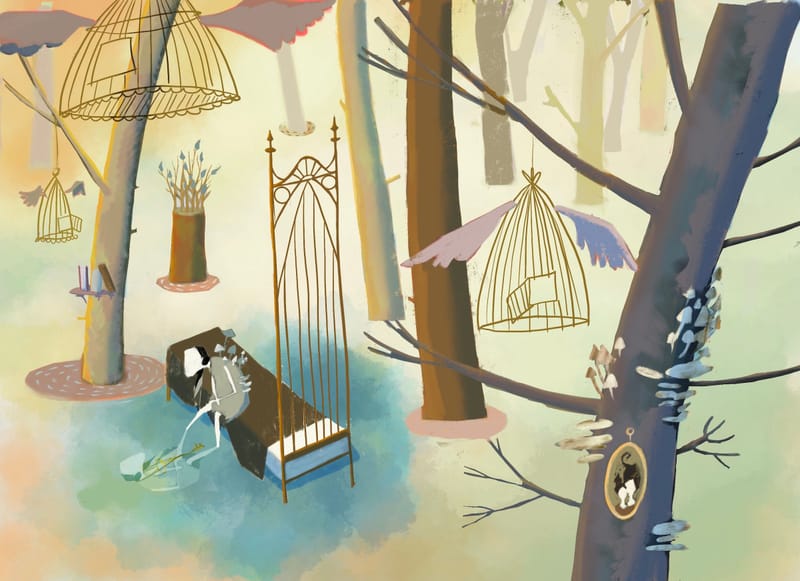
One thing I'm wondering is if I need to add something (maybe like a fallen tree to indicate that the area is flooded? And looking at it now I definitely need some books floating in the water!
Thank you for any feedback you can provide!
the site: katherinetyson.com
instagram: instagram.com/katherinetysonart -
-
@Katherine ooh it’s beautiful, yes some floating books would help also maybe if the tree bases had the same blue around them?
-
@Katherine this will be a beautiful, dreamlike illustration! Love it.
However, to be completely honest, right now it doesn't say "storm" to me. The trees look intact, the color palette is bright, and the overall feeling (to me) is peaceful.
While there is calm after a storm, usually a storm strong enough to cause major flooding also leaves behind evidence that it's been there. Yes, I think you should add felled trees or fallen branches. More than one. Were some of the birdhouses blown out of the trees? Papers scattered out of books? Maybe the wings on the bird cages are tattered or wet? Instead of sitting (dejected?) on the bed, could the character be picking up the pieces after the storm?
What if the background is darker, or we even see tiny storm clouds in the distance, or show the path of the storm? Something to point that it has been here and has wreaked some havoc.
These were my thoughts, at least -- and everyone experiences art differently. Takeaway from me: this piece doesn't say "storm" to me. More evidence of the storm would make it a clearer read for me.
Looking forward to seeing where you go with this piece! It's beautiful!
illustrator - author - smiley person
mbaileyart.com
instagram.com/mbaileyart/ -
I have seen this progress on this piece before and i love it! I also second what @Melissa_Bailey say.
I think, you shouldn't force the storm theme on this beautiful work, maybe you can start over with the character and the bed in focus with an all new background? with felled trees and so on.
Your intention for this piece was different as you say, i wonder if you try to put even more story into it then already mentioned, will someone be able to read it at all?I don't know about your story and maybe it's just like it has to be, but maybe you want too much from just one beautiful piece.
Have you been in a wood after a storm? We had some crazy storms in the past years here, and a loooot of trees where felled by the storms and some smaller woods just seamed to have disappeared, because the damage was just to big and the villages made their choice....i guess it was just an easy excuse to get more land for new buildings.
I am looking forward to what you make out of it
")
Website: www.von-Nimmermehr.com
Instagram: https://www.instagram.com/von_nimmermehr_illustration/ -
@Asyas_illos Thanks Asya — I was thinking the same thing with the blue at the base of the trees and will give that a go
-
@Melissa_Bailey Thanks Melissa — yep I agree, it doesn't scream Storm, does it. I've tried a few of the things you suggested today and kept some and scrapped others — I'll share an image later this evening
-
@von_Nimmermehr Thank you and yes it was originally destined for the Sprout theme late last year but I didn't make the deadline! I agree with what you've said and I tried some felled trees etc, as Melissa suggested and it just didn't feel right. So although my final piece might not qualify for the Storm theme I'll stick to what feels right for the illustration — I don't want to sacrifice the dominant themes and atmosphere of the piece just to qualify for the Storm Critique Arena.
-
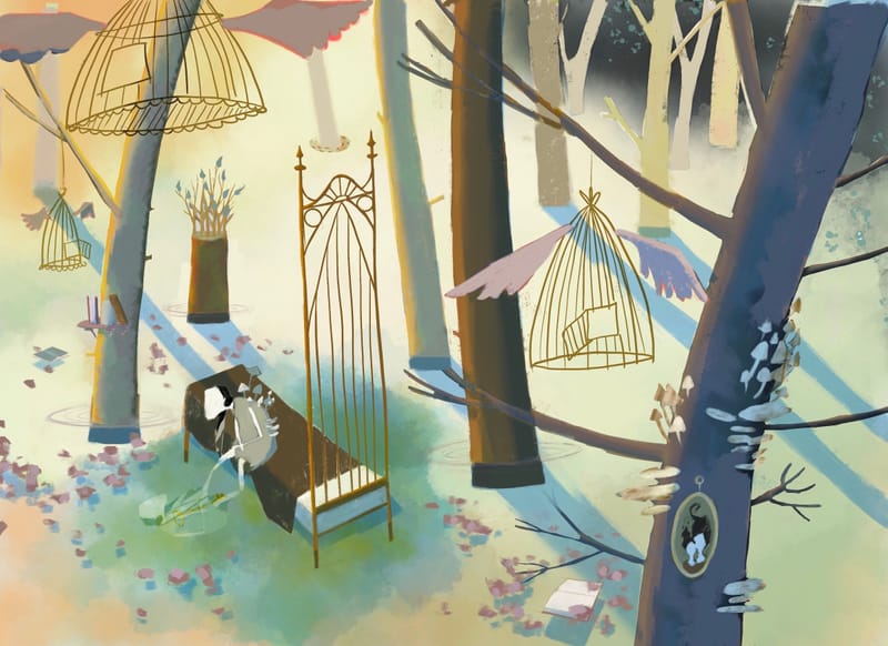
So I made a few changes, as suggested:
-
Books and leaves (although they look like petals) floating on the water
-
the base of the trees hopefully look like they're under water (this is still just a colour study so I didn't put much effort into the rendering)
-
I added a glimpse of the departing storm at the top right corner — I intend to make it more indigo than it looks here
I also added some tree shadow, which I've played around with many different compositions of and still think they look a bit lame. Not sure if they're adding anything.
It may still not scream Storm because I tried some felled trees and it just felt wrong. I like the idea of making the wings wet but that seems beyond the scope of a colour study so I'll leave that until it comes time to paint.
Have the changes I made helped? Should I push any of them more? Any thoughts on the trees' shadows?
Thank you!
-