A "Storm" WIP that lacks cuteness
-
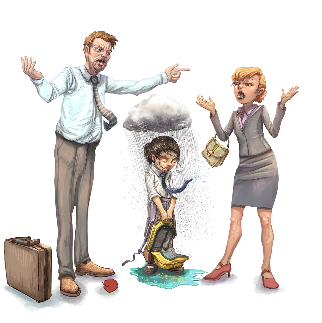
My kids recently played and loved the game "It Takes Two" which is the inspiration for this pic for next month's "Storm" theme. Going for a spot illustration/editorial type feel and I think it lacks the cuteness and is too sad to make the top 16 or win but would love any feedback.

-
@Jeremiahbrown Very nice rendering on this image and I can see your skill level in expressions and color and lighting and poses is very high.
I think I'm a little confused by the arrows - I think you want to explain that fighting is a vicious cycle where the little girl is caught in the middle of this storm, but I'm not sure that the arrows need to be there - they feel a little "old" to me, like something I would have seen years ago.
The other thing that I'd flag is just that I feel like I've seen this before. I'm not sure if maybe there is a way to put a spin on this to make it more unique.
I look forward to seeing what you come up with next!
-
@Jeremiahbrown it reminds me of the posters I would see in some of the schools in Vietnam, depicting children and their moms getting hit by drunk dads. So, I agree that its not cute, but its really good! I agree on the previous comment about the arrows, but they didn't stand out to me either.
-
@Kristen-Lango Ahhhh! You're right on all accounts. The arrows made me cringe after looking at them again. This might be a scrapped idea but I'll give it a little more thought and time to see if it can be saved. Thanks for the feedback!
@AlliFaith Eek, more encouragement to either make major changes or scrap the idea. Thanks for the honesty! I appreciate that about this community.
-
@Jeremiahbrown well does it really have to be cute? I know that CB illustrations are the focus around here, but sometimes sad stuff is necessary. I don't think you should scrap it! Plus, you can always submit more than one.
-
@Jeremiahbrown This is well done! Love the story telling... clear emotion going on and I'd say it's important, not everything is a rainbow and butterflies.
 I agree with you, I'm working on my storm value study and wondering if it triggers but oh well, our purpose is to tell a story and progression of emotions!
 -
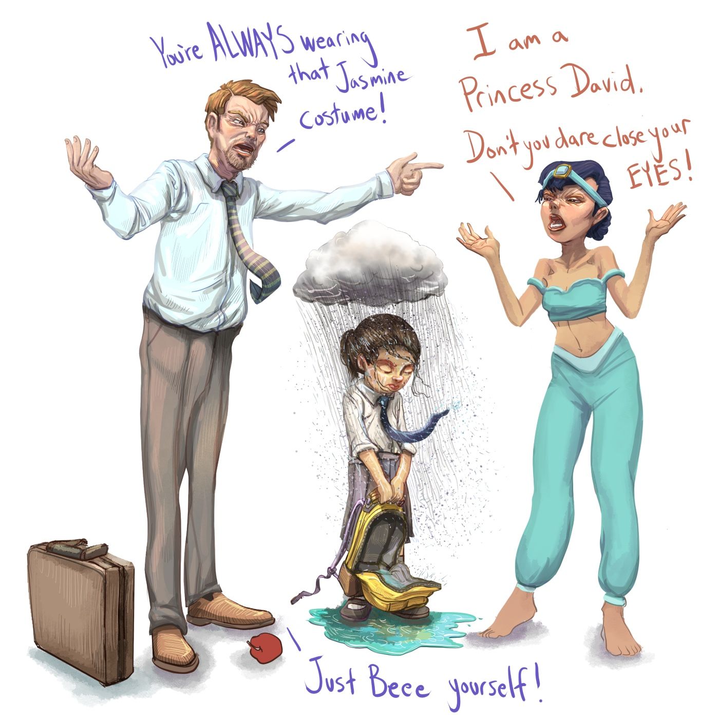
@ArtistErin I'm going to table this for the time being as I couldn't come up with anything. I did make this absurd and silly version, haha.

-
@Jeremiahbrown hahahahahahahahaha
-
@Jeremiahbrown oh my lord this is hilarious

-
@Jeremiahbrown Love the concept. My first idea I was toying with was really close to this so I might make a course correction

-
@Jeremiahbrown I think I would bring the child forward creating more of a triangular composition and focus which also allows you to show more of the child, as at the moment they are all alongside one another, you could also knock the parents down in value. I think the arrows and directions have to be either less pronounced or more pronounced. Excellent rendering as always.
-
@PenAndrew Thank you, those are great suggestions. I'll play around.
@jdubz Haha, there's potential there somewhere -
Hi @Jeremiahbrown, this is yet another wonderfully rendered illustration of yours. I've just managed to watch the 'Lucky' Critique Arena (wow, that was crazy wasn't it?!
 ) and Will kindly did a draw-over on my illustration which had the same kind of layout as this. He changed one of the elements to be in the foreground and it really made a difference, just as @PenAndrew has already mentioned above
  ️.
️.Even if you feel this would not be suitable to get into the last 16 for Critique Arena I would suggest to keep it, as this may be a great portfolio piece to show an editorial style illustration.
-
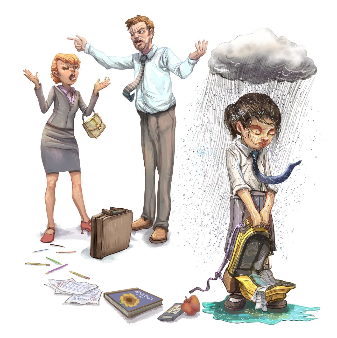
@lizardillo @PenAndrew I took your advice and gave it another go.

-
@Jeremiahbrown that really enhanced your story! The girl is much more the focal point, and she feels more ignored.
-
@Jeremiahbrown oh that really helped! I think this is much improved - the only thing I'd maybe change now is the direction that the mom is looking in... right now it seems she is kind of looking into the distance, and I think it might be even more effective if her glare was darting at the dad, which will give an even bigger emphasis to this young girl being really forgotten in the storm.
-
@Jeremiahbrown Yes, it is visually stronger, and now the sense of isolation and hurt is stronger too, and I like the trail leading to her.
-
@Jeremiahbrown this is so much fun- with the comments and I love the Princess jasmine costume and what this says about the character.
-
@lizardillo I am still waiting to see this Lucky critique arena. It sounds like a not to be missed episode!
-
@Jeremiahbrown That’s really working now


