Tiger - Constructive Feedback Requested thanks.
-
Good morning,

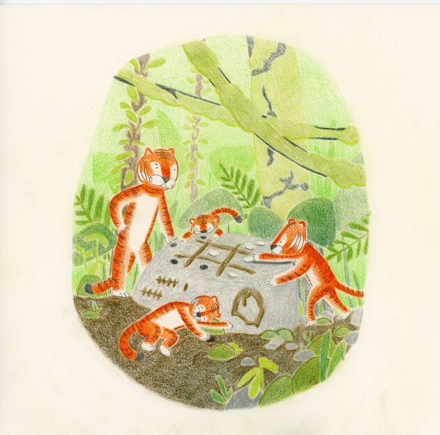
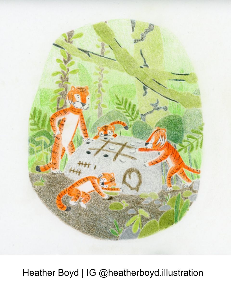
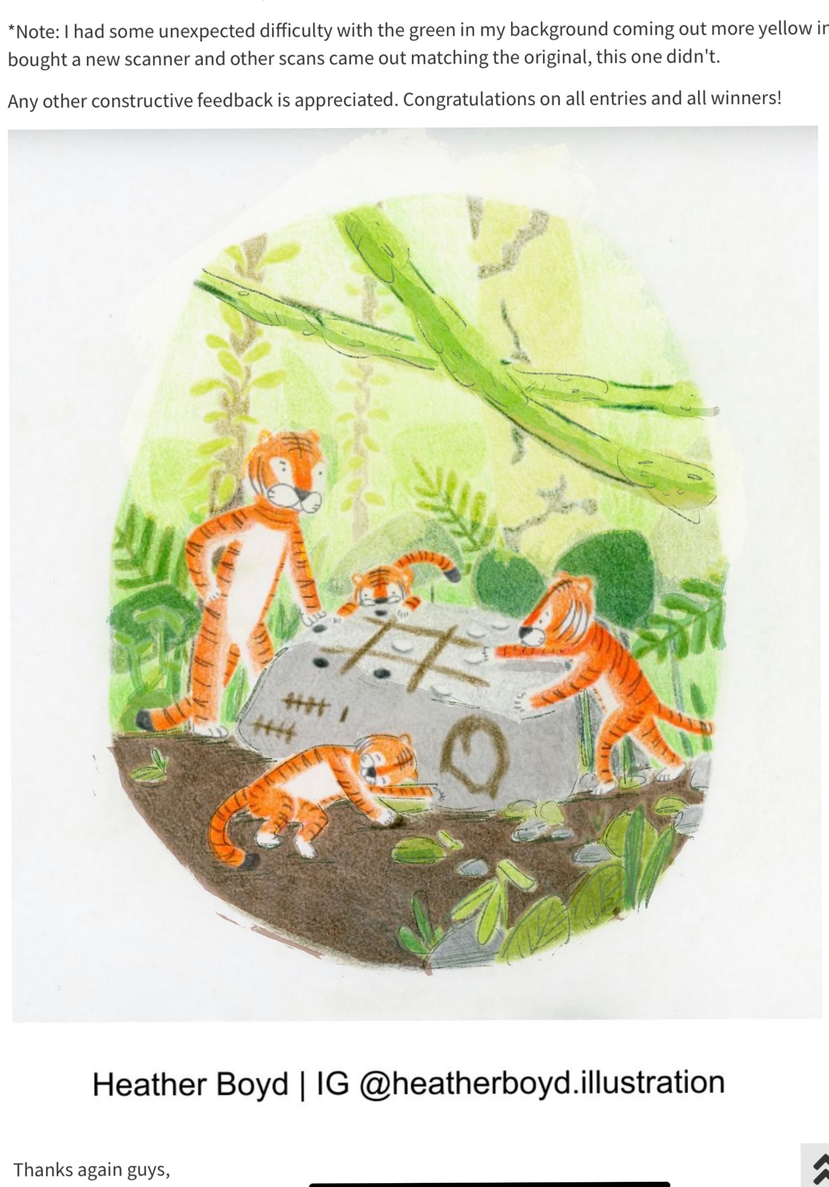
I am looking for some constructive feedback on my Tiger entry work. Questions I am looking to answer include the following:- What works well (colour, value, composition, characters, story, consistency etc...)?
- What story do you read? (In short: The young tiger finally won a game of tic-tact-toe.) Is this story readable, if not how could I have brought it more to light?
- Do you think I need to add pencil line work in the background to compliment the line work in the characters, or is that not needed?
- What could use some improvement?
*Note: I had some unexpected difficulty with the green in my background coming out more yellow in the scan. Just bought a new scanner and other scans came out matching the original, this one didn't.
Any other constructive feedback is appreciated. Congratulations on all entries and all winners!
Thanks again guys,
-
@heather-boyd this is a great illustration, I think it just needs to be slightly more readable. The background is so bright my eyes get a bit lost in it. To solve this I think maybe adding just a bit of line work around the characters and maybe some of the foreground elements would help. You could also try darkening the background a bit so it becomes more of a light characters on a dark background look. Right now it feels closer to light characters on a light background. Hope that helps!
-
@heather-boyd I love how focused the tigers look, they are so engaged in the game, that is great. I also think you did great for the setting, there is a lot of different foliage, it looks really like a place in the midst of a jungle.
I agree with Griffin that you could use a darker value in the background and maybe a more desaturated background.
For the story moment, I did not immediately get it. But that is really hard to solve. My idea would be to draw the moment when the little tiger puts the last winning stone down. The viewer understands that the third stone in a row is the win and the tiger could be really exited, maybe throw the otehr paw up. But that is just my first idea.The tigers are super cute and relatable and I think that is most important.
-
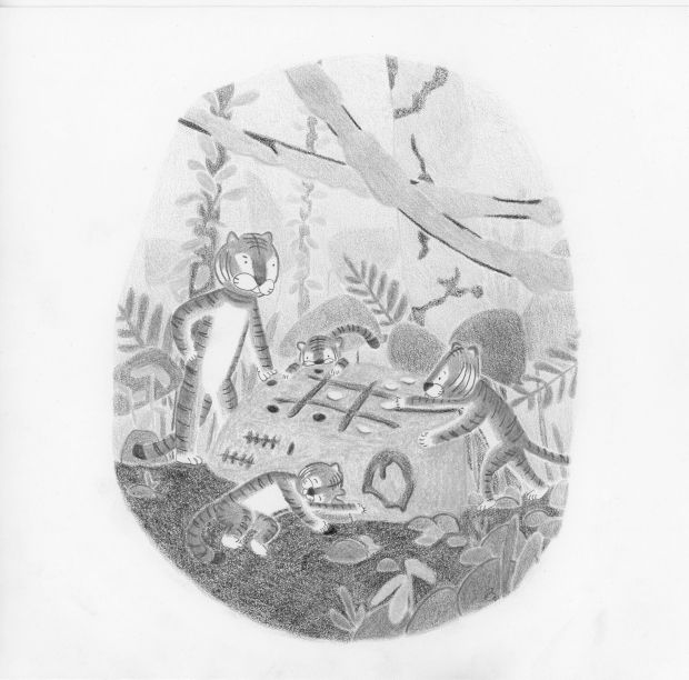
@heather-boyd I agree with the other comments about the background. One way to help notice stuff like that more is to take a photo of it and turn it into black&white image. Sometimes we confuse change in hue for change in tone when they are more similar saturation than they may seem. There is one thing I probably would have done differently about the tick-tack-toe game on the rock... it needs to be clear if the lines making the game are sticks stacked making the # shape, or if it's drawn on. And the white stones blend in to the rock if you squint. To fix both of those things, the big rock would need to be slightly darker grey and the sticks would need to be more brown and maybe outlined to have cylinder shapes to them. And maybe the points should be in white like drawing on a rock with a chalky rock, and have the tiger on the bottom drawing another point on the score.
But those are just stuff to keep in mind for next time. I love the tigers and the style and the soft texture of the medium you chose for the illustration. Can't wait to see what you'll post next! -
Hi heather, I really like the concept here, but I don’t think the story is quite clear enough. I think if the young tiger who won would have a really enthusiastic gesture like leaping in the air or throwing his hands up, it would help out a little, I’m not sure even which tiger has won, maybe take out a character? Also the colors are nice but seem really close in value, I think darkening some areas, more so the foreground, would help with some contrast. Lastly I don’t think you need to add much to the background if anything adding some pencil work to foreground would really give it detail and help separate the different layers. I did a draw over I hope you don’t mind. I didn’t change any characters though I wasn’t sure which one was the victor? I mostly just tweaked the values a bit.
-
To everyone that is included in this post, thank you for your kindness and suggestions.
@Griffin
- Concerning brightness of the background, I tried fading to lightness because things in the distance are lighter but perhaps that is further in the distance. I did plan light on dark. So I was uncertain how to combine these two ideas. I'm not sure how to solve it.
- Line work addition in pencil crayon might be a good suggestion if I keep to the colours of the tiger I already used. I'd like to add colour lines to future work.
@Sonja-Müller
- Desaturation I totally agree however all my traditional pencil crayons are well saturated. Do you know away to get around this or do I need to buy more variety? I also want to buy a pastel coloured set.
- That was the story, but I understand about the lack of enthusiasm. I was going more for how the younger winning tiger was a bit timid for the win especially with the anger of the older one increasing. I also understand about the positioning of the other paw. My point there was concerned about supporting the tiger leaning forward.
- Thank you for reminding me about taking a photo and changing it to b/w. I have done that in previous works. And I will take a look for this one.
- The lines are actually mud. I certainly struggled with visually describing mud. I tried to tell the story with mud being put on the rock by the sleeper/tired waiting tiger whose hand is in the mud, who tallied the game wines on the rock also.
- I agree about the white stone blending in with the large one, I tried to add shadow to those.
- I really love my 4 characters however if you kept them in I wouldn't mind a draw over.
- I tried to darken the younger winning tiger a bit, but I didn't want him to feel like a different type of tiger if I made him a stronger orange/red tiger.
- I understand about the enthusiasm (I mentioned above in @Sonja-Müller reply).
Again, thank you so much, I appreciate it. I work traditionally so I will take what I am able to test and apply some changes to my final work sparingly. But absolutely take it forward to newer work -esp. April's Treehouse!
@Asyas_illos
No I don't mind, thanks for keeping my characters. I try to keep mostly base value colouring with minimal other shadows. But I will consider what you've done. Perhaps a little more form shadow can eliminate the need for a hard pencil line work, or as I mention to @Griffin maybe have a darker coloured line instead. I had considered the addition of adding pencil line work to describe some of the interior leaves like you have done but since only my characters had line work, I left it off. Thanks. -
@heather-boyd I am sorry, I have nearly no experience with traditional media besides alcohol markers and some inking. I understand that you wanted a more nuanced pose and I really like that.That can be way more interesting than the obvious emotion, it is just harder to communicate I think.
-
Hi Heather. I think your illustration is really lovely. And I love the style. I wasn't sure what the story was either when I first saw it - I thought the larger tiger was watching over the little ones playing. There could be a bit more tension in their body language perhaps? Maybe you could have the larger tiger leaning in more and snarling whilst the younger one looks up at him, a little worried as he plays his winning move? So the two tigers who are playing are meeting each other's gaze. Hope this is helpful.
-
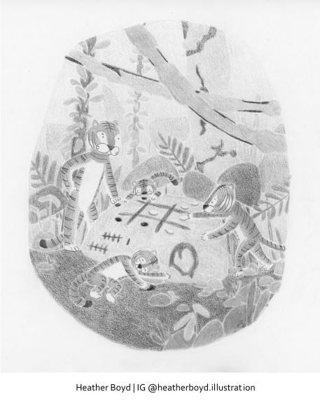
Hi, so I reworked my Tiger piece adding more value because I am not restarting this work from scratch. Thank you everyone for your contribution and all the additional story advice I will take with me into future work. But I wanted to show you the little I was able to add. Also added the b/w version of the redo below and the b/w of the first to compare. It's going to take me some practice.
