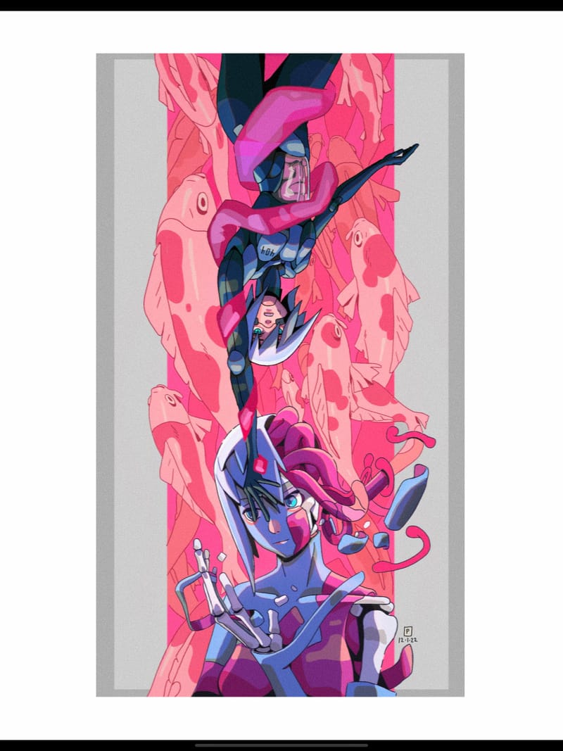
It needs a few finishing touches, i think.
-
Hey everyone! What do you think of this illustration I made? I want to make something that I could actually sell, so I'm being pretty nit-picky with this one. I feel like it needs something, but i dont know what that is. Any critiques and comments are welcome. Thanks, you guys!
Also lemme know if it looks too saturated, i think my display might be kinda wack.

-
@phoenix-yip whoa. It’s AWESOME.
-
@asyas_illos Thanks a lot!
-
@phoenix-yip I think what would help push this piece to the finish is higher contrast in values. A good way to check this is by zooming way out or blurring your eyes to see what stands out. When I do this I notice that everything in the foreground tends to mesh together. I would try darkening the top figure and brightening the lower figure so they stand apart slightly. The tentacle wrapped around the figure also gets a bit tricky to distinguish so maybe making it lighter would help but try just darkening the top figure first. Hope this helps!
-
@phoenix-yip
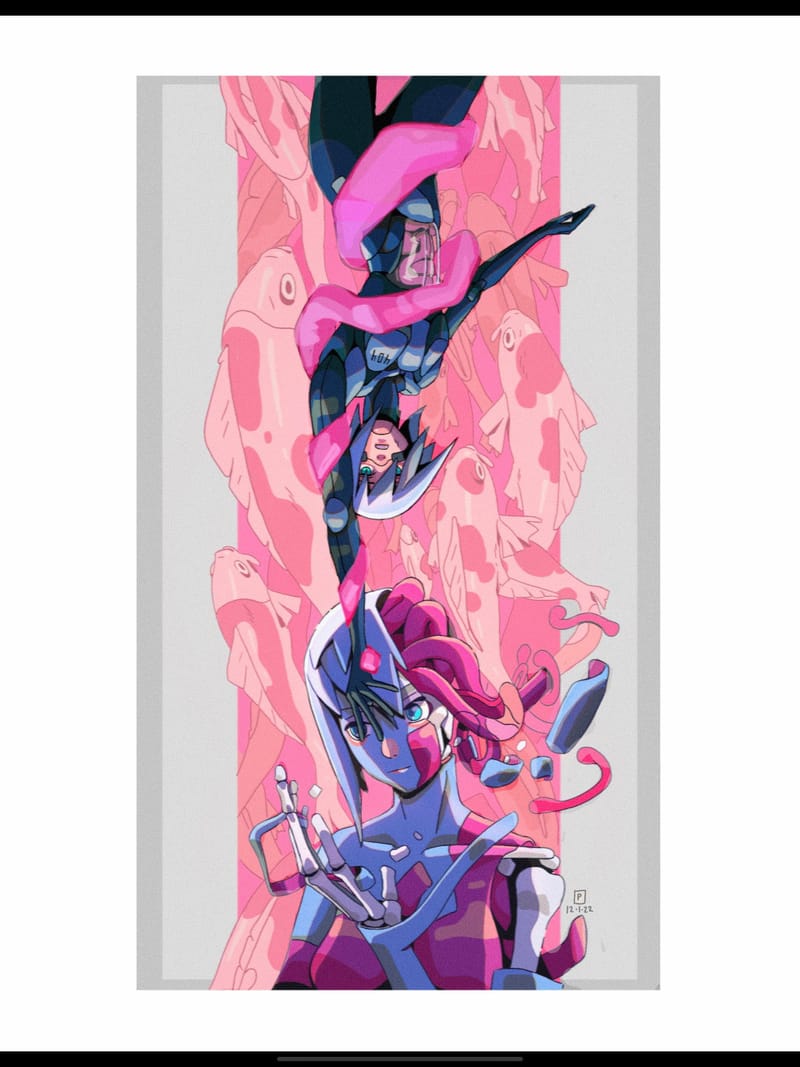
Did some little adjustments. Brightened the background so the characters stand out a bit more and I also brightened the tentacle.After looking at things more closely I think something else that might help with clarity is LESS contrast. I realize that’s the opposite of what I previously said but here’s what I mean.
I think the over all values of the characters, background, and tentacle should be more contrasting. So basically when you paint in your flats they should be very clearly distinguished. But within each of those general value areas there could be a smaller range of value because all of the high contrast points in the figure are going to draw a lot of attention which can get visually confusing.
