Layout/Compositional guidelines question
-
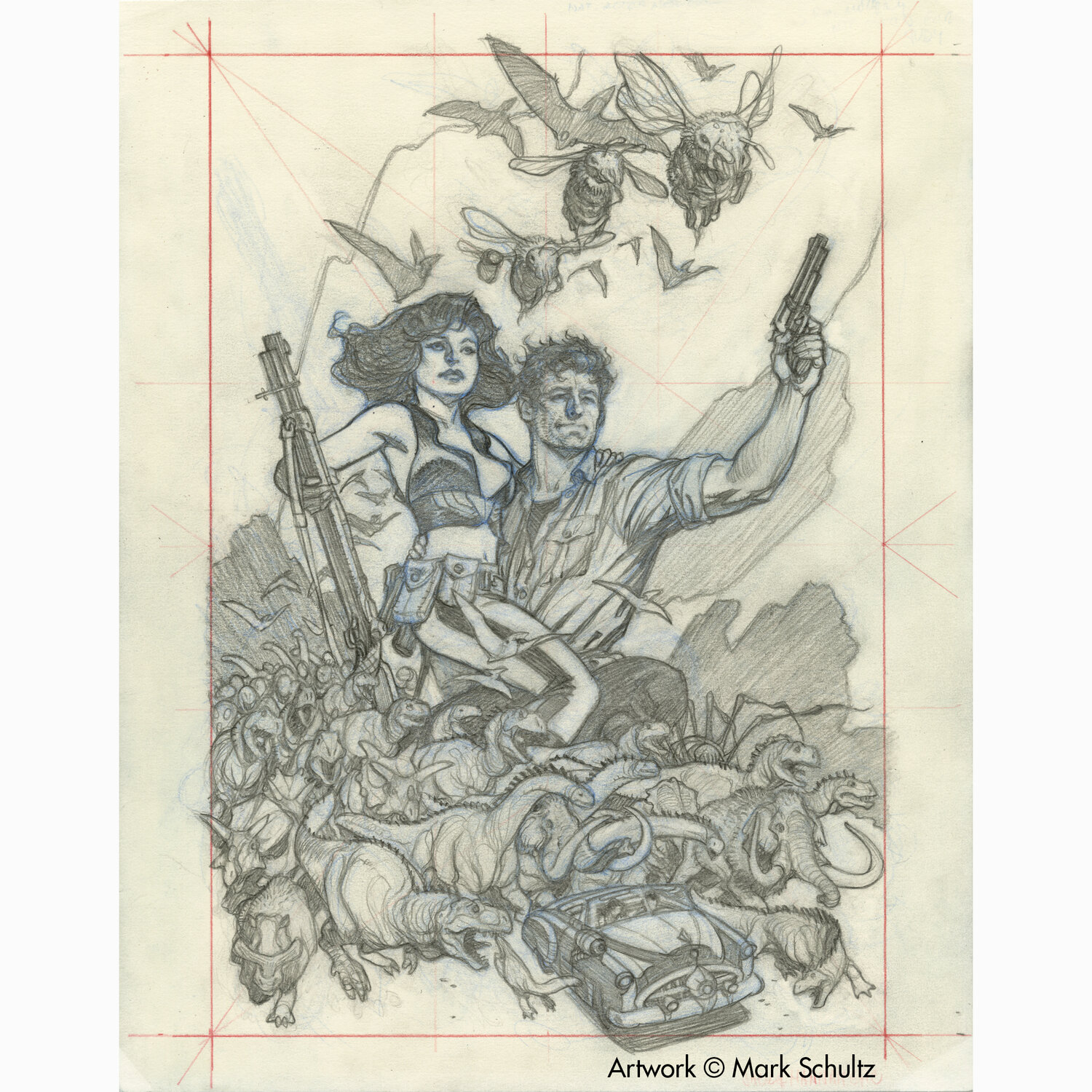
Hello, I've been looking at/studying Mark Schultz's work lately, and have been noticing that on some of his preliminary sketches he's drawing some guidelines (like the red ones in the attached image). I don't know what this technique is called, so when I've tried searching various layout methods via a Google search, all that seems to come up is the Rule of Thirds. I can see where those fit into what Mark is doing here, but it looks like other things are at play as well.
Does anyone know if there's a specific term for this kind of layout technique so I can research it some more to learn about it and try implementing it in my own work?
Thanks for any help you can provide!
-
@ghostshipmatt So I'm not exactly sure but this may be what Mark is using. http://www.the-art-of-composition.com/dynamic-symmetry-grids.html . It looks very similar.
-
It looks like he’s just giving himself a border and some vanishing points to keep his perspective in line?
-
@ghostshipmatt I think you’re right, it looks like he’s dividing the composition into thirds.
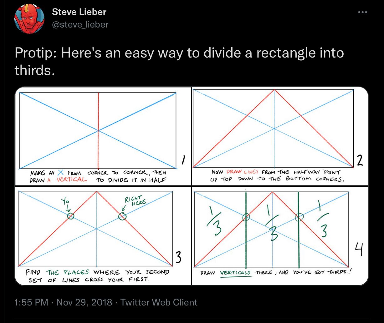
The advantage of using this technique is that you can make thirds on rectangles of any dimension using just a straightedge and a pencil, without ever touching numbers or fractions. In the rest of the thread, he shows how it even works in perspective. -
@randarrington - Thanks for the link! I'll take a look to see what I can learn.
-
@loud - Interesting. Thanks for that link. Probably the best, quick explanation I've seen so far. Glad you shared it!