Star - Feedback Kindly Requested
-
Hi everyone, I want to start with congratulating everyone who made Sweet 16 and of course the winners Josh and Miranda!
I was hoping for honorable mentions for the pieces that almost made it, but looks like we ran out of time. I really like it when honorable mentions are discussed.
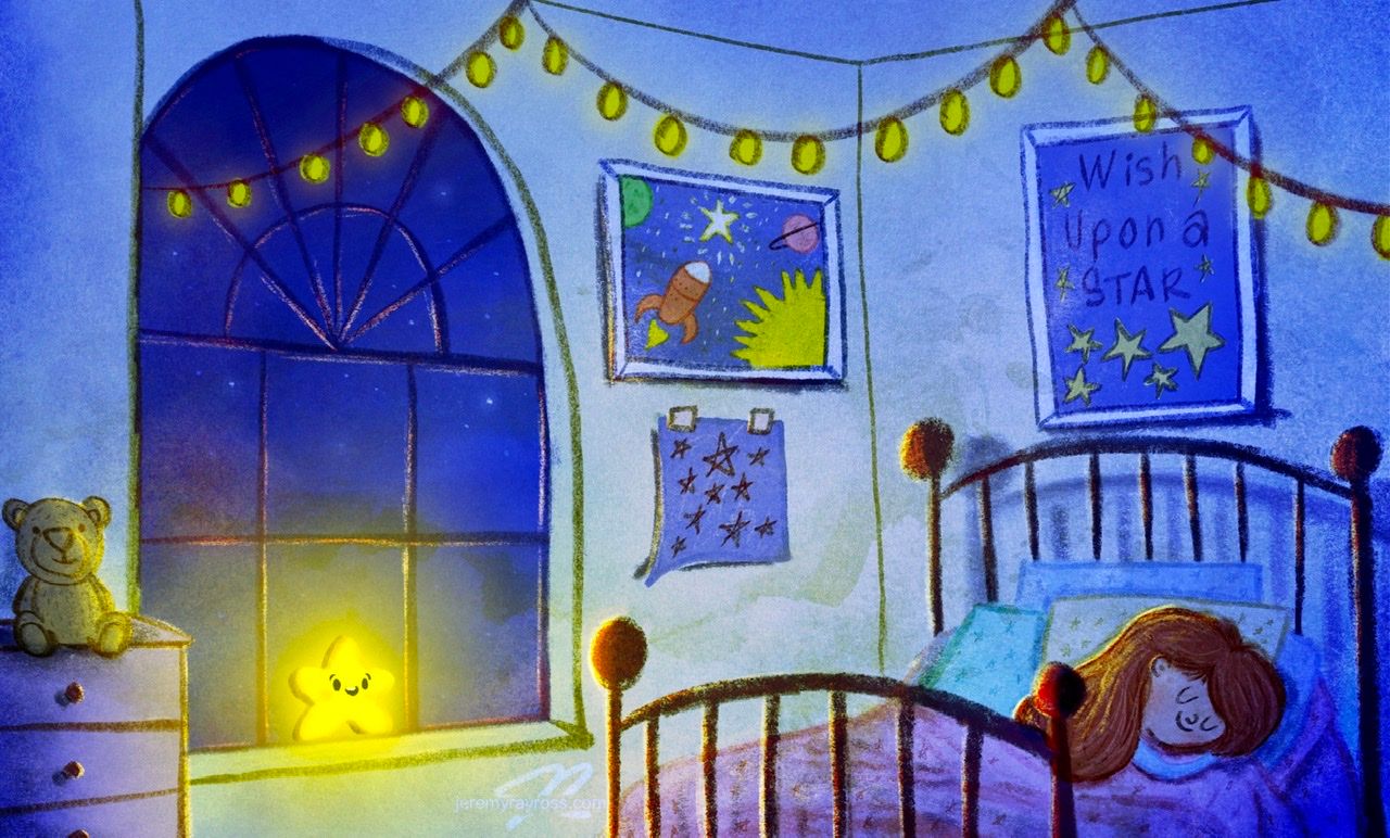
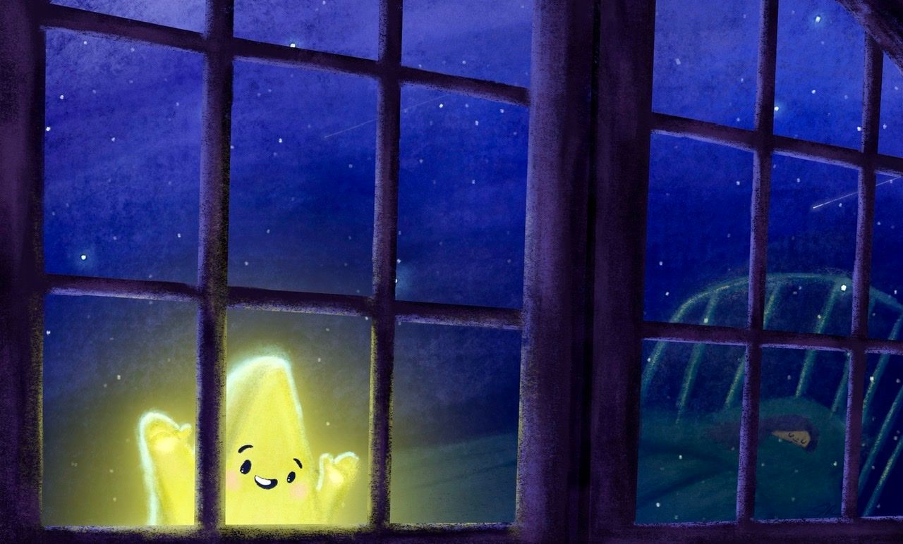
If anyone has a few minutes to critique my star submission, it will be much appreciated. I tried going for a close camera shot with the window frame and reflection of the little girl sleeping, but I don’t think I pulled it off.
Anything you can think of to improve this or is the piece just too boring?
P.S. The twinkle in the Star’s eye didn’t work for me Jake, haha!
Thank you in advance!
-
@jeremy-ross
Hi Jeremy, I think the perspective in the window is good and the colour choices are nice too, especially in the sky. I also think the glow effect lines up well with what they were saying at critique arena.There's just I few things that I might have done differently, but I'm not too experienced with scene illustration or painting, so by all means ignore me.
-
The shadow colour for the star, to me, looks convincing for something that is yellow, but as the star is giving off light, I'm not so sure that is needs shadow. I think some sort of saturated orange might work a little better as you can use that to show the form, whilst not looking like the star has shadow, especially since the star is the light source in the scene (the two winners did something like this). As well as this, I think you could do without the rosy cheeks as the star maybe wouldn't have skin. If it does have skin in this concept I think an orange or yellow/orange would give the design more harmony.
-
I think with the way the star is facing, compared to the girl, it looks as though he's looking at something other than her. Even though it's her reflection, the composition could be set up in a way that makes it more instantly clear that the star is looking at her. Perhaps by changing the design of the window so that there isn't a thick divide between the two of them where the two windows meet. Or perhaps you could have had the star floating closer to the top right corner of the window. That way his/her eyes would be looking directly/diagonally towards the girl and the two focal points would be set up in the rule of thirds composition, which normally looks appealing.
Hope this helps
") There's plenty of people on here who know more about painting than me though so if any of them say something better feel free to ignore me XD
There's plenty of people on here who know more about painting than me though so if any of them say something better feel free to ignore me XD -
-
@jeremy-ross oh, yes actually I thought the girl was outside with the star so I didn't get what the story was. I am wondering why he would be looking at the girl.
I can tell your painting quality has really improved and that star is SO cute!! You get better every month
Check out my art and tutorials :)
Instagram: www.instagram.com/carliannecreates/
Youtube:
https://youtube.com/c/CarlianneCreatesShop: www.carliannecreates.com
-
Hi @brettb_draws, thank you for the pointers! I take all feedback as a gift, so definitely appreciate you taking the time to share your thoughts. I struggled with the composition, but had a clear vision in my head. I think it’s one of those things my mind is better than my abilities, lol!
Thanks again!
-
Hi @carlianne, thank you so much for your kind words! I had a gut feeling the reflection and story wouldn’t read well, so will do better.
Appreciate the feedback on my continuous improvement, slowly getting better.
Really enjoying your YouTube content! Thank you for teaching!
-
@jeremy-ross Hi Jeremy! I really liked your piece. The star turned out especially great, in my opinion.
This may be off, but I think the way the piece was packaged to submit to critique arena may have actually been part of why it wasn't chosen, as opposed to the art itself, which I think could have made it into the top entries.
If I remember seeing it on the critique arena website correctly, your name was under the window, but then the space under the artwork was filled in with a dark color. Am I remembering right?
It may not have been an issue to the judges, but to me that color looked like it was trying to be the wall under the window, but it didn't have the same style. The name was also in a different spot than on the template, so maybe that was a factor as well?
I'm sure your design sense when it comes to your own art is ultimately better than mine, but I would have probably left white space around the top and bottom of the image, embracing that it is rectangular, and then put the name at the bottom.
I hope this is helpful. Keep up the great work.
-
Hi @kathrynadebayo, you are right! I didn’t particularly like how the piece looked inside the box template and added a little airbrush to the white space. I agree with you, it didn’t present well. The landscape piece looks better as a standalone.
Appreciate your kind words!
-
@jeremy-ross I have an idea: maybe you could try pulling the focus outward and show a little bit of the girl in the foreground, maybe in silhouette. That might clarify the concept that the star is looking into her window, and bounce the viewer's eye around the image a little. The star would still be the focal point. It has a very sweet expression, and of course the warm glow draws the eye immediately.
studiojcd.com
she/her/hers
Insta/Twitter: @chengdesautels -
Great idea @jenn, will give it a shot!
-
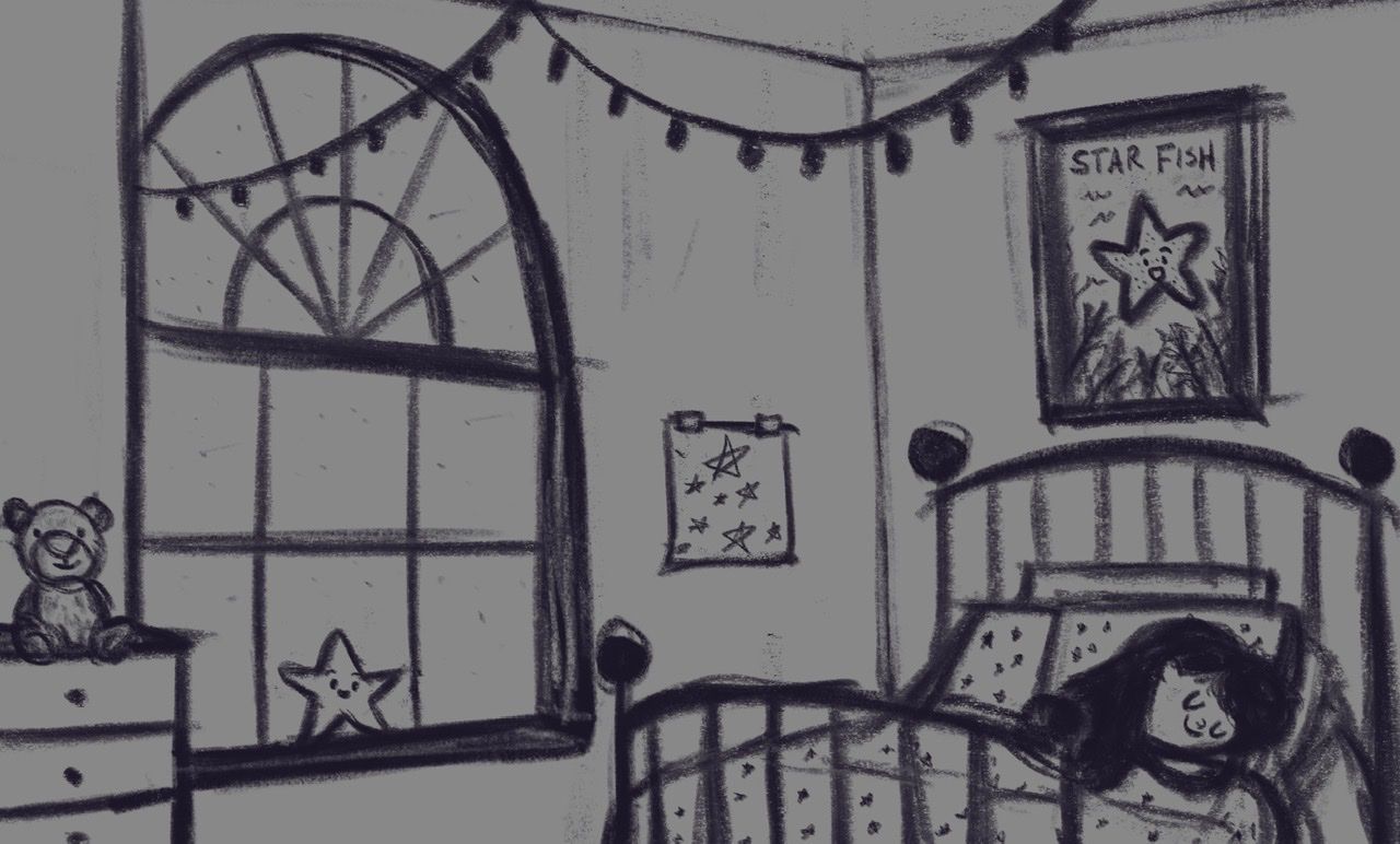
Pulling the camera back; does this look better?
-
@jeremy-ross oh yah! That’s way better! Nice!
-
Thanks @asyas_illos! Look forward to coloring this one this week.
-
I really like the zoomed out view. I just wonder if the starfish poster might be distracting? Will people think the star outside is a starfish too? Maybe make it a regular star poster? It might not matter, but it just gave me pause.
Website: www.tessawrathall.com
Instagram: www.instagram.com/tessawrathall_art/
-
Thanks @tessaw, great point!
Maybe “Wish upon a Star”, which is why the star is visiting to grant her a wish?
-
Finally found time this weekend to color it.
Appreciate everyone’s feedback!
-
@jeremy-ross This is awesome, your values in the redo are handled much much better. You have some good textures going, too!
-
@jeremy-ross really really cute! I'm wondering if a little rim light on her hair might help the girl pop a little. But you might also want to watch out for the tangent of the ball tip on the bed is having with her hair.
The color and values are really nice and the girl and star are both very cute

Check out my art and tutorials :)
Instagram: www.instagram.com/carliannecreates/
Youtube:
https://youtube.com/c/CarlianneCreatesShop: www.carliannecreates.com
-
Thank you @norman-morana!
-
Hi @carlianne, good catch on the tangent, I meant to fix that sooner. I’ll give it a tweak and add a little extra rim lighting to her hair.
Thank you!
-
Hi @carlianne, moved the bed frame ball up to avoid tangent and slapped on some rim lighting on the girl’s hair.
Thanks again for the feedback!