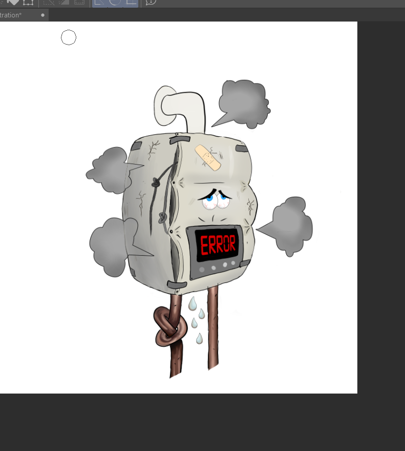
feedback requested for poor Yoily the Boily
-
hi everyone!
just want to request some feedback for this little illustration for an advert for a gas company...
i want it to be perfectttt!!!!Poor Yoely the Boily is popping and about to burst from all the pressure and stress of heating up an entire household.
is it well designed?
is it well rendered?
is it well perspectived? (just made up that word but im sure you know what i mean)
is it funny?
is it catchy enough for an advert??
where can it be improved?and also, how on earth should I work out how i should be charging?? this is the first job im being paid to do and i havent the foggiest how to charge for it.. what would be reasonable?

-
Hello! I'm not super experienced but at first glance, there is inconsistency in the lack of rendering on the top pipe. Rendering that out like the rest of the piping/painting will help I think. Also , the way the pipes cut off at the bottom is a little odd to me. Maybe you could have them fade out or get cut squarely off. It doesn't feel quite right how they're open ended though. Maybe you could attach them to the wall like you did with the top one. Also, speaking off the wall, I feel like it would be beneficial, depending on the add, to paint a background and/or a shadow to ground it a little better. I do like that distressed look you portrayed. You did a great job at that!
-

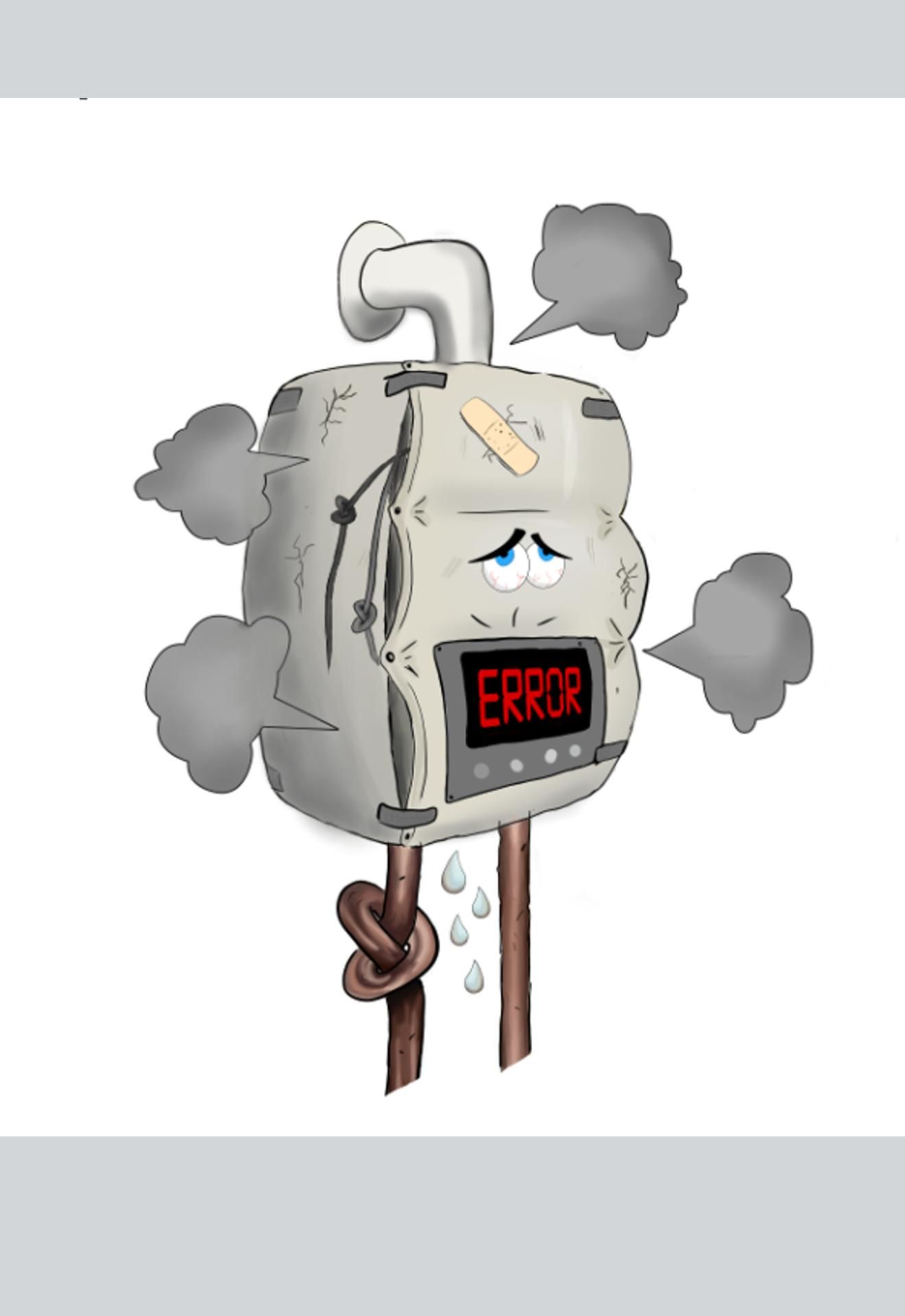
is this looking better yet?? -
anyone has more feedback?
taa -
Maybe the smoke should be without outlines and renders a little more 3D
Mic
-
Hi Leah!
Congrats on landing your first paid gig! That's such an exciting milestone! Could we get a little more information on the project? What will the illustration be used for? Ex: a flier, a logo, an animation, etc. What point does the gas company want to get across? Did they provide any documentation as to what they wanted? I absolutely love the expression on this poor character, lol!
-
so they are running a series of adverts, and this will be used on an advert promoting boiler repairs.
something abt the perspective of the screen looks a teeny bit off...am i right?
-
@leah Hi Leah,
Well done for getting a job!
I did a rough paint over, just to enhance the values a bit. So there's more shadow on the left side of Yoily. I've filled in the steam clouds on the left so they read quicker (although they could be a bit brighter still), and added a bit of shading to the top pipe so it is consistent with the light direction from the bottom pipes. Also added a tiny bit of shadow to the plaster (band aid). Hope that gives you some ideas. Sorry I can't help with the rest.
Adam. -
@leah hi Leah congratulations and sorry I have no idea on the money side but think your second version is better with the added rendering. Just one thing though the smoke puffs are like speech bubbles - which may be your intention but would more of a thought bubble with the little bubbles leading to it read better as smoke also maybe changing their sizes to less uniform.
I think it’s great though and hope they pay you lots.
Cheers
Helen -
@leah also 3drips is better than four unless u r in Japan!
-
hey adam thanks for your time and advice!
that looks real great, thank you.
i shall use your ideas, they do enhance the image.-leah
-
i do hear what your saying abt the smoke...however i think i like the pointy sharp bits leading to them coz it just looks more explosive that way