Portfolio feedback and advice needed.
-
Hi everyone.
I am an illustrator and character artists from Finland. I am interested in illustration, animation and games and I would love to be a part of making them. I could really use some advice and feedback on my portfolio as to what is good and what could I improve on. Is there something missing or lacking in the portfolio or my skillset that I should improve on. Is it a question of style or not having the right kind of pieces in my portfolio? Currently it is geared more towards illustration. In short what should I change or improve on?
I would really appreciate some honest help and advice with this, feeling a bit stuck lately.
Portfolio:
https://hakepe.myportfolio.com/Illustrator & Visual Artist
https://hakepe.myportfolio.com/ -
I have little experience in this area as I'm new but what initially stood out to me was that the title page text was rather hard to read on the background. Maybe you could shift it to a more contrasting spot on the piece? I think the white background on your portfolio page might also benefit from a little bit of interest. Not enough to draw attention but mores to ease the eyes with a gentler color or even a warmer white. Since you have a lot of cool colors, that might help your pieces pop too. Anyways, just some insights from a beginner, take 'em with a grain of salt.
-
Thank you for your advice. I will have a look at the background color.
-
@hakepe hi! Great work on building a portfolio. It’s no easy task. Would you be alright if I give you blunt, honest feedback?
Portfolio: nyrrylcadiz.com
Instagram: https://www.instagram.com/nyrryl_cadiz/
YouTube: https://www.youtube.com/channel/UCbJCF1Im8ZO7hpGWTKOJMuA -
@Nyrryl-Cadiz Sure. The only way to improve is to get feedback on what to pay more attention to.
-
I'll be blunt and honest too.
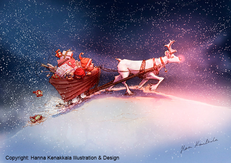
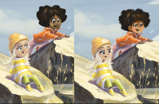
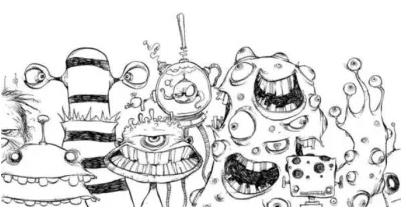
Your animals look alright, but in contrast, your humans look almost like they're drawn by somebody else because they are whole tiers worse!
The humans, just to be honest, look really stupid. If that was your intention you nailed it. But if it wasn't, that's the biggest problem I would focus on fixing.
Best thing to do might be to just trace very appealing kids characters from other artists. I did that with a few artists years ago, and it taught me alot that you can't learn from just drawing yourself.
My Drawing Show: https://www.youtube.com/ArtParlor
Instagram: https://www.instagram.com/frostdrive/ -
@Frost-Drive I would actually discourage that. Don't trace other artists' work and then put it in your portfolio! Use them as practice and then use what you learn to create original pieces.
In my opinion, the kids actually look very...kidlike(?). What I mean by that is that they do remind me of current styles of children's book artwork. Perhaps they need more development, as most artwork can always stand a bit more of, but they're not at a lower level than the animals, in my opinion, just a different style
I'd also suggest never saying something of a fellow artist's work looks "really stupid". As I tell my high school students, something like that strays away from actual constructive criticism . You can be honest in your feedback and not be rude about it (just my opinion). To me, the word "stupid" is so negatively charged it doesn't actually help.
Website: laurenpetiti.myportfolio.com
Instagram: @laurenpetiti"So the man who really loves God could...paint his pictures, even if no man ever saw them. He knows God looks upon them." - Francis Shaffer.
-
Hi Hanna,
So I looked through all of your site and I think you have some really strong pieces there. For example, I think these pieces are really well rendered. At least they speek to me.
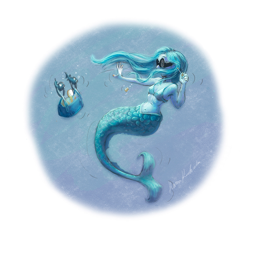
and this one
are very nice.
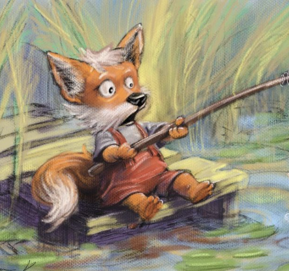
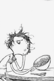
Some of the others though, feel like they're just not as well rendered. The hands seem rough or poorly defined and just don't seem to work and I do think the faces on the figures are pleasing. I'm not sure what it is...it's just not appealing to me. I think the kids look "old" to me which is part of it. Honestly, it reads to me as if you enjoy and are more comfortable with rendering animals than people. They just feel more natural and right to me. Maybe some exploration in cartooning peoples faces would help.
Then there's this piece:
Which I think works pretty darn well. As a matter of fact, the cropping created by the thumbnail on the site is very strong.
This is just my 2 cents.....which is probably what it's worth
 Thank you for sharing and best of luck.
Rand
-
@hakepe hello! I have a bit of experience working in animation, games and illustration and my best piece of advice is to pick one! I have multiple different portfolios for different kinds of jobs that I'm applying for and my "games" portfolio is very different from my "illustration" portfolio. I agree right now your portfolio is best matched for illustration, so if that's where your heart is go for it!
As for your portfolio if you're going for illustration. I looked through your Instagram and your sketches are beautiful! I can see you have a lot of technical drawing skills and if you had a portfolio full of sketches (with story telling) I think you could land some middle grade work.
I also noticed that it looks like you're more comfortable at painting adults or in a more realistic style but when you try to simplify your paintings in a cute kids style or paint children it falls apart a little bit. I think you may be over rendering the characters - especially the faces. This much detail actually makes your child characters look like grown ups. BUT I think you should pick out 8 other artists who draw children in a style similar to what you are going for and put yours in the middle and compare. (This is Lee's common advice and it's brilliant).
I think you'll see immediately what you're missing - since I'm not sure what style you love it's hard for me to say exactly what you should change.
I hope that's helpful!
-
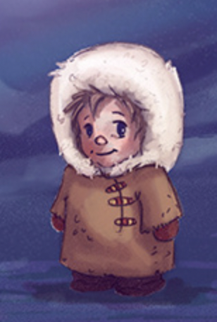
Hey I just wanted to follow up since I'm near a computer now with some examples. So regarding the faces on your kids (again this depends on the kinds of styles you like) but I mentioned they were looking a little old. Here is a paint over to explain what I mean:
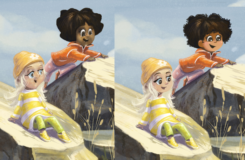
Some things that might make your young characters accidentally look old in appearance:
-
large jaws/chin and noses. Giving your character a wider face makes them look younger because as you grow your jaw gets longer and makes your face look less round. Similarily, children have smaller noses which grow as they age.
-
if you're going to detail rendering of the face you have to be reaaaallllyyyyyy careful about painting in too many folds or wrinkles or bags under the eyes as those are also signs of aging.
-
also big eyes are cute, but large pupils are cuter! You'll notice I kept the eye size the same but enlarged the pupils and the effect that had.
Some of your characters which I really like:
Check out my art and tutorials :)
Instagram: www.instagram.com/carliannecreates/
Youtube:
https://youtube.com/c/CarlianneCreatesShop: www.carliannecreates.com
-
-
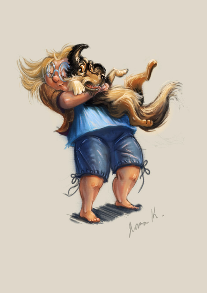
@carlianne Thank you, that is very helpfull. When drawing people, I always struggle with drawing "cute". In animals, it seems easier somehow and I really enjoy drawing animal characters. Often I also feel that my sketches or drawings look better than the rendered result. Perhaps I should try to let drawing show more, try less rendering or flat color under a drawing... On the other hand I really like more rendered illustrations too.
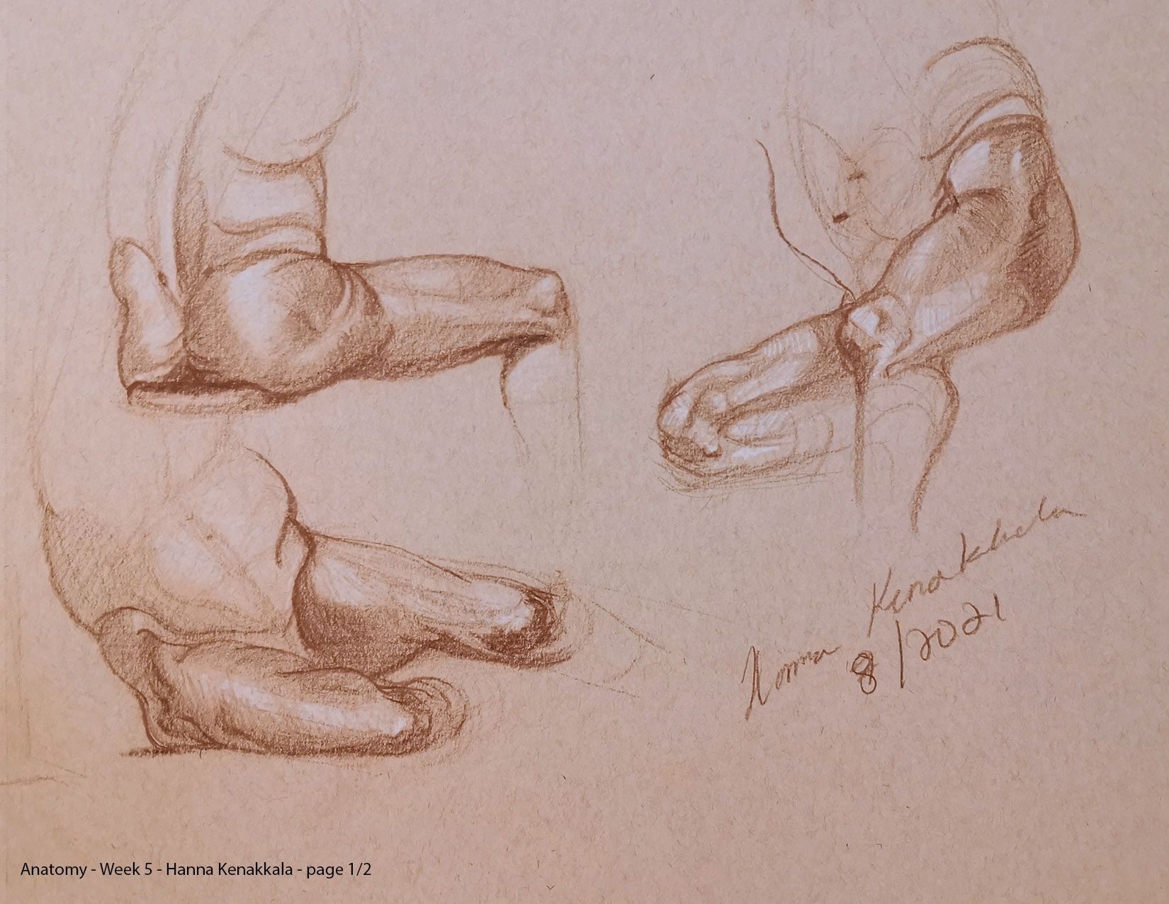
My background is more in the realistic arts. How to draw anatomy and form etc. A few anatomical studies below.
I know some illustrators make very realistic backgrounds in their paintings and draw more realistic characters. However I don't want to go all the way realistic, just cannot seem to nail a good balance between cartoony and realistic at least when it comes to my backgrounds. My character drawings and sketches in instagram are getting closer to what I want.
-
@randarrington Thank you. Perhaps I need to focus more effort in drawing appealing human characters in different age groups and practice drawing cute.
-
@lpetiti Thank you for your feedback. I agree that the kids do look a bit different than my animal characters. I think I need to draw more kids with the similar style as my animal sketches. For some reason when I draw kids I begin to tense up and I think this shows in my drawings. I have a hard time drawing cute or "conventional pretty" when it comes to people of any age. Don't know why that is. Then again I have always loved strange looking characters and a lot of the "conventional pretty stuff" does not appeal to me that much
") Not that there is anything wrong with pretty but my favourite animations include Despicable Me, Boxtrolls, Corpse Bride and Coraline. Also love the old Addams Family Movies from the 90s. More practice for me then. Perhaps I will be able to strike a balance between pretty and strange
Not that there is anything wrong with pretty but my favourite animations include Despicable Me, Boxtrolls, Corpse Bride and Coraline. Also love the old Addams Family Movies from the 90s. More practice for me then. Perhaps I will be able to strike a balance between pretty and strange Illustrator & Visual Artist
https://hakepe.myportfolio.com/ -
@hakepe I definitely think it’s possible! There’s also definitely a group of people who are interested in that
Website: laurenpetiti.myportfolio.com
Instagram: @laurenpetiti"So the man who really loves God could...paint his pictures, even if no man ever saw them. He knows God looks upon them." - Francis Shaffer.
-
@lpetiti Let't hope so. I also love the old Grimm Faerytales and animal stories. Also the more realistic folklore/fantasy illustrations of J.B. Monge. So I have some thinking to do as to how to combine my influences in a style that will work and if Children's Illustrations is the right fit for that style or not. How do you mix J.B. Monge with "The Minions"
-
@hakepe Aha! Your movie preferences actually say a lot about your style and interests. If you're not really into cute stuff, you don't have to do cute stuff! There are definitely books out there that would do really well with a more gritty awkward or gangly type style.
.
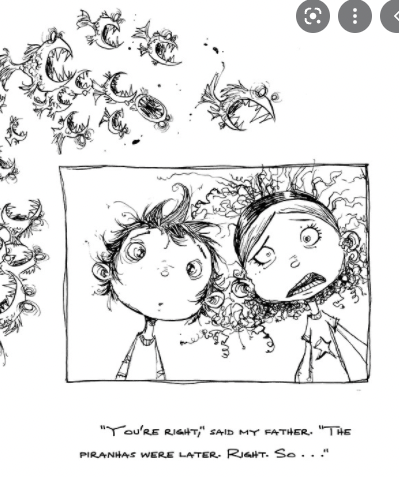
One of my favorites is the book "Fortunately the Milk" by Neil Gaiman. Illustrated by Skottie Young:
I really really recommend the dream portfolio assignment! It really helped me personally and I think it's great for helping your focus on what you really enjoy doing
Check out my art and tutorials :)
Instagram: www.instagram.com/carliannecreates/
Youtube:
https://youtube.com/c/CarlianneCreatesShop: www.carliannecreates.com
-
@carlianne These are wonderful! I need to check out this book.
Thank you for reminding me about the dream portfolio assignment. I did it a couple of years ago but I think I might need to do it again to see if my preferences have changed. It had a lot of animal characters and cute characters in it too but then there is the other side like Beetlejuice and Hotel Transylvania animations that I love. I think I will re do it and see what comes out. Perhaps it will be something between cute and weird
By the way. I checked out your portfolio and I think that your characters are lovely. They feel very sweet and appealing, especially the kids.
Illustrator & Visual Artist
https://hakepe.myportfolio.com/ -
@hakepe you're welcome! I've had to do it a few times as well as I further refine what I really like doing.
And thank you for your kind words about my portfolio! I am for sure in the cute category of illustration
