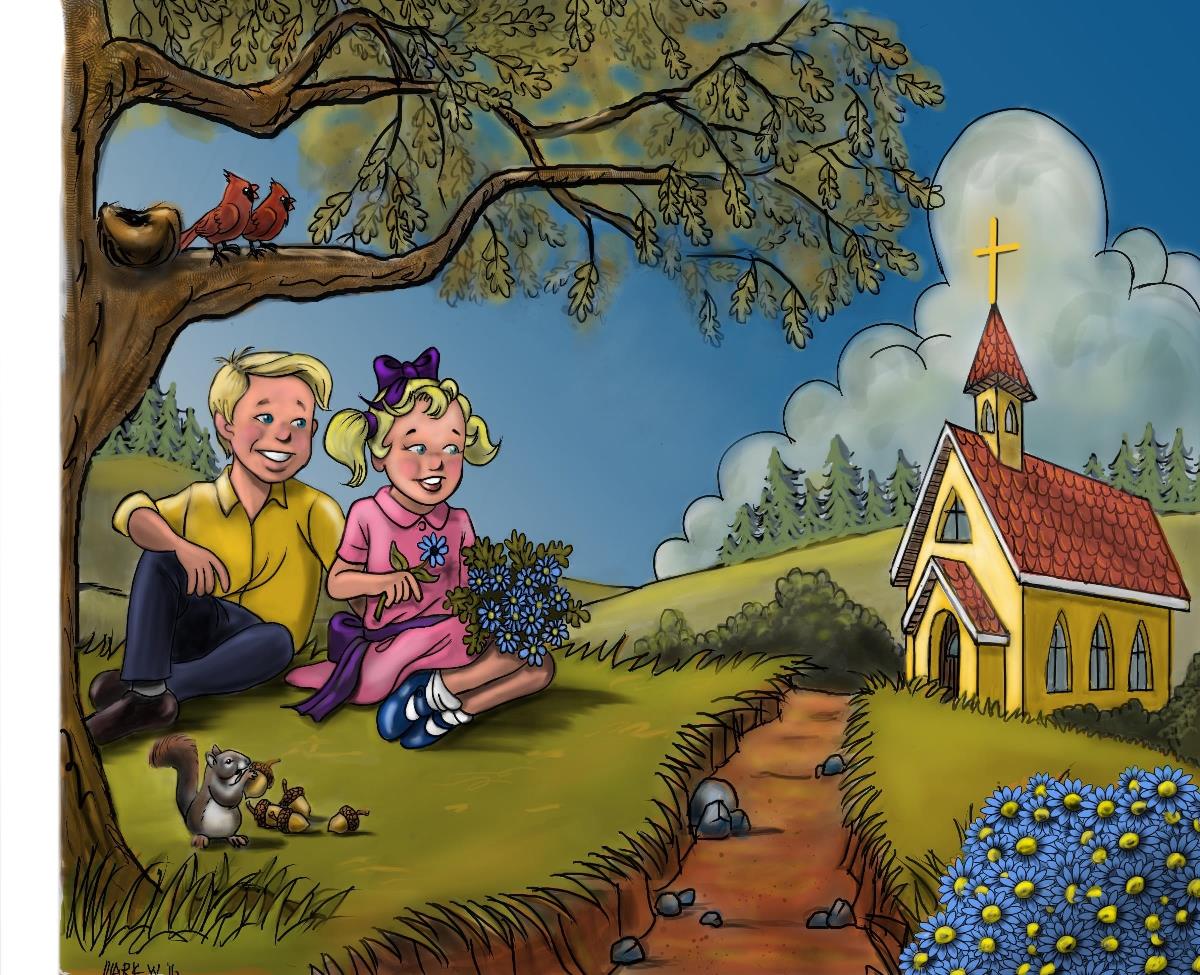
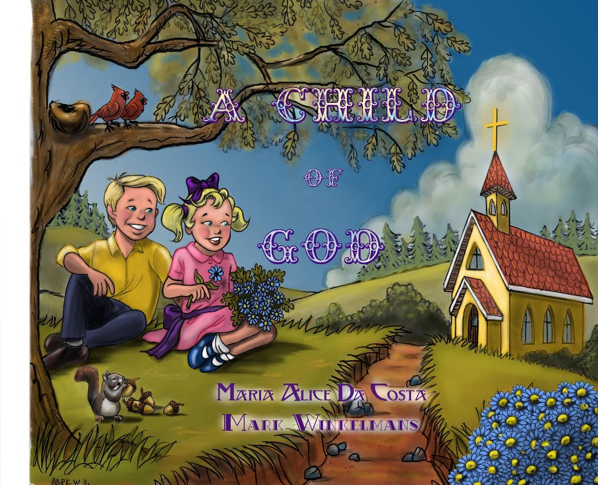
Cover Page for Children's Book
-


This is the first illustration for a children's book I have been asked to illustrate. The colors on the church, boy & girl and animals were all very specifically requested by the publisher (just sayin'). The rest was pretty much up to me. By following the instruction given by Will & Terry through their awesome courses, I was able to take this from thumbnails to finished product. I am so grateful for the wonderful courses offered through SVS. I am 59 years old with no formal art training and started drawing again about 5 years ago. I am so excited about this project (only 26 more illustrations to go!) and future projects that may come my way and I owe it all to SVS. Thanks again, Will & Terry! -
Great to hear that SVS has helped. I've found it to be a great resource as well

-
Hi Mr Winkelmans (what a dutch name), Your cover is really a great piece of work. Its a good balanced and well designed composition. The children seem very happy and I can tell that they are into going there. I think its has a religious course? There are a view things that might improve the drawing. First I would get rid of the outline on the clouds. Thats really distracting me. Maybe tone all the black-lines down? I also think that you can play a bit more with dept bij adding more shadow on the church. I hope this helps you, decide for your self if you use my tips. Please let me know if you need any help. Greetings Leontine
-
@mwinkelmans said:
5 years ago. I am so excited about this project (only 26 more illustrations to go!) and future projects that may come my way and I owe it all to SVS. Thanks again, Will & Terry!
It"s really cheerful and bright. Btw, I am 58 years old and have had some art schooling but I am not one lick better than you are. Plus, I am not yet a digital artist
 Great job!
 -
Hi mwinkelmans!
Nice work! I really like the composition, it was really well planned.
I agree with Leontine for the linework. Maybe you could try using just a slightly darker color than your local value for the lines (for example lines on the boy shirt could be dark yellow)
I would suggest also reworking your grass a little so that there is more variation between each blade of grass (size, direction).Finally, of course it is too late for this book, but maybe for the next one, I read an interview with an illustrator once (don't remember who) who said that as often as possible she kept the cover for last. Because by then you "know" you're character a little more, your color palette, the mood, etc. I just thought it was a great tip and I plan on using it with my future books!
Great work!
-
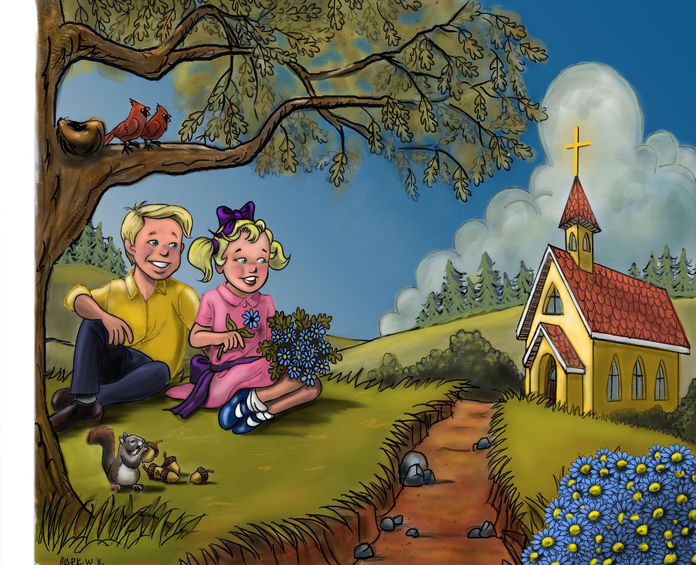
Thanks for the input guys. I've made the changes and it's a definite improvement!

-
@mwinkelmans

Oooops! the previous image didn't have ALL of the suggested changes. This one should be better. Sorry guys