Need some feedback/help solving style problems
-
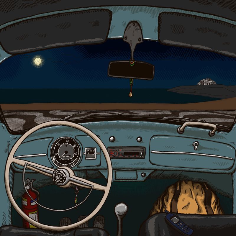
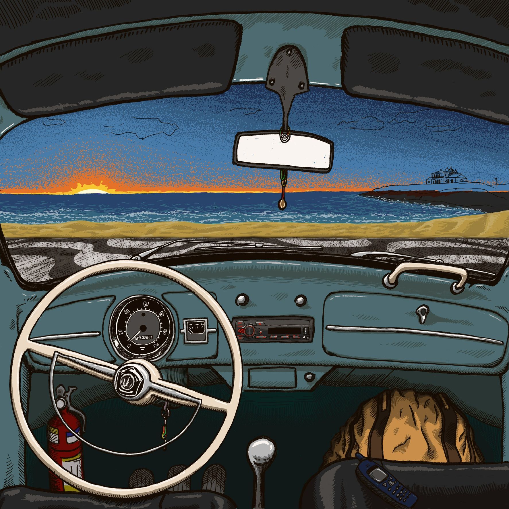
I’ve been working on this record cover and after finding my way for a while now I’m having some trouble. I’m pretty satisfied with what is inside the car, but the outside is giving me a hard time.
The outside as whole looks to me like a different style altogether, especially the more blended style in the sky in opposition to the hatching I’ve used inside the car. I prefer the hatching style, but I’m struggling to figure out how to do a sunrise sky with hatching and crosshatching. Im also having a difficulty in finding a way to draw the small waves in the sea.!
Any suggestions, examples or remarks will be very much appreciated. Thank you!
-
Hi. I hope this is ok that I did a draw over. I think softening the lines in the background give the impression of distance, with things far away being a bit softer and contrast more with the foreground. I use used a small round brush in photoshop (I use a Wacom tablet and stylus), to gently go back and forth with white overlapping lines to give the impression of waves, then up but the base of the shore line. Then I just use the burn tool with a soft brush to make the clouds. I dont know if this is what you're looking for, but maybe its helps a little? I didnt spend too long, but you get the idea.
-
I dont think it matters too much that the background looks a different style. I think the softness and blending of the background makes the car interior stand out more.
-
@fmb you did a great job rendering the interior of the car. Yes, I agree that there is a disconnect between the interior and the exterior background, and the difference in style has a lot to do with that.
What is the focal point of the illustration? Right now, they are competing for dominance.
If the interior is where you want eyes to focus, then my suggestion would be to desaturate the background and lighten the value. Bringing some hatching into the background will help keep the style cohesive throughout.
If the exterior is meant to be the focus, then perhaps darkening the interior or even placing it in shadow will put the focus on the sunset and what’s going on outside.
Hope this helps instead of muddying the waters for you!
-
@fmb I LOVE what you did with the interior. I don't know the story but I just wasn't to be sure you want the backpack(?) and fire extinguisher to stand out. If so, great, if not , you may want to tone them down, my eyes keep going back and forth between the two. Also not sure about the white review mirror. It would be reflecting a night sky /distant objects etc. I'm thinking you may have other plans for it, if so, no worries. I did a quick screen shot and adjusted some of you sunset colors. Mostly darkened the sand bar because I felt it was cutting the image in half and then desaturated the sky mostly on the right but left the far left pretty much the same and broke up the suns reflection a bit because it was drawing my eye to the edge of the dash. Threw some dark on the mirror to quiet it down. Just ignore all this if it changes up your story. It really does look good.
-
Maybe consider a gradient as you would consider a shadow?
You are using hatching to describe the gradient from light to dark; but you could also use hatching to describe the gradient from one color (orange) to another color (blue).
As you have continuous gradients at the moment, it could help to use posterization (available in photoshop, or clip studio), to decrease the number of colors to something more manageable.
For instance the gradient of the sky could be posterized to 3 colors: yellow, orange, dark blue. Then you use hatching to describe the gradient from yellow to orange, and from orange to dark blue.
-
Such insightful replies. You’re great, people!
It took me a long time to get back here because, first, life got in the way, but I also wanted to test some of your suggestions so that I’d have something at least a bit substantial to say.
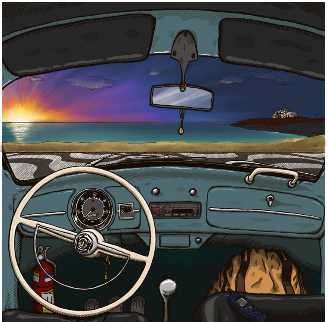
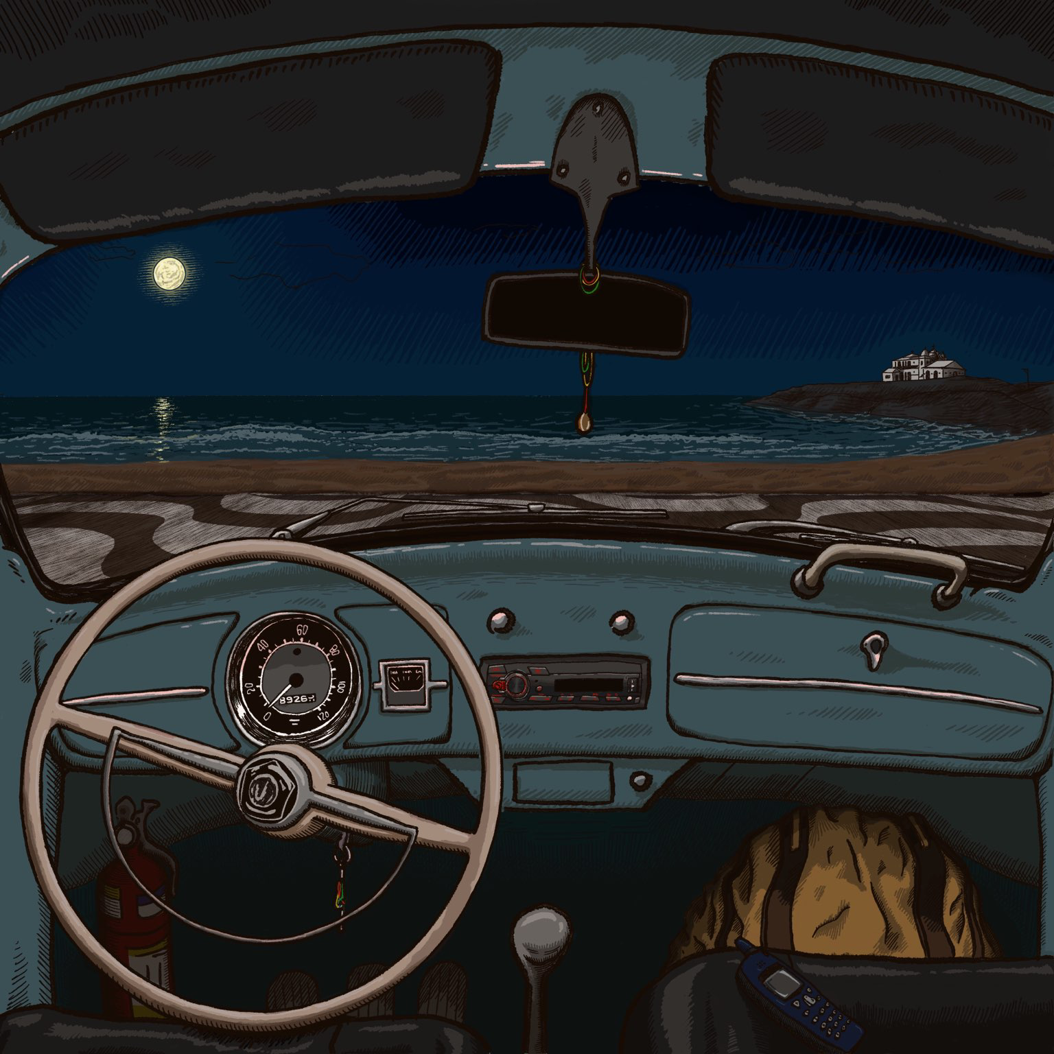
I tried switching to a night scene. I’m working on the outside in this hatching style I’m struggling so much to get the hang of. Please let me know if you think I overdid it—especially the moon. The thing is: now I feel like there’s too much light inside the car. I don’t want to put a light source inside it, as it will change the whole direction of light and shadows etc., but at the same time it is getting ugly if I just darken the rest of the inside, so I’m considering getting back to the sunrise and doing it in hatching style as well.
Thank you everybody who chimed in. If any of you have further suggestions, please let me know. I’m really needing some help here. No problem at all that some of you drew over it. On the contrary, it helped me a ton figuring things out and taught me some techniques and solutions along the way.
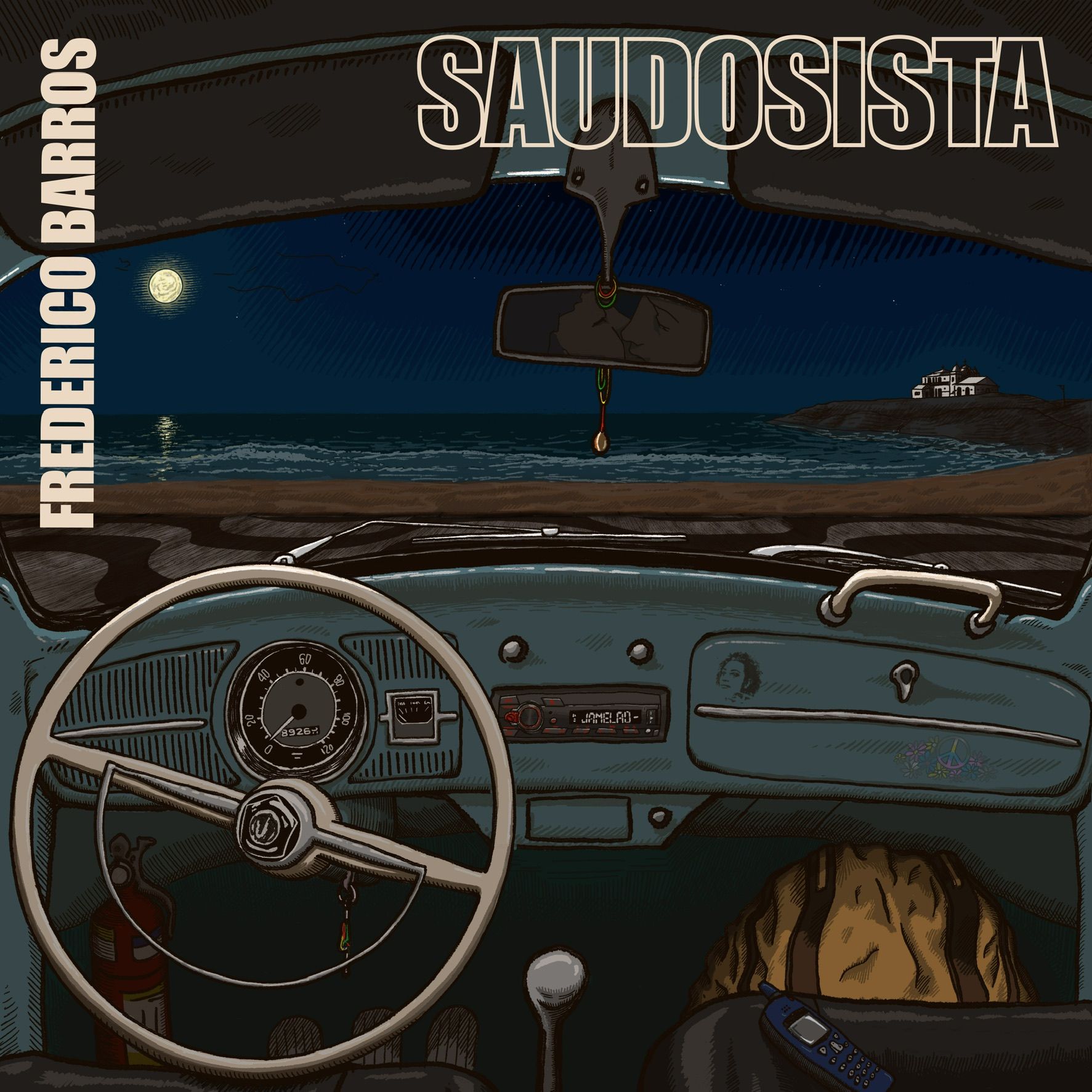
P.S. to end this already long response, in case anyone is interested, here is an explanation of the idea for the image:
I think the interior is more important, but I need the exterior too. The whole thing (this is a record cover) is dealing with the idea of longing for times past, so there’s a mixed chronology there—the car is from the 60s, there’s that little Nokia phone from the mid-2000s, the car stereo is current, there’ll be a sticker on the dashboard that can only be from 2019 or later etc. But on the outside the idea is that things get weirder, as that sidewalk in from of the car hints that it’s a specific place here in Brazil, but at the same time (time?! well, that’s the point I guess) that building on the right has been replaced by a new one in the 1910s. All this is to say that I have to somehow manage to make all this part of the picture, which I guess shows how inexperienced I am in this whole business… The fire extinguisher isn’t important at all. I was just copying from a picture of said car that I found and it balances the backpack, which is indeed more important. Finally, the rearview mirror is going to show very subtly a couple together in the backseat, just the bare minimum for you to understand there’s people there. -
@fmb I think this is a great improvement! it indicates what time of day it is and sets a mood with the "story" still very clearly centered on the inside of the vehicle. I would still like to see just a few little stars to break up that solid dark sky and a tiny bit of moon reflection....nothing distracting or too contrasty. Nice work.
-
@Larue thank you! I’m still on the fence about making it dark like you see in this last image, or portraying a daybreak. In the latter case I am also going through the trouble of figuring out how to do this consistently with the overall style (which brings us back to the initial question, I guess…). I’m learning a lot in this process, but I’m starting to feel it’s starting to take too long…
-
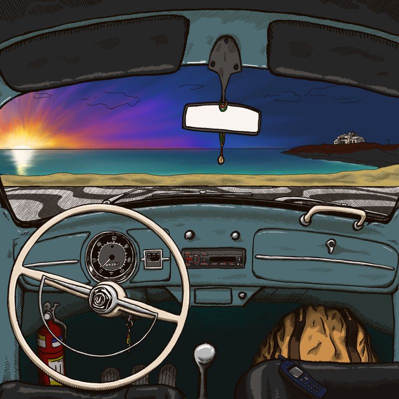
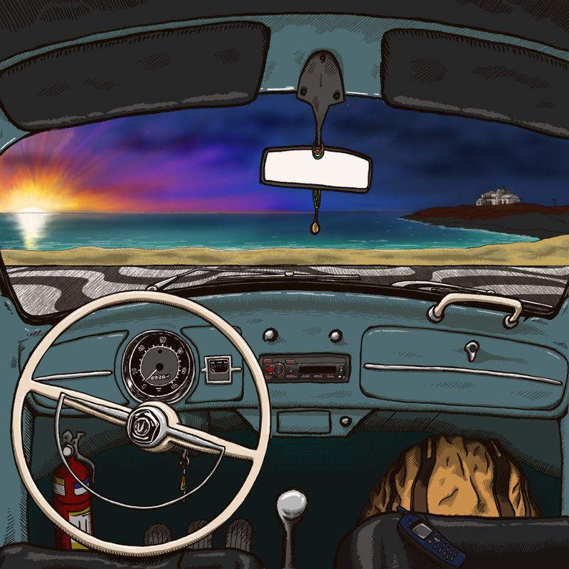
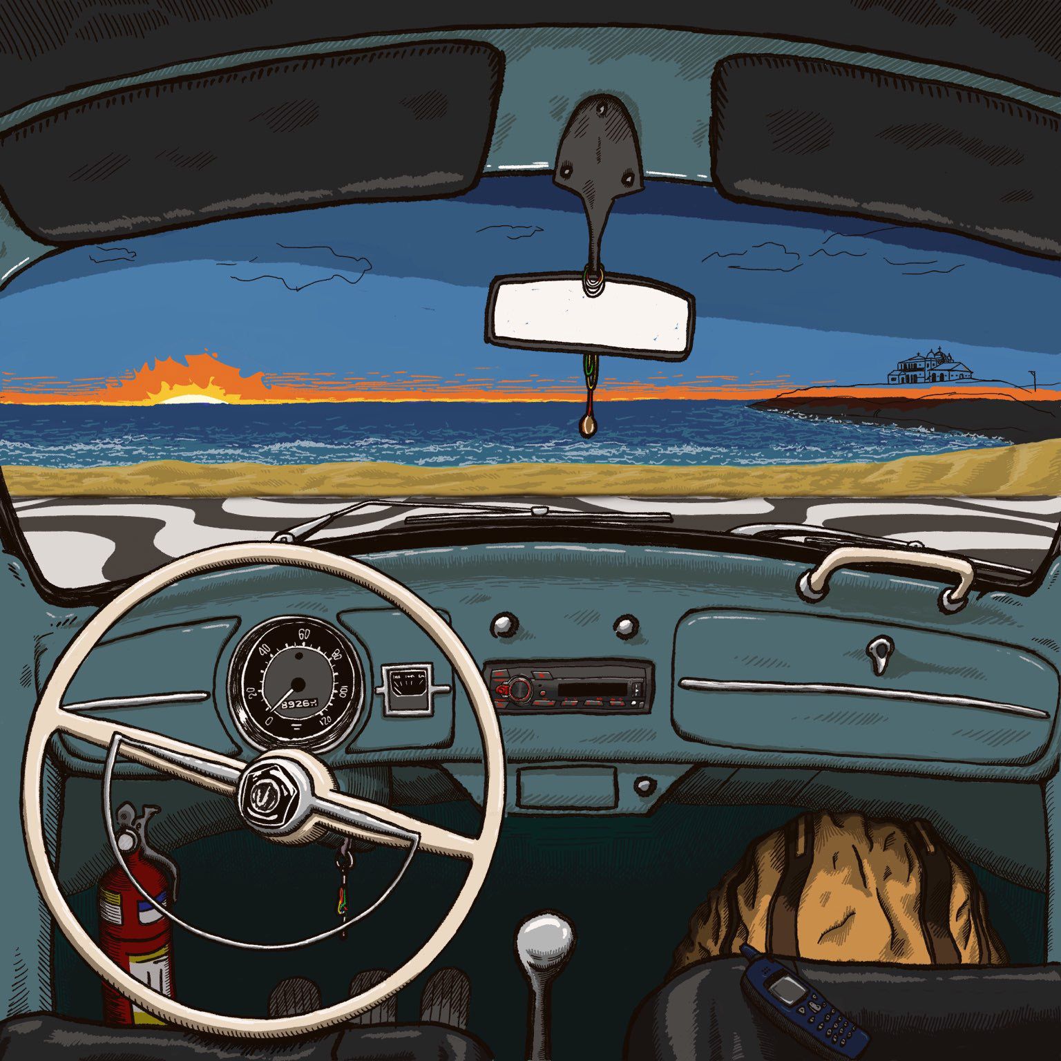
Here are the two unfinished options I have now:
-
@fmb oh wow! Both are so nice. Guess it all depends on what feeling you want the album art to convey -- each gives off slightly different vibes.
One other thing to consider: this is for an album cover, correct? So is there going to be any text or typography on the cover? Where is it going to go and have you left adequate room for it?
Nice work with the lighting and achieving that consistent style throughout that you were aiming for!
illustrator - author - smiley person
mbaileyart.com
instagram.com/mbaileyart/ -
I like the first of the two options best. The fire extinguisher draws the eye in the second one - maybe you need to tone that down a bit? It is in the footwell so a darker shade would work and then it wouldn't stand out so much.
-
@Melissa-Bailey-0 Indeed, they are different vibes. I currently am thinking that the darker one solved the problems I'm facing a bit better, but I sort of prefer the lighter version because it's less cold in terms of colors. That said, I'm leaning towards the darker one precisely because I know how to deal with its problems.
I really wish I found out how to solve the ones for the lighter version. I did two new now, one employing stippling, the other lines, and the stippling looks slightly better, but at the same time all my stippling images look like they'er somewhat dirty or something like this. The sun is indeed looking like an explosion. As a matter of fact, I'm not entirely convinced of either one and I'm starting to get tired of working on this image--luckly I won't have a client or an art director yelling at me, since I am also the client
") )
)Yes, the letters were an afterthought to me--I have zero experience doing these things. I tried putting them on the top, over the shaders (is this how they're called in English? Should I call them sun-breakers? I don't know, but it's the top on the image. In the days of Spotify and similar things, I guess the letters have to be a bit larger so that one can see them from the small screen of a phone, but I'm now considering the top left corner with part of the name turned 90 degrees to go at the y axis and the rest plain horizontal on top. I really don't know and I am totally open to suggestions.
Thank you for your comments!
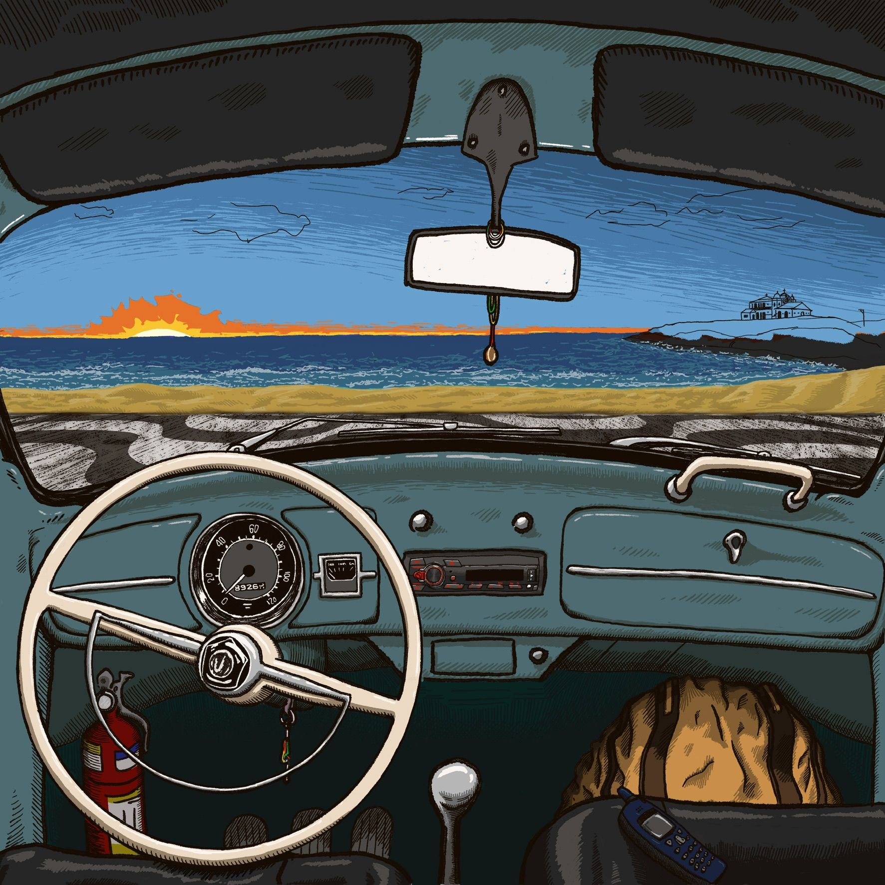
Thank you for your vote on the first on and for your other remarks as well, @geekinm. Yes, I toned the fire extinguisher down.
-
Here they are:
-
@fmb I'm really liking the night one, great work on the white caps. Keeps my eye on the car not the sky that is secondary.
-
@fmb thanks for the explanation. I agree that the stippling version is better. However, that hot orange is drawing the eye. Is it meant to be the focal point? Perhaps not having much going on in the sky is the way to go, giving the eye a chance to rest and not bounce around quite so much.
And remember: there is also going to be text, which is a huge design element, will compete for attention, and/or cover up things in the illustration that you might have poured time, sweat, and tears into. It would be a shame to have spent so much time agonizing over something that might get covered over with text.
Just sharing a tip that I've found helpful in designing covers: the client should provide the text at the outset and it should be integrated into the design at the sketch/thumbnailing stage. This has saved me so much hassle and frustration. Text is such a huge piece of the puzzle, and trying to design a cover without it is like trying to complete a puzzle with a bunch of missing pieces.
Hope I'm not stepping on toes and hope you find this helpful.
 ️
️illustrator - author - smiley person
mbaileyart.com
instagram.com/mbaileyart/ -
@Melissa-Bailey-0, you didn’t step on any toes at all. Your advice has been great and I’ll definitely heed it next time. Thank you!
Well, since you all helped me so much, I figured I should post here the final version. I still can change it if any of you have any suggestions, though.
Thank you everybody for all the comments, suggestions and, in a sense, lessons, I should say!