Where am I falling short?
-
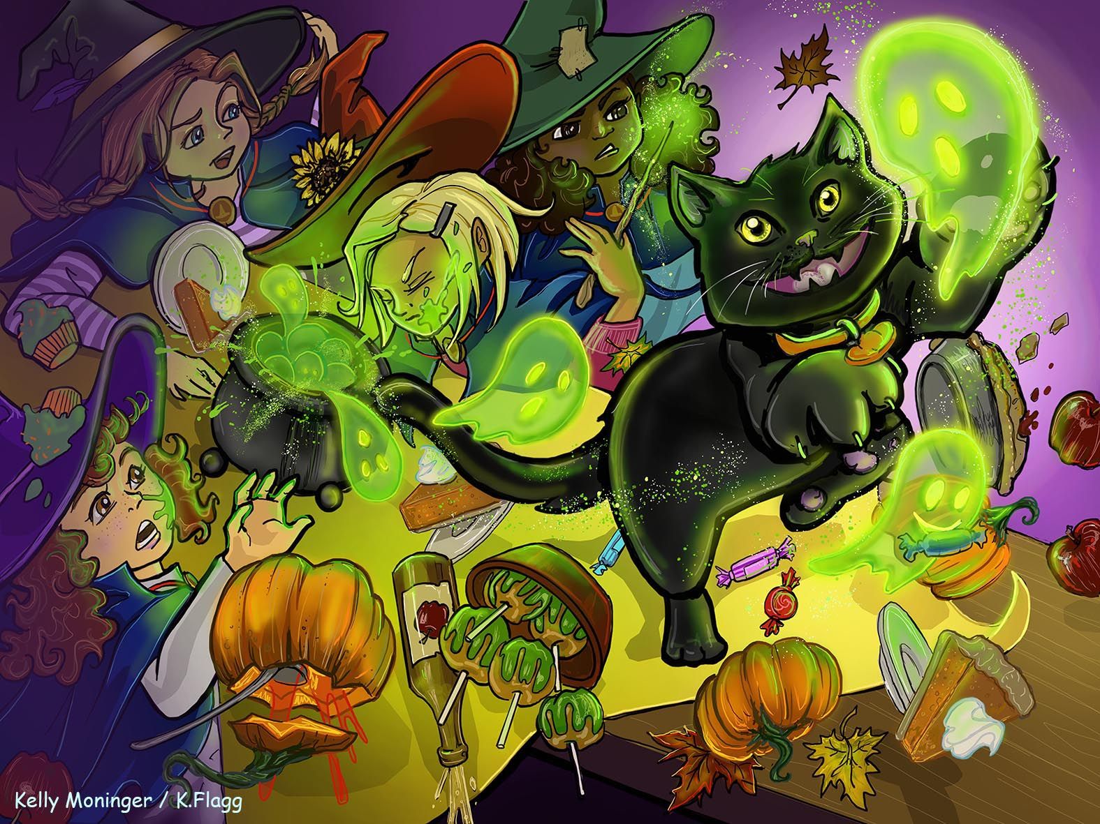
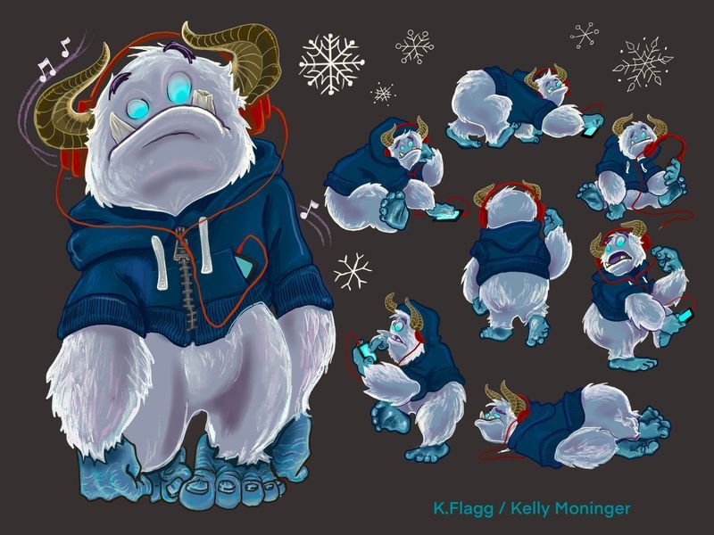
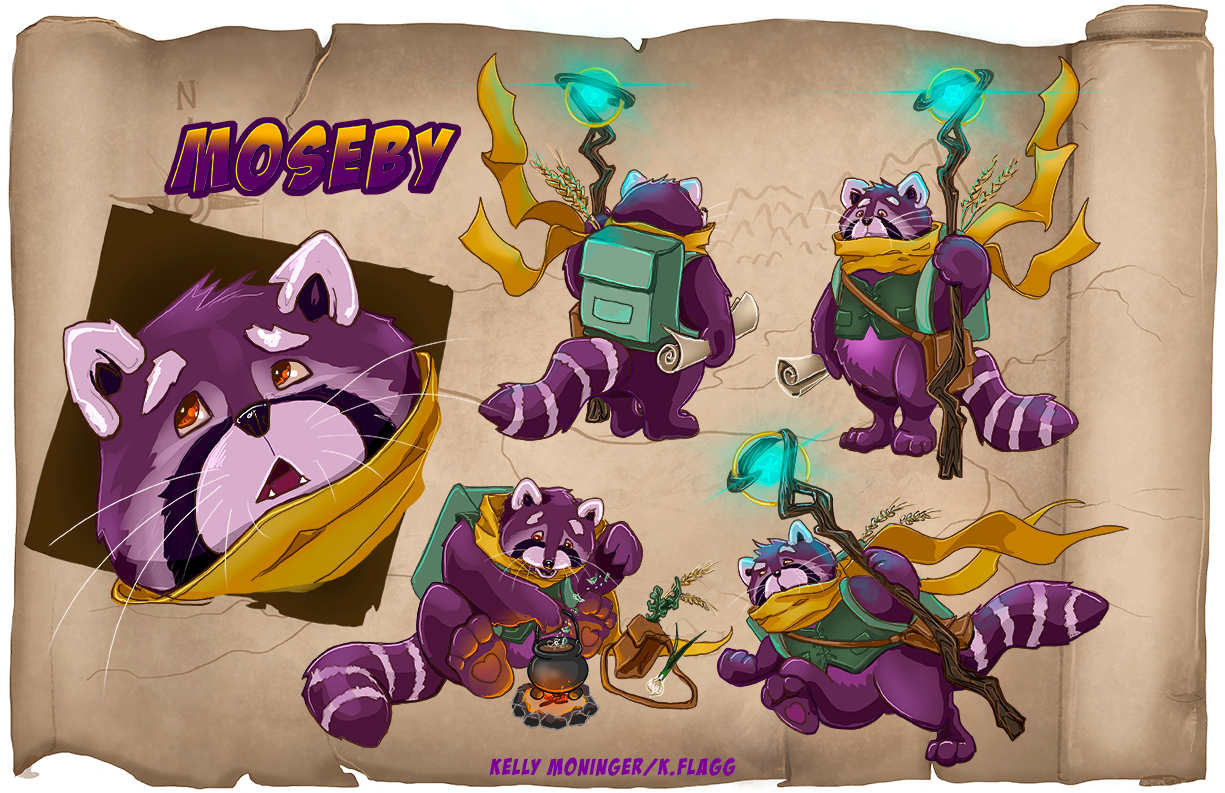
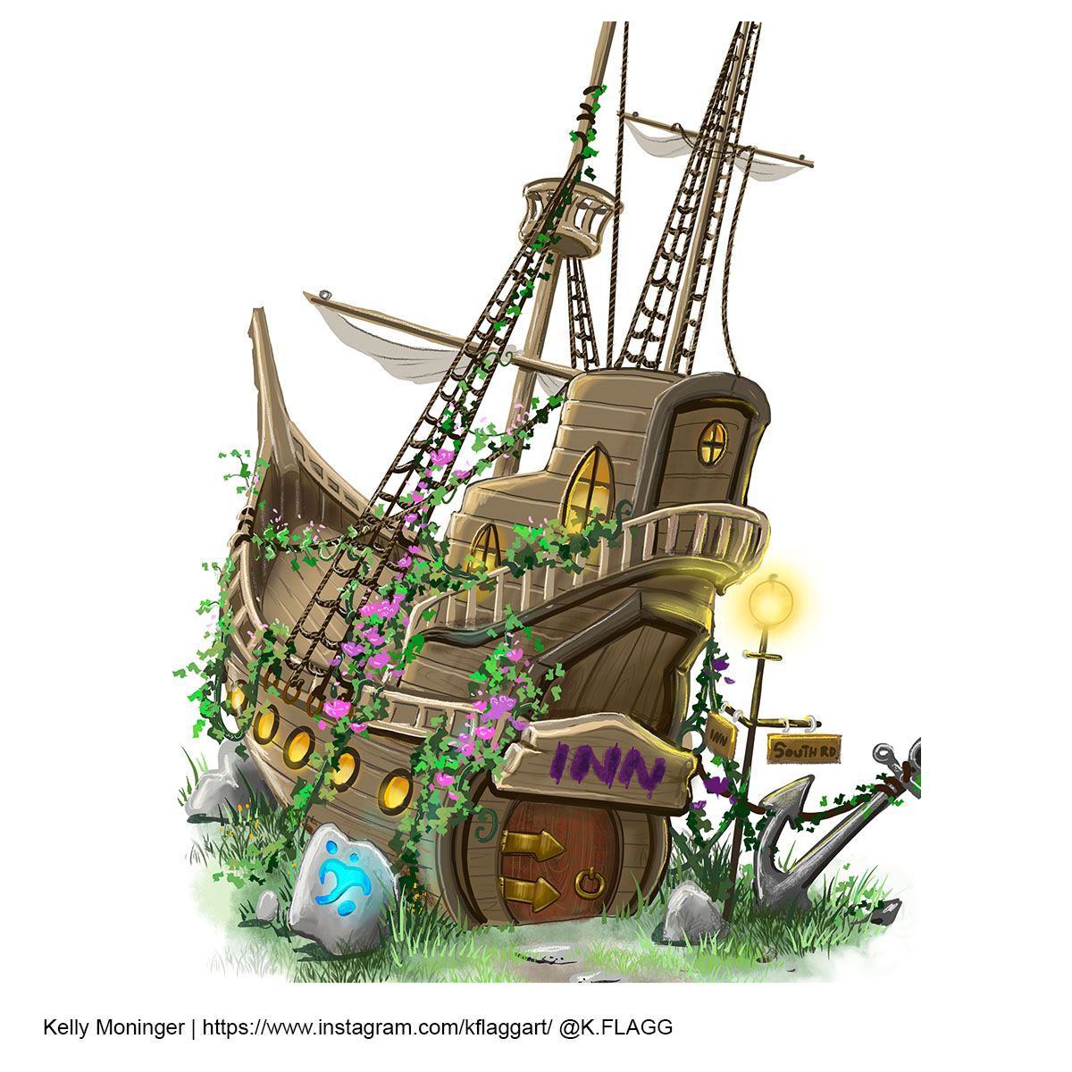
So over the past year I have made top 16 twice and was knocked out in the first round. I have many pieces that I thought were strong that still didn't make top 16 and I can't figure out why after years of doing this I still can't make through. I feel like I always follow the prompt, have interesting compositions and lighting, decent character design, and decent rendering. I was really excited that they were critiquing everyone on the last one since there were so many less entries but they didn't even show mine
 What am I doing that is not getting me noticed? Any advice?
October 2020
December 2020
March 2021
April 2021 (made top 16 but knocked out in the first round by a large margin of votes)
May 2021
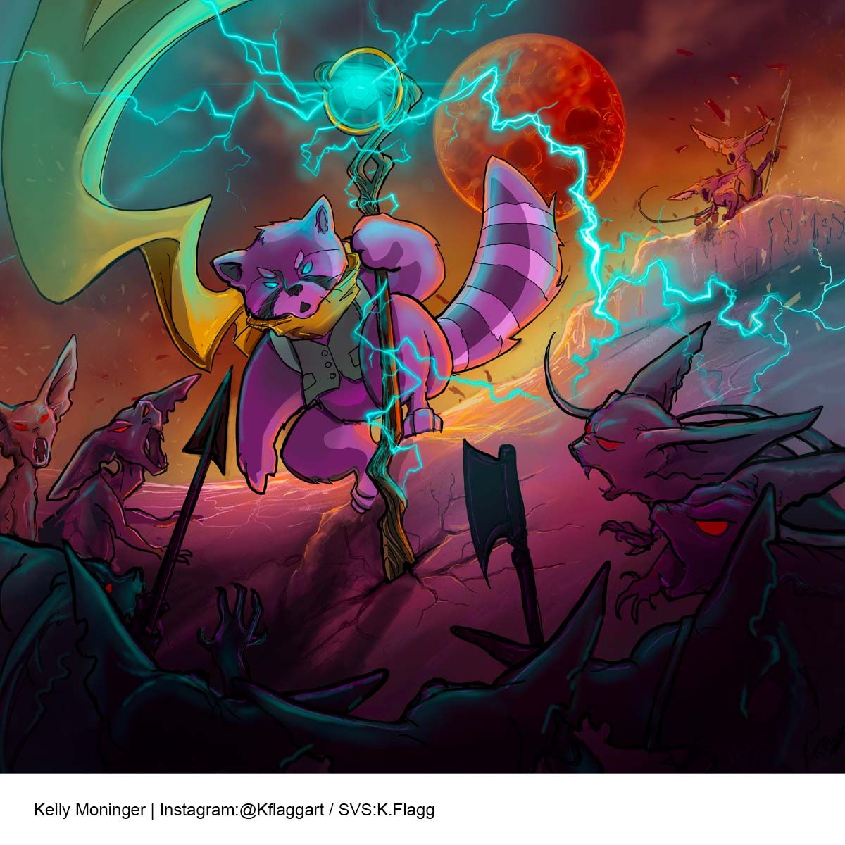
-
@K-Flagg I understand your pain. I have been entering contest since 2018 and it is only in the last year or so that I have been in the top 16. I think your work is strong. It is drawn well and your concepts are good. I think some of what you are experiencing is a difference of taste. The GUYS are usually looking for more of a children's book aesthetic and your is more YA. That being said, I think it helps to decide what it is you want to do. I decided that I wanted to go for a more traditional painted look in my art targeting older kids and fantasy art and that seems to have helped me focus. I then decided to try a different style that was more like the other styles of the current art in children's books and that has gotten a little more attention in the contests.
One thing I have noticed is that most of your art is supersaturated with color. Maybe try toning your colors down a bit to help build strong focal points or maybe go for a more monochromatic look with pops of color for interest? I have started doing raw value studies before I coloring. That has really helped me build better compositions.
I will also give the advice given me by @Lee-White Don't make your goal to win the contests but try to develop the best art you can. Learn from what they say to others. If you keep working and progressing you may start winning but that will be a side-benefit. The real benefit is that you will be producing quality art that others want to hire you to make.
I hope this helps! Keep going! You can do it!
Chris
-
@chrisaakins Thanks Chris! I have taken into account that I created pieces that I genuinely like and enjoyed making. I have heard the oversaturated color critique before and that is something I really do struggle with and would like to improve on. I really should give myself a project to work on that. I also do feel like my work is less popular with the majority of the community here because I don't do the real little kid stuff. But that is really frustrating because I came here because of Jake Parker's work and I have consumed all of the classes that had anything to do with comics and graphic novels,and with the new heavy focus on the Children's book pro courses I feel like there is less here for me.
-
@K-Flagg
I did a quick and bad draw over of your adventure piece to show what I meant:
But for some reason I am getting an error message. I will try again. -
@K-Flagg
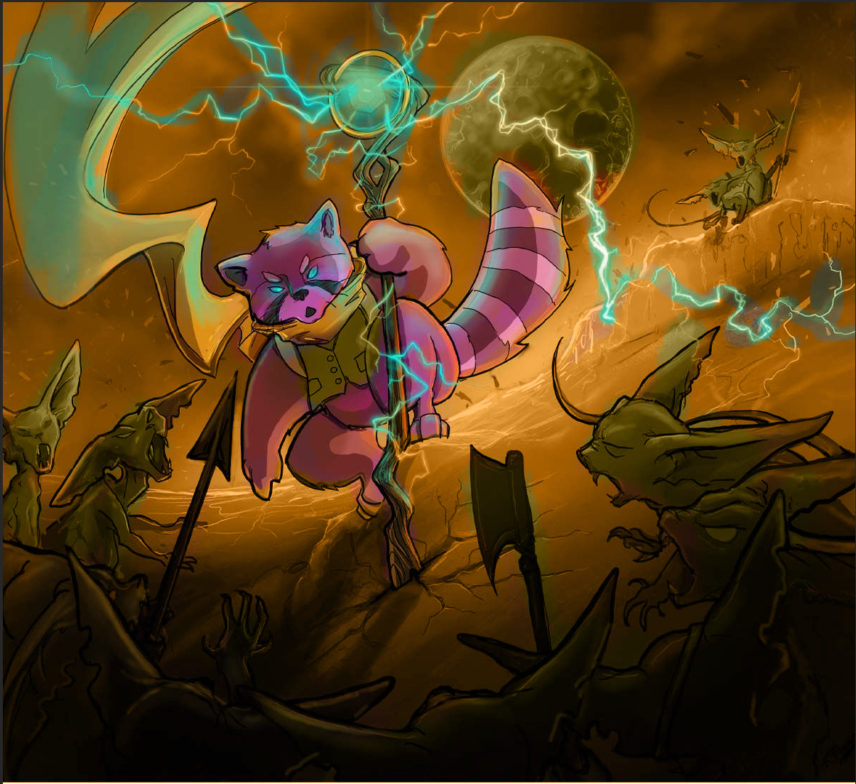 Here is what I meant.
I used color theory to assist with the focal point. Since your guy is purple I made the background shades if yellow and gold to make him pop. I also added a touch of red to make him stand out even more. -
@K-Flagg I totally get it. But remember that several other comic book artists have also been being picked. So don't get frustrated. Just learn what you need and keep putting your work out there. I wouldn't just look at the comic book stuff but the foundational stuff too. Even though I am a certified art teacher I still have learned tons of stuff from these courses and when I fail to apply them is when I make pieces that are not up to snuff. For example, will's class on creative composition really helped me to figure out what I was doing wrong with my storytelling.
-
@chrisaakins Thank you for taking the time to do a draw over, that really does make a huge difference. I know there have been a few comic artists that get picked for top 16 but they never make it to the end. I was just going back through all the past winners and they are all pieces that are traditional Children's book styles. the only exception I could find was Miranda Hoover's art which is still children's book art but in a more graphic style.
-
I have been meaning to try doing a piece using one of David Petersen's color pallets. I have been a fan of his books for years. He is incredible at inking and his use of color is so beautiful. I have been watching his live streams on Twitch and doing the monthly art challenges that he does. It might be time to pull the trigger on that project as a personal challenge. Here is his sight if anyone is curious who I am talking about:
-
@K-Flagg I agree with @chrisaakins about the style but mostly about the color. Your digital pieces are always very saturated, which is funny because I’ve noticed your traditional work is almost the opposite. Have you tried entering the contests with a traditional illustration? Or do the illustration traditionally then upload for minor tweaks?
-
Have you taken the creating custom color palettes course here with (I think it’s yas imamura)? Really, really great course I recommend it!
-
@Asyas_illos Haha I actually haven't entered a traditional piece accept for the inktober month contests. Last year mine was not picked but I wasn't super happy with my entry. I have though about sitting down and doing some traditional work for the contests but I wasn't sure my traditional work would fit in. I should give it a shot. In 2019 I actually did make top 8 with my inktober piece but that was so long ago.
-
@Asyas_illos I actually did watch that class and her work was really great but nothing really stuck. I should try to go back and watch it again i guess.
-
@K-Flagg your drawing is good. For the latest piece, I think the values could be improved on a little. You have a dark character on a dark background. If you desaturate your piece you might see the value problem more clearly.
-
@chrisaakins @K-Flagg - I agree, great advice from Lee, there's so much to be got from the critiques made to others...it can really help improve work and although it must be nice to win it's great practice working to a deadline
-
@K-Flagg While I probably am not qualified to address your question, I have some thoughts...
October 2020
The idea is good, but there are technical issues. Some are minor, like the cat's name tag is sitting on top of it's out stretched right paw.Traveler’s Inn
It was a surprise there were several nautical-themed inns submitted. What should have been a bold idea was lost in the crowd.The ship is well rendered, with a few perspective errors in the railing and portholes. That could have subtracted points. I’m curious to know why the lamp post is tilting at the same angle as the ship.
If there is a story behind the boat, I cannot say what the narrative is. Is it a building made to look like a ship? Is it a ship run around and converted to being an inn? There are sails, so it the boat sea-worthy?
While the choice of natural wood color is fine, it’s only fine. Have you considered give the ship a coat of paint? To add history, perhaps the stern/transom could have the ship’s name on it in its original paint, tacked on with the word “inn”?
May 2021
I see there is a stand-off between characters, but the narrative isn't clear. Is the racoon there to parley, fight or is trapped?The positioning of the enemy characters is odd. The two on the right, to whom are they snarling at? They’re not facing the raccoon. The one on the left with an open mouth, what are you telling the viewer with its arms? The one next to it seems to have turned his head to face the racoon. Why is it's body facing the cliffs?
-
@K-Flagg I think your character designs are really nice, there's a lot of nice expressions and gestures. Your colour choices are really good too. With the more illustrative pieces, however, I think you maybe need to work a little bit with some of the fundamentals and follow the judges' advice as much as you can, if your goal is to win the contests. Some of the contestants who win a lot are already professional illustrators or have been doing this for a long time so I wouldn't compare yourself to them and just compare yourself to you. For example, whenever I don't win or get noticed, or lose to someone in who is 44 when I'm 22, I just imagine how good I'll be when I'm that age. Hard work and dedication will always be rewarded in the end in some way or another, so keep going. I think your work is more or less there anyway, I love your character sheets !!
-
Hi! I can offer my perspective as a newcomer in the area of trained illustration. I am not a professional, and as a hobbyist I have been drawing mainly in a simple cartoony style, also my aim is towards comics and graphic novels. So I am a little behind still, but I am trying hard to look at what I do with a critical eye and find out where I am going (also my first try in the svs challenge, greatly acclaimed by my family, was quite invisible here!).
So, trying to get to the point, from my point of view, I don’t think the matter with your pieces is they are not “small children book illustration” as you mentioned, I think that you are on the right track for drawing comics, as your drawing and compositions and character looks fine, and the lack of succes as you perceive it on the challenge is just an indicator that you are close but that an extra layer of polish and experience is needed to get to that art level a single more professional illustration needs - the colors, values, style of rendering as discussed previously. Even if it might not be the necessary requirement for regular comic book work, I think getting that extra level of art and polish does push one to better results overall.
Τhis was actually mentioned on one of the pieces in the current critique session - that it would have done well in an array of images like in a story or a comic book - but for a showcase illustration it lacked enough wow. I think this means that to get to a better level and win in this challenge one has to be able to get an illustration to a “cover” “ or “art poster” level.
As indeed on svs much of the examples offered are children book images, maybe it would be usefull to have on the side as a study and comparison some art covers from other areas - YA, hero comics, pieces to wich you relate better..
I hope what I wrote made some sense... in my head it does

-
Ps. And I too think your weak point at this moment is the coloring/rendering - it’s a bit harsh... (I identify, having great pains myself with the coloring) so more work in that direction would get progress

-
@K-Flagg I actually think you made some great progress from the first illustration in 2020 to the last! Can you see that, I wonder?
-
Oh, and I noticed something about the last piece.... I realised what was bothering me about it: maybe by giving the racoon the blue lighting eyes you have lost his personality, it looks very cold... like the goblins...he is the main focus and the good guy in the piece, but he looks too distant like this to draw you on his side. Maybe this also influences people’s reaction,not just the colors?