Book Cover Composition Feedback Please
-
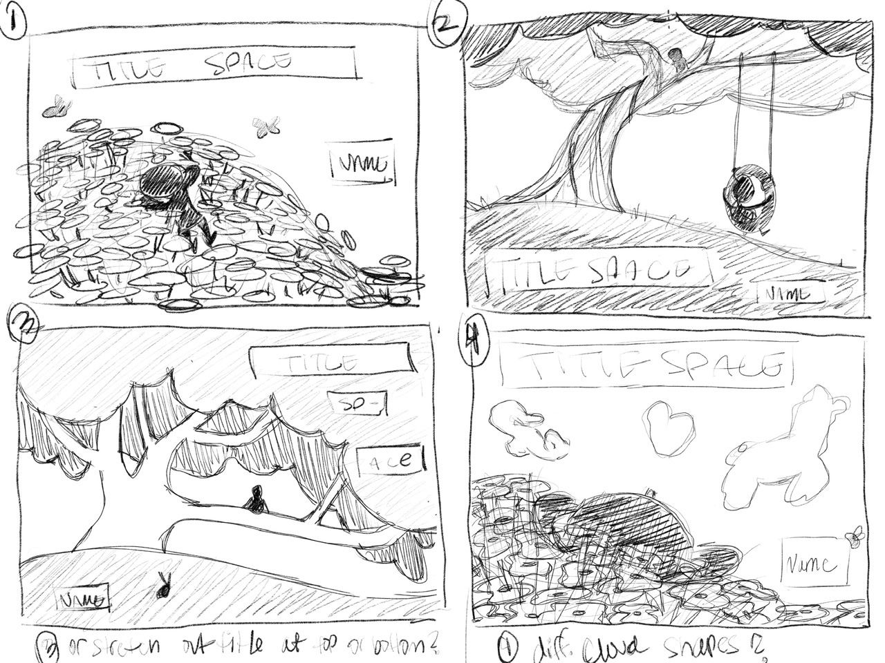
I am working on a picture book with just rough ideas and sketches (I wanna be the “centaur” lol) I’ve narrowed it down to these four and I’d like some feedback on which cover composition you guys like best. I’ll most likely still use the other comps throughout the book too, but want some fresh eyes and opinions

-
@Asyas_illos I think it's a tie between 2 and 4 for me. The composition on 2 looks nice and clear and the focal point is in a nice location, but I really like the idea of number 4, the angle is really interesting.
-
@brettb_draws thanks for the feedback! I'm glad you could tell the perspective on four, I was worried that it wouldn’t read well in rough sketch mode!
-
Four is my favorite by far...I can imagine the title in puffy cloud font. The point of view is engaging.
Number one is my second fav....unless the flowers are bright orange poppies against green which would be distracting.
-
@RachelArmington thank you, I haven’t decided what kind of flowers they are yet but I’m going to avoid bright colors lol except for pops here and there
 ️
️ -
@Asyas_illos Hmm, I think it really depends on what the topic/subject matter is, but without knowing that... I think I like number one, mostly because it's the one where you can really see the main character's face most clearly. I do really like the other comps as well, and I think number 2 could be an interesting back cover honestly!
Sabrina Gosselin
Instagram: https://www.instagram.com/sabbygimagery/
Website (currently a WIP): https://sabbygimagery.com/ -
Hi @Asyas_illos, I like the composition of #2.
-
@Jeremy-Ross thanks for the feedback!
-
I think its good to always have the title near the top. Depending on how books are presented, if you have the title at the bottom, theres a chance it would be cover up.
Art is hard.
https://www.instagram.com/janettehillart/ -
@Asyas_illos what's the book about? Really difficult to give feedback on cover design without knowing the gist of the story, as that's what the cover is supposed to communicate. (And sell the book, of course!)

Just looking at these, not knowing the story, really liking your lines and flow in 1 and 4. Check comp titles for your book -- there are quite a few picture book covers out there already with a predominant tree on the cover. (The Giving Tree by Shel Silverstein, Dear Girl by Amy Krause Rosenthal and Paris Rosenthal, my best friend by Julie Fogliano, and The Night Gardener by the Fan Brothers spring to mind.) There are also some picture books that have a field and sky composition, but not as many. (For example, Love by Matt de la Pena and I Wish You More by Amy Krause Rosenthal.) Putting a twist on yours will help it stand out from what's already out there.
 ️
️illustrator - author - smiley person
mbaileyart.com
instagram.com/mbaileyart/ -
@Janette interesting, good point!I hadn’t thought of that, Thank you!
-
@Melissa-Bailey-0 thank you for tips! The book is about being alone and not in a bad way, some people enjoy being alone and also how they aren’t really alone there’s always something like the trees or flowers or animals and ultimately themselves. I haven’t thought about the title too much yet so that why I left it off for now

-
I haven’t even written it yet but it’s going to be a very minimal word story like a sentence per page, relying heavily on the illustrations.
-
@Sabrina-Gosselin thank you, I missed your post earlier but I answered that same question to @Melissa-Bailey-0 ithe book is about being alone and loving it basically. Thanks for your feedback!
-
@Asyas_illos So having watched the Adventures of Beetle zoom discussion, it looks like I'm not actually right about my comment on the titles always going at the top. lol I have no idea what I'm talking about!
Art is hard.
https://www.instagram.com/janettehillart/ -
I think #4 is the most interesting and creative composition
K.Flagg
-
@Janette hahaha! No worries it made sense to me but what do I know! Lol
-
@K-Flagg thank you for your input 4 seems to be popular!