Society of Visual Storytelling

    SVSLearn Forums

    • Register
    • Login
    • Search
    • Recent
    • Tags
    • Popular
    • Users
    • Groups
    • Search

    May contest entry WIP

    Contest
    12
    30
    367
    Loading More Posts
    • Oldest to Newest
    • Newest to Oldest
    • Most Votes
    Reply
    • Reply as topic
    Log in to reply
    This topic has been deleted. Only users with topic management privileges can see it.
    • Morten Christiansen
      Morten Christiansen last edited by

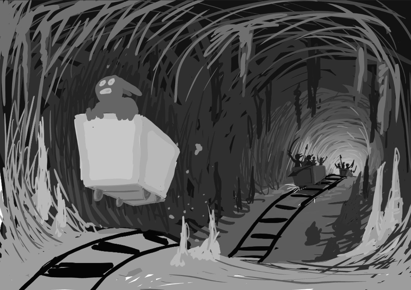
      This is the initial sketch for my May entry. Its a bit lacking in details apart from the wagons, but I'll try to work in a few extra touches such as animals, mushrooms, etc.
      8bfa568e-bee7-4399-a84a-96d0f15a1f1e-image.png

      Instagram: https://www.instagram.com/mortenchristiansenart/
      DeviantArt: https://www.deviantart.com/mortenchristiansen

      1 Reply Last reply Reply Quote 13
      • Sabrina Gosselin
        Sabrina Gosselin last edited by

        I love this! It's bringing back old memories from my Super Nintendo days and Donkey Kong Country (does that age me? Oops...). Are you planning on having debris/stuff from inside the cart/etc behind him (I think that's what those spots are supposed to be)? And this is just an extra thought because I already like his pose, but what if he's holding on to a hat/something? Anyway, really digging its dynamism so far! Kudos! πŸ‘πŸ» πŸ‘πŸ»

        Sabrina Gosselin

        Instagram: https://www.instagram.com/sabbygimagery/
        Website (currently a WIP): https://sabbygimagery.com/

        1 Reply Last reply Reply Quote 0
        • Morten Christiansen
          Morten Christiansen last edited by

          @Sabrina-Gosselin Thank you, I'm glad you like it. I think my main inspiration was Indiana Jones and the Temple of Doom. Those spots are indeed supposed to be debris. I haven't really spent much time figuring out what the adventurer will be like and what gear he/she will be carrying. I just liked the idea of the ears being caught in the wind πŸ˜‰

          Instagram: https://www.instagram.com/mortenchristiansenart/
          DeviantArt: https://www.deviantart.com/mortenchristiansen

          Janette ajillustrates 2 Replies Last reply Reply Quote 0
          • Janette
            Janette @Morten Christiansen last edited by

            @Morten-Christiansen My favourite movies as a kid! πŸ™‚

            Art is hard.
            https://www.instagram.com/janettehillart/

            1 Reply Last reply Reply Quote 0
            • ajillustrates
              ajillustrates @Morten Christiansen last edited by

              @Morten-Christiansen Just showed Temple of Doom to my kids for the first time the other day! You totally nailed vibe!

              https://ajillustrates.com
              https://www.instagram.com/aj.illustrates/

              1 Reply Last reply Reply Quote 1
              • Asyas_illos
                Asyas_illos last edited by

                This is great can't wait to see more!

                Asyasewardillos@gmail.com
                www.Instagram.com/asyas_illos/
                https://asyasewardillos.wixsite.com/mysite

                1 Reply Last reply Reply Quote 0
                • dantter
                  dantter last edited by

                  Very nice, very good use of the grayscale and chiaroscuro.

                  [url=https://www.piccolemedieaziende.it/creazione-sito/logo-design.html]creazione logo[/url]

                  1 Reply Last reply Reply Quote 0
                  • chrisaakins
                    chrisaakins last edited by chrisaakins

                    @Morten-Christiansen I love this! Very cool take on the idea!

                    Chris Akins
                    www.chrisakinsart.com
                    www.instagram.com/chrisakinsart/

                    1 Reply Last reply Reply Quote 0
                    • Morten Christiansen
                      Morten Christiansen last edited by

                      @Asyas_illos @chrisaakins Thank you guys πŸ‘

                      @dantter Cool, I just learned a new word πŸ™‚

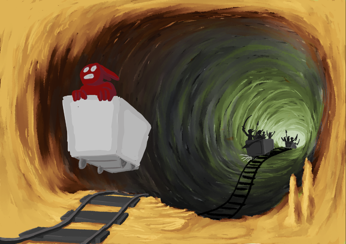
                      To be honest I've kept postponing the next part of this drawing a bit, since I was afraid I couldn't realize the feel of the initial sketch. The combination of lighting and texture work has been daunting since I have to capture a specific mood. Now that I've begun I think its not looking too bad. Currently I'm playing around with gradiant maps in photoshop, which allows me to map the grey-scale range to specific colors for the foreground, middle ground and background in isolation. In this example I'm testing a sort of evil looking green light for the background and a desert lighting for the foreground. I'm undecided if I like the idea that the foreground is the mouth of the cave, exposing the scene to daylight. The middle ground ties the two color schemes together with a subtle blue lighting. What do you think?
                      5520dd5b-a000-4fc9-973e-faf2bb5f3457-image.png

                      Instagram: https://www.instagram.com/mortenchristiansenart/
                      DeviantArt: https://www.deviantart.com/mortenchristiansen

                      lizardillo Georgios Christopoulos 2 Replies Last reply Reply Quote 7
                      • Larue
                        Larue last edited by

                        Nailed it!

                        1 Reply Last reply Reply Quote 0
                        • lizardillo
                          lizardillo @Morten Christiansen last edited by

                          @Morten-Christiansen this is wonderful

                          Website: lizardillo.co.uk
                          IG: instagram.com/lizardillo

                          1 Reply Last reply Reply Quote 0
                          • Georgios Christopoulos
                            Georgios Christopoulos @Morten Christiansen last edited by

                            @Morten-Christiansen this is beautiful so far.!

                            Instagram : https://www.instagram.com/g.chris.artwork/
                            Deviantart : https://www.deviantart.com/g-chris

                            1 Reply Last reply Reply Quote 0
                            • Asyas_illos
                              Asyas_illos last edited by

                              I like this color combo but curious what other color palettes you play with too!

                              Asyasewardillos@gmail.com
                              www.Instagram.com/asyas_illos/
                              https://asyasewardillos.wixsite.com/mysite

                              1 Reply Last reply Reply Quote 0
                              • Morten Christiansen
                                Morten Christiansen last edited by

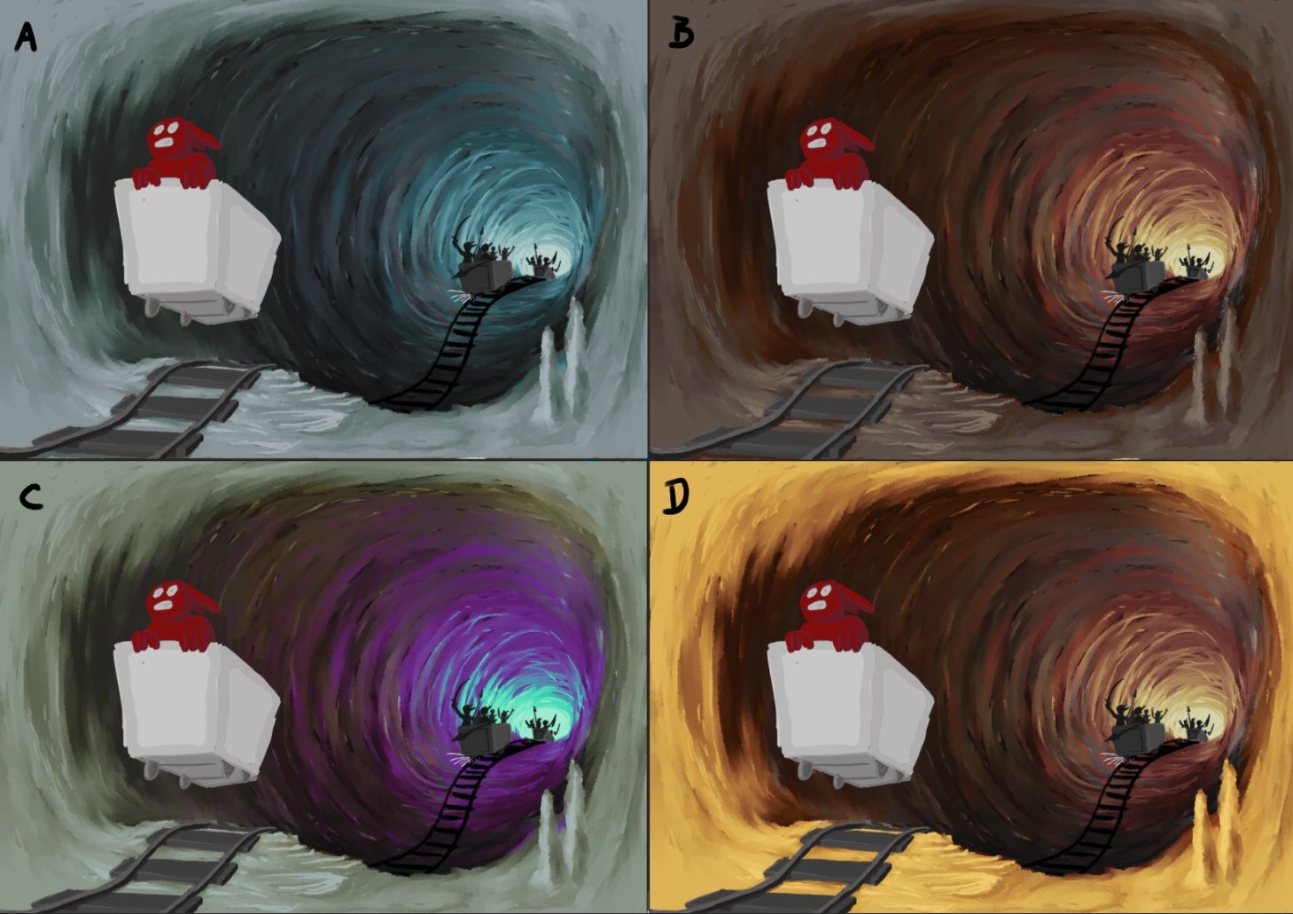
                                @Asyas_illos Here are a few other interesting color combinations. Option C was mostly just for fun though πŸ˜ƒ Of these I think I like A and B the best, although I still prefer the original one. Since its so easy I think I'll just alternate between them while working on the details for a bit to get a feel for each of them.
                                Untitled.jpg

                                Instagram: https://www.instagram.com/mortenchristiansenart/
                                DeviantArt: https://www.deviantart.com/mortenchristiansen

                                ajillustrates 1 Reply Last reply Reply Quote 1
                                • ajillustrates
                                  ajillustrates @Morten Christiansen last edited by

                                  @Morten-Christiansen I think I like B the most, but if A is set in an ice tunnel, that would be a really exciting illustration too.

                                  https://ajillustrates.com
                                  https://www.instagram.com/aj.illustrates/

                                  1 Reply Last reply Reply Quote 0
                                  • Morten Christiansen
                                    Morten Christiansen last edited by

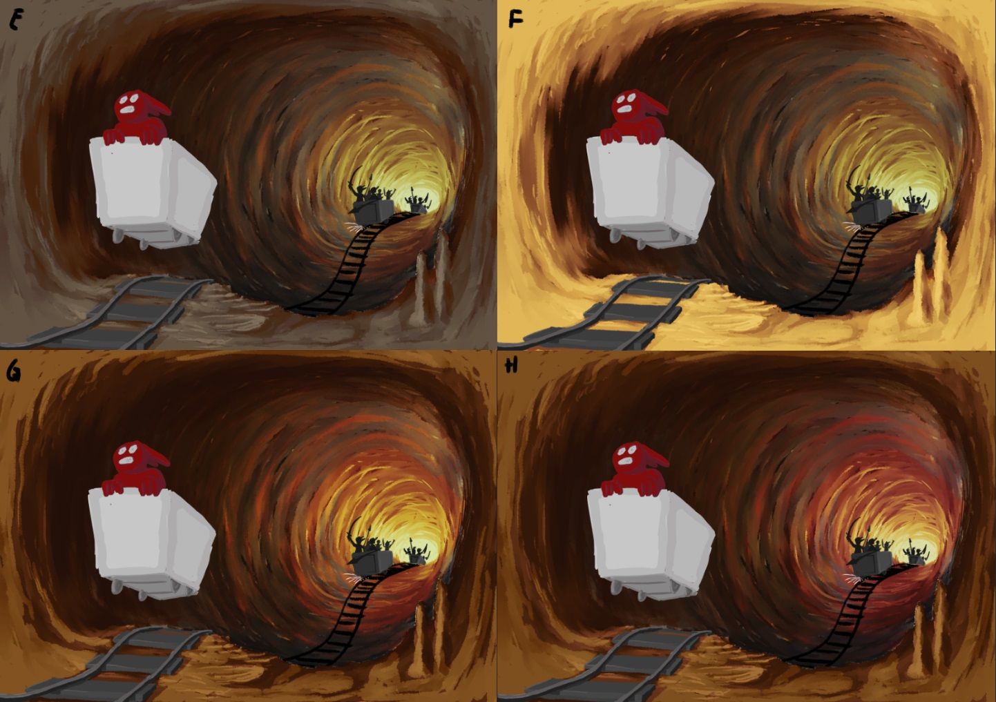
                                    Hmm, an interesting development. By accident I turned on two different color schemes at the same time and it turns out that they combine in interesting and quite dramatic ways. Here are a some examples of how the original can be mixed with option B and D. I think it will become quite difficult to choose πŸ™‚

                                    Untitled2.jpg

                                    Instagram: https://www.instagram.com/mortenchristiansenart/
                                    DeviantArt: https://www.deviantart.com/mortenchristiansen

                                    lizardillo 1 Reply Last reply Reply Quote 1
                                    • lizardillo
                                      lizardillo @Morten Christiansen last edited by

                                      @Morten-Christiansen oooh I like G!

                                      Website: lizardillo.co.uk
                                      IG: instagram.com/lizardillo

                                      1 Reply Last reply Reply Quote 0
                                      • Melissa_Bailey
                                        Melissa_Bailey last edited by Melissa_Bailey

                                        Really interesting color combinations! Love the storytelling, too.

                                        But for me, one thing is unclear: where is your focal point? Do you want the viewer to first see the pursuers? The foreground character? The cart?

                                        When I squint or look from a distance, the first thing I see is the cart -- it's so light and has the most contrast. The second thing I see are the characters in the background giving chase. Even though he's red, the character being chased (your main character?) gets lost in the warm background, maybe because the values are so similar and because of the high contrast of the cart he's in.

                                        If this isn't supporting the story you want to tell, one small change that might help with your values is to lighten the dark values right behind the character, which naturally would happen at the entrance of a cave. You could also put some rim lighting behind the character, as there would be some cast light from that strong secondary light source in the background. This might help him stand out more.

                                        Found a reference image that might help communicate what I'm trying to say:
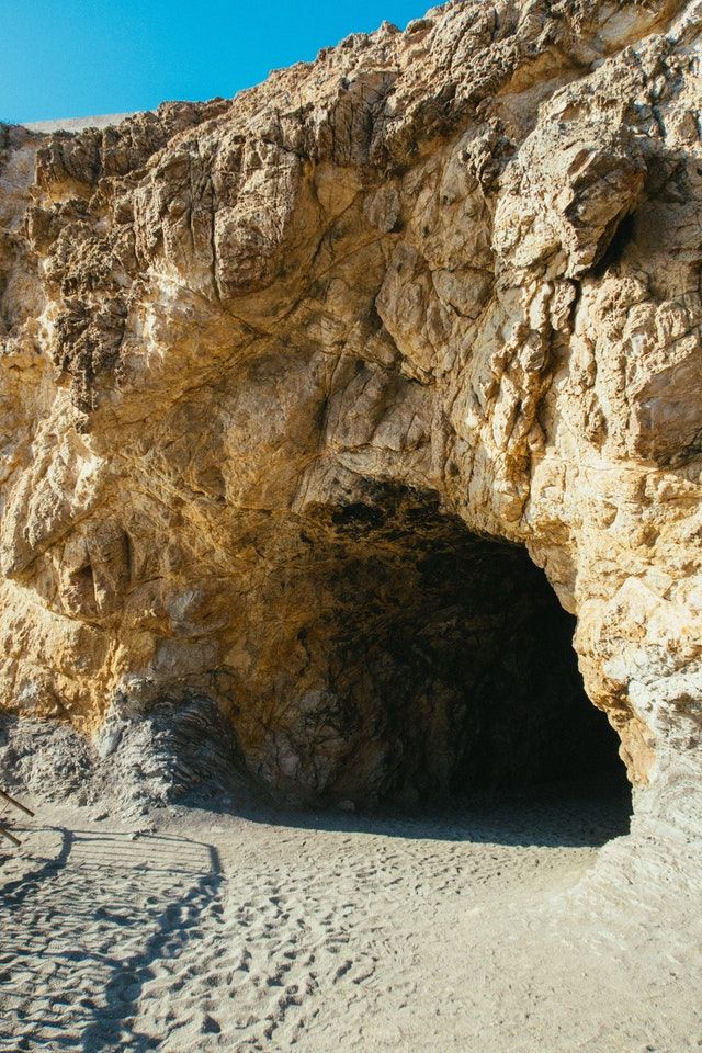
                                        f2165bd8-42e6-425a-a2bf-1f746e8bf413-pexels-athena-3010021.jpg

                                        Just wanted to share what I'm seeing. Looking forward to seeing where you go with this piece! pexels-athena-3010021.jpg

                                        illustrator - author - smiley person
                                        mbaileyart.com
                                        instagram.com/mbaileyart/

                                        1 Reply Last reply Reply Quote 0
                                        • Asyas_illos
                                          Asyas_illos last edited by

                                          Great color combos! I personally like G and H (although c was really fun) and I also agree with @Melissa-Bailey-0 that the character to cart contrast should maybe be switched, I realized you’re not finished maybe you are already doing this, but yes he does get a bit lost in the background.

                                          Asyasewardillos@gmail.com
                                          www.Instagram.com/asyas_illos/
                                          https://asyasewardillos.wixsite.com/mysite

                                          1 Reply Last reply Reply Quote 0
                                          • Morten Christiansen
                                            Morten Christiansen last edited by

                                            @Melissa-Bailey-0 The front cart is supposed to be the main focus, with the pursuers the secondary focus. I had deliberately held the front cart in neutral colors so far because I wanted to get the background colors down first. I'm closer now to its final look, but there is still some tweaking to be done to isolate it from the background.

                                            When I added the lamp to the cart it naturally drove the mood to better fit without daylight in the foreground.
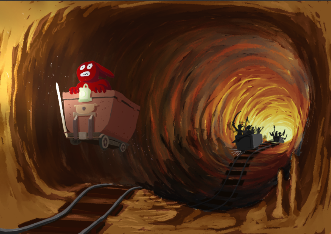
                                            5e7ae7f6-b660-4d38-8527-de12cdeb1dc1-image.png

                                            Instagram: https://www.instagram.com/mortenchristiansenart/
                                            DeviantArt: https://www.deviantart.com/mortenchristiansen

                                            1 Reply Last reply Reply Quote 2
                                            • First post
                                              Last post