New Portfolio Website!
-
Hello SVS Community!
Finally, I’ve launched my very own Portfolio website!
I’ve selected some of my favorite pieces from the SVS monthly challenges and proud to finally have a portfolio to showcase my work.
Before joining SVS in 2019, I had no idea I would be pursuing children’s picture books, but I’m having a lot of fun on this new journey in my 40’s.
Love to get your thoughts on my website!
Thank you!!!!
-
@Jeremy-Ross Yay! This is exciting! The site looks great, so many amazing pieces! I just bought your first book "Nobody Loves Mustard", can't wait to read it. Congratulations!!!!
-
Fabulous!!! Well done!!
-
Thank you so much @Tiffany-Thomas!
-
Thank you @Coreyartus!
-
Website looks great! Congrats!
-
@Jeremy-Ross Congrats...inspiration to get mine up! Good luck out there. Looks great!
-
Thank you @Asyas_illos and @Larue!
-
Hi everyone!
I just wanted to announce that I’ve updated my website based on advice from recent airings of the 3-Point Perspective podcast, and the Children’s Book Pro course. I still have quite of work to continue improving, but you have to start somewhere, right?
Here’s a quick summary of my additions:
-
New pieces added (better pieces) (e.g., fun food series, more variation, spots, full page spreads, stand-alone pieces, etc.) Also, I provided a brief caption on each piece to provide background and thoughts. I’m hoping this slows my audience down a bit rather than quickly scrolling through the art.
-
Added a “Sequential Art” tab. This includes a selection of in-process artwork from the initial sketches to the finished piece. This gives an art director a level of confidence of what they can expect from me.
-
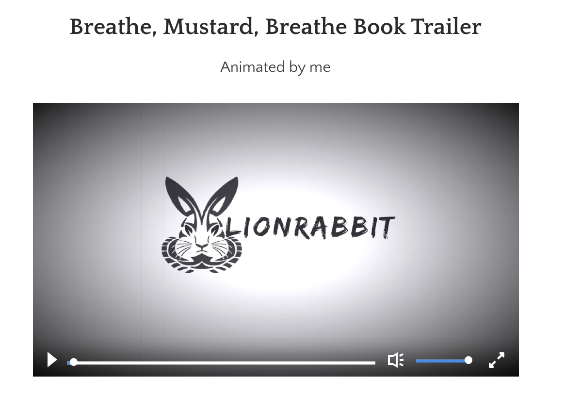
Added an “Animation” tab. My goal with this tab is to show the publishers that I can also animate trailers, if necessary.
-
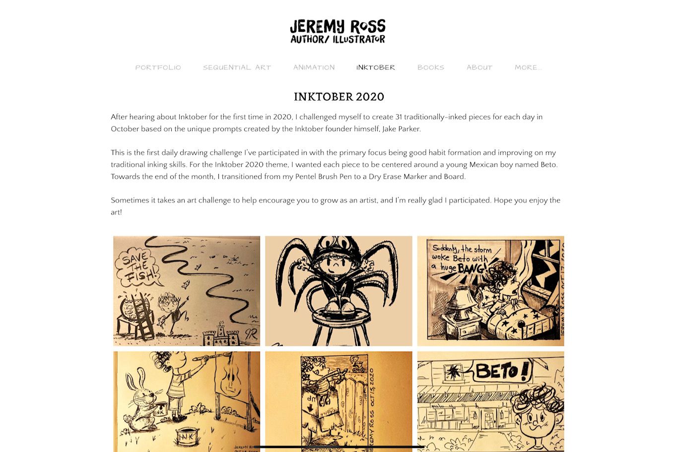
Added an “INKTOBER” tab. I debated on including my Inktober work because I wasn’t sure if it’s “good enough” because it’s quick work; however, I’m proud that I followed through with the challenge. I’m hoping this shows my perseverance and grit to get through the month.
-
Added a “Media / Interviews” tab. I was pleasantly surprised to hear about my books being read at a library in Connecticut and a few YouTubers using my books for story time, so I thought it might be helpful to future agents, editors, art directors, etc.
-
Other thoughts. I’ve written articles for health and fitness and thinking about linking my blog on my site, though I’m not sure if it’s to different. Thoughts?
-
Other thoughts. Should I include my email or do you think the web form is better? I’m concerned with spammers or disingenuous people capturing my email.
-
Other thoughts. I’m considering starting a newsletter. Curious if others have seen positive results.
Here are some screen shots of the updates.
What do you all think of my website updates?
Thanks for taking a look!
https://www.jeremyrayross.com/


-
-
This is great progress Jeremy. Feedback is always important on these.
The fact that you decided to do an Inktober round with a character named after me (Alberto is my real name and Beto is a common nickname in Spanish) is enough grounds for approval.


Regarding the email in site: I tried using a web form by formspree.io because it kinda made sense, but eventually became a magnet for spam and I didn't want to add my email in clear text either... so I settled by reverse-encoding my address using ROT13 encoding and injecting it via Javascript, and so it displays on my contact page. Yes, it's super nerdy stuff but coding is my day job so this made sense for me. So far I haven't seen any spammer bothering to decode the whole thing (and I hope they don't in a long time).
-
@Jeremy-Ross Hi Jeremy!
Okay I just spent an entire day reviewing portfolios for my day job, so I'm going to let loose all my feedback on you LOL Know that I love your art and I really want you to succeed so all of this feedback comes from a place of love.
This title bar is super hard to read, there isn't enough contrast for the text.

I actually don't like the text under the images personally, I would rather be able to enjoy your art, and click on a piece to learn more if I wanted. I find the text detracts from your art. But I'm interested to hear how others feel about it, and trying to have people slow down is an interesting idea.
I think you have too many pieces, and there is a lot of work there that I know you made a long time ago that isn't up to your current abilities, I would take it out. There are also a lot of varied styles in your portfolio, you'll want to filter that down, but I know you're still figuring that out.
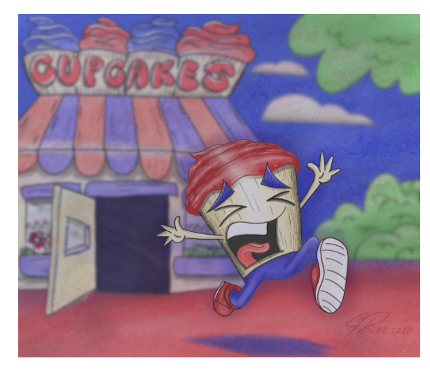
For example this one doesn't have as good color or value as your other pieces:

"Sequential Art" usually means comics or storyboarding. Not showing your steps of how to create a piece. I'm not sure what the purpose of this tab is
I actually really like the inktober tab, I would move that and "books" closer to your portfolio tab
random but for the animation page, can you give this guy a thumbnail image? I thought it was just going to be a logo animated and never would have clicked on it

-
Nice work!
-
Hi @carlianne, I’m so grateful for your feedback!
I agree completely with your comments, and will definitely make these changes. I might need to work some coding to hide the art descriptions; though admittedly, I like the portfolio without the descriptions, but curious how it looked to others.
I suppose great art will slow down an audience, not forced reading, haha!
Thanks again for your constructive feedback!
-
Hi @Alzamon, thanks for the feedback and for geeking out on the coding! Love it!
When I was a kid, my Mexican family and friends called me Tito because Jeremy was too long to say, lol. My cousin’s name is Beto too, which I thought would be a cool name for a character in a book.
I’m glad you like the Inktober tab!
-
Thank you @keithryanstudio!
-
@Jeremy-Ross you're welcome! And I didn't know you had author/illustrated some books! That's so awesome!
-
Thank you @carlianne!
-
Hi @carlianne, I fixed everything you suggested, re-arranged my tabs, and deleted some of my old pieces.
I just want to take this opportunity to thank you for taking time to provide constructive criticism of not only my website, but also my portfolio.
You’re right, I’m still working on my style and not trying too hard to find it; just taking my time.
I’m very late in the game of illustration at 42, but hope to make a positive impact with my art.
Thank you!
-
It's honestly so much better!! Great job applying the critique!
The reason I continue to give you feedback is because I can see that you really take the feedback to heart and because of that you really are growing very rapidly! Just keep going my man you're doing all the right things

-
Thank you @carlianne, feedback is a gift!