New Portfolio Website!
-
@Jeremy-Ross Hi Jeremy!
Okay I just spent an entire day reviewing portfolios for my day job, so I'm going to let loose all my feedback on you LOL Know that I love your art and I really want you to succeed so all of this feedback comes from a place of love.
This title bar is super hard to read, there isn't enough contrast for the text.
I actually don't like the text under the images personally, I would rather be able to enjoy your art, and click on a piece to learn more if I wanted. I find the text detracts from your art. But I'm interested to hear how others feel about it, and trying to have people slow down is an interesting idea.
I think you have too many pieces, and there is a lot of work there that I know you made a long time ago that isn't up to your current abilities, I would take it out. There are also a lot of varied styles in your portfolio, you'll want to filter that down, but I know you're still figuring that out.
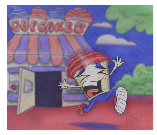
For example this one doesn't have as good color or value as your other pieces:
"Sequential Art" usually means comics or storyboarding. Not showing your steps of how to create a piece. I'm not sure what the purpose of this tab is
I actually really like the inktober tab, I would move that and "books" closer to your portfolio tab
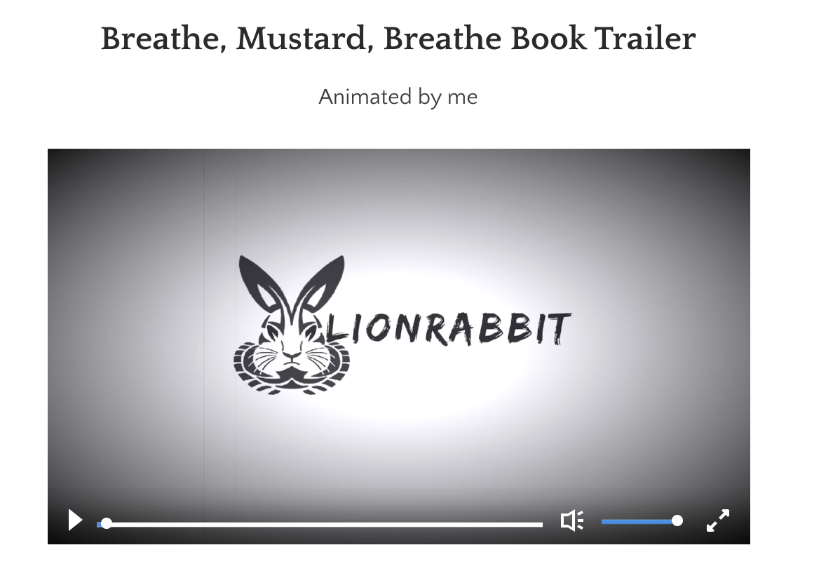
random but for the animation page, can you give this guy a thumbnail image? I thought it was just going to be a logo animated and never would have clicked on it
Check out my art and tutorials :)
Instagram: www.instagram.com/carliannecreates/
Youtube:
https://youtube.com/c/CarlianneCreatesShop: www.carliannecreates.com
-
Nice work!
https://instagram.com/keithryanstudio
https://keithryanstudio.com
#createforward -
Hi @carlianne, I’m so grateful for your feedback!
I agree completely with your comments, and will definitely make these changes. I might need to work some coding to hide the art descriptions; though admittedly, I like the portfolio without the descriptions, but curious how it looked to others.
I suppose great art will slow down an audience, not forced reading, haha!
Thanks again for your constructive feedback!
-
Hi @Alzamon, thanks for the feedback and for geeking out on the coding! Love it!
When I was a kid, my Mexican family and friends called me Tito because Jeremy was too long to say, lol. My cousin’s name is Beto too, which I thought would be a cool name for a character in a book.
I’m glad you like the Inktober tab!
-
Thank you @keithryanstudio!
-
@Jeremy-Ross you're welcome! And I didn't know you had author/illustrated some books! That's so awesome!
Check out my art and tutorials :)
Instagram: www.instagram.com/carliannecreates/
Youtube:
https://youtube.com/c/CarlianneCreatesShop: www.carliannecreates.com
-
Thank you @carlianne!
-
Hi @carlianne, I fixed everything you suggested, re-arranged my tabs, and deleted some of my old pieces.
I just want to take this opportunity to thank you for taking time to provide constructive criticism of not only my website, but also my portfolio.
You’re right, I’m still working on my style and not trying too hard to find it; just taking my time.
I’m very late in the game of illustration at 42, but hope to make a positive impact with my art.
Thank you!
-
It's honestly so much better!! Great job applying the critique!
The reason I continue to give you feedback is because I can see that you really take the feedback to heart and because of that you really are growing very rapidly! Just keep going my man you're doing all the right things
")
Check out my art and tutorials :)
Instagram: www.instagram.com/carliannecreates/
Youtube:
https://youtube.com/c/CarlianneCreatesShop: www.carliannecreates.com
-
Thank you @carlianne, feedback is a gift!
-
@Jeremy-Ross said in New Portfolio Website!:
I’m very late in the game of illustration at 42, but hope to make a positive impact with my art.
I'm a few years older than you, I actually majored in graphic design and art. Illustration and animation are fields I always wanted to make my mark on but life took me in different directions... now I am here charting back my course looking to finally scratch that itch, trying to cast a wide net in all things creative.
Just in case you've ever felt like being alone at this — well, don't.

Portfolio + blog + sketchy things @ https://alzamon.art
IG: https://instagram.com/alzamonart/
Twitter: https://twitter.com/alzamonart/ -
Thank you @Alzamon! That’s what makes this community awesome!
-
@Jeremy-Ross nice website, really compliments your style.
-
Hey Jeremy,
I just took a look at you website and i think you did a great job so far!
As i was looking at the from sketch to finisched site i was thinking, that art directors most likely dont have the time to wait for your slide shows to finish by them selfe.
I would maybe just upload 3 or 5 pictures of the process. 3 Because they fit in a row, to show the progress.Also i personally don't like the inktober section because of the inconsistency of the lightningt or process, all the pictures have this yellow lightning and at the end, they get all extra white, maybe because you changed your medium?
I would have the feeling by looking at it, you just didnt want to put the effort in making a nice picture or scan the pieces.Professional people taking a look at your website, don't know you and don't have a backstory on why you did something or maybe also don't read the text above.
I guess you would like to be real about the progress, so you just took the pictures you made last year from inktober. But at the end of the day, the market out there is all about selling yourself.
You can stick to what you think is right for you, thats fair enough. I am pretty drained by playing this instagram/(insert what ever you like social media) game. But for me personally it would bother me.
If its important enough to show it, it should be important enough to present it in the best way possible.The Contact site it nice, i personally would go for one picture instead of header picture (thats perfectly fitting) AND an extra illustration. Its also perfectly fitting, but distracting too. Also the litlle monster looks to sad (somehow negative) to send you an E-mail

I have both, my e-mail and my Web Form. my clients use both of it. Also i don't have spam, maybe it's luck or not i don't know. I'm using my mailaddress for 5 Years now.
If you think your Blog is important for you, you could link it in the more section, but as you said, it could be too different. Maybe you should keep it seperatet.
But like i said, you did a great job on your website and i'm looking forward to see more of your work
Website: www.von-Nimmermehr.com
Instagram: https://www.instagram.com/von_nimmermehr_illustration/ -
Thank you @harris! It’s certainly a work in progress, but slowly getting better with time and effort.
-
Hi @von_Nimmermehr, thank you so much for your thoughtful feedback!
I appreciate your feedback on my 2020 Inktober pieces, will look at opportunities to improve the aesthetics. You’re right, I was all over the place with media so will need to take another look.
You gave me some great things to think about to improve the look and feel of my site, especially the start-to-finish slides.
Many thanks!