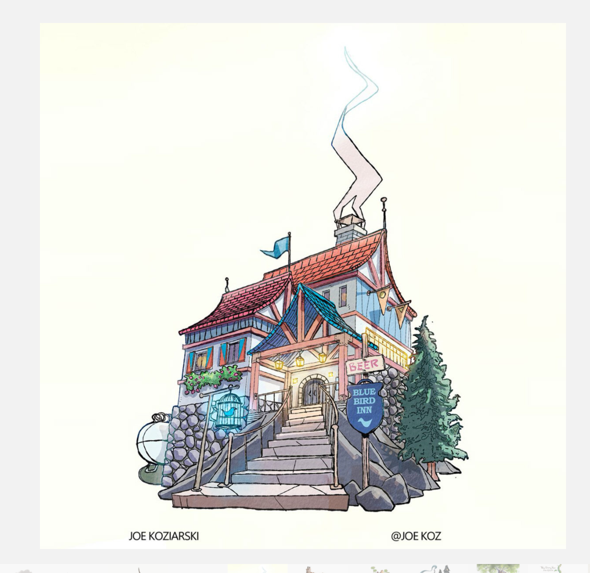
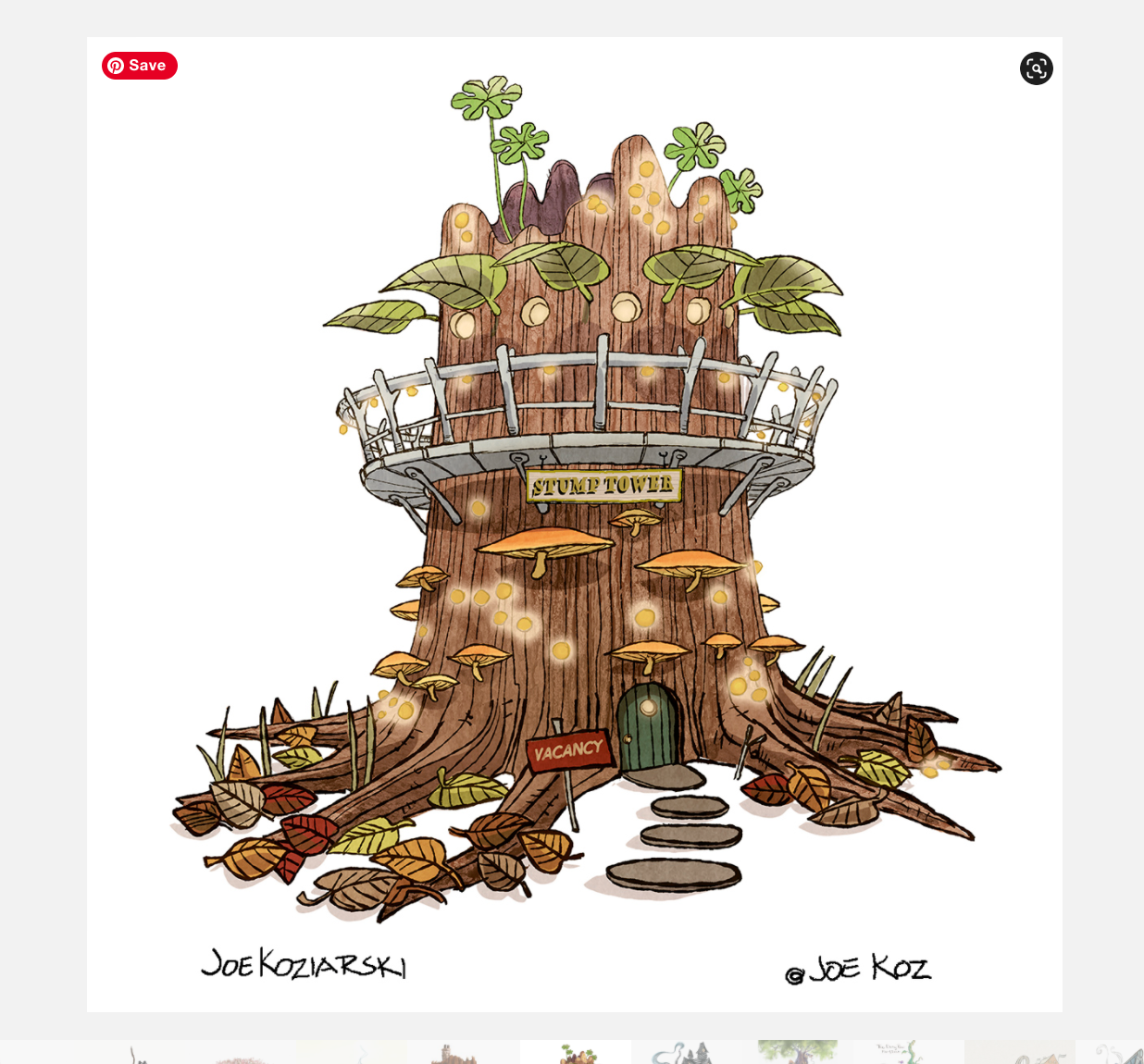
APRIL CONTEST: Design A Fairy-Tale Inn
-
@Elizabeth-Rose the hat texture is beautiful
-
@ellenseal14 This is lovely

-
@Tiffany-Thomas you have such a wonderful style
-
@Larue thanks so much!
 ️
️ -
@Melissa-Bailey-0 I'm having fun spotting all of the fairytales, just noticed the three bears in the window

-
@lizardillo so glad you're enjoying it! (I may have gone a little overboard with all the fairytale references.
 )
) -
@lizardillo hah that's funny you say that. I swear the entire time I was drawing the falls it was like I was literally hearing the roaring water and I was like "Am I freaking crazy? What is this??". It felt like it got louder the closer to being done it was. That must sound ridiculous lol.
-
@lizardillo Also pretty epic final there. Really nailed making it look super busy but it all fits and makes sense and belongs.
-
@Kim-Rosenlof Thanks! Yes, mine's mostly watercolor with some color ad detail fixing in Procreate. I'm also trying to find that balance between work that feels good in traditional media with work that I can edit quickly digitally. Getting closer.
@lizardillo Yes! -
@Larue thanks for leaving so many supportive comments for people!

-
@lizardillo glad you like it! Thanks.
-
@Tiffany-Thomas Thanks so much! I had a bit of resistance to this month's challenge and creating a building, but once I finally got going, I really enjoyed it and then I just kept wanting to add more and more details. Thank goodness for the deadline.

-
@Jeremiahbrown thanks so much Jeremiah!! Glad you like it!
@ajillustrates thanks so much! I was worried for Choosing this pallette, but it turns out it came out ok !!
@ruth thank you very much Ruth! -
@ellenseal14 thanks so much!! Yeah I bet he d be really annoying especially on very hard mode!!
-
@Asyas_illos they looked good to me
 I am going to play around with the template and Procreate in the next few weeks and see if there is anything I can do to make the process smother. Thank you for working through all these problems last month!
 -
Everyone's submissions should now be viewable in the gallery on the current contest page. If you noticed that I missed one please let me know. Thank you for everyone's willingness to work with us on the changes!
The new prompt should be up on the Critique Arena site later this week (we will also be posting it here on the forum).
-
@AustinShurtliff thank you for being patient! Also it’s not a big deal but I noticed on my entry of the sand castle there’s a tiny image in the center of the Rose entry lol.
-
@AustinShurtliff pretty sure I put an entry up on the critique site last Thursday or Friday that’s not showing in the scroll. Not that it’s going to make the top 16 or anything, just letting you know that there might be some missing. Or I might have screwed up with template.
-
@Larue thanks a lot

-
@Joe-Koz Hi Joe, I've just had a look at the slideshow and I can see two of yours.
I'm not really a fan of the slideshow format to be honest. You can't expand any of them to have a good look and there are some on there that are not on this thread and I would like to see them at my own pace. You have to keep clicking back and forward.
These are the two I can see:

