How can I improve this character design?
-
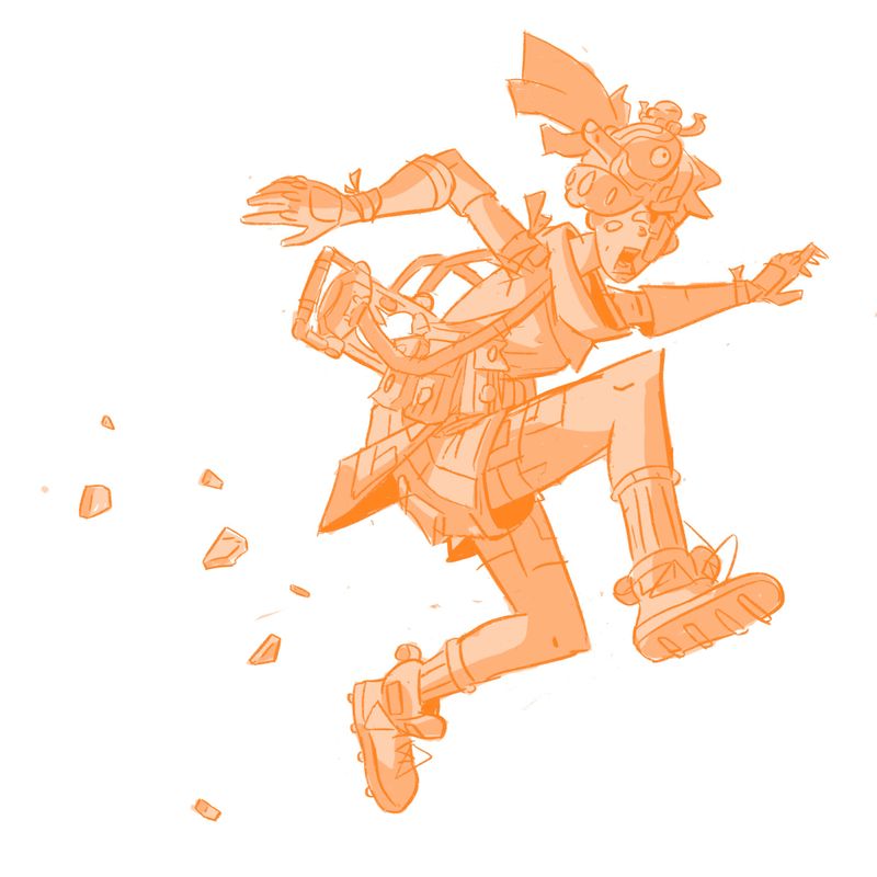
Hey SVS people, what do you think of this character design? I'm trying to open an online print shop and I needed some print-worthy art, so I decided to draw something cool looking that hints at a larger story. Is there anything I can improve? I'd love to hear your feedback. Thank you!
-
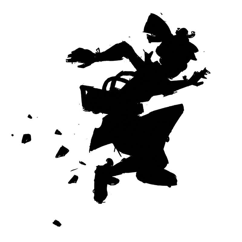
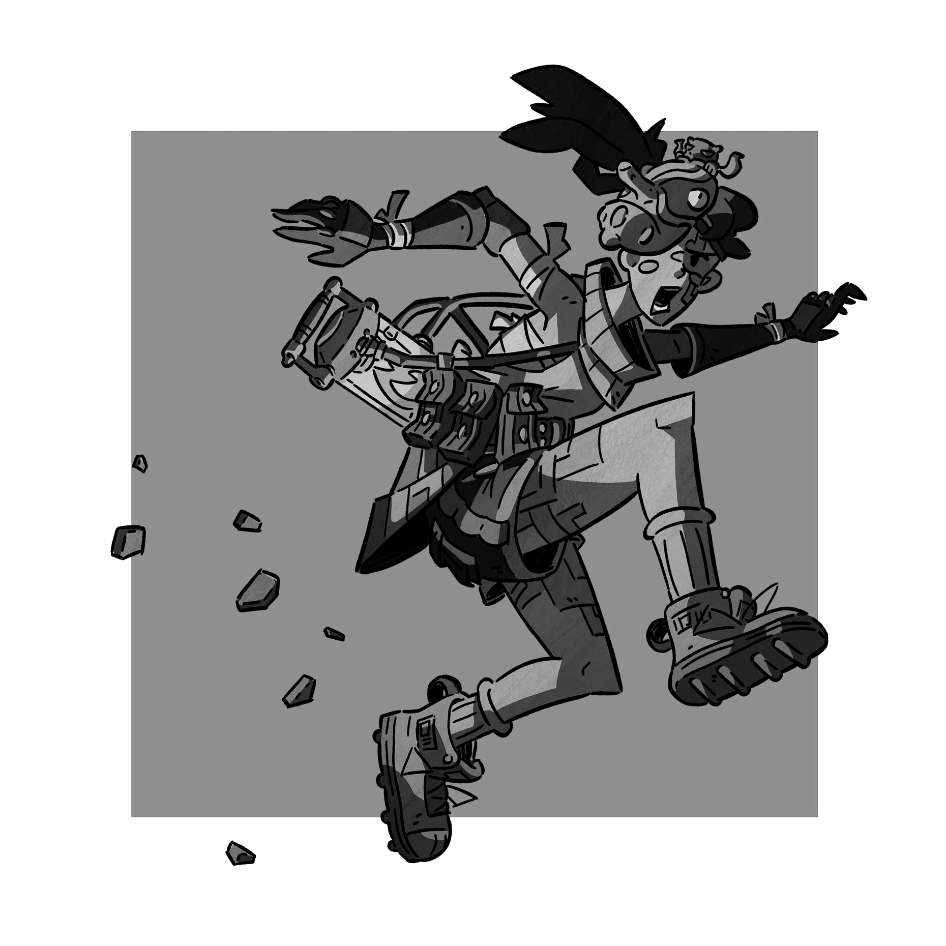
@phoenix-yip Hi I really like this piece, and from the looks of the character I would like to know more about the story, the world he lives in, and who he is. Are you going to refine this piece later? I feel like that would help give better advice on how you can improve him. The first thing I want to add about this piece is the silhouette. I feel like the legs are too close together and it makes his right leg less defined than it should be. His left arm gets lost because of the scarf he's wearing and it makes him look like he's got a really tiny arm.
So I don't know what route you want to go for. Are you trying to exaggerate the proportions so it looks like we have a narrow camera lens? Or is this more of a natural shot? Here's what you could do to improve the silhouette.
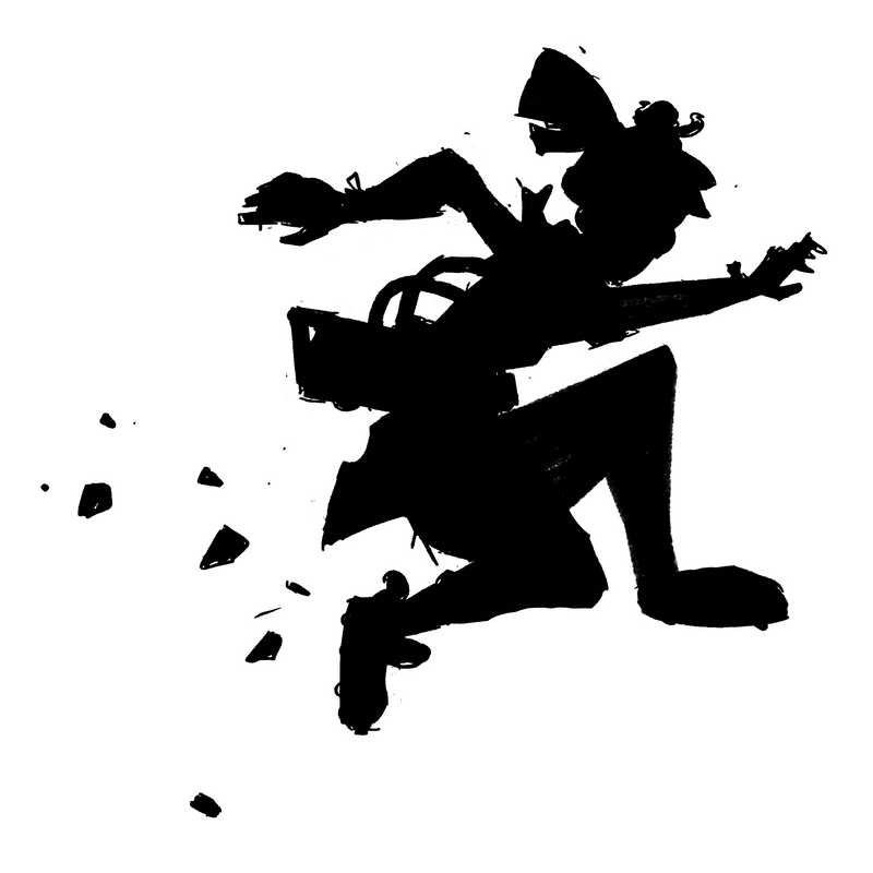
Another issue I can identify is visual clutter. I understand that you are going for a super-detailed character with a lots of cool thingamajigs around their body, because I have created characters like that too
 but I think especially around his torso area and his thighs too it's a little too much.
So I am going to assume he's wearing sometype of backpack? It kind of looks like a vaccuum. And around his really long waist is a bet with many pockets that I assume are filled with ammo, power-ups, health, etc. Try to lower the belt so that it's not competing for our attention with backpack, it gets obscured. Regarding the shorts, is that just a pattern on his clothes? Just not sure what I am looking at because it's still in a sketch form.
If you have the time to clean this up, I think I can give a clearer opinion on his design, but overall while I really do like his look, he has too many details in some areas that need to be cleaned up and the silhouette needs to be better clarified by having his arm out more and not having the legs overlap each other.
I hope this helps
")
Finis Coronat Opus
Instagram: www.instagram.com/madgcartoons/
Behance: www.behance.net/madgcartoons
Website: https://michaelangelodgo.wixsite.com/madgcartoons -
@Michael-Angelo-Go Thanks for the advice! I totally agree it is pretty cluttered and I had a feeling the silhouette was a little hard to read. I will fix that and send something when I'm done. Thanks so much for your time! I appreciate it.
-
@Michael-Angelo-Go Oh yeah i am planning on refining this a lot more. fully rendering it actually. I did really want to make a character with a lot of cool things to look at. I was referencing art similar to Moebius. I think maybe i just need to group my details together better and leave areas for rest as well. Thanks!
-
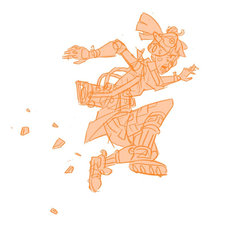
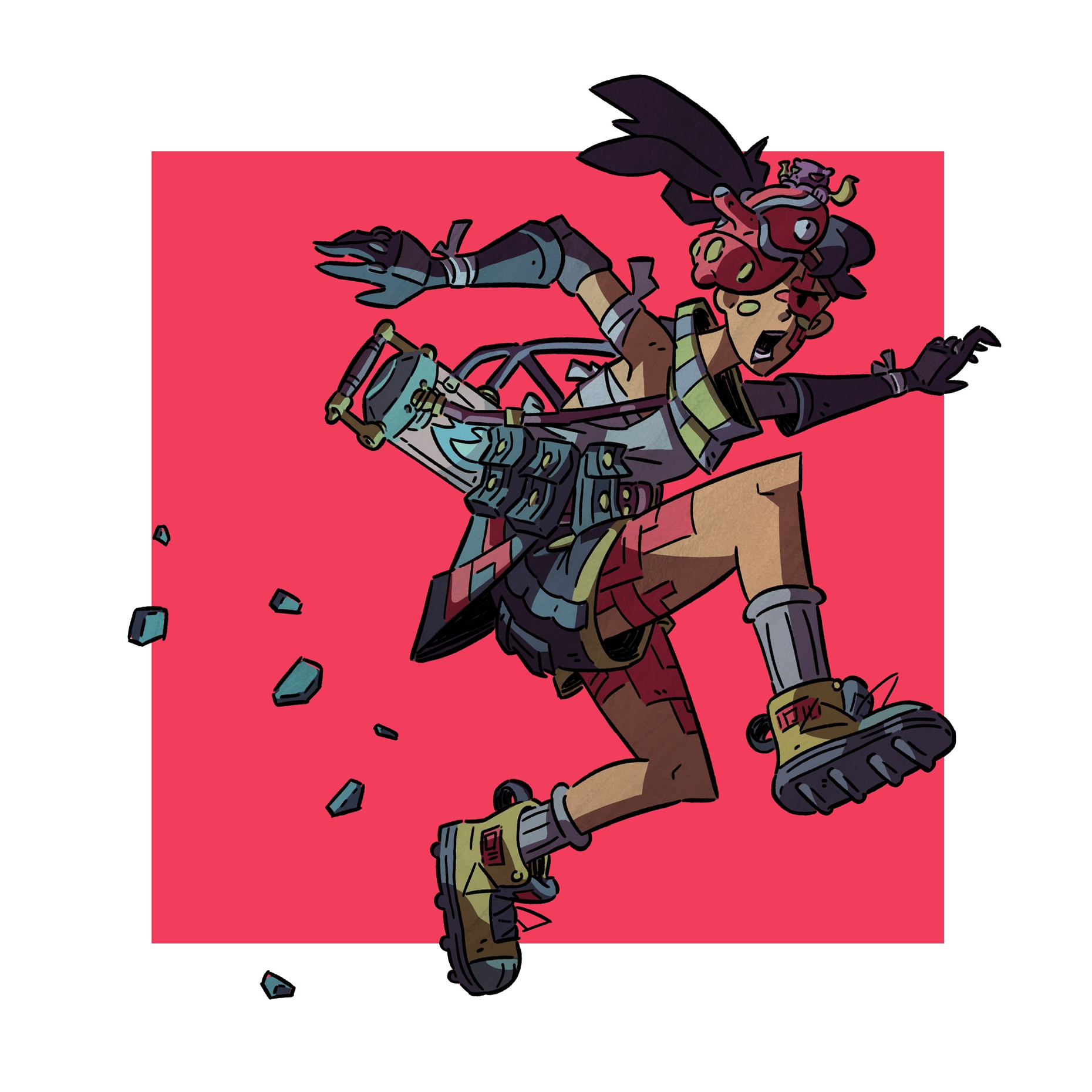
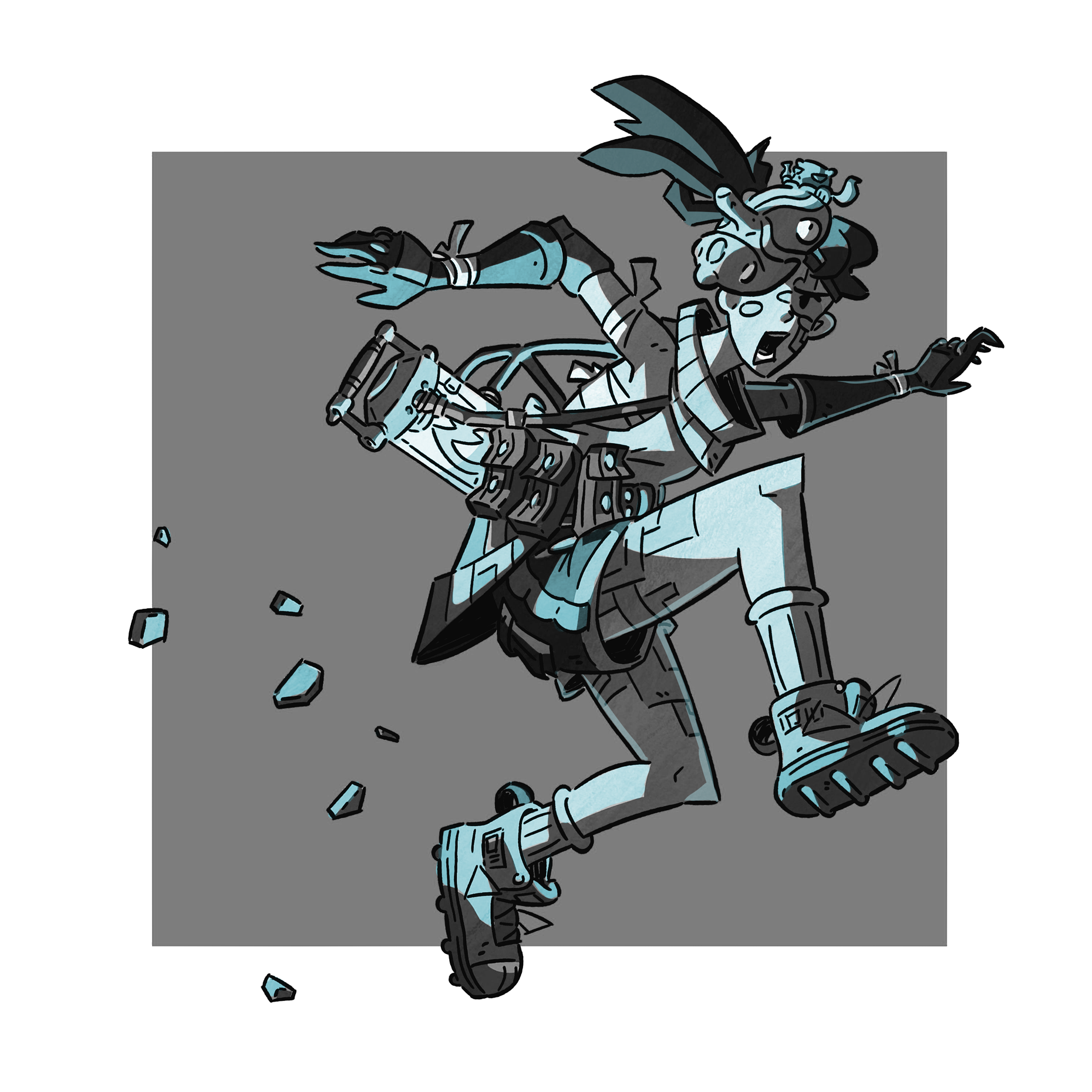
Does this look better? I tried to make the silhouette more readable, and I moved the pouches down and the backpack thing she's stealing further up.
As far as the story goes I only have a moment I'm telling. I haven't thought much more about it, but basically, this character is some sort of thief or smuggler and she steals some valuable essence or energy that is trapped in this chamber. She then gets caught and tries to make a quick getaway and that's the moment I have captured in this picture.
Thank you for your help!
-
@phoenix-yip Oh I'm sorry I thought it was a he.
Well that looks so much better!
Now maybe additional advice I can see what they're carrying on the side. Is that a lantern? Looks like it.
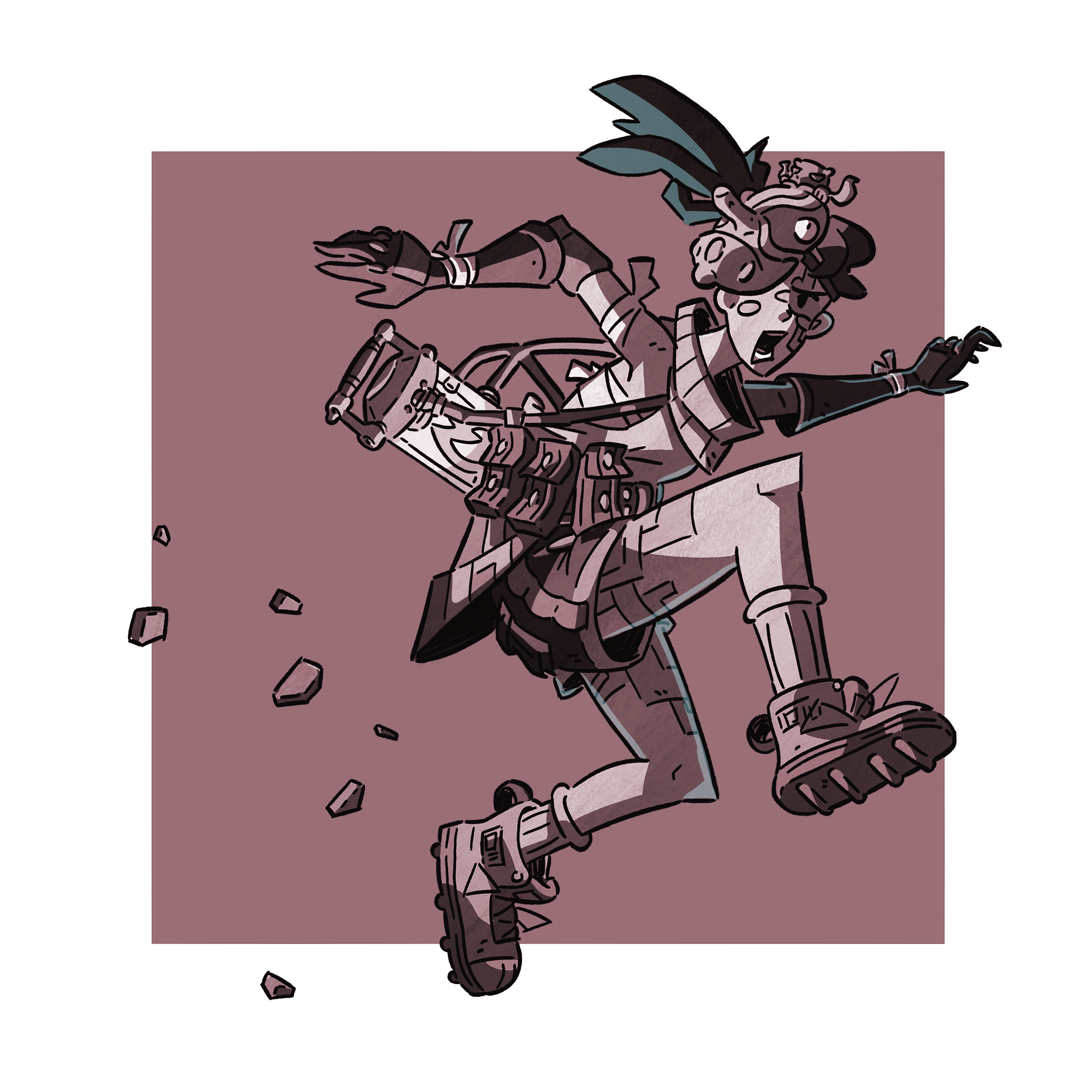
Maybe what you could do with that one thing they're carrying is maybe lengthening the size of the strap so we can see a little bit more of the lantern. Also try to not have that one long strap covering the pockets. Like so?
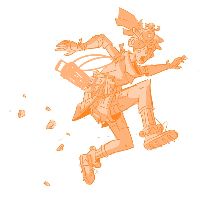
You can choose to show a little bit more of it, or all of it if you wanna show a lot of movement, like as if they're running REALLY fast, really lengthen the size of the strap and have the lantern really far out. Just don't have the straps covering the pockers or the actually lantern itself.
But otherwise, great improvement and I love the character already. Cannot wait to see you refine it. Are you going to add color or is it just going to be this monochromatic orange overlay? Eitherway looks really cool and you did a good job

Finis Coronat Opus
Instagram: www.instagram.com/madgcartoons/
Behance: www.behance.net/madgcartoons
Website: https://michaelangelodgo.wixsite.com/madgcartoons -
@Michael-Angelo-Go Thanks so much! No it's fine, she odes look boyish. I agree with youre saying. I will move the strap to make the silhouette more clear and yes i am gonna color it fully. Im planning to make this a print
-
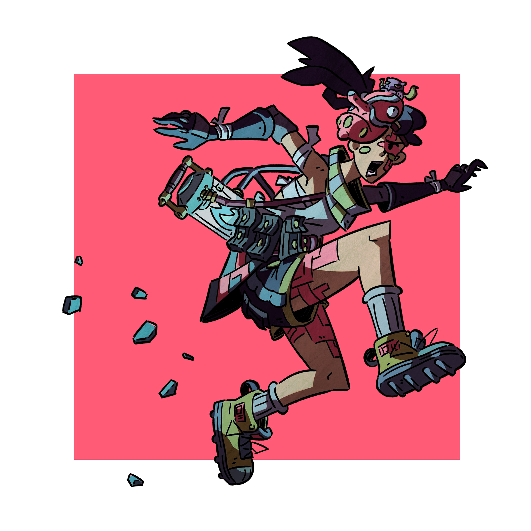
Took me a moment to realize that was a Tengu mask. Mostly because of the color pallet, and the line work being close to the all over color pallet as well, have to strain to see detail. What else on the character denotes Japanese culture? Maybe the character themselves, but I would have to wait to see it refined further to understand that.
The packs are interesting, what do they hold? If you can't think of anything, then are they needed? The style of pouch/bag would somewhat be determined by what they need to carry.
I like the new pose, much more fluid.
All my links: https://APHOTICMOTH.carrd.co/
-
@CLCanadyArts Thanks! Yeah I was very inspired by that mask. This character is just kind've a jumble of a bunch of ideas in my head. I haven't really though of anything to put in the packs tbh. I just thought it would make the character's silhouette more interesting. I will think more about the purpose of every item. thats a very good idea.
-
What do you think of this so far? What can I improve?
-
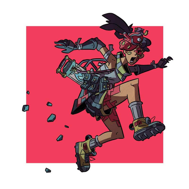
@phoenix-yip Hi, I like the color the scheme and the reddish-pink block in the back. Your piece is giving me Tokyo, neonlights anime vibes. What I would recommend now is playing with the values.
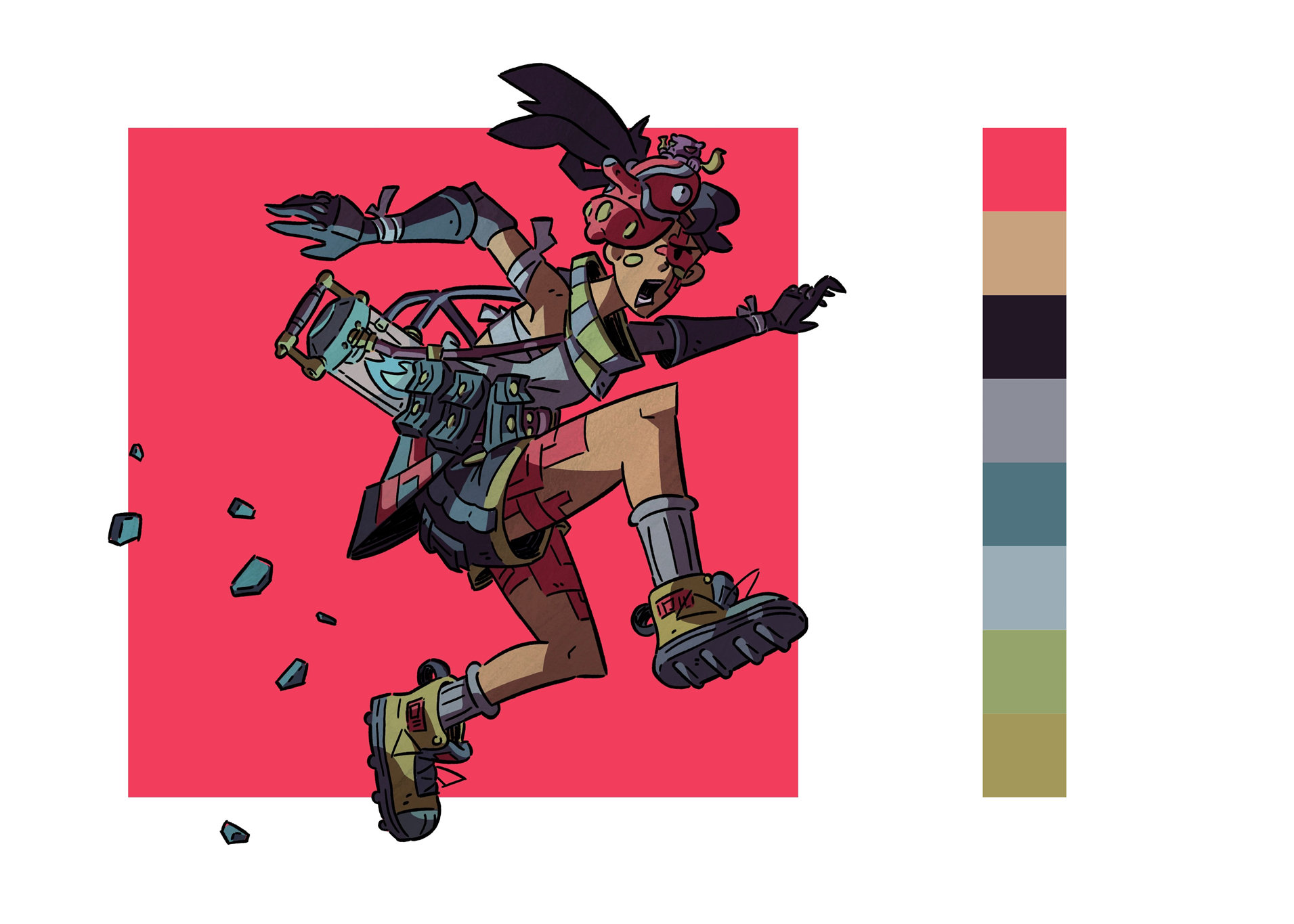
See how similar her values are against the block? What I would recommend is brightening up the block by just a little bit and adding more contrasting values so she'll stick out more.
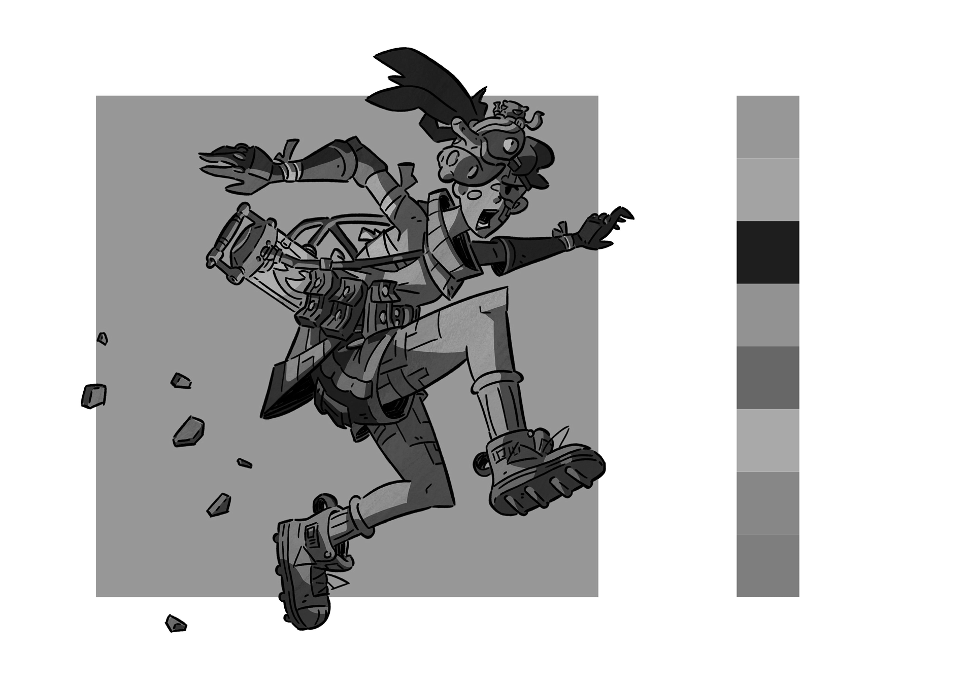
So what I did was I uped the contrast a bit and I highlighted the areas where your character's body is being lighted by her lantern.
What I did next was I added some hue to the lighting, it looked a little desaturated and I thought it would look better if the lighting had the bright hot blue color radiating over her.
This is how I applied the additional blue lighting.
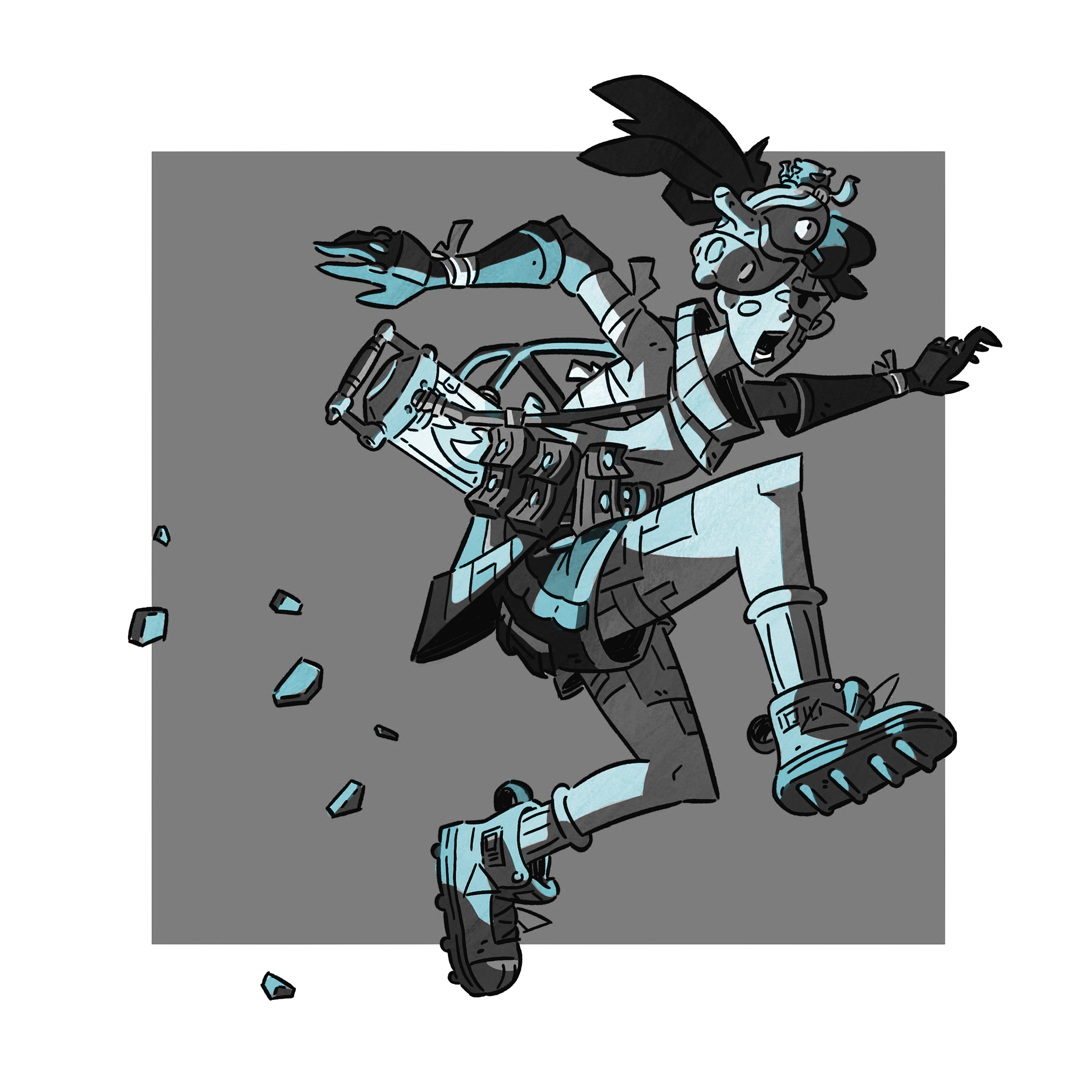
I added some additional lighting other areas like her hair, because I felt like that should actually be illuminated considering it looks her arm isn't covering the lantern for the hair not to get any lighting.
I looked at the edit that I made, and I felt like what I offered still wasn't strong enough, and I think I know why. It needs a filter. If you gave her a reddish-pink overlay like the square, she will feel a lot more cohesive in appearance.
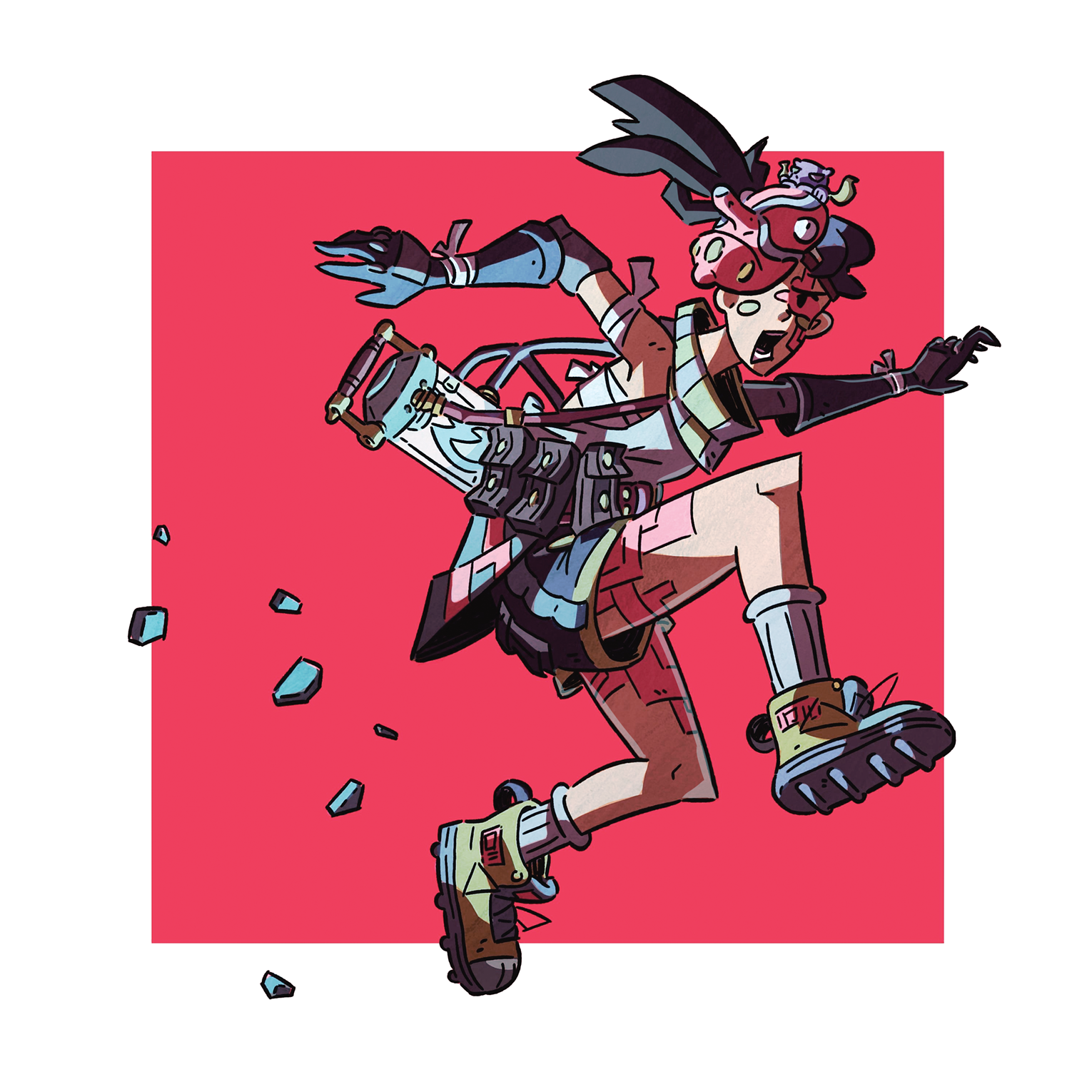
And this is what I produced in the end. She looks really cool now and I would totally buy a print of her. In fact, I love her design so much, I would love to see your work some day. On a side note what are trying to pursue in your illustration career? Because I would love to see this style used in the art direction of a children's tv show or the cover of children's novels. She just looks so cool and full of character and I would love to see more of your work.
Let me know if this works for you or not. She's kind of brighter than the original photo, but I was worried if I made her too bright. I put the photo into photoshop to make sure that I was giving you good advice. If you don't already know you need to convert your color profile on images from RGB to CMYK so that the printer doesn't automatically choose for you the wrong equivalents. Luckily while some of the original colors that I was adding were not working, when I converted it to CMYK the color shift was only very, very slight, so we're still good here.
Again, let me know if she's too bright for your taste. @CLCanadyArts do you have any more feedback for them or anything important to add to my own feedback? Since you seem more experienced.
Finis Coronat Opus
Instagram: www.instagram.com/madgcartoons/
Behance: www.behance.net/madgcartoons
Website: https://michaelangelodgo.wixsite.com/madgcartoons -
@Michael-Angelo-Go Oh my gosh I didn't think you were going to go this in-depth! Thank you so much! The edit you made looks so much better, I totally agree having more contrast in value will really help.
I don't really know what I want to do yet, I'm only 16 so I have plenty of time Ig. I think telling my own stories and making my own comics someday would be really awesome.
I did end up changing the color layer to multiply mode and putting a slight reddish underlay thingy under the color to help it be more cohesive with the background.
I also did this in procreate, which I probably should've used photoshop, especially for the color. Anyways thanks so much! Your advice has been so helpful and I've learned so much!
-
@phoenix-yip You're already talented at 16. I remember when I was in high school the first thing I was about to do when I graduate was go to animation school to someday become an animation producer. But my dad said no and I ended up with an architecture degree... but now that I am an independent adult and I recently graduated, I am already starting plans on becoming an animator this year at 23. I wish you the best of luck, follow your gut, take care of yourself, and I hope you follow the dreams that make you truly happy.
Finis Coronat Opus
Instagram: www.instagram.com/madgcartoons/
Behance: www.behance.net/madgcartoons
Website: https://michaelangelodgo.wixsite.com/madgcartoons -
@Michael-Angelo-Go Ah man that really sucks, I'm glad you're finally pursuing your passion. Thank you a lot. I wish you the best of luck in the animation industry as well!
-
Not sure what else to say, it's going in a nice direction. New generation is going to blow past everyone, so many skilled people coming out of highschool. I just turned 34, and am finally pushing myself to pursue art work.
All my links: https://APHOTICMOTH.carrd.co/
-
@CLCanadyArts That's great man! I'm glad you're doing that. It is kind've daunting and scary knowing that there's so many talented artists and the industry is also very competitive. I wish you good luck! I really like your work btw
-
@phoenix-yip Oh and another thing I overlooked. You don't need Photoshop to get the colors right for printing.
Procreate should already have an option where you can work in a CMYK profile or export the final image in CMYK.
I use Photoshop for its many tools, one of them being to make sure that my illustrations meet CMYK standards or else it will print murky. My main program I use is actually Paint Tool Sai (ver. 2) a very popular online program.
But Procreate should let you work in CMYK or produce CMYK images.
Finis Coronat Opus
Instagram: www.instagram.com/madgcartoons/
Behance: www.behance.net/madgcartoons
Website: https://michaelangelodgo.wixsite.com/madgcartoons -
@Michael-Angelo-Go Awesome! Thanks so much!