Help in background design / feedback request
-
Scroll down for TL;DR
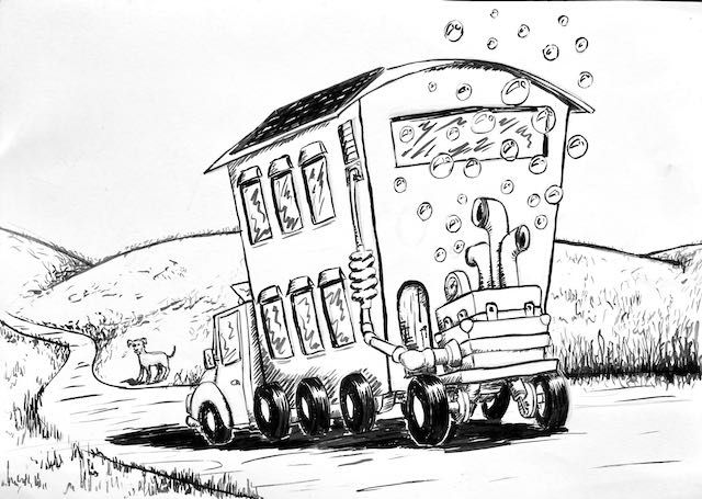
Any feedback in any regard is appreciated, but what I’d really like to ask you people about is the backgrounds. This is something I always struggle with. First of all - and I guess the trained eye can spot this is the case here as well - it’s always somewhat of an afterthought for me. Ok, this I can solve by myself by not “afterthinking” it and incorporating it into the design, but then I always have a hard time prioritizing what should and what shouldn’t be detailed, avoiding making it stand out too much and competing with the main subject, overdetailing and crowding the image - as in the wolf image - vs making it too simple and boring - as I feel this is the case for the bus image - and so on.
I’m aware that the perspective on the bus image is off, some parts aren’t aligned and all that, but I did this primarily as a way to learn to work with the brush for inking, so I didn’t care much for the other stuff. In the wolf - and comments on this could help me as well - I tried using gray liners to push the background further back against the foreground in black ink and I think the experience wasn’t all that successful either.
TL;DR is can anyone please critique and offer advice with regards to the backgrounds in my images?
-
Hey! I think these backgrounds are quite nice and work very decently. The only thing that bothered me about the cart image, perhaps, is that the bubbles don't really form any shape to lead the eye. I think they could have been used more purposefully to make an interesting shape!
Whilst I don't think your backgrounds are an issue in the two images you've posted, I do think not "afterthinking" would be a good approach. You posting about this has made me realize that for a few years now, I've not really thought about the background as a 'background' anymore. Ever since I started thumbnailing and planning out whole images, I no longer draw elements separately - the background is as significant as the foreground is, and they must ideally work together. A cloud, a branch, a path can all help lead the eye and has its purpose.
Bottom line is that I think both of your examples look great! I'd have a hard time pointing out anything to criticize, and I don't think the focus is off, either. If you were to also use colour, you could easily draw more attention to the most important element with light or colour, too.
But if you yourself think that backgrounds aren't part of your process, I guess I'd recommend doing some thumbnailing exercises where the background as well as the main element are just shapes and tones that need to balance each other out! That way when you fill in those shapes with actual background elements, they can support your overall image structure.
-
@Nathalie-Kranich thank you so much for the detailed reply. I must admit I'm feeling even happier with the feedback you gave now that I've checked your IG and saw how good your work is.
I have never done these thumbnail exercises. Frankly I had never heard about those and I'll definitely try them.
Once again, thank you!
-
@fmb I agree these don’t feel like an afterthought to me either! I often try you doing thinner or lighter lines in the bg and thicker/darker in the foreground to help separate them but these are looking pretty good.
For thumbnails I love this video by Lee white https://youtu.be/jghVE4V5FfU
And then working out the composition early on in that small thumbnail stage helps me a lot

Check out my art and tutorials :)
Instagram: www.instagram.com/carliannecreates/
Youtube:
https://youtube.com/c/CarlianneCreatesShop: www.carliannecreates.com
-
Thanks a lot, @carlianne , for the analysis, the suggestions about lines and composition, for Lee's video, and, finally, for the incentive !
By the way, I checked your (great) work on IG and found a tip for something I've been struggling with as well: I do my sketches in black ink and scan them. Then I trace them with an inking brush and work them digitally, but I've been dabbling with color lately and never get the black lines to blend well with the colors. It always seems to me like they are in different worlds. I'll try your colored lines thing and see how it goes.
-
@fmb I’m so happy to hear that! Good luck
 ️️️
️️️