"Swimming" Sketch After Composition Class
-
Hey everyone,
This week's topic for the weekly illustration group I'm a part of is "swimming." I just finished Will & Jake's Creative Composition class, so I thought this was the perfect time to try the things I learned.
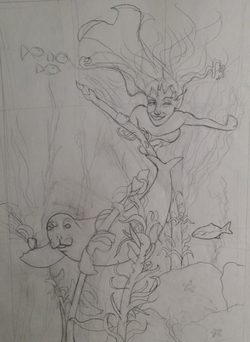
This is the sketch I came up with, but I'd like any input. Also, she's supposed to be behind the seal, so I think her head is way too big - is it? (I've been looking at it too long). I had her face looking more faery-like, but I thought it may have been too distracting...Thoughts are appreciated! (Btw, her left hand is pushing away a patch of what will be seaweed
") )
)
-
3 things come to mind just glancing at it Amber...
-
Why not show off her lower body more, it seems a waste to draw only half a mermaid.
-
I think her arm can move the seaweed at the forearm, to show more forward movement, rather than the foreshortened hand, which at first looked upside down to me, like she was holding it, rather than pushing it. If you depict the rest of the swimmer's action, it should appear as if she's moving through it, then moving a piece she and we can frankly see through already...
-
Is the Seal mad at being chased? What is their relationship? Friends?
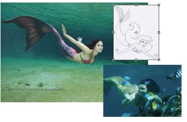
Not sure if this will help, but here's a Video of divers with Seals kind of fun to watch anyway...
-
-
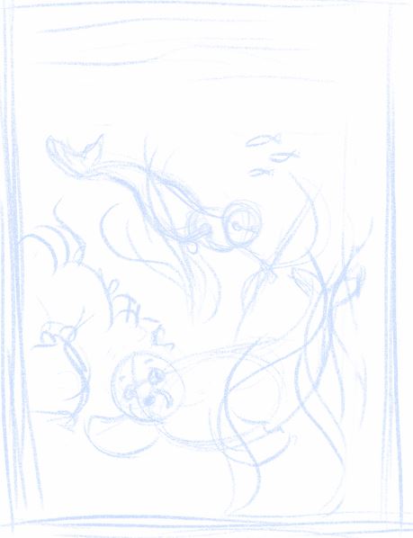
I agree with Bobby. Mermaids are graceful and flow-y and full of fun curves to draw. For a better view you should turn her a bit so she doesn't look flattened out, and to show off her mermaid shape. Also, your composition could have a nice curve going on from the end of her tail to the seal's front fin. It's almost there but her body needs to be turned. I also made her smaller to show that she's farther back in the image. When I sketched this I had the whole thing flipped so the seal was heading off to the right but flipped it back to match yours. I can't tell if the seal going left is bothering me or not. If someone else wants to comment on that, please do.
www.lydiamueller.com
Twitter @lydesigns -
Awesome advice - thank you, @gimmehummus & @Bobby Aquitania! I can't believe I hadn't even thought to make her more sideways, lol...
Bobby, she's playing hide & seek with the seal and he's raising just one of his eyebrows in consternation over not being able to find her. I'm not great at sketching - my details become so much clearer when I do the final drawing (I think it's because I add so much more detail to the shading and textures in the final drawing, but not in my sketches. But I'm working on doing more sketching to try to improve that), so it's probably not very clear. I think having her farther in the distance behind the seal will also help clarify.
Thanks again to both of you - and gimmehummus your drawing helped a ton!
Facebook Page: http://www.facebook.com/amberwingart
Instagram: @savinafranciscoart
YouTube: http://www.youtube.com/amberwingart
Website: http://www.amberwingart.com
SVS Sketchbook: http://forum.svslearn.com/topic/915/savina-s-sketchbook-updated-2-13-16 -
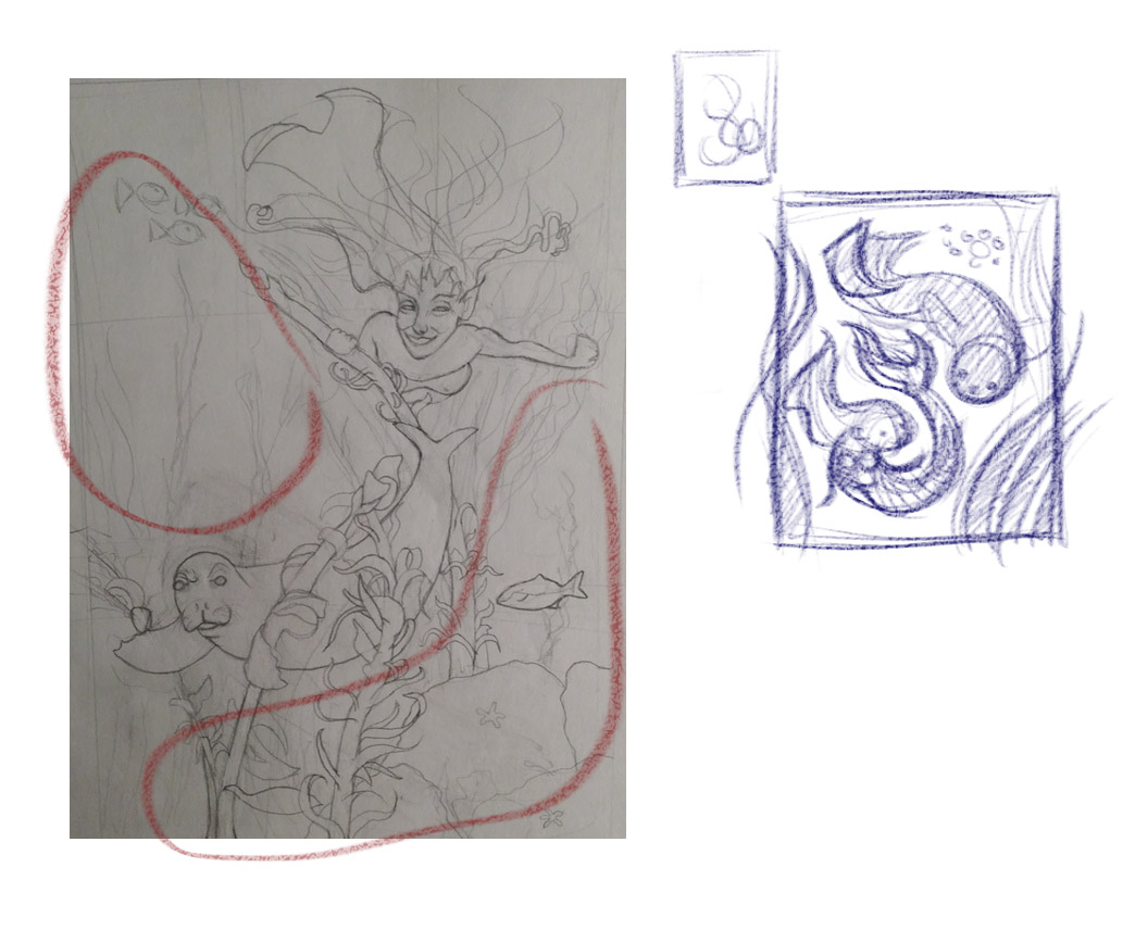
@amberwingart Hi Amber - you've already received excellent advice - I thought I might take a stab at the composition
 as well...
I think you have these wonderful creatures who can flow in any direction underwater. Their spines bend and twist unlike land creatures. I think if you find a good marriage between the two working together you will be able to utilize the space more efficiently and with more flow. I notice the empty spaces - remember if they aren't being used to fulfill a purpose they are diluting the potency of your design.
Cheers,
WillSVS Instructor
http://willterry.com/ -
Hi @Will-Terry - wow, thank you for commenting on my sketch (and for the sketch)! I see what you're saying about the shape... I have a question though: in the Creative Composition course, you talk about leaving blank spaces for the eye to rest & get drawn back to the important parts - should those blank spaces just be smaller than what I have here or should I not have any at all? I'm a little confused on that part...(I understand the part about making better use of her body shape & space though).
I have to say that composition course helped me so much, btw - A hundred lightbulbs went off for me while I was watching that one.
I'm going to re-work this sketch & I'll post the new one here tonight.
-
You're right - you need rest spaces - just smaller - give more space for your main characters unless there's a specific reason to have bigger empty spaces. For instance - if I want to show my characters traveling through a vast environment I'll give much more space for the environment...