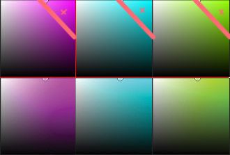
My work got published! ...but uh...
-
@Michael-Angelo-Go I used Paint Tool Sai back when I used to do digital speed paintings, circa 2010 or so I want to say? As for the lime green and neon blue in CMYK, honestly I personally don't mind it so much. I have a tendency to go a bit overboard with very flashy colors, and it's often not very tasteful. Using CMYK helps me tamp down on my neon color tendency. In the images you showed the colors on the CMYK version are still very bright. And it's always possible to make them seem brighter than they are by using duller or darker surrounding colors. There is very rarely a good reason to use neon colors in illustration. In my experience if the color won't print, it's probably bright enough to hurt someone's eyes...
-
I got to use Paint tool SAI until around 2014 when I came upon PaintStorm Studio, it works and feels similar but it is incredibly much better than SAI. It also features some of the tools found in photoshop and sketchbook pro as well (the rulers are and the rope (lazy mouse) are the best imho) so it is a really great program and It is also very cheap, I highly suggest you to try it out.
Another program you can use is Clip Studio Paint, really great overall program that has a huge deal of tools similar to photoshop as well as really cool brush customization features. It is worth much more than PaintStorm though.
I wouldn't go with an ipad and procreate just because everyone else and their mothers are using it, most of it is just hype.About your original topic, yep, it is a cmyk problem, you can avoid color conversion issues if you work with less saturated colors, so try avoiding picking colors at the top right corner, this should reduce a lot of the problems when converting to cmyk.

-
This post is deleted!