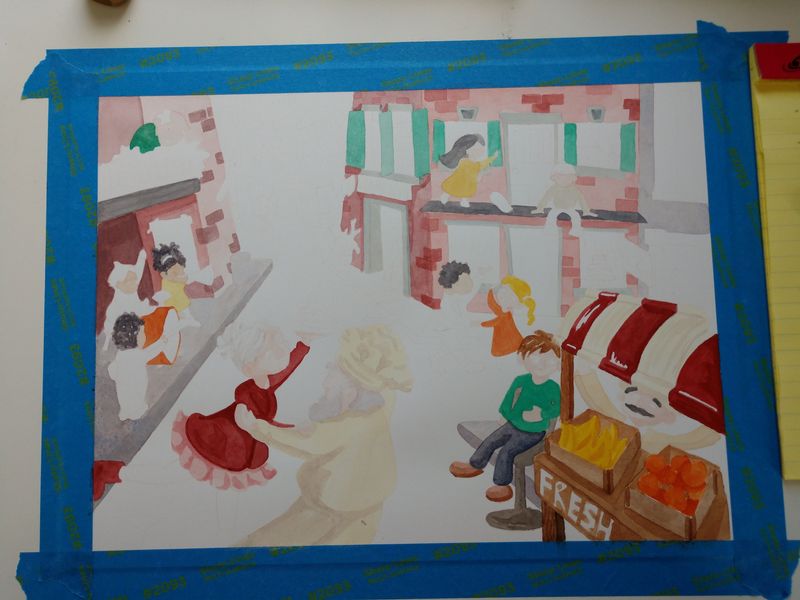
Painting progress
-
I'm currently working on this painting and am going to just share my progress on here while I keep plugging away at it. It's a scene from a story I wrote called Sylvia. It's an image of joy and surprise for her. Trying to limit my color palette but it's hard! Using watercolor and qouache. Any critiques, suggestions, etc are welcome.


-
Looking good!
Did you do any color comps? Those are incredibly helpful when it comes to deciding which colors go where, and in determining a limited palette.
Lately I’ve been using Procreate to do this. Even though I still prefer to illustrate using mostly traditional media, I find that I now prefer to sketch out the composition digitally, as it makes the process SO much more efficient and changes SO easy to make! And it’s easy to add a layer or two to do color comps.
Anyway, that’s what I’ve found has been working for me, and it really has been a game changer for my illustration process.
-
Hi,
I totally agree with Melissa on colour comps. They really helped me.I do also find it helpful to take a photo half way through with traditional and do a quick colour paint over in procreate or even on my phone just to see what it looks like. It usually helps me see the overall look. It is easy to adjust some of the contrast, brightness and hue features on your phone to give you some more ideas on where to correct things.
I find if I am doing a limited colour pallet I keep trying to add in more colours so I have the colours I am using as paint/digital blobs from the beginning. Then I stick to it. There is always loads of room to shift values and tints but make it feel like its using similar colours. I have been recently using only two or three colours in a limited pallet with black and white. I find having less colours actually easier. If anyone has any good tips for limited colour pallets I would love to hear them?
I would love to see how this turns out. I particularly like the bricks and all the detail in the buildings. Is there are story behind the illustration?