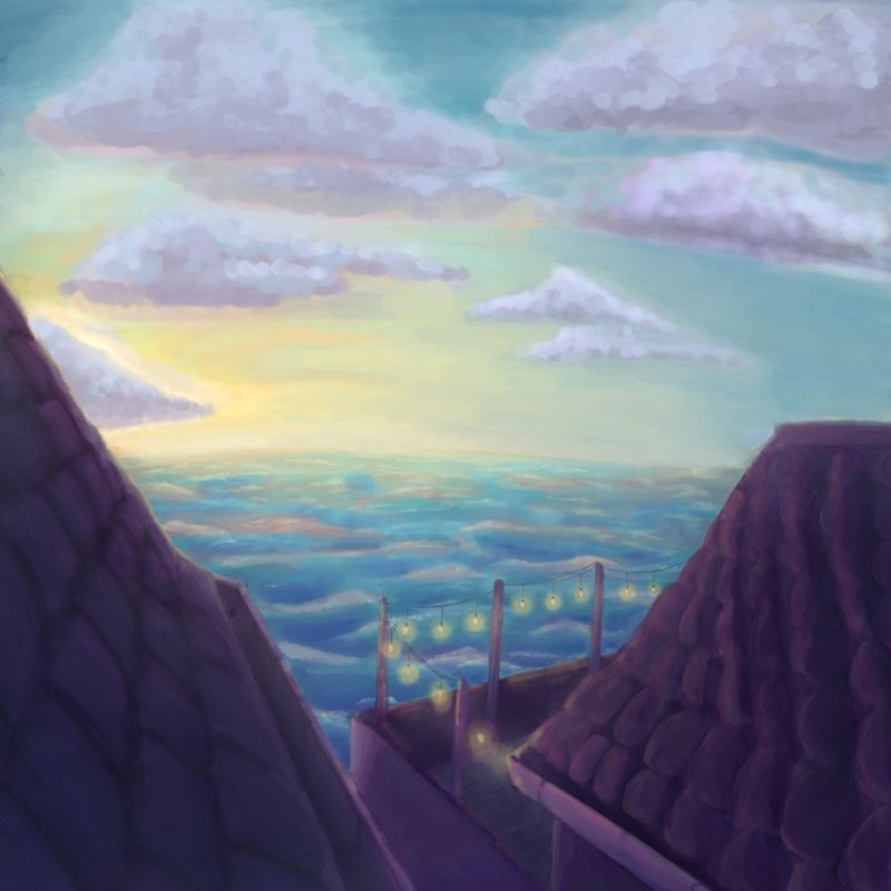
I’m working on scenery. Any feedback is welcomed
-
Not quite sure what my style is and where my artistic niche is.
Wanted to see what y’all think. I’m planning on adding some personality to the buildings, water and sky.
I feel like the flow pushes the eye to the lightest part of the sky.
Might add a chimney to the right building to curve the flow and complete the circuit.

-
@dafoota I like the colors and the palette. What kind of illustration are you going for? That will shape my advice. If the subject is the view, I think this is a nice job, If the subject is the porch, I think you need to saturate the colors a little more to emphasize it. YOu can increase the values of the porch to give it more contrast. I hope that helps!
-
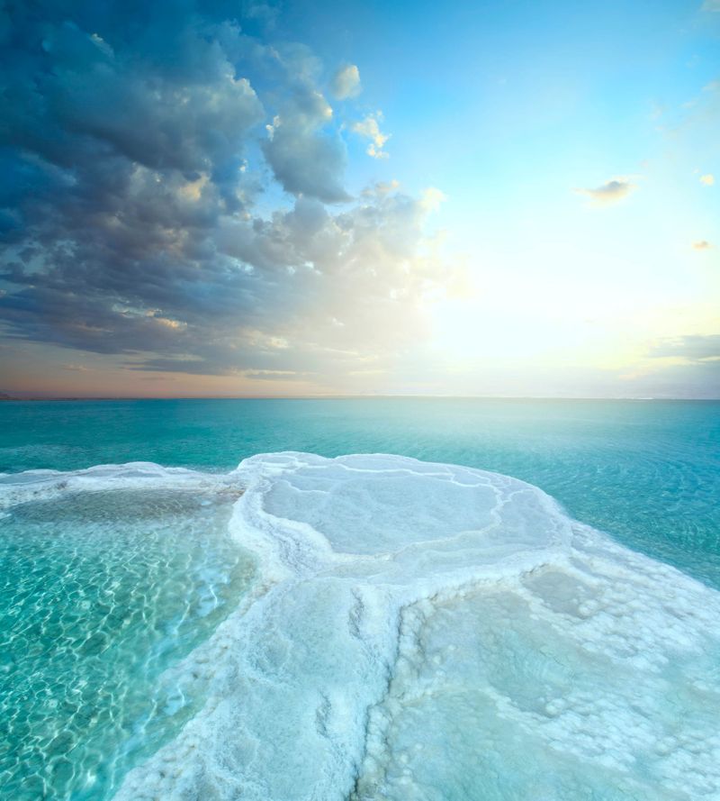
Ok so again my feedback might not be relevant to you as it depends on the kind of thing you are aiming for. If you wanted to make it a little more 'realistic' I would consider atmospheric perspective, you have started to do it with the ocean. Use reference images to help you here - so often when there is a bright almost 'white' glow hitting the horizon line of the sea, you will start to see the colours of the sky and sea blend. But notice how you almost always have an identifiable line that depicts the horizon line of the sea. (I've attached a good ref image for this for you). The other thing that would help with this depth is to make some of your clouds pushed back into the distance too. I feel like the one touching the rooftop on the left is a bit uncomfortable to look at - almost like its too close to where the viewer is? I think you could try pushing this cloud into the background - maybe try dropping its opacity to see what it looks like when a bit more translucent - you might find it shifts the focus back into the foreground where your lights are - which I think would be nice. (Though of course that depends on where you want your focus!)
I'm also not sure about the colour of the clouds - I think they may be too lilac/grey for the scene? They tie in nicely with the colours in the buildings but I think they might need to be a different tone to make the painting more harmonious?I really like how you've captured the light on the right side roof tiles - that's so nice and subtle!
Really like where this is going can't wait to see the finished piece!
-
@Abigail-Hookham and @chrisaakins
Thank you both for the feedback. It’s amazing what one cannot see until those who can reveal it. I’m sure their is a biblical message in that.

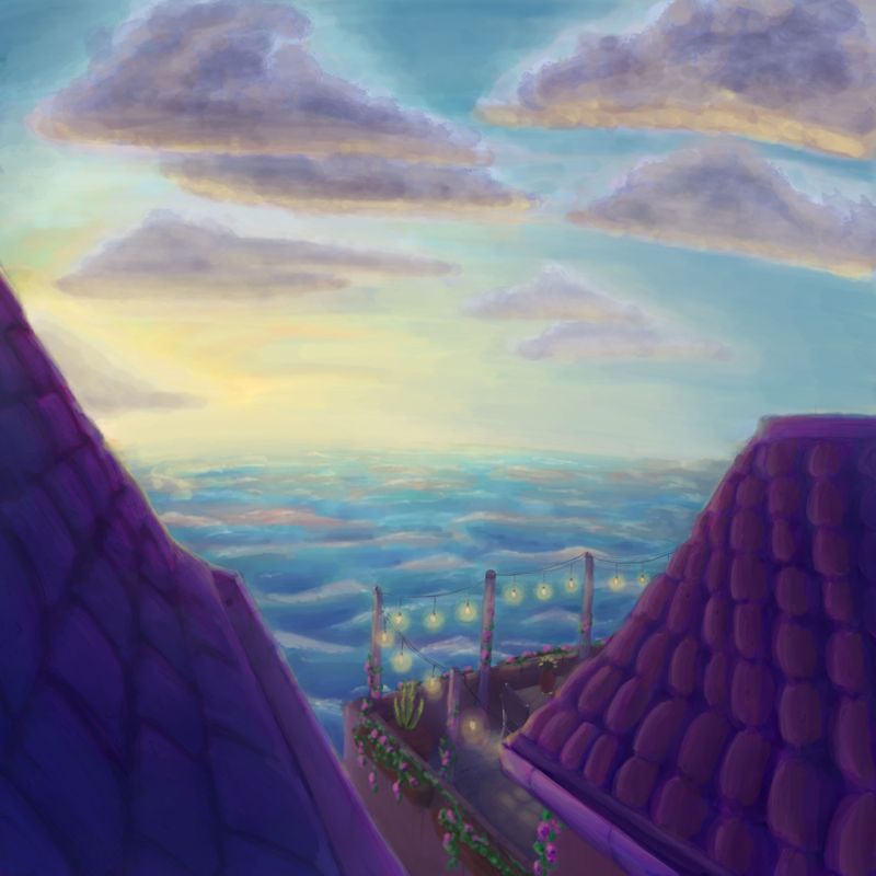
Clouds darker, horizon line faded, better contrast of roofs.
Clouds are still weird to me. Time for more studying.
-
The change you've made to the cloud on the left makes a huge difference! Looks so much better.

-
@dafoota Been working on clouds myself lately. One thing to help is to realize that clouds will run parallel with the horizon generally because they are sitting on a giant cushion of air that is also hugging the ground. Also, atmospheric perspective applies to them, too but in reverse to elements on the ground. They should get less detailed, more grey-blue, and smaller as they approach the horizon line which in their case means getting lower on the page. Are you doing them on a separate layer? It looks like you were trying to blend the sky around them. If so, I would do the sky first as a separate layer.
-
@chrisaakins Clouds>Parrallel with the ground>smaller and less detailed closest to the line
I've been watching a lot of Angry Mikko. He uses layers however suggested that it is good practice to try one layer.
Yea i need to get in there and touch it up.
Thank you for that awesome feedback.