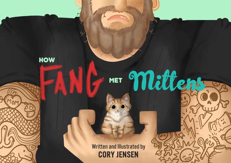
New Book Cover!
-
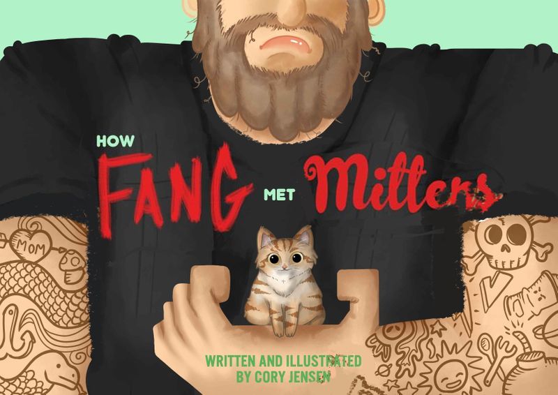
Hey guys! I just wanted some kind and constructive critiques from you guys on my new book idea... be gentle

-
Hey @Kori-Jensen ! I love this concept, and the image is very well done also love the tattoos. I might suggest maybe a little more definition of a chin for the kitty closer up under his mouth? Also I like the manly tough guy and I don’t know the whole story but it might be a little comedic if maybe he had a silly grin or garish smile? Just a couple thoughts
 I really do like this image overall though it’s great!
-
@powsupermum Thank you so much for the suggestions. I do have a reason for not having him so serious, the whole idea is to have the audience think he is something he is not. At the end of the story there is a surprise and having him seem like one thing and be something completely is all part of the plan :D. Does that make sence?
-
@Kori-Jensen I think so basically he acts tough but really he’s a big softie? I did a draw over to show you how I saw the kitty chin if that’s ok
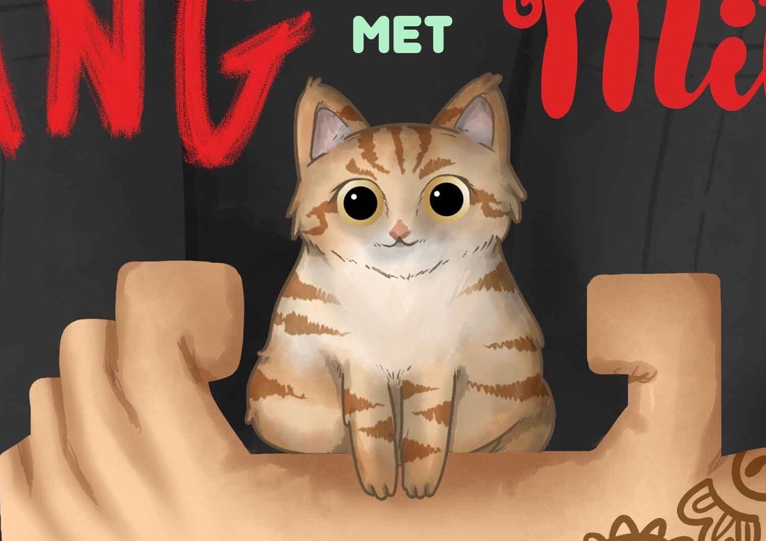 but I get it too if he just had like a bunch of extra fluff, like I said it’s great
 -
@Kori-Jensen I'd widen his chest a little bit to fit the whole title on his black shirt, for better readability! Avoid that tangent of the F with the side of the chest, just fit the whole text nicely in the black. Also, I'd erase a few tattoos on his left wrist so the bottom text doesn't have anything interfering with it. It's a super cute concept that works really well! Just the text is a bit hard to read as is

-
@Kori-Jensen This is so cute! I'm intrigued to know more about the story from the cover

I think Vanessa has given really good design feedback! I have tiny things nit picks to add- After the title, your name should be the next more readable text. Consider changing the size/font of "written and illustrated by" so that your name stands out more.
- It seems that the kitten is missing a leg on our left (unless that's part of the story!)
- Add whiskers! Whiskers make everything extra cuter!
- I understand the boxy shapes are part of your style, but before I could read the title and get an idea of what the story may be about, my first read was the kitten surrounded by those boxy fingers. Almost like the kitten was going to get clamped! Consider increasing the space between the index finger and the kitten so that there's a little more breathing room and looks like a gentler hold.
Great work!

-
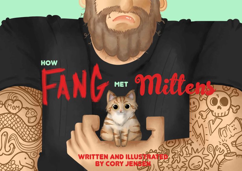
@powsupermum Oh yah!!!! cool I like it! Like this?

-
@Neha-Rawat Thank you so much I added some whiskers and you are tots right it does add to the cuteness. However with the leg on the left side it is the normal one, the right one is just covered by a tail curled in. And I changed the size of the kitten because the smaller he is the better :D. What do you think of the font? Typography was never my strong suit...
-
Whiskers looks good!
I mistook the line of the tail as the thigh line. The tail and legs are not distinguishable. Maybe add a separate curled up tail?
I think the right side looks perfect and you can match the left side to the right side of the kitten and add a separate tail. Here's why. The palm of the man is slanting towards his body while holding the kitten so technically the kittens legs should be overlapped by the palm. So The slight gap between the left kitten leg and the palm seems off.
For the font
- Since you've used a limited color palette in your Illustration, stick to it. I'd suggest the same dark shade as the tshirt.
- Remove the dino tattoo
- keep your name on a seperate line but bigger/bolder than the previous line
-
Looking really good! I like the whiskers, I also agree about placement of the title text and to be more legible where you name goes maybe fade out the tats on his arm you don’t have to erase all the way just enough so text pops
-
@Kori-Jensen Here's what I was talking about:
-
@NessIllustration ok I will work on those suggestions thank you

-
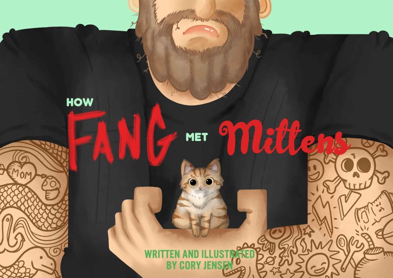
Hi, I think most has been said already. the only thing that still jumps out at me is that the fingers look like they have the knuckles at the wrong position. for the thumb it works, but the other fingers it somehow looks awkward to me. good luck with it, it looks good.
-
@Neha-Rawat Hows this?
