Feedback and suggestions wanted!
-
This is a personal piece for my portfolio and I'm not sure what to do with the white space at the bottom.
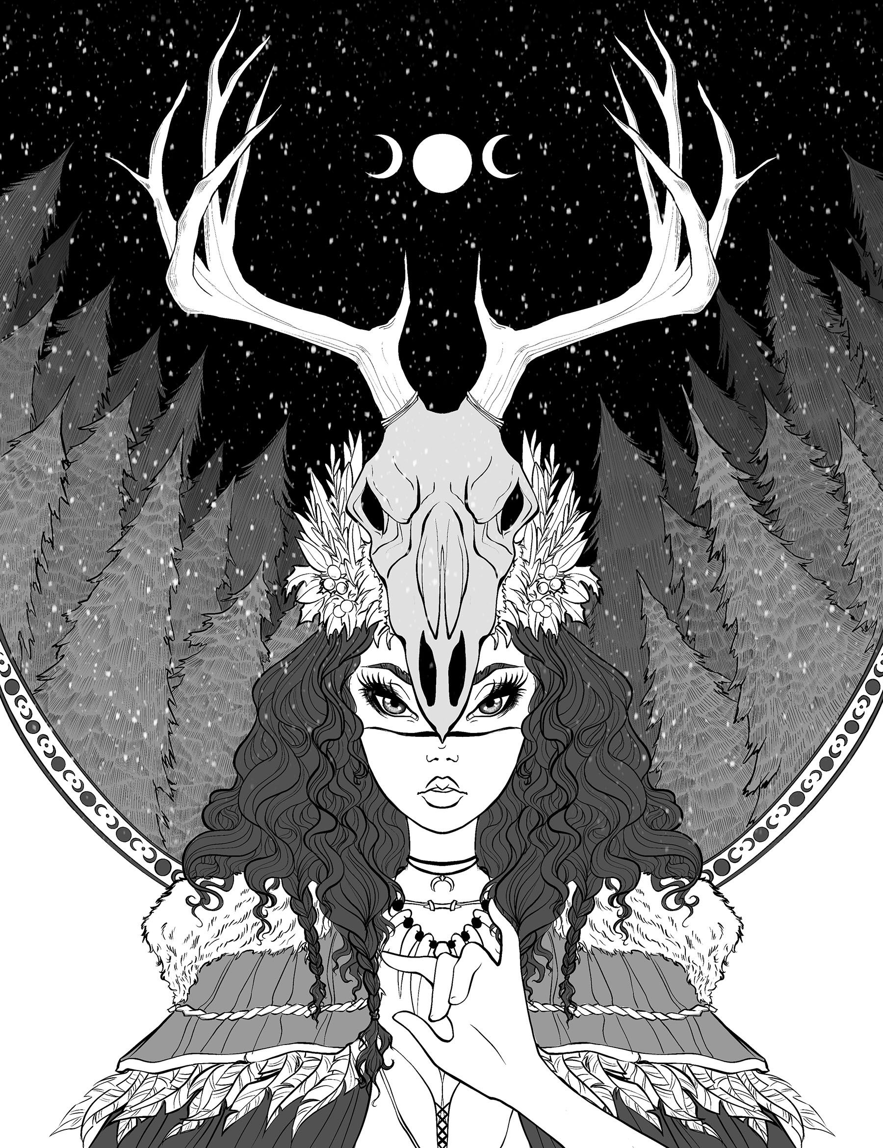
Also, should I give it some cell shading and highlights to the valued areas? Whenever I start adding highlights to the hair I'm not satisfied with it...maybe I just need to look at reference as I'm doing it.
Let me know! Thanks guys!!
-
could you move the entire background down so that she is included within the circle pattern and then maybe continue the circle around the top of the image, enclosing her antlers and the horn, to tie the piece together? I don't know, I'm just spitballing here.
As for the highlights in the hair, I think that would look DOPE ... but, I feel if you do that, you have to be consistent and add highlights everywhere else as well or it might feel off. Again, just my input.
Really love the work though. this is a cool portfolio piece.
-
Hello Eliso, she looks really cool, but there are a few things that stick out to me about this piece that I feel like need a few tweaks.
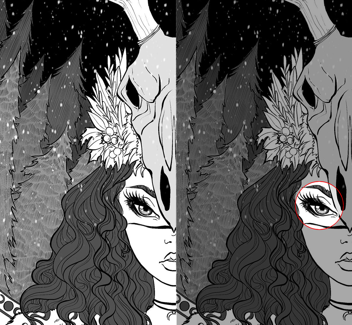
I'm not sure if it was intentional, but please let me know. It just felt like the cornea was tilted too downward so I corrected it. I think it makes the eye look much more natural unless this wasn't what you were going for...
I also wanted to comment on her hand. Are you using a reference. I feel like the thumb, middle, and ring finger are okay, but I feel like the index finger is shifted a little too far away from the fingers, or it's just too short. The same goes for the pinky, it feels a little too small for its scale compared to the other fingers.
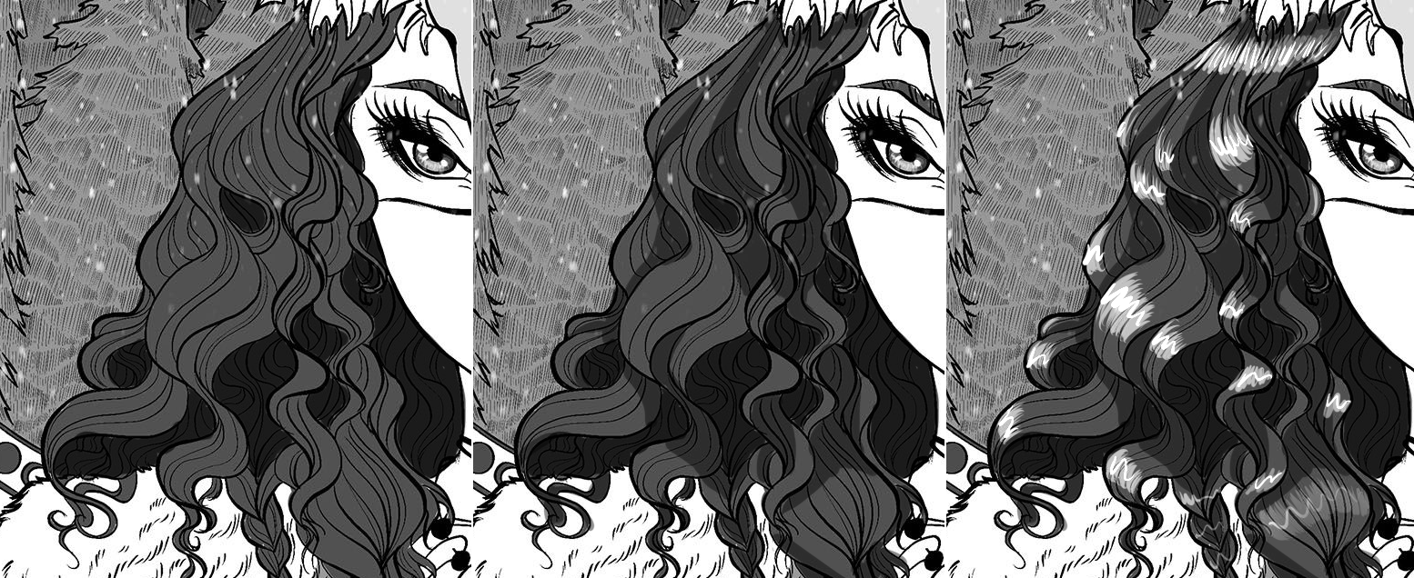
My advice for shading hair, is because of how much detail is in this piece, this gives you an opportunity to create a variety of different spots in the hair with different amounts of lighting or shading.
What I did was 1. Add shading to parts of the hair that I felt like were further back and thus have more shading and were darker. Hair touching the face tends to be darker. 2. I added secondary shading in areas where it looks like the curls sort of create an umbrella for segments of the hair that receive less light, but are probably not as dark as the further hidden hair. 3. I added a variety of highlights on the "bumps" of the curls that get more exposure to lighting. Also hair towards the parting or scalp typically receives the most amount of lighting, thus creating a halo effect. You could also highlight more parts of the hair by replacing some of the lineart colors to white, but that's up to you.
Overall, great piece!