thumbnails for a book cover - what do you think?
-
Hi,
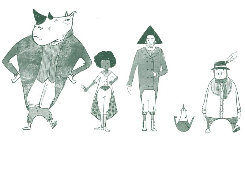
I did the character Design class by @AnnaDaviscourt and really liked it. Now that I have the Character Line up, I am thinking of doing a book cover for it. Please see the (super rough) thumbnails below and give me your feedback. Which ones do you like? Why? What is your favourite and what should I improve on it?
Thanks for taking the time.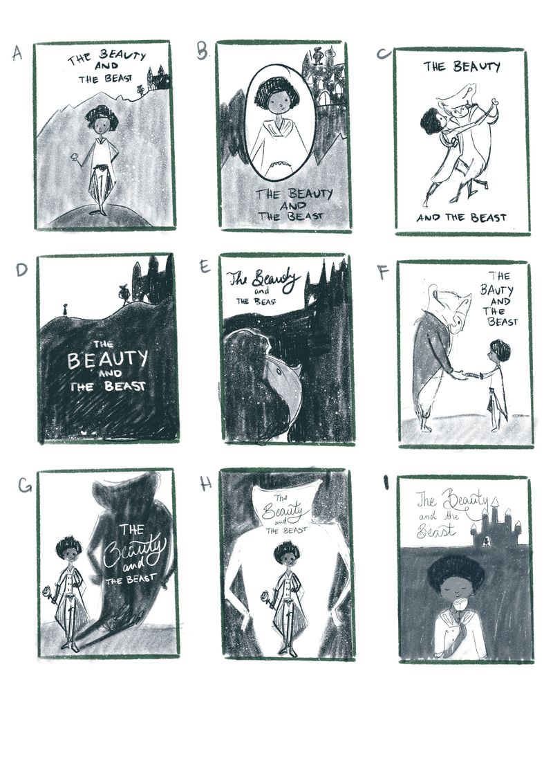
-
@doro_thea I like G, LOL it reminds me of an illustration I made some months ago with a similar idea (https://carles.barrobes.com/drawing/posts/frog-and-prince/). I like that it showcases the characters but keeping some mystery as to the beast.
E is also one of my favourites for the emotion it conveys, and compositionally it has great contrast (shape sizes, value...). Although it could be hard to draw the expression of face at that angle.
-
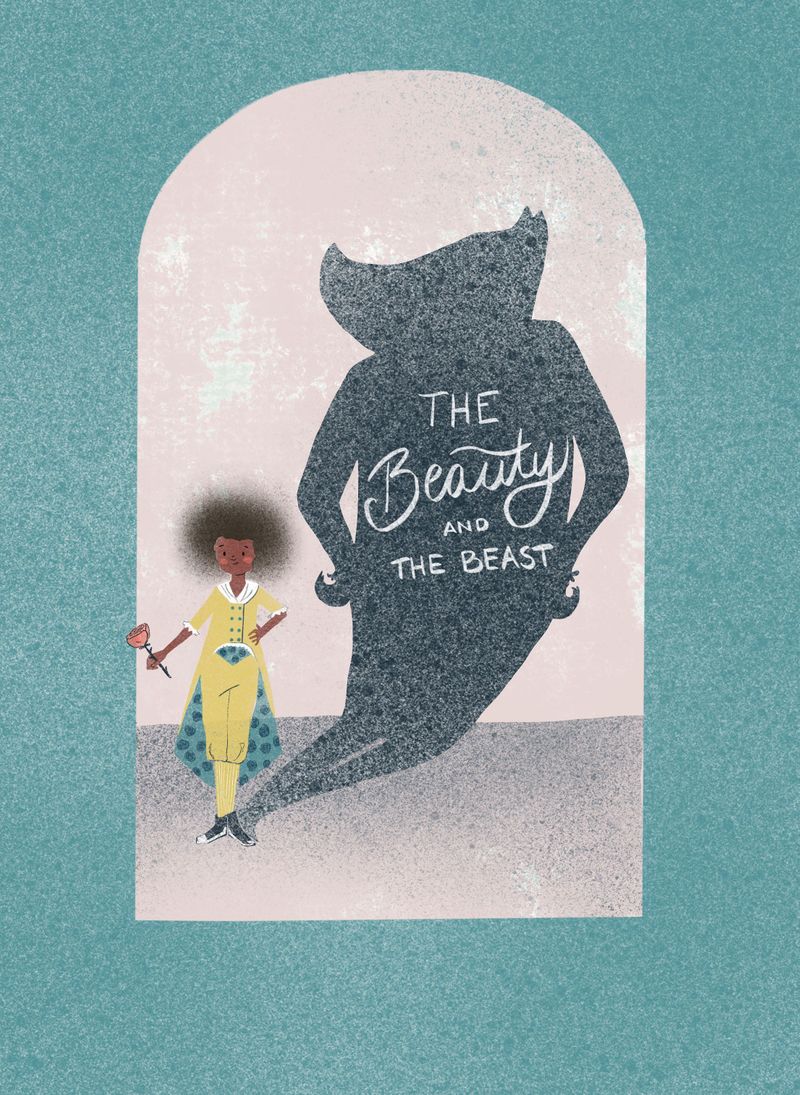
@txels thanks for the feedback and including the link to your drawing. That is really nice! I love how you added a frame around it. maybe I should look into something like that as well. adding the entrance door of the castle or a garden thingy...
I think you are right on E. The angle of the face makes it hard to do the expression properly. Maybe I can try it out as well though and see if I can make it work... -
@doro_thea I think I like G the most because the composition reads very clear!
")
-
@doro_thea G is really nice and dramatic! I think my second favorite is E.
-
@Jacy13 Thanks! I worked on this some more. so I will post my work in process here, and I would love to get your feedback on where to improve even further.
-
@NessIllustration thank you. feel free to give some feedback on the update.
BTW: I love your you tube videos. -
Hi,
After the lovely and constructive feedback, I decided to go with this one. I am not sure about the colors yet, my name is still missing and I tried several versions with flowers on the border but didn't like any of them, so I chucked them again. Still wondering if it is to clean as is...
any feedback you have, please share it with me. Colors, compositions, details,... anything.
what do you think of the lettering? to casual?
Thanks for your time and feedback.
-
@doro_thea Looking good with your progress! I like the lettering you have for the title and where it's placed.I think the lettering used for the word "Beauty" is really nice.
One thing that jumps out at me immediately is your main characters' hair. I don't know if your still working on that, but as it is right now her hair doesn't look connected to her face.
As far as colors go, I like the aquamarine background against the light pink. I'm not so sure about her chartreuse dress. It seems kind of an odd choice to me, however my color sense is probably not the best yet, so take this advice with a grain of salt
One last thing I notice is with the beast's shadow. Is there some room to exaggerate the beast's horns? I think it would be good to push the horns out just a little further, just to express the "beast" like quality of his character.I'm excited to see your final design! This is going really well already

-
@doro_thea I really like the direction of this cover!
My main critique would be the balance of the piece. The illustration seems to be pulled towards the bottom-left corner. Your main character is down there, the shadow is leading down there, the text is leaning that way, and the floor is slanted in that direction. I think shifting some elements around (including straightening the floor--or even having it angle the opposite way) would help--or possibly adding another element to the bottom-right corner of the pink section would add a counterweight. I've found that flipping/mirroring your image is very helpful for getting a fresh look at the balance in an image.
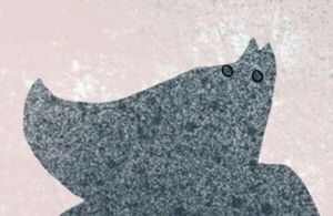
I agree with what @Jacy13 said about the beast's silhouette. I would also make a slight clean-up to the beast's texture. When I was looking more closely, a couple of the larger dots stood out to me (circled below), and I couldn't stop seeing them as eyes (so may brain saw a rhino--which would be an interesting direction, but I'm assuming not the one you were intending).
The design of her outfit is super cute. The style is very unique and approachable. Keep up the good work! I look forward to seeing it finished

-
@doro_thea I like the lettering!
I am not sure I understand the reasons behind the different font sizes though. It feels like "The Beauty" is the title and "and the beast" is a subtitle - is this intentional?
-
@doro_thea Also have you tried other approaches to her hair? Currently it looks like a background shadow, it doesn't feel like it's in the same plane as the head.
-
@Jacy13 thanks for the feedback. I will defiantly look at the hair again. i wanted to get across the stanching idea/technique, where you often have the things not perfectly aligned, but I need to rethink where to do it. Face is obviously not the right place. Thanks for pointing that out!
Regarding the colour, the dress is yellow, as the beauty in the beauty and the beast is traditionally dressed in yellow. And as Belle does not have the rest of the usual trails in my design ( suit instead if a dress, BIPOC instead of white), I wanted to stick with something traditional. But maybe I need to choose a different yellow tone, or reajust the rest of the colours.
I'll think about the horns (actually in my character design it did not have actual horns, but hair that sticks out like horns, but maybe I should relook at that as well...)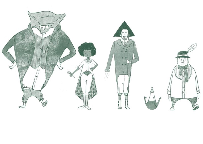
-
@txels Hi, thanks for the feedback. It is not intended to be a subtitle. So I will relook at it and maybe adjust the size of the lettering. And I will look at the hair as well, not 100% sure what I want to do with it though...
-
@miranda-hoover Thank you so much for your feedback. Very appreciated.
I did a super dirty draw over. do you think this improved the balance?
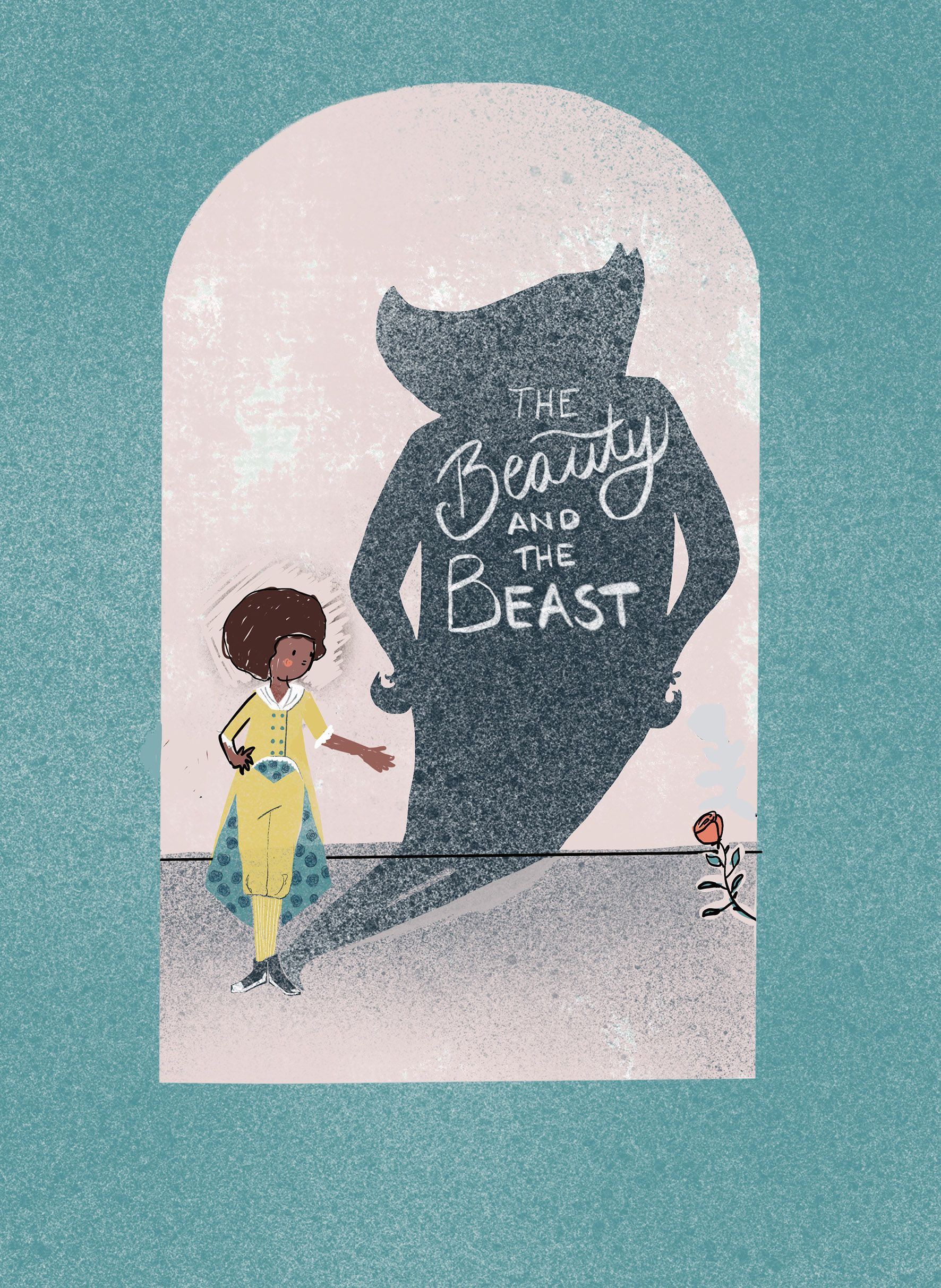
Thanks for the tip with mirroring.
I will defiantly clean up the the texture of the beast and I guess I should look into the silhouette again as well. Not sure what to do yet, but I'll have a look.
any more feedback?
BTW: I love the Idea of a rhino. I am considering to redo the lineup with a rhino designed beast.
-
I had a hard time picking between these, I don't know what exactly this character or book is all about but they all look really promising!
They all have a different vibe to them and look like they tell slightly different versions of a story.
out of these however, I personally really liked c and d !
These thumbnails really made me stop and think about the story and the cover and the character and what they all mean!
that alone is amazing about your designs so great going! -
@doro_thea Okay, see the color choice for the suit makes more sense knowing that. I admittedly don't know much about princess stories, so I wouldn't have known about the yellow color of the attire at all. Oops!

And I didn't know that your Beast doesn't have horns per say. Either way, I would still think about exaggerating that part in your silhouette.
-
@doro_thea Yes! I think the balance is much better. I'd probably tilt the line of the floor a bit more towards the right--but that's probably just me getting nit-picky.
Looking great
-
@miranda-hoover Thank you! I'll also try the the tilting the floor, as I really like how your feedback influenced my design.
BTW tried out the rhino beast. And I am actually considering to rethink my line up, as i think it is so much fun
-
@Jacy13 I will look into how to exaggarate the "horns". I think this is really good feedback that the silhouette needs to be more interesting...