Hot Holy Snowman - Feedback?
-
Howdy folks! It's me again, with another seasonal illustration!
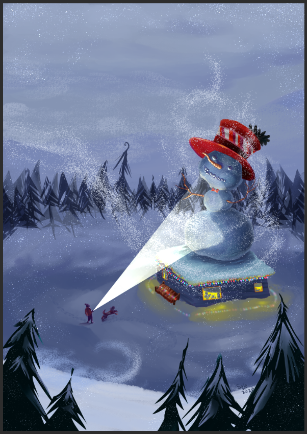
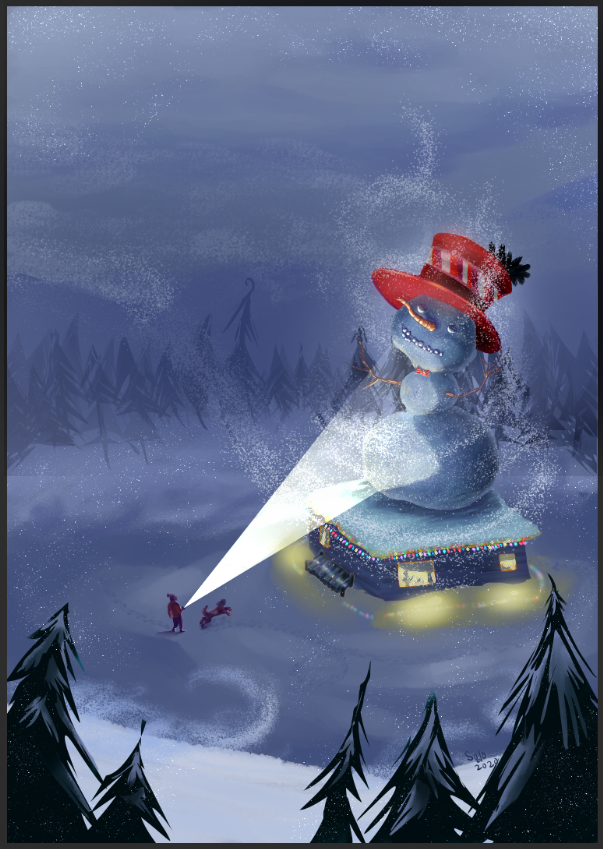
I'd love some feedback on this piece - I'm feeling a little insecure about the log bin against the house. It feels out of place and not very legible. [Also, this is a screenshot because the file sizes won't fit, so sorry for any graininess.]
But any feedback is appreciated!
I hope y'all are well and keeping busy!All the best,
Shani -
Here's a process video for any folks who are curious~
https://youtu.be/3Fe6LKlf_UU
Thanks!
Shani, The Art Bard -
Hello @TheArtBard I want to offer you a little bit of advice that might help make this piece a bit better.
Overall, I think the idea is clear and the composition is very decent, I only have a few tips.
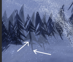
The way you drew these trees are sort of sloppy. I know things like in the background you want to tone down the detail so that it doesn't muddle from the main subject, but it's a little distracting. Also, they're kind of drawn inconsistently with the other trees in the foreground closer to the audience that I say is well illustrated.
I checked out your Youtube video and saw that you simply just copy and pasted then mirrored the trees, which is a time saver, but you also kind of check these knitty-gritty details so your piece doesn't look incomplete.
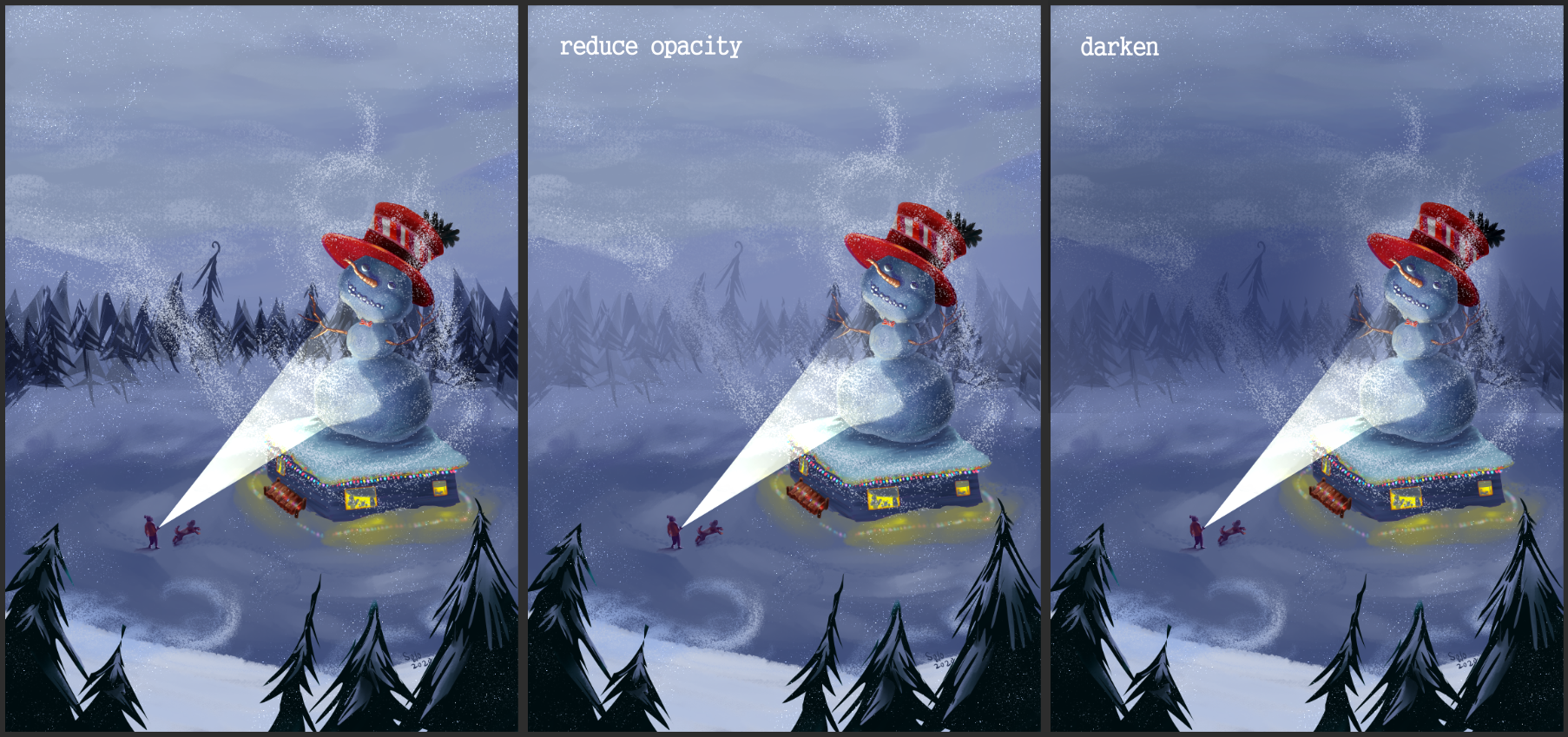
Maybe you could just darken the background behind the snowman where the forest is so the snowman can stick out. That way you can justify not having as much detail to help bring the main image out.
I agree about how you feel about the log, but I don't think the log itself is the reason it feels out of place. It's the color that is the issue. You have this background where the lighting is darkened because of the snow weather, where the main light sources are coming from the child's flashlight and the inside of the log cabin.
The colors I would say not fit.
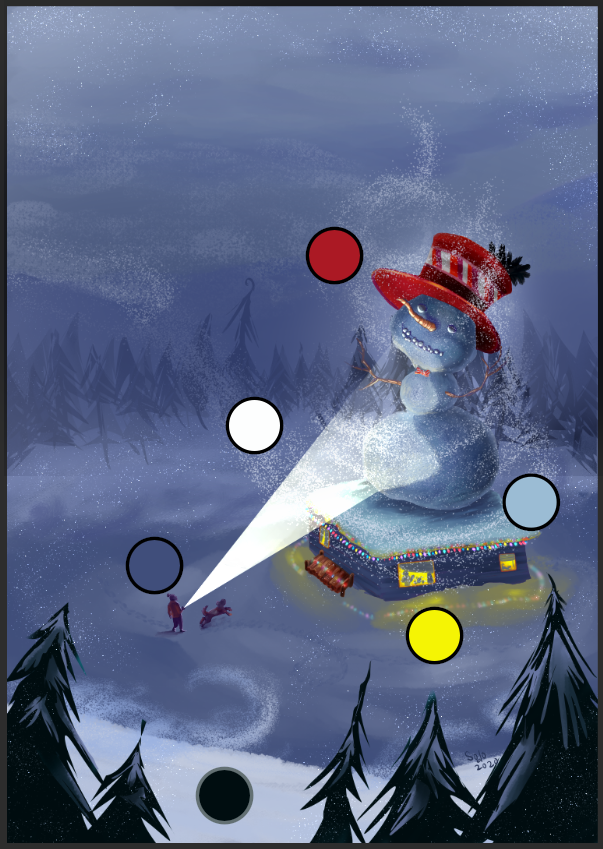
These are the main colors I have identified from your piece. It looks like you're going for a sort of classic, RYB, black and white color scheme. The log feels out of place is because you colored it brown. What you should do is recolor it by changing the hue settings on your program so it can match the colors of the dominating blue hues.
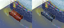
Like this.
One last thing I'd probably suggest is maybe tone down the yellow a bit? It's a little too saturated compared to the majority of the image's colors. Overall, I cannot think of anymore advice than these tips. I think you did a good job overall!
Finis Coronat Opus
Instagram: www.instagram.com/madgcartoons/
Behance: www.behance.net/madgcartoons
Website: https://michaelangelodgo.wixsite.com/madgcartoons -
@Michael-Angelo-Go
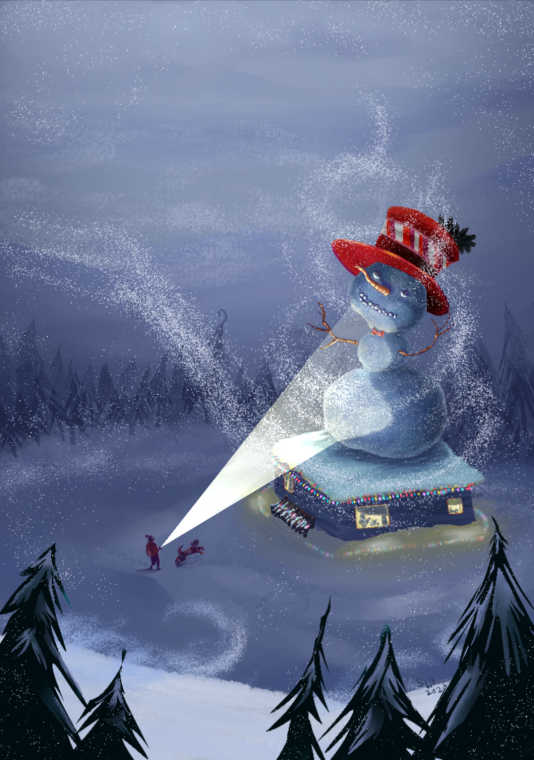
Thank you SO MUCH for that insightful critique! I referenced it multiple times as I went about the improvements. You were spot on with all of it - That was exactly what it needed!
Here is the updated version - I'll feedback is appreciated, but of course, no pressure, you've given me a lot of good stuff to work with!
Thanks again Michael Angelo Go!
All the best,
Happy holidays
Shani, The Art Bard -
@TheArtBard OMG! That looks so much better. I'm glad you benefitted from my advice. Happy Holidays!